

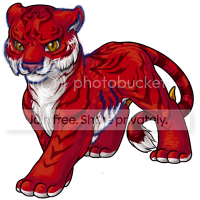
The tigrean is up for a revamp, and we'd love to get your constructive feedback on this proposed design. <a href=/explore/polls.php?act=vote&poll=99>Vote in the poll here!

 Using 's edit I wanted to poke at the Tigrean more. After watching Life of Pi I felt more inspired to poke at the Tigrean.
Of all the redraw's this is one of my faves. Focusing more on the ribcage defining that area more would be nice. Though Tigreans look like tigers the current Tigrean had very... I guess you could say nimble feet? It would be nice if that returned but I don't know how well that would do with the realistic body proportions.
A much more 'angry' or aggressive facial expression would be swell. Tigreans shouldn't look too friendly even if they are pets.
Shrinking the nose is perfect but where the I guess lips touch the nose is too close to the nose and it should have that little space like cats have.
Other than that, the shape of the back legs seem just a little off and the paws seem a little large but it doesn't look like that can really be changed.
Also the stripes on the back feet should go lower so that the foot in the very back could have at least 2 stripes.


No.... just no.

I cannot even begin to express how excited I am about this! I had no idea the Tigrean was going to get a revamp, but it's a very pleasant surprise. Not that the artist did a bad job, but I have always been dissatisfied with the current version. The pose is very static and does not have the sleek, catlike build that the original graphic had. I feel like this most recent revamp proposal brings back all the charm of the original graphic, while adding a refreshing dose of anatomy and proportion. Though I still do miss the head tilt on the original Tigrean (just a slight tilting of the head can add a lot of flow and character to a pose, so perhaps something to consider) and others have provided some lovely critique and suggestions, I would agree that the graphic works as-is and any changes would probably be mostly nit-picky (not that any of the suggestions should be disregarded, sometimes it is the little details that can make or break a design). My biggest concern is really just that the pet looks like a tiger and nothing more. I know that with these really old pets, artists don't have a lot to work with in the way of originality, so I sometimes find that stylization can bring more to a character than just 100% perfect anatomy.


I would have to agree with in that you ought not to make the nose too narrow. Making it smaller, yes, but not narrow. It's a tiger, not a house cat, so the nose should still be rather big. I do like her edits more than the previous ones, as those both look too narrow to me to fit the size of the maw properly. And yes, you ought to be careful about the upper part of the jaw. THe current version is missing too much of the upper lip area and it's mostly nose. Just looks strange.
I don't really mind the legs that much, as the original had large legs too, but to me, somehow the back legs seem to be shorter than the front (and I know it's in perspective, I mean if it wasn't in perspective it /still/ looks like the back legs are shorter than the front).
It also doesn't look like it has any shoulders, but that the neck just blends into the spine which makes the torso look stunted. I wasn't going to do this... but I am going to.. guh....
I'm using Freckles edit- because I liked how she edited the face. Her edit, my redline, then how it looks edited. What I found, was the spine needs to be defined, and the stripes on the back along the spine do not align with it, it's not even aligned with the tail! I also showed the 'dip' that was mentioned earlier about the ribs. I also added in claw marks and defined the back paw, which is really a small tweak with a little bend so it's not like "LOG- TOES" which is what it's doing now. Considering how many other of the pawed animals have defined ankles, I think it's only fair this does too (which the front paw has a wrist, so, the back paw should have a defined joint too). So yeah, here's some little edits. Sorry for more... 8x

So, yeah, there you go.

BTW, I voted for the new one but I would like to see the modifications Freckles has made. :)

Oh goodness, Freckles' eyes look WONDERFUL.<33333333333333333333

I'm a bit indifferent about it. Something about that revamp doesn't sit right with me.
You know which pet is in DIRE need of an artist? Serpenth. Most of Serpenth's pallets are still in its old forms.

Omg now that I see SleepHead's edits, their nose is lovely~

A few things bother me about the new one and tbh I voted for the old one out of concern that they won't be addressed. Phoenixx's edits were my favourite so far but ultimately there were a few big problems that just look off to me.
-- The back paws look very odd - almost as if the paw segment isn't there, is very small. -- Yet the width of those paws are HUGE and seem disproportionate -- They Nose is HUGE and doesn't appear to be cat-like enough -- The eyes feel very off and, as I've seen in some edits, need to have the black around them. -- It looks super crazy shiny, glossy even -- the rib cage is very odd and awkward. The body looks almost more lion-like than tiger-like because of this. -- I would've LOVED to see some of the markings (specifically around the eyes) kept but that's more personal preference than anything :3
Alright. First, I want to say that the art is beautiful. The quality is really gorgeous. Second, I'm just going to say this, and I apologize for sounding like an asshole, but /please/ do not give it that Voldemort cat nose. It's way too small. This is a tiger, not a domestic house cat. The hair tuft is also highly unfitting for the revamped style.
There are two things I wanted to point out, though I only care about the nose. Hopefully my image will load. [IMG]http://i40.tinypic.com/344a9sk.jpg[/IMG]

Not a bad design. but i do agree with the people who this needs a "happy medium" in terms of making it a good for both genders... the new design is too masculine imo... female tigrean owners won't be too happy.

I think I will miss the old version very much. I always was my favorite and it was my first pet here too. The art sure is lovely but I don't like the anatomy of the new version at all.

's edits would make it absolutely perfect imo. _

The revamp I see it being 100% masculine I can't see it being female for those who would want a female one. There needs to be a in between area. I would like to see the revamp have the puff of hair on its head and the eyes be a bit bigger. Sadly, have no interest in the revamp. Not appealing enough to my eyes. If more is changed like I stated any some of the ideas from other posters then just maybe =3

Personally I love the idea of the Tigrean getting a revamp. I never did like the old pose what-so-ever. This proposed new version of the Tigrean isn't that bad. It's getting a lot of criticism, and it should. The eyes, nose, belly, and feet need to change. I think the artist did a wonderful job altogether, however it just does not suit the "Tigrean look." However I do love that it's getting more of a big cat image. I think if the Subeta artists were to look at Phoenixx and Cylum's revamp versions, they would find what they're looking for. I LOVE the nose, eyes and face in general of Phoenixx's revamp. If it were to be added onto Cylum's drawing I would LOVE LOVE LOVE it. I think people would be more satisfied too.


I love both for different reasons (old one because I'm more used to it, new one because it resembles a tiger better than the latter). What makes it hard to choose between the two is that the older one looks like a cub version to the newer one xD (ironically)
Either way -- loving the art for both.

I really love the new one, however, I prefer the tuft of fur on top of the old version's head, and the fluffier chest fur. If you found a way to work those into the new design it would be perfect :)

I love the new design. However, I love the old design better - it is sleeker, more cunning in appearance, and all around has a better feeling to me. I like that it isn't exactly like a real tiger, because I'm not here for replicas of real animals though I know there are a ton of people that love this design and would like it to be more realistic. I for one would be extremely unhappy if Ducan, one of my first pets ever, were to be changed to this version. Again, its not because I don't like the new design. I feel it would be better if the new design were altered a little bit (colors, physical accents, etc.) and it was made into a new species rather than a revamp. The newer design does not feel like a Tigrean to me, it feels and looks like a totally different pet. I think when revamping, you should stick to just updating the art. If you change it too much, you might lose what the users loved about it originally. I think this is one of those revamps.
I know there are other users who feel the same way. I also know that a lot of people love this version. What do you guys think about keeping the Tigrean the way it is and making this new one into a new pet?
I don't mean to sound rude if I do. I love Subeta so much and all of the artists are absolutely amazing. I have a lot of respect for what everyone does here and know you thrive on user opinons, which is why I'm giving mine honestly. Up until this one, I've loved all of the revamps. Keep up the great work :)

This is a pet where I really wish we had a male and a female version. xD It's just too muscular. I wish the belly fur we be cut back a tiny bit. Tigers have a heavy build, yes, but the fur on this one is just a little too long. Especially on a short body with short legs like the one above. It's a little too low for the pet.
I agree with the lineart changes except the tuft. It doesn't really work on the pet anymore in the new lines.

I like Sleepyhead's edit to the nose! But the tuft of hair does not work on the more realistic version at all.

The new one is better
Haters gonna hate

Wehhh...I really like the more cartoony one ;o;

The front paw and back paws on the revamped version need more definition. I can't even tell if there is actually a joint to those legs, it's more like stubs with paws at the end. Don't see any claws either and that's a common thing for a cat species to have atleast shown being retracted. Something about the pose bothers me. If it's supposed to look like it's walking then the leg should be drawn up a bit closer to the body and pushed out a bit. It just look like it's preparing to fall over in it's current pose.

YES YES YES! A+ to this revamp.
Just one thing guys please please PLEASE round out that ribcage and watch out for the stripes making continuous lines into said ribcage otherwise A+

I don't mind Cylum's hairless edit, but might still prefer the old one (at least its personality and charm).


I prefer the old one, the new is very well done and is much like a real tiger, but not like the Tigrean and I find that these details could be improved:
º In my view, the tigrean is an intermediate between a jaguar and a tiger, with the finest legs and a face thinner that tiger. º Same as everyone says, I think you should make bigger eyes, would return the young character to the Tigrean º The legs look shorter in the new one, the old one didn't give that effect, since he is in a position where it seems that can stretch more the legs. º The fingers did not fit with the new style, they are too round and without much detail, I really think that could improve.
Those are my more general criticism, but I still like the idea of &;&;revamp, I love the way he get painted, as did the fur and how you added details.
Now I'm also special afraid that change some Tigreans whose design is really great and that I did not imagine them in a better way: Bloodred, Dark Matter, Galactic, Glacier and in especially Reborn, which has a finesse that could lose with the new Tigrean robust body.
Sorry me if I can't express well myself, English isn't my language

I think the tigrean does not need a revamp. :/


No matter how many edits pop up to "revamp" the proposed revamp, it still looks too masculine of a pet that allows the option of a female gender upon creation. I still hate it, and if the Reborn color looks as terrible as the revamp then I'm definitely going to look into changing my pet's species to something else. :(

p.s. love Cylums' edit!
I prefer the old version because it has good memories for me. What puts me off the new version is mostly it's face. It looks a bit flat and... well... munted :( The old version had a lot more personality.

I like the new art, the old tigrean was starting to clearly be an outdated drawing. But I like the old one better in the sense that he looks more young and adventurous, where the new one looks like an everyday boring adult tiger. (Boring as far as tigers go)

My Tigrean was my first pet.. the one I chose without a doubt as I absolutely loved the way it looked! Unfortunately, with the revamp I might have to consider changing its species... I am totally not keen on the new one (it's awesome artwork, no offense there!!!). It's just that the new one is so very bulky and seems to radiate less "personality". And yes, I know real big cats aren't the sleekest and are quite bulky..
It's awesome though to see how so many people see it all so very differently. :)
As a pet here I just prefer the older version...

Love this proposed revamp! Never liked the Tigrean because of it's current look, but this revamp is just amazing. I especially love the nose, demon markings, and the extra toes!


I think, with the nose, eyes and paw edits suggested by cylum and others, this could be really amazing.

I think the nose is too big, the ears too small, and the paws too clunky. I find the positions of the ears to look rather odd as well, like the opening should face us a little more instead of being sideways.

One thing revamp artists must always keep in mind is that you have to keep the charm of the old one. This new one is very well made and I applaud the artist, but it's a bit bulky and doesn't retain the old, once again, charm of the other. I think the version Phoenixx showed down below is a better way to revamp it. Still good art, but it keeps the same "look".

I like the older one, because it's cutesy. the new one is kinda cool since it's more realistic but I prefer the cutesy old one. And I am going to be sad since the newer version seems to be winning in the votes!

Posting again to say that I love Cylums's edits!! ❤️
<-- original 
 <--Edited versions
I like both versions! With those edits the new tigrean become absolutely perfect!!! ___
<--Edited versions
I like both versions! With those edits the new tigrean become absolutely perfect!!! ___


To be honest.. I like Cylums version the most :'D Smaller nose, eyes with more personality - perfect!


the old one is much cuter :/


I voted for the old one...the new art is good but the head is too small for the body. I'd rather keep the old design than have pets be disproportional.


I love the revamp, though I personally feel the newer version looks a lot more mature than the older version, it's like the tigrean has grown up, and I want to own all of them. :3

WOOOOOWWWW!!! GREAT THE NEW REVAMP!!!!

OMG I really want one now ://D The new art is amazing


Its not too bad, but it looks too "real" xD the old one is cute :3


I actually like the new one more, but something still seems to be a bit... odd. Probably the ears (?)
The new one is better

i must say i love the new one, even if it is getting some hate. like the crits and i totally agree with the nose and back FEET being edited, but otherwise it is great and going in the right direction. for the love of god im so happy that the tuft of hair on the head is gone, that was just so tacking and ew love how this is stepping up the bar with pet art

I LOVE the old one, I hope it does not change.
I think making it closer to a tiger is awesome! Here is my two cents on the redraw though. The new official version does seem to have a rather wide nose atm. Along with those beady eyes it makes me think that this version is some sort of piggish villian haha. While Tigers don't have large eyes they also have an area of white around the eyes to make them appear larger. I think some more shading of a lighter reddish brown or a design or something there would help alot. For the front leg I think the foreleg line goes up to far on the side with the fluff. If you could imagine it straight on from the side with that high of an 'armpit' you'll see what I mean. Also the paws. I agree that that area just looks too big. The darn thing has cankles lol. I think the issue is that the legs start off normal and get bigger towards the bottom ending in a big paw. But what needs to be done is to keep that same size that you start off with throughout the length and just have the paws be big by themselves to prevent them from looking as though the ankle area is as big as the shoulders. :)