

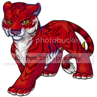
The tigrean is up for a revamp, and we'd love to get your constructive feedback on this proposed design. <a href=/explore/polls.php?act=vote&poll=99>Vote in the poll here!

I like 's revamped version more and more, only thing needed is to have the ears a bit more rounded...now all that needs to be done is to add ankles and make the nose smaller and I think we'd have a great new pet!

there's always going to be a little attitude change with every revamp, but i think the direction this took is really nice.
i really want to change Wolfwood into one of those. he fits older, male characters so much better ;;

I've always thought of the old one as slightly feminine (could easily go both ways), but when I see the new one I think it veers far too heavily into the masculine side of the spectrum. In my own opinion, when I look at the new one I see 'tiger', it just seems too... realistic? It mimics the bulkiness (the hanging fur) and raw power of a tiger, but to me, that's just it... a tiger. Not a tigrean. The jollin, though it looks realistic, it has just enough to set it apart from Earth counterparts (dat tail, and those gorgeous spots), yet this new tigrean seems just like an oddly colored tiger. It definitely has the cheeky look of the tigrean yet it lacks its initial sleekness, something I was attracted to. A suggestion could be to slim it down ever so slightly so it would appeal to people who want female characters, enlarge the eyes (for a slight cartoony look, something that I love about Subeta), make the back claw sharper and more hooked, and bring the ears out a bit (they seem too folded back). Of course, the artwork itself is still stunning c: maybe deeper shading on the red? This is just my opinion though, and I do give praise to the wonderful artist for a great piece of artwork. I just don't think it has the right feeling?

All I can say is its perfectly beautiful and anyone who doesnt like it: thats what over lays are for, you can have it looking like a ferret I'd you really want. And as for subeta-ey I think it still has a fuck load of personality and the species really needed a bit of love. However, I do agree with the anatomical changes suggested, the forshortening etc but its lovely, I fucking love it. :) well done, congratulations and you guys are amazing as always :) <3


The new one has superb art and colouring! There are only a couple things. First I would like to see the ears facing more forward, this would make them look a little bigger and balance the face out a bit more. The front leg, extending forward looks stiff and wrong at first glance, but when I look a little closer, I think its the pattern of stripes that makes it look so dead and non-fluid. Maybe the stripes could be made less evenly spaced, a little more ragged? As for the eyes, while I agree they could be bigger, I do think they work okay just as they are. As the owner of a glacier tigrean, I'm mostly concerned about keeping that frosty expression.

Oh please god no! Please don't change it! I like the old one! DX


YES PLEASE! Don't care if you edit this version, but I absolutely adore it! Hello, new, manly Tigrean!

challenged me to unfold the ears:

I am so not an artist xD


I think the chest either needs to be narrowed or the lower back area needs to be thickened, because the two halves of the "torso" look disproportionate to me otherwise, but overall I REALLY like the new design.

Okay, so I attempted to do a red-line on the revamp to address a few of the problems I had with it. Note that I say "attempted". I'm not a Subeta artist. I accidentally messed up some of the shading, and potentially messed up some other things too.
Crossing my fingers that these images will work. I've never posted an image in a news comment before.
I made two versions, one with the stomach fur and one without. Personally, I prefer the one without, but I know that other people did like the fur because it's more realistic.
CHANGES -Made the eyes and ears bigger -Made the nose and mouth narrower -Pulled in the left side of the face a bit -Made the neck a little narrower -Changed the stripes going into the white of the stomach (was trying to make them look less like ribs; don't know if it succeeded) -Made stomach fur slightly shorter (right version) or removed it completely (left version)
CHANGES I HOPE TO SEE THAT I DID NOT ADDRESS -The way the front legs cross. I initially tried to include this in the red-line, but I fail at perspective, and I could not get it to look right.
I hope this helps to illustrate some of the things I said in my critique, even though I'm not the best at red-lines. I agree that the current version looks a bit too masculine for my tastes. (Yes, I know that real female tigers look like that, but we're on a pet site, and bulkier/more muscular translates to masculine when drawing cartoon animals.)

while i'm glad we're allowed such an open forum to give criticism here on subeta, i think a few of these comments are extremely picky about some of the most miniscule things. i will agree that overall the body of the revamp is somewhat out of proportion, the face could possibly be made a little more ambiguous, and that maybe changing the pose up a little might lend a different, even better perspective that more people might be satisfied with. but some of these comments seem a bit destructive as opposed to constructive because they're more motivated by emotion and attachment and not objectivity.
to be honest, and just from what i've gathered by reading the responses here and on other revamps, it seems like there are some people who just don't want to move forward. i regard subeta so much higher than all the other pet + avatar + forum sites out there because of many things. just look at our HAs. they're extremely realistic (except when it comes to the hands and feet, respectively). but also look at all the clothing items and wigs and make-up and everything not only the staff have come up with, but that the users themselves have dreamed up and made a reality through CWs. look at the overlays people have put on their pet profiles in order to match the "maturity", so to speak, of their HAs and the stories they've come up with for their pets. i would honestly say that subeta, albeit smaller than most, is one of the much more mature communities out there (especially despite the varied ages of the users), and i think it should have more "mature" looking pets to match a website that has grown from what i'm sure some used to call a neo-wannabe into something that rivals and, imo, beats sites like neo and gaia any day.
that's just my opinion, and i recognize everyone is entitled to their own. just realize, all, that this is a rough draft and nothing is set in stone yet. what you do know is that no matter what, the staff will do their best to try and make everyone happy in the end.

---------------==============================----------------
I enjoy the new design. It's stronger looking and more realistic. However... I'm quite fond of the older design. It looks determined and, although stylized and bright.. most of us have already gotten used to it.
Adding on to that, it would put more on the programmers to have to make new designs for each pet color with the new design.
Therefore, I'm going to propose an idea.
The new Tigrean revamp should be a new 'color.' Just like with the Glade event or the Galactic pet event.
It will not only give the users a new way to customize their pets, but it isn't forcing those who want to keep the original design to change it.
Perhaps calling it "The Imperial Tigrean" (As I'm basing the name off the Chinese Lion Dance.)
I hope others can see and read this and give their thoughts from here. This way, the new design can be implimented, yet done without


I think the new one is better BECAUSE it's masculine. I love the more realistic looking pets on Subeta. They're wonderful. The talon on the back legs has always thrown me off, but I know that that's basically what sets them sort of apart. I can't wait to see the colors if this is voted through!

I like the new one and think it's great, but it just feels weird to me because I've always sort of seen and coded the species as looking a bit feminine in the "normal" pose/colors and I feel like the newer revamp is just the opposite. Not that that matters any.

I can't believe how picky some of you people are in the artwork. I love the new one!

I do like Speiro's tweaks -- the bottom of the back leg does seem very thick, which is what's putting a lot of people off. And the thigh area/under belly could use a bit of shading. The eyes in Speiro's suggestion are a bit bigger which is nice.

I LOVE IT. c: It's so powerful and amazing and unf. ;o;

Very nice.I really like how the new version looks less cartoony and more mature than the old one.

Even though the new one is really pretty, I voted for the old. Would be better if new tigrean's nose is a bid smaller xD

I'm not a fan of the revamp. It is lovely, but the change is pretty huge, and I'm not fond of the direction that it took. The revamp sort of looks like just a red tiger as opposed to a Tigrean. It's lost all the charm of the fluffy, creamy fur and the slightly cartoonish, cub-esque appearance. If the fur were fluffier and the eyes larger, that might improve it. The size of the nose is a bit jarring too. The layout of the body is quite good though!

Well, I'm going to miss the pose and the attitude of the old one, but the new one has a much better face and head.

My heart will explode if the tigrean is revamped. I love the old one so much better!
Not to disrespct the artists - the new one is beautiful and what not... I just prefer the old one. Greatly.


I feel in favor of everything but the head. I think for me, the new proposal looks like an adult, whereas the old version looks like an adolescent.

Hmm, I really love the style and the new stripes, but as mentioned before, I think he looks a bit weirdly shaped. I think tweeking the back leg would probably fix that though. Other than that, I love it.

Yes, yes and please yes were my first thoughts on this. Intermingled with some unintelligible fangirl squealing.
Which is perhaps not the most useful of crits ever, so in an attempt to be slightly more useful: PRO: Love how beefy the Tigrean has stayed. I've always viewed them as the more masculine of the cat species, as the Feli is extremely feminine. I like that we can have that differentiation in feline species. CON: The change of white to red fur is not a smooth line on all parts of the Tigrean - except the toes. This causes them to look somewhat strange connected to the rest of the Tigrean. Perhaps if the red and white of the toes was also 'feathered' to match the rest of the Tigrean? May or may not look better. PRO: Love the smooth head without the fur tuft. PRO: Love the smaller ears without blatant inner ear of pinkness showing. Was one of my old peeves with the current Tigrean. CON: The nose is very large, and maybe a little too prominent? I also wonder what it may look like if the nose pad coloration was darker, more like the darker red of the stripes? PRO: Love the new eyes without big eye whites. Also the more intricate stripes on the head. Just curious how easy it will be able to repeat on other colors/poses.

I like the new one. I even like the smaller eyes, but the small ears really bother me. they seem out of proportion or something.


okay, first off... it looks AMAZING. I just think that the nose is a tad too big... other than that, I LOVE IT.

I have to say that I completely agree with The art is beautiful but I think some bigger eyes would do some good :)

I like how it's more realistic and I like the new stripes. But I think the legs and body are a bit short, which make it look stocky.


I like the new one, personally. Even though the old one is cartoon-y in a sense, I think the new one is more matured, like a couple of the Subeta pets already [such as Lain, Xotl, Velosotor, just to name a few]. Yet, you can also think that most of the pets need to revamp it in that specific way [realistic-ish, but with that Subeta splash]. I don't know, hopefully more pets would get a similar upgrade as well.

I am not great at giving art critique, but I feel like the eyes should be a tad bigger, and the front paw should be a bit more forward and pointed a bit more toward the right. This would give the option to show a little more of the front right paw. Maybe the ears should be a teensy bit bigger, too? Otherwise, the art is fantastic. The markings are extremely well done, and the hanging fur is very nice. :D

The new one is gorgeous, but I don't think the design is "quite right."
The head to me looks a little too round, I think the muzzle is slightly too wide and the ruff too rounded against the face. The stripes going into the belly are fine (that's typical for a tiger), but the belly fur is a bit too long, and reduces the sleekness of the chest and belly muscle that help define a cat. The front right leg does seem off in terms of a pose, I'd probably sit it a bit longer back. The eyes, to me, are fine in size (comparing them to an actual tiger, and to recently revamped pets).


The older one looks cuter to me. Not so sure about the new one, it kinda looks fat.


I like it a lot. It looks more mature and masculine!
The tiger's eyes are soft though - there's no frown/glare to the eyes

[quote@Objection]I really love the new one but...I don't think it looks very Subeta-y, if that makes sense? idk when i look at it i think "red tiger", not "Subeta pet". also i always thought of Tigreans as more of a mix of a tiger and a housecat, not just a tiger, so i kind of feel like that was lost too[/quote] I felt that way too...hence why I said I think a cougar body might be more fitting. I know it's suppose to be (mostly) based on a tiger, I feel like the stripes and colour alone are evidence enough of that, (not to mention, the name) but I don't think it was suppose to be an actual tiger. I thought it was supposed to be more than that. Lots of pets have traits of more than one animal.
I reeeally wish they would've done something like this on archan instead. :p Would've been so much more fitting, IMO. Archan needs it a lot more too. :/


I like how on the old one the hair goes back instead of down, and has the tuft on top. The new one is too realistic I think. It looks fabulous regardless so I am no really opposed to a revamp.

I do like the new, but the old one seems to have more character in it. Maybe the new could be a whole new species?

I know some people are commenting about how the feeling isn't the same between the two, but I personally think it's the most spot on revamp I've seen yet. The older one has this mischievous glint in it's eye, and I definitely see it reflected in the newer one. It's the same expression my cat gets when he wants to play, or when he's gargoyle-ing on the top of my fridge.
As for the actual artwork, I think it's stunning. It definitely fits in with all the newer artwork, and while it still has the cartoony element of the paws, it has so much beautiful detail that for the first time I really want a tigrean. As Shalashaska said, I think it could use a slightly darker bit of shading between the thigh and the stomach, but other than that I see nothing wrong with the anatomy or body placement. I personally don't really like the archans or anyus because I think the body length seems to be squished into the canvas, but this guy still feel elongated and flexible like a real cat. Also, I really love how it looks almost siberian, like it's got a really thick winter coat.
 This isn't some sleek, pampered-looking creature, it's a burly shaggy, tank of a feline, and I love everything about it.

I don't own a tigrean or plan to ever own one, but I have to say I do not like this revamp. The art is wonderful and very realistic. But it just looks like a plain old real-life tiger to me, not a tigrean. They're supposed to be different! I honestly don't see a need for a revamp at all.


I like it. The only thing that really strikes me as "off" is the tuft of fur on the tail. It just looks weird and stiff to me.
Noooo, a revamp that actually affects me. :( I love the old tigrean, but the new art is really pretty so I can't say I'm completely opposed to this revamp, it's just very different. So. If we're going with the new tigrean, I have to put in a little criticism since one of my pets is a tigrean:
I think I agree with all the people who have suggested the eyes be a bit bigger, and with about the shading near the pelvis.
On top of that, I feel like the stomach/rib cage hangs a little low. As it is, it's such a sharp turn upward as you approach the pelvis. I'd like to see that lifted a little, or at least sloped more gradually.
And just because I don't want to do homework, I played with photoshop:
 Revamp => My tweaks

I like the older one on the right better. The one on the left looks more tiger-like, but the older one looks more Subetan in style. Also, I agree with the leg issue. I think they're too thick on both sets.

I like the new one! As gwennie said, it is realistic as far as Tigers go. It's nice to see a heavier, powerful looking cat for once. Tigers looking nothing like my skinny litttle noodle of a housecat. xD

I really love this revamp, and this is coming from someone who doesn't like big cats. ;) I personally love how big the nose is, hehehe.
but oh dear god, some of the posts here........ el oh effin' el.

I like everything about the older one better (except perhaps the detailed shading). Please don't make me change my pet's species for a third time because of changes that aren't as good as the original.


The new art is wonderful, but too realistic for my taste (looks like a red tiger) and too large of a departure from the original IMHO. The bulkier body, combined with the smaller eyes, makes it look very masculine and more mature to my eyes, while the old one had a more unisex look. It looks more predatory than mischievous like the old one is.
The pose is really nice, though! And again, lovely art -- I just thought I'd add my two cents, as I am a fan of feline type pets. ^^

I like the older one better, it looked more mischievous/sly. The new one's head looks a bit too... fluffy/fat?? And the eyes are a bit small. Looks more smirk-y than sly, which I don't like, but i love the new body!!
I knew there was something else that didn't look right! Caged hit it right on there - the leg should taper more towards the paw instead of being one thickness. It's like the Tigrean has no ankle :S
Wow... I love how the new one has nearly 2x as many votes, but there's a lot of hate in the comments. . . . As a 'father' to a Reborn Tigrean, I fell like I should weigh in. Artistically, I'd be happy with the revamp, but ... Bigger eyes. Please. I don't take issue with the hip/stomach issue; the leg is stretched out, and it's in a slight cartoony manner anyway. I love the ears, and the nose width... The wrists are the next thing I remember people complaining about. Human wrists do have a shrunken part before the hand, but tigers don't. Personally I love the revamp as is, and I can't wait to see that twisted into this pose
 I just ask that you keep the fire wings on the back. :3