Manchu Revamp Feedback Gathering
Filter
Show Official Posts OnlyReplies
Please feel free to contribute your constructive critique or suggestions. If you have no critique, and love it just how it is, that's info we'd like to hear too. We appreciate your feedback, even if we do not implement all of it!
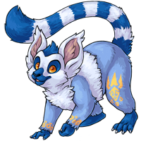
Just to note - we are removing the 'wing flaps' from the manchu design, and they won't be coming back.
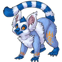
Rah image drawn by the dear !
i dig it quite a lot! very cute.
 SLAVA BOGU // MY WISHLIST
Aw RIP wing flaps. :( Other than that the new one is great :)
he/him / 31 / EST |  | My best friend is |
I think you should keep the head in the same position- it kind of changes the whole attitude in the new drawing
[Kiss=ChibiStraws]
I really like the revamp but the ears seem a bit off. I'm not sure if they are too big or maybe slightly off on the angle, maybe both. Could just be me, lets see what everyone else thinks ^_^
I really like the revamp. It's so fluffy I'm gonna die!
The position of the near front paw on the old version always made me think it was about to tip over.
Except has a good point about that near ear. The old version looked like it had a curve of cartilage there, it looks like the new version's trying to make it look like hair. But it doesn't really succeed so it looks kind of like...a pyramid of cartilage? Maybe if that could be changed just a bit to make it look more like fur, because if it's cartilage it kind of makes the base of the ear edge too wide and kind of non-proportional.
I like this new one quite a lot. --
I totes agree with about the head, I like how it's kinda tilted?? Also the current one has a bigger tail which is great.

I personally like the revamp, but is there a reason why the wing flaps are being removed? :U
I looove how fluffy and soft this one looks. So cute!
Quoted rom my news comment:
Holy cow. This is the cutest little guy ever. I love his little hands now! And he looks all alert! I do wish the eyebrows were a bit more like the original -- I liked the curiosity they held. And the chest fluff seems a bit out of control. But beyond that, I really adore it!
I really love the new one :D
CW Release Shop [Url=https://subeta.net/user_shops.php/shop/24352/category/CW+For+Sale] Cw's for sale from my wardrobe[/url]
You're right. the new one looks pleading where as the old one looks maybe teasing?!
I'm staring and staring, I really like it! The tail is bothering me a bit because it looks more like a tiger tail. With much less movement. I'd like to see the tail have more of a twist personally.
The new art is super cute! It has a similar feel but is much more detailed. The colours are also tonally better, I'm not sure if that's just because of better shading or what? But the palette looks like it fits together better.
My only critiques are that the right front paw looks a little small/strange? And the line weight at the end of the tail looks a bit heavier than the rest of the lines. Overall a good improvement though! I don't mind the wing flaps disappearing because I never even realized it had them, and it kind of clutters up the design.
That's really not that big of a change in my opinion, just a sprucing up with some altered details.
I love the change to the ears. While nice, I kinda miss the curved tail and how big it was at the end. Also, the eyes look more concerned than I think you intend them to be.
EDIT: I just noticed the wing flaps are missing. That is a huge change and I kinda hope they come back !

The tail looks a tiny bit stiff -- like it should be curled more? Other than that, I think it's a great improvement. Very cute!
I really like the updated artwork! And removing the wing flaps is a good idea - I always forget they're even there, and they don't really even match the overall design.
I don't really like the face, though - or rather, the expression. I like the curious look the original one has, but the new version just has a blank look. If anything it actually looks a little apprehensive. Maybe make the smile a little more pronounced, or make the eyebrows less "worried" looking.
I mean, obviously the art in the revamp is better and shinier and all that, but I feel like he's lost some of its playfulness in the revamp. The pose in the old version is just more 'hihi, come get me, come on then', while in the revamp he appears to just be standing there. He seems boring now, personality wise. :x He seems kinda hoity toity now even. If he could be drawn over in the old pose (while making him not seem about to fall over on to his the front left), I think that'd be much nicer.