Manchu Revamp Feedback Gathering
Filter
Show Official Posts OnlyReplies
….Huh. Somehow I never noticed the flaps. Anyway, I love it! Looks much more lemur-y. I agree it looks slightly melancholy though.
Mischievous Diadem available in my CW shop!
Lovely! Just one thing - IMO, it needs a longer tail. It's a feature I find most striking in monkeys - their almost disproportionately long, leisurely curved tails.
🎃[tot=Betelgeuze]🎃[/center]
The new design looks great (love the fur!), though I would suggest a tail more like the old one (except the big paintbrush-like tip). I've been around lemurs quite a few times and the current tail feels way too stiff.
[flower=Sayuri]
suuuch an improvement, and i'm glad the "wing flaps" were taken out because they always seemed like they were tacked on as an afterthought anyways
the the only thing i can see that really bothers me is the inside of the ears? i think the fur on the inside should really be distinctive from the flesh of the ear rather than being the same colour

I think the current tail looks too stiff and (maybe?) not long enough, but I love it otherwise! The only other thing I really miss is the "wing flaps;" I looked at the revamp and felt something was missing, and then I realized it was those.
And the back leg that we can see clearly (the left one).. it looks like it's not really attached to the body.. like doll joints if you know what I mean. Also the right rear leg seems alot more fluffy than the left one, and that foot seems to be a bit bigger.. lemurs have really round 'knees'..
I never noticed the wing flaps tbh xD.
It's definitely a tighter design, few things:
Tails don't curve up directly like that - give a slight outward curve before you bring it up over the back (Like a C, but not quite that sharp). Lengthening it just a bit would balance him/her out as the lemur these things are based on use tails for balance and are immensely long for that reason.
Paws are more realistic - huge plus. The rear left leg with the insignia on it has the calf indentation running a little bit too high, same with the shading along that area. Bring it down just a bit and should be more 'balanced'
Muzzle seems a bit short, but that could just be the higher face perspective. The blue no longer makes a soft diamond around the muzzle tip - intentional?
~Kai
I adore the shading/artwork of the new one, but the pose seems much stiffer. I really like the fluidity of the old version's pose. The new version's expression also seems slightly...worried? The old Manchu looks friendly and playful. The new one looks like it's ready to bolt at a moment's notice. Overall I really like where it's going, though (and thanks for taking off the wing flaps).
I love how fluffy the new one is! I do agree about what said about the head being in a similar position though.
As for the wing flaps, I had to stare at the old manchu to even know what you were talking about lol. Count me as another person that never knew/noticed it had them XD
Proud Gamer | My best friend is
Yeah, Pretty much my reaction xD. I like the new one a lot, but sad, no wing flaps.
I love it! It's so much more fluffy than before and I really love the details of the golden tattoos. All of it's colors are so much more rich now. Although I have to say that something seems a little off in the back. Maybe it's the positioning? It kind of looks like the torso needs to be a bit longer to even it out, maybe?
Love the quality of the new art, gonna miss the wing flaps though.
Actual crit coming tho =O
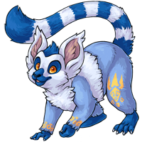
Pros: Overall quality of the art is superb, and blows the old one out of the water, no doubt about it. I love the fluffy fur and the shading, the tail appears to really have some weight to it and the back legs actually have a working skeletal system now. Anatomically better, better details, better quality art.
Cons and crit: [li]Expression: I'm not personally a fan of the expression, it looks incredibly worried and this is a huge change from the pet's original mischievous attitude, looking at the way it's been drawn I'm not entirely sure if it's a smile that looks worried, or an actual worried expression. But I said it for the Ricardo revamp and I'll say it here too, eyebrows are relaxed when smiling, arched eyebrows indicate tension, in this case making it look worried. I think the slightly confused lines around the corners of the mouth are adding to this. I think a worried look would look good on some recolours, but for a common pet, which is going to be on the 'make your own' page, I feel it should look more welcoming.
[li]Pose: the new pose is incredibly static in comparison to the old, the back legs look tense and coupled with the worried expression it looks about ready to run away, where as the old is relaxed and inclined in a friendly manner towards the viewer. Everything about the old design said 'hi I'm friendly this is a fun place to be', which I feel is important for a common colour.
[li]Yellow and Blue this is coming that bothered me with the old one too, it's not just the new one. Yellow and blue should be complimentary colours, however the shades seem... wrong on the Manchu, the shade of yellow used on both the new and old design is hard to focus on, though it is far better on the new one.
[li]Wings: I was never a big fan of the way the wings were done, but I am sorry to see them go, before we had a ring-tailed lemur / flying squirrel combo, now we just have a lemur with yellow paint on it. It might not have been super original a design before, but now it's just a blue lemur. If the wings are going to be removed, it'd be nice to see it changed up in some other manner -- the tigrean's distinctive ankle-claw has already been shrunk down, lets not loose another distinctive trait?
[li]Paws: Love the added detail and more natural positions, but the toes/fingers on both (it's) left limbs look twisted, the narrow fingers are also somewhat uncanny, particularly when the pet already looks so unfriendly.

The orange used on the new manchu is far too dark for that shade of blue, for the orange used () should have been used, colour theory says so.
ECA03F and 2F6E97:

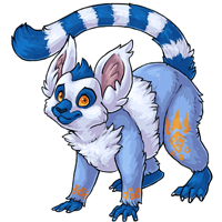
I had a go at editing the new version without redrawing major parts.


I've swapped the oranges out for the paler version, spread out the back toes to take the weight of the pet, moved the whole image up to try to make room to thicken out and balance out the left hand, relaxed eyes and lowered the eyebrows and widened the pupils. I have also edited the mouth to look clearer -- the darker or lighter mouth area is used to enunciate the mouth and make expressions clearer, if it's interfering with the expression, something has gone wrong. I also rotated the right arm up (and the paw down to keep it flat) a tiny bit to spread the weight more on the front legs and make it seems more playful and less flighty without redrawing.
Bonus version with wings added back on, because I think it's a shame to loose the only pet we have with that kind of wing on site, plus loosing the hybrid look of the Manchu.

Generally I think this is a great revamp, but I had to vote for the old one for action, originality and personality.
It is obvious that the art in the revamp is of better quality.
However, I do agree with a lot of people. The attitude that it had is no longer there and he looks bored and blank. The wing flaps were a huge detail that is no longer there, which takes away a lot from its unique features. I think the tail should be more relaxed and curled, looking more comfortable and friendly.
I think you had a lovely go at it and I love what you did with the wing flaps and the colors, especially. ♥
Style File ♥ D.A.
I never much cared for the Manchu but the proposed revamp really changes my opinion. The redesign really makes it look more like a Lemur. I like the new pose, too, it really feels like it has more weight to it. I also love the fact that the tail is a bit more stiff and isn't as swishy and poofy. It makes it feel more primate and less feline. I do have to agree with some of the criticisms about the expression, though. It does look a bit apprehensive. As well as the eyes perhaps the new Manchu could have one of its front limbs lifted like the older art. Perhaps reaching towards us to make it more inviting and playful?
Cheers ^^ I think the eyes are too 'Disney' on my attempt but eh, if they get what I mean across so be it ^^; I'm working hard at colour theory atm, so that means a lot, thank you ^^
Absolutely love the extra fluffiness! Great idea to get rid of that yellow underbelly (aka wing flaps)...did not really blend well. Seems more compact with a sense of agility and the face is so inquisitive...BRAVO! :)
I love the revamp! I think the feet and tail look like it just pounced!
i LOVE the new version!!! w
I'm not fond of Manchus in general, but that's just 'cos I don't like primates. (Even other humans! Ha! ;D ) BUT the revamp looks really good :) I'll agree with most everyone that my only real qualm is that it looks a bit stiff and worried now.
Overall, I like 's tweaks, especially the change of the color. "the shade of yellow used on both the new and old design is hard to focus on" YES EXACTLY! And I didn't know how to say it before, or why until the color theory explanation.
And like many, I didn't realize it even HAD wing flaps. I think it looks better without them (even in Shalashaka's version, since it looks like they connect the front and back legs together, like the Manchu wouldn't be able to move its legs). It IS a shame to lose a trait that distinguishes the Manchu from a regular lemur... but then, it's still obviously not just a lemur.
On the whole I much prefer the new version. The muzzle bothers me a bit. Taking the blue so far back makes it look like the Joker's smile and not very much like a muzzle. Could you take it back more to the original?
Formerly known as RedCalypso
Beanbags - 2967/2977
Plushies - 5006/5080
Stickers - 2123/2281
Tiles - 38/61
Food -11478 /11481
Books - 2933/3262