Manchu Revamp Feedback Gathering
Filter
Show Official Posts OnlyReplies
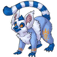
To be honest, there is an unlikely chance I would own a Manchu, so I'm not sure if my opinions are entirely valid, but the face seems to be 'throwing people off' so to speak, and I think I found maybe some minor tweaks to assist? [IMG]http://i93.photobucket.com/albums/l77/Zombeeism/Manchu.png[/IMG] My Edit // Original
Eyes I moved the Manchu's left eye up a little bit. The head doesn't look like it's tilted, so it doesn't really make sense to me that the eyes are tilted by themselves. I also thickened the brow / top of the eye markings lines a little because how they're thicker a little bit back gives it a worried expression mainly being conveyed with the eyebrows.
Mouth I filled in the odd marking gap. This is entirely a personal preference thing, as I think it made the maw look a little awkward and at a funny, twisting angle. The other thing I did, was fix the way the marking under the end of the lip on the Manchu's left side droops down. When zoomed in it's clear the manchu is smiling but when resized down, it looks like it's frowning, and that little bit of droop is what's causing it I think.
Extra Tiny, stupid nitpicks of mine, but I made the hair tuft a little thicker like the old version and thinned that one ear down because it looks really wide / thick in the redraw for some reason.
I won't even attempt to help with the body area because I am not good at animal anatomy aside from faces lmao.
The art on the new one is nice in terms the shading and linework however the old pose flows much better and is a lot looser which I can appreciate. The new one overall looks...quite stiff and somewhat forced (and lacking in personality at that.)
I really dig the new design... it's very cute and the manchu appears floofy, which is always a plus.
I am not sure I like the "hands" so much, however. I don't know if it's that they look too small for the manchu's body or what, but something feels off about them.
Love that it got a haircut though! That swirly thing on top of the old version's head was weird >.>
The only other critiques I might give would be making the tail a bit more curled at the end (more like a monkey, maybe), and I'd really like to see the expression livened up a bit. A few people said something to the effect of the new version looking blank or apprehensive, and I tend to agree with that assessment. The direction of the face doesn't necessarily need to change if the overall tone of the face were made to be more lively or playful.
Great work artists! <3

[flower=Immortal]
I think the artwork style is much better on the new design. I think the new one has a better pose on the front hands. The older version looks like the artist wasn't too sure what to do with the hands but I do have some feedback. This new design is missing the arm webbing, which to be honest I had never even noticed before, so maybe the artist that redesigned it didn't even notice. I also feel like the playfulness has been lost a bit in the new design. Overall I really like it and would consider getting one for my next pet.
Falling leaves and cooler nights
Wandering, searching, desperately needing
Finally found the faery's light
ngl i'm super sad about the loss of the wing flaps 8( and i fully agree with 's crits, especially about the change in shade on the yellow/orange.

just want to huggle this version .. Great Job so cute
[tot=Nanny]
[flower=Nanny]
As always Shala knocks it out of the park with subtle changes.
- the example with the filled in muzzle actually looks pretty nice. -possibly making the tail a weeee bit longer? -adding the wing skin back would be nice cough other than that this Manchu is amazing!
love the new revamp, the fluffiness of the ears especially.
“Make magic…part of everyday life…” ― Kamome Shirahama, Witch Hat Atelier, Vol. 2
Something about the front half of the body bothers me. Something is off, yet I can't pinpoint what exactly. Like, the neck isn't long enough and the poor thing is having to strain itself to be able to look up.
I actually agree with a few others about the playful look of the old one's face/head position.
Here are some photos of lemurs, and maybe someone with a better understanding can explain. xD
hello mr. lemur

Personally, I adore the way these guys sit.

Wanna know more about battling? ❤️ The Official Battle Guide v3.3 ❤️ Need to find books? 🌈 The Book Grind Guide v1.0 🌈
I have to say I love version much much better. Winged or not, the face really makes a huge difference in the appeal of the Manchu.
[CENTER]CWs for Sale | WL 1 | WL 2 [/CENTER]
I like the pose and expression of the original much better. I think the revamp takes away its personality :(
I agree about the markings needing some kind of fur depth, maybe the top of the thigh where the leg connects to the hip along there could use some fur definition
Nice edits. I have to definitely agree the shade of orange for the markings does not work with the shade of blue. That was one issue I noticed right away.
Wanna know more about battling? ❤️ The Official Battle Guide v3.3 ❤️ Need to find books? 🌈 The Book Grind Guide v1.0 🌈
I like the one on the right of your post better.
I personally liked the uniqueness of how the original Manchu design had gliding flaps, it gave it that mystical feeling that Subeta pets have. Now it looks more like a natural lemur with tattoos. Otherwise it's nice to see this pet get a revamp and has better dimension and detail. : )
I hope I'm not the only one who never noticed the glider flaps on the original. I suppose I saw the body shape and assumed they were meant to fill a lemur/monkey niche and didn't look beyond that. Ah well. Other than that, to me the new image isn't so much a change in design as a higher level of detail, re: the fur and the shading. And as with all the revamps, I appreciate the move toward more "believable" body proportions, particularly in the face/eyes.

I feel like the angle of its neck definitely looks strained, and its back is too short. Idk. I really like it otherwise, but the pose just seems super uncomfortable to me. I didnt even notice the wing-flap things were gone, so I guess I could take them or leave them.
I think the front arms need to be longer or have more of a bend in them. they look too short and like it would have trouble walking on all fours.
but omg the new one's fluffiness is adorable and overall i like it much better! (just wish the arms were different.)
I LOVE it. It look so fluffy and really pretty all around. A huge step up (if that's even possible). There are a couple things that I could point out: (Note that these could just be from my pov, but alas.)
Constructive:
- The tail is a little bit rounded at the end. I personally liked it better when it was a bit fluffier, but that's just me hehe.
- The tail looks quite "metal wired" and stiff from what I can see. It seems like it's very stuffed animal like. I think to add a bit of a curve to the tail like the original could be an interesting addition
- The emblem on its leg is in a bit of a strange place. If you were to look at it from the front, it would be kind of half off the knee joint of the manchu.
- Finally, the position of the arms and legs look a little bit stiff in my opinion. the hands flat look much more natural than the original, but with them so close to the body, combo'd with the tail, it's a little bit stiff looking, and it'd be a bit plush like. I had originally thought it was a nostalgic pet when I first saw it. I think it's more the tail, but I Think that the arms may be a bit too close to the body, but the tail is the biggest culprit.
Positive:
- The orangey yellow looks a TON nicer against the blue. It compliments a lot better.
- It overall looks a ton cuter.
- It looks 10x better without the wing-flaps. I didn't even notice them that much before, but the difference is great!
So really, the only thing is maybe to look into the pattern placement on the leg (but that's a small thing) and to make it look a bit less stiff. I'd say spice up the pose a little bit by moving the arms a bit more forward- I think some of the Manchu's personality was lost with the change of position- and in that way I agree with other people. I think I could live with the position just so long as you're able to make it look less tense and plush like :)
Thanks for all the hard work you guys do!