Manchu Revamp Feedback Gathering
Filter
Show Official Posts OnlyReplies
I noticed that there was a bit of bleeding in the revamp and, well, thought I'd make a few subtle changes to the new look of the Manchu that's been proposed:
[center
Large Manchu Images[/center]]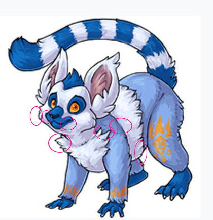

The right cheek and the right side of the muzzle (true right) had the bleeding. I took that off and circled the additional changes on the original revamp that I made to mine on the right. They're quite subtle but gives the Manchu that playful look back again. I do still miss the wings and the left arm could do with re-positioning, but I'm not good enough an artist to do that. I also feel as though the front toes should have longer nails to match the back. It looks a little unproportioned with the back paws having longer nails and the front so short. Doesn't give the manchu much to grab with.
I cut the fur on the chest back some. I know on the right side of the chest it may be a tiny bit too much but not steady with the mouse. I added some lines that were faded on the mouth and shoulder blade, sharpened the muzzle a touch, fixed the eyes and smile a little. I also fixed the chest/stomach some by tucking it up a little so it doesn't have such a bulky/heavy feeling to it.

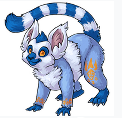
I think the right fella captures more of Manchu's personality. It's a happy pose and is similar to when a puppy's are being playful.
Although the left Manchu appears more cautious, which would be more like jungle creatures.
Both are wonderful!!
I love the coloring and the shading style of the new one, but the older pose is much more fluid and expressive. If the older pose were to be updated with the newer shading style and proportions (with maybe a slightly longer tail), then the final result would have a lot more visual weight and probably look really amazing
The wing flaps never seemed to improve the design of the Manchu... in fact, they looked downright awkward and hindering in some designs, for instance: Spectrum, Reborn, Galactic, Bloodred... god, especially Galactic and Glade. They took away from the pet so much in those colors, seemed downright painful. :( And were left out in several, such as Nostalgic, Nightmare, Darkmatter...
This redesign is a great way to make the pet look less awkward, and more functional.
Well done!
Man, I remember when these guys were new! The new art is technically a lot better, but I think the new art is just a little more static than it necessarily needs to be. For instance, the curve of the original tail and the cant of the head (along with the larger eyes) gave a little more movement and flow to the pose. Mind you, I don't know how realistic that position is for this kind of animal, but I think that in service of more visually captivating poses, that shouldn't necessarily matter too much?
❤️tumblr❤️ ❤️About Lexigraph❤️Avatar Archive❤️
Great work on the new design! I think the new manchu looks far more playful and alert. Overall I like the new design better. The only thing I could suggest is to maybe alter the tail a little so that it's slightly longer and becomes bushier towards the tip. Just an idea.
| [egg=kunni] | [tp=kunni] |
I love the expression on the face! Great job :)
My only feedback is that the back-left leg looks strange compared to the old one. I feel like it should have more of a thin ankle before the leg fur starts. It is looking like these feet atm: link

I seriously can't wait for this revamp. I actually never liked the old Manchu but this revamp is just GORGEOUS! I am actually pretty glad the wing flaps got removed. I never liked them and they didn't seem to match the Manchu design at all.
ok so here's my breakdown so far:
- the orange is too dark, it should be lighter to better complement the blue fur and help the irises stand out.
- the expression looks worried, make the smile more prominent and the eyebrows less upturned.
- the pose is a little stiff, it should be more loose and fluid.
that's pretty much it, fix those things and you'll have a perfect revamp on your hands.

It seems a little disproportionate to it's head - the body seems a touch too large - but that's probably the pose (and fuzzyness).

Definitely liking the revamp! Definitely considering getting one after the revamp. I've thought about getting a Manchu before but something about the wing flaps always seemed odd to me and were... I guess you could say kind of a turn off for me?
My one critique pretty much echos what lots have people have already said, which is that the pose looks a bit stiff. Overall, though, I'd call it a definite improvement :)
Ping is [-parade]
I like it a lot! I understand why the wing flaps are removed, but the idea of them was pretty cool
This revamp is such an improvement, I love it. Glad that the tuft on its head is short as I disliked its exaggerated hairdo which looked wrong. Although I'm a bit disappointed that the removal of the wing flaps, I can see why its removed but now the manchu just looks like a generic lemur with markings on its legs plus getting rid of a feature that makes the manchu stand out from most pets. I like the idea of having that stretchy skin shown in many gliding mammals as many users on this thread were showing.
It's facial expression does look nervous and I think it's the eyebrows that make it look that way. If they didn't bend at the tip of the brow then it would look more happier and give it more personality, I don't think its smile should be changed. I think its head needs to be more lowered like the original to give it the playful look we all know. I agree that its backside should be more round where its tail is. The manchu's right forearm I think needs to be wider from the left to give the feeling it's wanting to pounce.
Overall, great revamp! Just needs its personality back. ^^ (sorry for a late reply!)
