
December 31, 1969, 7:00 pm by
delerious_queen


i cant even see the pics so i just chose the new one
December 31, 1969, 7:00 pm by
ElectricMouse

I can't see the pictures!  Oh well...
December 31, 1969, 7:00 pm by
ElectricMouse
I can't see the pictures! Oh well...
December 31, 1969, 7:00 pm by
dreamcatpaws

catey_- What do you mean the keeto needs one next? DX I think they're perfect.
I can't wait to see the NEW Hekei revamp.
December 31, 1969, 7:00 pm by
diru

thought subeta hired new artists.
December 31, 1969, 7:00 pm by
Deleted User
oops  didnt mean to put ruffie
i meant to put keeto 
December 31, 1969, 7:00 pm by
Deleted User
personally, i love it 
but i really think the kanis and ruffie are next in line for the in-need revamps
December 31, 1969, 7:00 pm by
Kabuto

I'm freaking lol'ing like no other at these people who seem to think the hikei was EVER a gracefull fancifull pony.
It wasn't.
It's still not.
But at least now its incredibly well drawn and has some personality to it! I absolutely love the spunk and bulk of the redesign. Also, this isn't a horse, but regaurdless the artist did an awesome job on the posture and anatomy. I love that you can really see the muscles and shape now as well C:
Kudos to the artist!
December 31, 1969, 7:00 pm by
Deleted User
TheDMW we dont envy you the job of drawing a horse! They are one of the hardest animals to draw! You would do great art or you wouldn't have been hired! But your not going to please your audience 100 percent of the time! Thank you so much for trying and for accepting suggestions well!! It is a good piece of art it was just that it lost some of the things we liked about the previous one!! Not that its a bad drawing! We users dont doubt your ability at all! Its all trial and error with he new redraws! Please just keep the heiki cute most of all and not to strong or boyish looking!!! begs!!!!!!! lol
December 31, 1969, 7:00 pm by
Elementary

TheDMW I cannot wait to see the new versions ^^ It's great how the artists here are so willing to take the users' feedback to improve their work. It's greatly appreciated [=
December 31, 1969, 7:00 pm by
Hunter


The front feet are splayed out funny--a horse's legs don't do that. The old face is cuter and the stripes are better. The current one is too skinny and scruffy and too knoby in the knees.
December 31, 1969, 7:00 pm by
Peaches_822

I like the old one better simply because this one lacks a more obvious "cuteness"
it's front legs are weird, they look.... beefy and chisled. I think they should be smoother. the back feet should be slightly larger and the mane should be smoother. the spikey thing don't look right.
December 31, 1969, 7:00 pm by
Deleted User
Hey there, I'm the artist that drew the revamp and I'd just like to thank you all for your suggestions and opinions. Computer troubles are keeping me mostly offline so I haven't had much opportunity to comment (I'm kind of quiet anyways) but you should know that I do read every single comment and I'll do my best to take it all into account.
From my perspective the hardest part of trying to recreate the Hikei pet you all love so much up to the new Subeta standards is taking equine anatomy and trying to apply it to a creature that has ridiculously un-equine proportions. The Hikei species identity is mostly in its stocky, bulky feel but looking at any real horse-like animal you'll find that there is a HUGE difference between the diameter of the belly and that of the legs. In the original Hikei they are almost the same width. Taking that natural anatomy and warping it so that it resembles the pet is a challenge, and I'm sorry I disappointed you. Please have faith in the ability of the Subeta artists to take your criticism and apply it effectively to bring you the pet you have always loved with the superior artwork you have the right to expect.
My next move is going to be to try a couple of different solutions. First I want to take your suggestion of sticking more strictly to horse anatomy and making it proportionately more like a pony, and see how much that affects its Hikei-ness. If that isn't recognizable, I'll try using some other type of animal (maybe a dog? I'll play around with it) for the shoulders, chest, and legs (but keeping the hooves) so that it will have the stocky, fat Hikei legs but more structurally appealing than they are now.
Thanks for all your encouragement on the glowing balls though! They're my favorite part too.
I'm going to the library shortly to check out some reference books on veterinary anatomy, which should help. Even though I'm new, I have the whole talented team of Subeta artists to help me out and I'm confident that with their help, one way or another, we'll be able to get you a Hikei revamp you'll like.
Thank you all for the time and attention you've put in to helping me out here. I really appreciate it!
December 31, 1969, 7:00 pm by
Deleted User
Ehhhh.....
the is okay
he legs are kinda weird though
I like the old one more.
December 31, 1969, 7:00 pm by
Deleted User
the front legs look fat, the eyes look strange, its neck in toooooo short (well if its ment to be based on a horse then it is :]) otherwise the neck looks like a pigs neck (no ofense to the person who drew it) 0_0
December 31, 1969, 7:00 pm by
Lor

Wow, lots of comments =o.
On a constructive level, I feel the back feet should be a bit bigger(thicker?), because they currently look too small to support the Hikeii's body weight.
I'm not to fond of the face. I keep seeing a little piggy face or a hippo's face in my mind. Perhaps it's how round and chubby-cheeked? (Chubby cheeks aren't bad, they're cute on some animals). The original isn't any better though 
Perhaps it's also the way that the head is turned away, and it looks as though it's straining a bit to look at us from the side. Maybe a more straight on, or just turned more toward us position would do it more justice.
The spiked hair is cute, but it's not consistent with the Galactic Hikei. I would think it a shame to have to revamp a pet that is still pretty new, right? Not to mention all the others, and I have never seen anything wrong with the Angelic, and I am not just saying that because I own one.
The spectrum and DM's hair is spiky, but not nearly as much as this one, and more so than the original. Perhaps something in the middle like the Spectrum and DM? Slightly more spiky, but not like "whoa, rock on punk-pony". XD
Also... it's front hooves. The way ithey're turned out like that is a bit awkward.
Love the new shading, love the detail on the tail, but the rest needs a bit of tweaking in my humble opinion. =)
December 31, 1969, 7:00 pm by
CaptainZebra

Good first draft.
Fix the front legs and you're there. =D
December 31, 1969, 7:00 pm by
Glitter


For the person who said anyone who had crits should try, I did.

I tried. I looks a lot better bigger though XD
December 31, 1969, 7:00 pm by
Deleted User
I love NyauNyau's sketch as a base. I think what bothers me the most about the current redraw version is how thin it is. In addition, the back feet are a little too small. I also find it awkward that 3 out of the 4 feet are pointed one direction, while the 4th is pointing another direction. A little scruffiness/texture would be nice. As someone else said, the current redraw looks a little too glass-like. I would also much prefer the hikei looking towards the center, but that's just me. Thanks once again for asking for input!
December 31, 1969, 7:00 pm by
Cobralily

please don't change the hikei!
December 31, 1969, 7:00 pm by
Pony_747

It's gorgeous, love the shading and what not.
The only qualm I have is with the head. It just doesn't seem to match up with the rest of the body in terms of quality (though I love the eye!). I feel like it should be longer, or at least more horse-like in anatomy. Also, if the rest of the body is going to be done in the three-quarter angle, the head might look better done that way as well.
But that's just my opinion. Lol.
December 31, 1969, 7:00 pm by
Deleted User
It's nice..but I think it looks a little to...scruffy.Perhaps if you made it a bit softer.
December 31, 1969, 7:00 pm by
Deleted User
It's nice..but I think it looks a little to...scruffy.Perhaps if you made it a bit softer.
December 31, 1969, 7:00 pm by
Ambrus


I, personally, do not like it.
The back paws are much too small. They look more like a cat than a lion. (Or whatever the cross is...) If they could be bigger, that would be nice.
Also, it would be nice if it were a little more...fuzzy. I'm not asking it to be a sheep, but it looks kind of like a glass statue.
What I DO like: I like the eyes, and I DEFINITELY like the front paws. The mane is kind of nice, and I really like the way the tail is designed.
December 31, 1969, 7:00 pm by
Darkstorm02

i really like how the tails done as well as the back paws but the front hooves make it look a little off. some of the below designs look really good.
December 31, 1969, 7:00 pm by
Nebulae

Umm you guys have to remember the hikei's not all zebra it's got cat like back claws
December 31, 1969, 7:00 pm by
Nebulae
Umm you guys have to remember the hikei's not all zebra is got cat like back claws
December 31, 1969, 7:00 pm by
Mackenzi


It looks pigeon toed, and the front legs look massive compared to the rest of the body. The old eye marking would be better than the one now, and the mane less spikey. It's also looking a little grey to me, but that's not really a problem, I suppose.
So just some anatomy tweaks on the legs/body build? I do like the art. -thumbsup-
December 31, 1969, 7:00 pm by
Yami_Zangetsu

I'm sorry, but the only reason anyone would pick the revamp is because they felt that the artist worked hard, and put his or her soul into the piece, just like the people on American Idol voted for Brooke White even though she totally sucked. The old Hikei was both cute and well drawn, where as this new version loses the cuteness and doesn't even add much of the new drawn look that attracts most of the revamp supporters.
December 31, 1969, 7:00 pm by
stickchick2811

OMG S4RS, your drawing is amazziinngg i would love it if was like that ;DD
December 31, 1969, 7:00 pm by
peanutchan_769

I don't want to be rude but.. going off of others comments and what I see for myself I think this design might be better.
Its just a quick edit so I'm sure one of Subeta's artists can do a better job.
December 31, 1969, 7:00 pm by
Pain

It's like.. the top half was drawn by a completely different person from the bottom half. o_o
December 31, 1969, 7:00 pm by
Marth

I personally liked the old one. The body and the head look okay, but the feet seem strange. The front legs seem too "boxy", while the back legs look tiny in comparison. The shading on the side is also too linear.
December 31, 1969, 7:00 pm by
Sekhmet


The Clawsion needs a revamp much more. And what's with making all cute pets into bulky males? 
December 31, 1969, 7:00 pm by
Luxe

I think I forgot the marking around the eyes on my very first comment here.
5. The markings around the eye confuse me. We already have at least 5 pets with a round marking around their eyes. I think losing the previous unique hikei marking doesn't really do much for the pet. I'm curious as to the reasoning behind it.
December 31, 1969, 7:00 pm by
Rajani

I'm not a fan of those front legs. The way they're splayed just looks really uncomfortable, and the fetlocks seem to have disappeared completely. I don't really like the feathering either, but that's more of a personal opinion.
I love the new stripe pattern, but I don't think the blue blob around the eye matches the rest of it.
Does this mean all the other colors will be redrawn?
December 31, 1969, 7:00 pm by
Baby_Succubus

I think there had been enough comment on the chect and front feet that I dont have to add my opinion as well, but the thing I noticed the most is the side. The way the markings are drawn and that strait line of the shading make it look like the side is very pointy instead of curved. .
December 31, 1969, 7:00 pm by
Deleted User
Spd4e_ LOVE your structure!.........I have an Idia......... what if we mix the new and the old. I agree the back legs look k-9, isn't that suposed to look feline? I love this site! i love these pets! keep it up! wow, I go crazy over awsome site creatures. I hope once I learn html, and drawling online, I would b of help one day._ This rocks! besides my enthusiasum, I hope u guys can take my Idea into consideration. peace, rock on!
December 31, 1969, 7:00 pm by
Solembum

This one could be good if the anatomy was better and the shading/highlighting wasn't so random.
Uniqueness isn't an excuse for bad anatomy, not even on something that isn't "real". It's obviously based off of a horse and you should use horse anatomy, especially for the front.
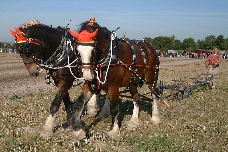
You gave this pet the chest, stomach, and it basically has the anatomy of a dog, which looks extremely awkward. What bothers me most is the chest and feet. Also ALL hooves, regardless of the animal, go all the way underneath them. Even on draft horses and animal with a lot of fur around their feet you should be able to see the back of the hoof.
http://upload.wikimedia.org/wikipedia/commons/thumb/8/86/RestingHorses.jpg/800px-RestingHorses.jpg
That would help you see what the chest looks like. Also you can see that the way this pets legs are in the front is not really possible. At least, it doesn't LOOK right.
http://upload.wikimedia.org/wikipedia/commons/thumb/4/46/Shire_horses_ploughing.jpg/800px-Shire_horses_ploughing.jpg
Even on draft horses you can see the back of the hoof. They shouldn't look flat footed. The hoof is literally their toe.
So yeah, that's my critique. The positive side of the spectrum? The line art is as beautiful as always. The glowing orbs are amazing, especially the effect on them. The tail and face look great; I think they should stay the way they are.
But, that's just personal opinion. 
December 31, 1969, 7:00 pm by
Luxe
http://www.arkive.org/media/E4712CA3-956D-4AC7-A25C-D6FC2AD2D756/Presentation.Medium/photo.jpg
For anyone taking issue with the hikei's mane, the above reference should help. It would also help if you stopped thinking of the hikei as a horse, and thought of it closer to an ass. While it is an equine, it is not a horse. The two terms shouldn't be interchangeable.
December 31, 1969, 7:00 pm by
hollo

There are some people out there who think that the Hikei should have hooves on all four feet because its based on a horse/zebra.
Does this mean we should take the wings off of the Feli? Or the Montre? Just because the creature is based on a real life creature, doesn't mean it has to be exactly like it. Like someone said, Subeta has unique pets, and part of the Hikei's uniqueness is the hooves-in-front-paws-in-back thing it has going on. I always thought it was a front-half-zebra back-half-tiger sort of thing.
I think that fixing that front right hoof would alleviate a lot of problems, including the "body-too-short" one, since it seems more of a perspective problem. If the hoof faced forward, it would be more apparent that foreshortening is at work here. Also, I think that adding a fringe ling on the front left leg, starting from where the hoof disappears under the fuzziness and extending nearly-straight upwards would help give it the look of an ankle and fix the flat-foot problem, maybe. Maybe.
:3
December 31, 1969, 7:00 pm by
Maki_504

It looks nice but the way the feet are positioned makes its pose seem a little unnatural and awkward... in my opinion at least ^^;
December 31, 1969, 7:00 pm by
Templar

tangleduptight, to retype what a very wise person said; if we have to be able to do whatever we critique on, does that mean that I have to know how to build houses to know when one isn't worth what someone is asking for?
December 31, 1969, 7:00 pm by
Salimity

I liked the older version more, even though I don't have a Heikei. It's one of the closer polls I've seen too...I think. Anyways, I just don't like the art. Cute redraw, but in ways doesn't look like the older Heikei.
December 31, 1969, 7:00 pm by
Deleted User
ehh well the face looks nice n_n;;
December 31, 1969, 7:00 pm by
Tekkengal

From all the redraws, I have to say this is one of the most disappointing. The dimensions are wrong...the rear paws and head are in one direction and the front hooves look as if they are facing another direction. The facial expression looks as if it is chewing on something and make it look goofy, the chest area looks off and the body too short. The legs should be alot thicker to keep in line with the old version. I do however like the tail. I have always commented positively on past redraws (because they were so awesome) but this one really looks as if it was not thought out when drawn.
December 31, 1969, 7:00 pm by
SilverSekhmet

I think it's looks too blocky and the hooves don't look like they belong. The back paws look too small and I agree it looks abit dogish. The stripes and tails look great though.
December 31, 1969, 7:00 pm by
Francine


I think its nice, but i don't think it should look so... angular? I think thats the word... or... Sharp? yeah sharp is a good word.... I think it should look more rounded and soft, like I would love to hug or ride it.
December 31, 1969, 7:00 pm by
Khioli

I like the tweeked version but the hooves need tweeked
I love the new version...been waiting a long time for a Hikei revamp >< Nice job!