Charlie Revamp Feedback Gathering
Filter
Show Official Posts OnlyReplies
Please feel free to contribute your constructive critique or suggestions. If you have no critique, and love it just how it is, that's info we'd like to hear too. We appreciate your feedback, even if we do not implement all of it!
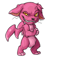
Rah image drawn by the dear !
it definitely looks a lot better than the original, and i love the expression, but i feel like the wings look kind of stiff plastic-y? i would love for them to look more membraneous (like bat wings?) and maybe still have one or two slightly-visible veins. other than that i think it's great.
[edit]also going to echo others with regard to the top-heaviness, the awkward placement/shape of the hair tuft on the head, and that one whisker that gets lost against the ear. also, though i think the expression is fantastic, i'm going to have to agree that maybe it's a bit too intense for the basic pet. not that every pet has to be adorable and happy and smiling, but maybe tone it down just a bit and leave the more extreme/interesting expressions for reposes.

I like the one on the left. He looks more diabolical and seems like he would get into more trouble.
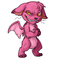
it definitely looks a lot better than the original, and i love the expression, but i feel like the wings look kind of plastic-y? i would love for them to look more membraneous and maybe still have one or two slightly-visible veins. other than that i think it&;s great.
Ditto. Or maybe just make them a little less shiny looking. That might help.
I think in general the revamp's a big improvement, but the pink spot on the wing caught my attention in a not-great way.
That rounded, distinct spot looks like far more like "plastic shine" to me rather than contoured coloring.
I like the new one a lot!! I love the more detailed shading and the more devious grin. I'm excited to see the voting results!

Overall, I love how the revamp looks (and I'd definitely want one, tbh). I agree with Frenchi, though. The wings look very stiff and inorganic compared to the rest of it.

" Okay, so you’ve made some bad decisions. You’ve hurt people. You’ve hurt yourself. You’ve stumbled through life from one self-inflicted disaster to the next without anything even approaching a plan. To which I say: welcome aboard. Maybe you’re not good... but you’re sure as hell good enough. "
The thing that always stood out with Charlies, for me, is their little devilish personality. I think with the revamp that personality comes through a lot more. Overall, the revamp just enhances the old charlie to me. I feel like it's good :) The only crit I have are the wings. Are they wings? They just look a little lumpy to me, and it's hard to figure out if they're supposed to be just appendages to the body or actually wings o3o Also, there's a circular spot of shading on the forehead that looks a little off to me. However, I really like this and hope to see the revamp! c:
i reeaaally really agree with the suggestion by Frenchi that the reintroduction of the veins in the wings would be nice!! i also think it'd be really cute to add itty hairs onto the new Charlie's little ear boil, too : o
it's looking super cute! <3
Yeah, I'm in with the agreement that the wings could use some love. They're awfully flat and would benefit from some more detailing and improved shading. Not that they aren't well improved already, but they could be taken a step further.
Otherwise, I like the revamp a lot. Retained the sense of the pet quite nicely with updated art.
The head looks a bit disproportionately big. I prefer the chunkier body on the old version too.
Unpopular opinion, but I like how the old one was just smiling, and you could only see its canines. I also prefer the legs of the old one, which kinda remind me of rabbit legs. I don't know, I liked the combination of cute and mischievous.
I have to agree with everyone else. I love the revamp in every way except the wings, which look a bit like extra deformed limbs to me? Although I was under the impression that the pink spot and stripe on the edge were markings rather than highlights? I'd love to see it with a membrane across it, so it looks like a wing rather than a bird head sticking out from the Charlie's shoulder blade....
absolutely in love with the expression and THOSE HANDS! So menacing!
Much more personality and wonderful artwork on that revamp, I must say. The face is a great improvement especially. My biggest off thing about it is the weird wing-like appendages carried over from it's old design. I'm not sure if they'd work better as an actual bat wing or a bird wing without feathers or otherwise, but they're just very odd looking. Strangely thick and blobby P:
I love the expression and pose! I agree with what others have said before me however. The wings look kind of off and plastic-y. If they were a bit more detailed or had veins that'd be great!
Thank you for your hard work on it though, I always love your art and its wonderful you guys ask our opinion at all. :D
[CENTER]CWs for Sale | WL 1 | WL 2 [/CENTER]
I love the new revamp, however I must also echo what's already been said. The wings are a little.. pillowy to me. Otherwise, fantastic! Love the expression.

I agree with the others about the wings. Also the shading on the head also looks a little weird on my screen. In terms of other edits, I would add the scar back on his leg and make the legs slightly more chunky to go along with Greg's opinion of the rabbit legs. I imagined charlie's hopping around versus straight up walking.

To echo everyone, wings for sure look plastic, so there's that. I also miss the scar on the leg, but no biggie. Either then that, he looks awesome, love the face and the grin-cackle, I can almost hear him :D Great job!
I'm with everyone for less plastic-looking wings. Love that it looks fluffier, but then should the wing be fluffy too because of the way it connects? It does intrigue me how the wings would look so shiny (or even leathery) connected like that.
Also one thing that bugs me is how its head sits on the neck. I feel that the head should be slightly further right (its left). It seems like it's resting on the chin??? /weeps because unable to describe
Lastly some general little preferences is that the right eye could be bigger (why make the eye so pretty when it ends up being shut?) and that I liked it a little tubbier. It looks a little malnourished, but it could be just my opinion.
Excited to see the new revamp! Good luck staff! ^0^
p r e s a g e .[/font]