Charlie Revamp Feedback Gathering
Filter
Show Official Posts OnlyReplies
I love the expression! As for the wings looking a bit like plastic, maybe make them resemble Mori's wings from a bit more, so the outside can be pink like left wing, but the right wing needs some different pattern on the front?

[font=monotype corsiva]Lost in the Darkness[/font]
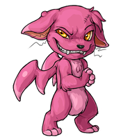
I really wish some of the inherent personality would be taken out. The facial expression, the paws, the whiskers, the wart? Such things should really be kept more to repose colours, not be in every standard recolour. There's not much you can do with a character with this pet without an overlay. Even if a pet species has some general specific characteristics that need to be expressed in the standard pose art, it shouldn't be anywhere near as dominant. I really thought a revamp would fix this problem, not amplify it, especially not as greatly as it has.
I don't know why but I feel like something is off with the size of his head. Maybe it is a little too big for the frame of the body.
if you know where i can credit to them now, please let me know
[tot=ibook]
The revamp has better shading and the grin is nice. However, I miss the old body type. The revamp's head is disproportionate to the body, I feel. Maybe I just think the new one is too skinny. Like how much trouble could it really get in when all it wants to do is steal someone's sandwich?
Overall I definitely think it is more detailed with nice shading though.
I love the new slightly leaner, more scheming look - it gives the Charlie a lot more personality than it had before :D The eyes are great (and I do like the squinting one-eye-bigger-than-the-other, as that leads to a more "I'm plotting something" look) :D
The only thing I would say looks like it needs something is the right wing (our left) - whether it's the more natural angle of the other wing or something else, it just doesn't look like it's part of the body to me, and looks glued on.... maybe it's the lack of fur on the wing, with that almost shiny shading, or the angle.... not sure, but something just looks a little off on that (and I know that's rambling :P)

My CW shop ~ forumset by [/font]
I think the revamp definitely fits the current art style of the site more. Its a great improvement! I do agree with what others have said in that the wings seem kind of off. Weirdly shaped? Not detailed enough maybe? Hard to pinpoint it exactly.
[img align=left]https://img.subeta.net/items/beanbag_punkingrub.gif[/img]
Click here to reveal a special grub....
[img align=center]https://i.imgur.com/v6Z446T.gif[/img]
[img align=right]https://img.subeta.net/items/minion_darkmattergrub.gif[/img]
I love the revamp, besides the wings. They're so fat and useless. I guess if it's characteristic of the pet, then so be it, but I'd like to see more...usefulness? to them. I for one kind of like the big-headedness others have mentioned. And the sneakiness to him is adorable.
Seasonal Linkies
🌼🎃🥚[egg=ShayBaby]🧻[tp=ShayBaby]🎄Lumi Gifties
Honestly my only comment here is that I miss the leg stitch. I really like it otherwise!
Personally, I prefer the old version much better, the new one looks like a psychopath =/
i like the less thin body and kind of floppy-lookin arms on the old one (it looks like if you pick it up it would be kinda floppy like a cat is floppy when you pick up a cat and i like that) but the newer one isn't too bad i guess
No offense, but the new one is definitely a downgrade. The large head and the bottom heavy body are things which work about the old one as well as the fact each wing goes either side. Both wings on the left side does not work. The old one works better as a silhouette. Worst of all, the new one just adds detail in all the wrong places. Andy detail in the Charlie should be mostly confined to its head and even then the artists shouldn't go crazy with it, more detail isn't always better than less. The new one doesn't look like the person who drew it has much talent, no offense. The arms and shoulders also look really weirdly anatomical in the new one.
I definitely like the personality of the revamp better, but the wings do bother me. I think it would have been okay to stray more from the original design, as adding shading and angling the wings don't make them look better.
Not to jump on the bandwagon of the wings on the revamp..but they do need some work. I also think blend the shading a little, like one mentioned before the spot on the forehead kind sticks out, a little soft blending there may make it look so much better.
The body and everything of the new revamp look soft and yet if you pet him he'll bite you or do some form of prank on you. I love the revamp otherwise, great job artists and good luck.
or or or
i love the revamp compared to the old one; when i saw the news post i thought the new one was the default! it fits charlies a lot better i think. i agree with the wings seeming a bit off, and the mid-tone circle in the middle of it's head is kind of distracting after it's been pointed out but that maybe more nitpicky than a huge issue.
I like the one on the right, it looks more cheeky than the one on the left. The left one just looks creepy. c:
If it keeps that grin I'd be so tempted to get one, and then wait for the special colors to get their revamp. (: Love the pose as well, though the wings look a bit weird. :o

tbh the whole thing looks a bit....strange? Like the proportions aren't right.
The expression is perfect though
Overall, a good revamp.
I would prefer if the tuft of hair on the Charlie's head was covering the scar. It bugs me that the tuft looks like it's so heavy, it's about to fall off.
Art blog | Custom Wear Wishlist More items for sale here | [flower=RNA]
I'm terrible at the arts, and this was quickly done in paint lol, but I wanted to doodle a bit and see if I could sloppily incorporate most of the things folks have mentioned. So here's roughly...body widened a titch, wart less pronounced and hairy, tuft of hair moved to center-ish of head, hairier legs and ears, dark circle shading removed, 07 hair on chest fixed, less muscular arm muscle, leg stitch back, right eye moved closer to center of face, more pronounced neck/head moved forward, and (terribly done) membranous wings.

Seasonal Linkies
🌼🎃🥚[egg=ShayBaby]🧻[tp=ShayBaby]🎄Lumi Gifties