Charlie Revamp Feedback Gathering
Filter
Show Official Posts OnlyReplies
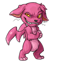
I love the expression of the new Charlie and I hope you will keep it. It looks really diabolic and evil and IMO we have enough cute looking basic pets.
But I alos agree that the wings look to "fleshy" and not really like wings. Probably make them more like bat wings with a mebrane ? The rest looks fine for me.
Oh looks pretty great what you did with the charlie.
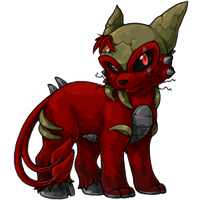
Gallows Art (c) by Charlie.
My art can be found HERE
The altering that , , and did all look great, I think.
I love the wings that created. I also like either making the head smaller like did or the lower torso bigger like did.. Then, I love the way made the wart less pronounced and the way she made the tuft of hair on the chest, along with moving the eye, moving the tuft of hair on the head, adding the other scar, and the other little things she did. I think if these could somehow be combined that'd be one, even more, wicked Charlie. Also please don't change the name or that devious grin, I think both are fine as is.
Proud Gamer | My best friend is
ooookay i hope this isn't stepping on anyones' toes or crossing boundaries
i tried to implement some of the suggestions that've been offered!

 edit -> original
i can't perfectly imitate NK's stuff obviously,,, but it should get your ideas across? i like NK's work a lot and hope i did it justice haha,
also, as further reading and supplemental material for any perusing the thread, i suggest checking out: rottweiler's edit on page 2 dachshundsr4me's edit on page 4 shaybaby's edit on page 6 kitestrings' edit on page 7 speiro's edit on page 8
EDIT: i missed kitestrings' the first time listing the edits!! sorry! if i missed anyone elses' and anyone wants to point it out i'll add them, they're all lovely!
I'm not sure if it's been said already, but I feel like the head on the revamped version is out of place. Whether it's too large or in the wrong position I'm not sure, but that's the only thing really sticking out to me.
I honestly don't think his wings need to look "functional". I keep seeing this as a critique, but I didn't think his wings were functional to begin with. Yes, please shape them up, but they don't need to look "useable" IMO. I just don't see the Charlie as a pet that actually flies and flutters around. That's probably why the Angelic Charlie's wings are fake. It's like a jetpack (wings strapped on) so I always took that a sign to mean his original wings were just vestigial. Don't get me wrong, I think they could use improvement art-wise, but as far as functionality goes, I LOVE the idea of his wings being more like a chicken's. They work, but not to actually travel on. I don't want to see upright, cutesy wings on this pet.
[tot=Chey]
Love the revamped version! My only suggestion is that the tuft of hair is more pronounced! It kinda gets lost in the new version because of how close it is to the ear. I always liked the how it stuck out more in the older one.
The wings don't have to be functional, like you said. I think it'd be good to make them more like a "broken/damaged wings/fallen angel" keeping with the Torrey/Charlie thing perhaps. As for the Angelic Charlie's wings and halo, I always took it that since the Charlie is the "bad" side of the Torrey, it doesn't deserve them or it wants to mock the other Angelic pets or something lol and that's why they're so obviously fake.
Proud Gamer | My best friend is
YES!
Charlies are my favourite pets (I have four), so when I saw the 'Charlie revamp' heading on the font page I was like 'Noooooo' and mistyped my login in my haste to get at the newspage.
But I LOVE it. It's exactly what I wanted. Love the grin, love the ratbag expression, love the ears, love its clasped paws, love its big head vs its scrawny body and I'm so glad it's still warty, lumpy, scarred and pretty, pretty pink!
Minor thing, but like a few other people, I think the wings could use a tweak. The shading makes them look bulgy when I think they should look a bit flatter, and they're held wonkily (if it were face on to us, its right wing would be pointing to the side, while it's left wing would be pointing backwards). Neither of these things is a big issue though.
Really, I would be perfectly happy if this went through as is. In fact, I want it now, please.
🌂
I definitely would love the broken/damaged look. I like that. It'd be more fitting than these weird finger limb things on the proposed revamp. I always think of Charlies as little imps. They'd probably get in lots of fights, ragged wings are almost a definite!
[tot=Chey]
can we please get a wing that actually looks like any kind of biologically viable wing instead of rehashing the anatomy mistakes from the first incarnation? it's obviously not a stylistic choice in the original design, and keeping the old mistakes but updating anatomy, shading, etc only emphasizes how wrong the wings look as is.

Overall I prefer the proposed revamp, but I don't see the veins on the wings or the scar on the leg. Not that every superficial detail has to carry over, I'm just wondering why those weren't included.
The body also seems a LITTLE too small and scrawny? I'm not sure why though, since the proportions seem alright.
Oh, that does look better! Maybe the head was just a little too big? (Though it was, even moreso, in the original too.)
I think they're more like...vaguely wing-shaped tumours. I kinda would like to see them looking more like featherless, underdeveloped wings though. Like a baby vulture or a plucked chicken. ouo

【[I]Biting List on Profile![/I]】
First off, very phenomenal artwork on the revamp, it's beautiful!
As for the critique, I agree that the head should be smaller like @ shown. A smaller head would make the revamp less 'babyish' if that makes any sense. The wings look fine to me. I'd rather they stay looking like artificial limbs tacked on. I always saw them that way. BUT the small dot on the nearer wing looks very off to me. The hair floof being on the far left of the head doesn't look pleasing to me. I think it would look much better in the center. I want to say I like the pose, I do in a way. But I think it's a tad over the top. I like the subtle mischievousness of the old version. When it comes to giving pet art expression, it's best not to make it too blank or too expressive, though it can be a fine line!
All an all, beautiful revamp, but I prefer the old one (mainly because of the more subtle pose and expression).
I liked the old version better.He looks as though he is sitting back on his haunches and is waiting for something with his arms(paws)crossed.
I'm a fan of the revamp's expression, but I feel that it's missing the little hunch of the original image - I think his head should be moved more to our right, his left.
Loooooove this revamp! So much more character :)
I think the wings look too chunky/rounded, and the tuft of hair on the chest is too thick, and perhaps the one on the head too. But that's just nitpicking ^_^

Vaguely relevant: I kind of thought Charlie's look more than Darkonites than Torreys.
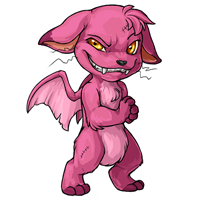
Like they originate from the same place.. maybe it was more pronounced in previous versions. :P
Holiday Things
That face. Oh. My. Lord. It is perfect. Do not change a thing. Also, the paws. So devilish, so sneaky, and the pose for them (and the legs) is much improved from the awkward stance they were in before. Bravo.
BUT! I do agree that the wings need to be...well, they need to be something..else? They certainly are odd aren't they? Are they plastic, skin, flippers, dragon? I always thought they were unique, so that would be a nice aspect to keep, but they shouldn't look so fake and confusing. Maybe since he looks so devilish make them look like a little demons wings?
But seriously, AMAZING IMPROVEMENTS!
I really love the new charlie revamp. This version looks a lot more badass than before, like he's about to totally wreck somebody's shiznit and enjoy every minute of it! It's a pleasant surprise after seeing a lot of revamps over the years that actually leeched personality from a pet species' default form, keeping any hints of it in reserve for the redraw colors. I've been debating getting a charlie for a long time, but this proposed revamp would definitely convince me to get one with my next Loyalty Box if it goes through! Much love to the artist!
Also, I actually like the weird wings. They make the charlie feel like some sort of mutant creature...and I do like mutants.
"Nooo! I will not read your book of meanness and swirls!!"
Personally, I like the wings looking like useless vestigial flaps. I'd rather it have no wings than have cliche demonic bat wings or plucked 'fallen angel' style wings.
🌂
The body looks a bit too thin, or maybe the large head is making it look that way. I think having a larger/fatter body or shrinking the head a bit would fix that. It just looks very top heavy. The head also doesn't look properly attached to rest of the body. The old one didn't have much neck going for it either, but a little more definition might help it look less pasted on. Wing issues have been addressed by everyone else. Overall, I think it's a pretty solid revamp headed in the right direction.