Montre Revamp Feedback Gathering
Filter
Show Official Posts OnlyReplies

Please feel free to contribute your constructive critique or suggestions. If you have no critique, and love it just how it is, that's info we'd like to hear too. We appreciate your feedback, even if we do not implement all of it!
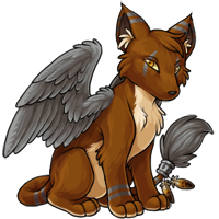
Rah image drawn by the dear !

Nice work! (makes me want one now!!) So much Fox <3

Beautiful ;3;! Just...beautiful!!
"A beautiful woman uses her lips for truth, her voice for kindness, her ears for compassion, her hands for charity and her heart love. For those who do not like her, she uses prayer."
I think the new pose takes away a lot of the character of the old design, personally? He looks like a shifty and crafty fox-like creature in the original, whereas the revamp looks much more generic and even stoic. which doesn't seem quite right.
I love it. It still has the mysterious feel of the original but is now better proportioned and posed! :D
i think it looks really good thus far!! my only concern is the flatness of the face-- i think it needs a but more of a curve? perhaps slim the ears out a bit, also, to be more similar to the old one. other than that, i think it's good! :)

Overall, I like it. Love the wings and front legs a lot. The only points that bother me are the snout being so straight and something about it's sitting position makes it look like it's trying to poop? It seems very stiff.
I kinda think it would be cool if it were a bit hunched over like the original Montre was:
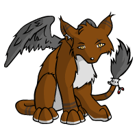
I really love it, except for the muzzle. It looks a little too straight to me; I think it should jut outward a little more like the original. Other than that, fantastic work!
I voted for the one on the left, because the wings are bigger and more plausibly functional :)
While the shading and wings on the new one is nice, I still prefer the old artwork. I think there's something about the muzzle on the new one that bugs me.
I also agree with
The art is definitely better, but I prefer the general shape of the old one. I liked that it was a very slim pet, the shape of its face, and the thinner tail. Montre is one of my favorite pets, but I'm not terribly fond of the new version. I also really like how defined the feathers are on the old one. It might just be because I love the species so much, but I'd honestly just prefer updated shading on the old lineart.
That is some beautiful art, I love this revamp already! But is it just me, or is something kind of wrong about the head and wings?
Also it looks like its got a lil' pot belly, so cute.

I kind of prefer the old wider eye spacing/placement but otherwise the revamp is really pretty! I love how the wing looks.
I really like the feathers, eyes and ears on the older Montre but happy to see the tail not quite so skinny.
“Make magic…part of everyday life…” ― Kamome Shirahama, Witch Hat Atelier, Vol. 2
it's definitely better art but it looks a lot like a kumos with a different head/wings attached
The muzzle needs to be angled up a bit, I think, but otherwise it's amazing
I like the little details that were improved. I think the eyes can be more defined.

Forum Art by
Signature Art by
