Montre Revamp Feedback Gathering
Filter
Show Official Posts OnlyReplies
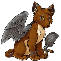
The far wing is in the wrong place for him to be very comfortable sitting like that, it should be closer to the front and more visible.
If I have claimed a Dance from you and do not immediately Dance I will get back to you.
Always Buying:
[/font]The pose on this seems so dull imo. It's the same thing as the kumos and there's nothing dynamic about it, it's so stiff. The art itself is fine but there needs to be a little more unf to really bring it to life ):
Looks like a Kumos to me. I like the body but don't like his head at all: ears, head shape, eyes are better in the old one. Ah! And his tail! I always liked these feathers on his tail but they are almost gone in the revamp.
<p>I drew this up for what I can see right off hand. The nose is too flat, the head is too far back and just pulled back and up too much so it looks stiff. The tail is pinched at the top so it looks somewhat like it&;s made of rubber rather than bone like it should be. Also, it appears as though you&;ve given him a pot gut! That should be slimmed up a bit, that&;d be better. I&;m not a fan of giving pets a huge gut for no reason... and the toes bother me as well, since they&;re not structured, they&;er too cartoony. The original pose is much more relaxed and the remake would be nice to be more relaxed too. I only sketched over the revamp and didn&;t change the pose, but I fixed the neck, the back, the placement of the legs- since the elbow is up too high too.
The ears are a oddly placed as well as the cheeks... so hopefully this gives some kind of helpful critique. The shading is slightly weird, it seems more detailed on the bottom and then the head hardly has any.</p>
<p>The wings are great tho, very nicely shaped. I love how you can finally see the tail puff, that&;s nice too and the shading is lovely on that as well- and the jewelry is good as well.</p>
<p>

agree with all of these!
adding my thoughts as well: the revamp and the shading are absolutely gorgeous but imo it seems like the weight isn't distributed properly in the pose (see below). the montre looks like it'll fall over with a small push. the left hind leg should be further out (i.e. less brown should be visible between the right fore and hind leg) to help even out the weight a bit!

oh wow how lovely! the anatomy, pose and coloring is all gorgeous (and much improved!) but in my opinion, i prefer the face on the old version as the snout and jaw seems more stylized/pronounced and lends a charming quality to the pet that i feel the new version is missing.
edit: just seen kissi's edit; this is really nice and exactly what i meant about the face ^^
I like the new design but... I think the nose is a little bit too long. Now it reminds me a little bit too much of a Kumos with Wings and another tail.
<p>
^ Do this and I'll likely turn all my pets into montre's again!
I love the fact that the montre's are getting some love (and hopefully eventually finally a nuclear colour - begs), but I agree with everyone that while I do like the new art, something about the design just looks off. I love the feathers and the tail, but the face and the snout are just mweh.
I usually love all the revamps but there's definitely something off with the muzzle there. It's too straight or something, I don't really know what it is.

I voted for the old one. New one looks to much like a kumos. I don't like this dog-like look, the old foxy look is so much better.
[tot=Insomnia] [egg=Insomnia] [tp=Insomnia]
I agree with a lot of the critique on the muzzle that others have pointed out, it's definitely weirdly shaped in the revamp art, and I think maybe the ears could use a liiiittle tweaking (maybe slimmer, as someone mentioned on the first page?) but overall this is a great improvement!
As far as what I really like about this change, I think the legs actually look like a pet that would be able to stand and walk--the current has weird shoulderblades. The legs, the abdomen...it all seems more, uh, what's the word...lifelike? Not sure that's the best term. Hmm, maybe "animated" is better suited to what I mean.
Good to see the Montre getting a revamp. I love my Montres, ahaha, I just got another but was hoping a revamp would be in order soon--though right now she's an angelic so not sure when that revamp will happen, but having the common revamp is a start. :D
GUYS GUYS IT'S FORELEGS ARE ANATOMICALLY PROBABLE NOW CHECK IT OUT bricked
Seriously, overall I prefer the revamped art, but the pose feels pretty stiff compared to the old one, and the new face seems to be missing that "side-eyeing ya real hard over here" look that the old one has. The new wings are absolutely gorgeous.
I love the new Montre and I hope this revamp will go through soon!
I love the new wings, and the tail looks a more relaxed angle. The shading is fantastic compared to the original too!
However, there's something about the pose that just looks a bit off to me. I'm not sure if it's the similarity to the Kumos pose (which seems more apparent with the new angle for the Montre) or the snout appearing to be longer than before, but the body just looks uncomfortable....kind of like it's got indigestion and needs to sit bolt upright o.O
Overall though, it's a definite improvement on the previous one ;)

My CW shop ~ forumset by [/font]
Overall I really like the revamp, but I don't like the muzzle. It looks very flat and broad. I'm also not so keen on how the tufts of fur (especially around the face and ears) and tail are drawn. The thick rounded look is lovely on the tops of the wings but I'd prefer the fur on the body if it were thinned out a little and had more of a variation between the thicker rounded shapes it currently has and thinner, sharper lines. The ears are oddly shaped too.
I like the pose and everything, it really is a huge improvement overall and I'm very excited about this revamp since the montre is probably my favourite species! So to see it looking so pretty finally is amazing. The wing looks so much better now too!
Edit: 's edit to the head looks amazing!
Never liked the montre, it feels that too much is going on on one pet..
But anyway, the revamp is totally better than the old version lol just few things:
- consider closing the wings, now they look like a cardboard wings, or give them some kind of movement.
- The face looks weird, something is wrong there.. like it got cut from the right..
- LONG TAIL let the feather be more visible, it THE THING of the montre
I like the new pose, but the head seems a little off to me. To me it's a little too cutesy. The original kind of has a rougher look and personality to him that I really like. I like where the ears are pointing in the original and the little kinda of cut up tuffs on the tips of them. I also like the shorter snout on the original better. I'm not sure about the anatomy but but his right leg looks a little off at the top. Like it curves in a little too much? But overall I kind of hope you can bring more of the roughness of his personality back in

I think the old stance was way cooled personally, but the detail in the revamp is awesome, so maybe just edit it to be more detailed not loads different? x
Cleared by staff, oversized
I like it! My only suggestion is to place the nose just a little higher so its on the tip and not the front of the muzzle, then I'm completely happy with it. :)
🌺🌺
I preferred option 2 because it is in motion and is looking at you and is moving it's tail and head as if just this was happening now. The left option is more static and greytoned and I'm wondering where the heck the neck is.
The tailfeathers are drab and are not "just hanging there" on the left image, while they are more colorful and in motion on the right image which I like better.
The feathers of the wings are lovely on the left image, but they make the wing seem more full and birdlike and like they don't really belong. The wings on the right image are a little sketchy like why does this critter have wings on it anyways.
I love the new revamp. very very nice! the wings and pose are very realistic but my fav. has to be the tail :D
my one critic would be the nose area, it seems odd for him not to have lips... maybe a fang sticking out?
I mean in that pose you'd expect to see the outline of his mouth right? that area is actually bothering me which is a shame because it's such a lovely re-vamp!
