Montre Revamp Feedback Gathering
Filter
Show Official Posts OnlyReplies
I like some of the motion on the old one.. like the way the feathers are all drifty. But the new art is very detailed, and I love the serene face on the new Montre. ALl in al there's something rather Coyote about it.. and I dig it.
We are the ones who remember, the ones who see what was, and is, and will be.
Me~
Oops apparently I need to post this in this thread/not the news comments.
The anatomy is off a little bit. I feel like if you brought that one leg down a bit more it'd help an awful lot with the position. Concerning the head; it looks a bit too large to me, personally. The eyes don't line up correctly and the whole muzzle structure looks a bit too low. I feel like the neck's structure is also a bit awkward / doesn't define the shoulder as well as it could. The backleg's actually missing part of the anatomy entirely (just having the knee go to the ankle indirectly is incorrect). And ultimately, the tail would be positioned a little differently. Since this is probably confusing as to what I mean specifically, I've made a redline.
[IMG]https://40.media.tumblr.com/3f73f220cd06733b47bae4f612f39f71/tumblr_nwjze8BGRl1qk7m4wo2_r1_250.png[/IMG]
Overall though the shading is vastly improved and I really love the way the wings are done especially!
[box=#444342]
I feel like the new montre is more of a mix between kumos and montre rather than a revamp of just the montre. When I first joined, I was stuck between several pets, which includes the montre, but ultimately fell in love with the tigrean. The reasons I loved the montre is because it felt mysterious, with a slender light body and face.
There are several good aspects to the revamped version: Better wings, more detail, and better anatomy. However, I believe the slender legs and snout of the old version would make a more unique feeling and traditional montre rather than a montre-kumos hybrid.
I don't know if others feel the same way about this as I do, but I thought I'd just share my opinion o:
Montre opinions...
The newer one looks cooler, I love the detail. It doesn't look as cartoon-ish as the older one. The new one has a more regal or formal look to it, but I liked the more playful look of the older one. Needs more detail on the eyes; the old one actually has more detail on the eyes. Like a pupil. Would like more detail on the tail feathers. I like the wide color variation of the older one. The far ear needs more cream colored fur detail, it seems to be missing. Or maybe the ear is just turned way back and I can't tell? I'm wondering how it would look with the wings set a little bit further back on the back? The newer nose looks like a dog's, the older looks fox-like. I like the shape of the older nose.
Hope these are helpful! :)
When pigs fly, I want to ride one.

I don't mind the chub in the belly, since I think sitting like that would push it's belly out a little. I'm happy either way to be honest.
I voted for the one on the left. I should mention I am the opposite of an artist, I couldn't tell you anything about shading or line art, but I do know what I like in the finished product.
Left: I'm loving how the ears look, it's face is beautiful and the eyes are looking skeptical but not menacing. I'm really loving the contour of it's chest and abdomen, it looks like a healthy animal. The fluff at the end of the tail is fully visible and the wings are proportioned to the size of the animal. Nothing comes to me about the paws, they're pleasing to my eye and the tail looks natural.
Right: This one scares me. The left ear is down, it's hunched over and it's eyes are menacing. I feel as if I'm looking at an animal that's been abused and it makes my flesh crawl (not the art, but the overall 'feeling'). I don't see any contouring to the chest or abdomen but I do like the light band around the paws and their V shape. Half the tail fluff is hidden, it should be fully visible. The wings are too small for the size of the animal. I don't know if they're supposed to fly or not, but wings should be big enough to carry whatever they're attached to. My over all feeling is I need to take this little guy home and give it lots of love.

I really like how dignified/aloof the new version looks, and the fact that the tail tuft and back wing don't look like they're merging into a strange Klein bottle anymore!
 they/them/theirs, please.
I feel like the new face is kind of flat. The muzzle seems too short and down turned in my opinion.
* * * my wislist
The only thing that bothers me about the revamp is the tail. It's too stringy at the base where it's attached to the body and why is it punching itself in the head with the fluffy end? The tail is all wrong!

Upon further inspection, I think what bothers me most about it is that it's so rounded off now, and that makes it look very Kumos-like. The older version is very angular.
I like the shadng on the new one and the size of the wings and the change to the tail but the ears, head and muzzle look off. Also the placement of the wing looks a bit wonky. Like the forepaw and wing share the same joint location. Then again that's not the first time a monte's wing has looked out of place like with the storm color.
[Kiss=Phantomhive]
Biting for: SPOILER (click to toggle)
All Strains 2009 - 16, 2020 - 26
SPOILER (click to toggle)
Ant (Sporous) 17, Love Sucks (Dry) 18, Muerte (Fortitude) 18, Fevermore (Song) 18
Running off super weird amounts of sleep atm but here are my 2 cents
[IMG]http://i93.photobucket.com/albums/l77/Zombeeism/Montre-revamp.png[/IMG] (Black lines = same // Red lines = different)
- Move the eyes down a bit / align them a bit better
- Perspective on the snout is a bit off (lowering the eyes makes it a little shorter like the original too)
- The angle of that ear should be in front of the head, not behind it. The other one is too high up (this is just personal opinion on the second ear)
- Actual tufts of fur on the ends of the ears.
- Lower the actual head / the original was a bit more hunched and while the new posture is great, it eats some of the personality.
Also things I a really stoked about:
- Dem wings man. A+ A+ A+
- The tail fur like yes?
- Fur shading / detail is also fabulous
- Thank you so much for fixing the tail thickness hilarity.
- And for making the eyes less anime. B)
I think the only thing I like better on the new one is the wings. These are def. better.
The expression is fine. The Montre is not meant to be happy, or joyful.
I do like the old one's facial features better, but the personality of the Montre has been understood by the artist.
The angle of the head is not something I'm fond of. I know the old one's anatomy is all wonky, but I like seeing both sides of the face, which is something we're losing on with this revamp. Also, there is less focus on the feather decorations on the new ones, and they made the Montre unique to me.
They're the big mystery about the Montre? Well, I feel like the new pose is not advantageous for these, because we can barely see them when they're close to the back paws. Old pose has them more visible.
Positives for the new design:
- I love the detail in the wings and the end of the tail.
- I also think that the legs look more realistic.
- The tail ornament (or the ring of it) actually looks like it fits the tail better.
- I like that you can actually see the end of the tail properly.
- I actually like that it looks a bit more stoic than before.
Negatives for the new design:
- I'm really not keen on the shape of the face. The jawline seems strange somehow and the nose seems too thick.
- There's something strange about its chest/belly - almost like it has a barreled chest and is heavily pregnant.

"When you love the Doctor, it’s like loving the stars themselves...
You don’t expect a sunset to admire you back."
The muzzle bugs me. I'm pretty sure that it's the angle of it that I find a bit iffy. It should be angled up a little. Other than that I think the artwork on the new one is great.
[Edit] Ok, I just noticed 's edit to the head and I love that. If it could look more like that it would be perfect ❤️
I drew this up for what I can see right off hand. The nose is too flat, the head is too far back and just pulled back and up too much so it looks stiff. The tail is pinched at the top so it looks somewhat like it&;s made of rubber rather than bone like it should be. Also, it appears as though you&;ve given him a pot gut! That should be slimmed up a bit, that&;d be better. I&;m not a fan of giving pets a huge gut for no reason... and the toes bother me as well, since they&;re not structured, they&;er too cartoony. The original pose is much more relaxed and the remake would be nice to be more relaxed too. I only sketched over the revamp and didn&;t change the pose, but I fixed the neck, the back, the placement of the legs- since the elbow is up too high too.
The ears are a oddly placed as well as the cheeks... so hopefully this gives some kind of helpful critique. The shading is slightly weird, it seems more detailed on the bottom and then the head hardly has any.</p>
<p>The wings are great tho, very nicely shaped. I love how you can finally see the tail puff, that&;s nice too and the shading is lovely on that as well- and the jewelry is good as well.</p>
<p>
I reaalllllyyy enjoy these fixes. Like a lot.
Pros: -New wing is nice -Overall art quality
Cons:
-Head shape reads really awkward/kinda broken. Like the neck isn't quite on right, or perhaps rather the head onto the neck, maybe. Adding in the stylized over-size/smoothed muzzle and it just looks kind of... blockheaded.
-The shading seems... really obvious? Clear gradient? Not sure I'm using the right terms but it looks kind of like old art. Especially noticeable on the bottom part of the front leg closest to us, the fold right by the foot on the back leg closest to us, and the tail tuft. It brings the quality of the whole down a fair bit. It is still better than the old (obviously) but it could be made so much more better (yes) if this was addressed.
-Don't personally care for the new tail cuff. Kept the massively oversize tuft but randomly clipped that down? Should be both or neither.
Neutral: -The gauntness of the old pose is gone. Not something I personally care a ton about, but I could see those using it being bothered.
TL;DR: This has potential. That potential is what my pro-vote is for. Not this version as-is.
Edit: Several of the red-lines and edits above address the head rather well. It really is the big drawback. I know that is more this artist's style, but that should be beside the point. It should be a Subeta Pet first, a ______ Pet 2nd if at all. Not vice versa in the slightest.
Edit 2: Just to clarify, these are the two redlines in particular that jumped out at me as fixing the head/muzzle. Some of their other tweaks are nice as well, but not quite so sorely needed.
and 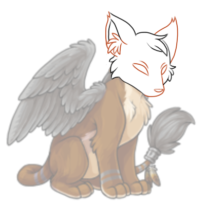
I'd also be A-OK with bringing back some of the 'emotiveness' of the pose/some of the 3/4th viewyness. To help differentiate from the Kumos, in part. I didn't notice the similarity at first (despite owning both, albeit a non-colorfill) but now I can't un-see it.
It's definitely rendered better, but the new one just seems really.. stiff. The right one has more character, like it's hunched over and the legs are splayed.
I think both are fine (?), but the old look's paws and wings bother me a LOT. So in the end I prefer the new look just because of how below average the old Montre's 2 traits look. I feel like the revamp could use brushing up however. The thing is, it still is better than the original.