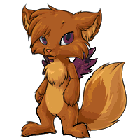
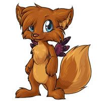
<center><img src=http://images.subeta.net/torrey.gif></center>
There is a <a href=/explore/polls.php?act=vote&poll=88>new poll</a> for you to vote in :)
Note: This post is for <u>constructive</u> criticism. That means tell us <i>what</i> is wrong with the pet, in your opinion. Personal attacks on the staff, or the artist responsible ('this fails', 'you suck as an artist', 'why did this get polled?!') will result in being banned from comments, and probably a warning :(. Be nice!
December 31, 1969, 7:00 pm by
m1str3ss

Wow Ive looked at all the comments on this little pet and all you read is mostly criticism..most everyone says they like it, and then say BUT this or that need to be changed. Are you kidding me???LOL
I dont know it must just be me..I guess its just human nature to complain about the smallest things sigh
Anyways, to the artist, this is a beautiful little pet..and there is nothing wrong with the art on it...I know Im only one person, but I feel that it is by far one of the greatest revamps Ive seen!
I honestly hope that the poll goes through, so that I can go adopt one when it comes out!
Amazing! 
December 31, 1969, 7:00 pm by
Tonne

I really like how Cries_for_neo made the eyes match the wings, i think it really makes the wings seem like they belong.
December 31, 1969, 7:00 pm by
BlueRiver


I'd rather the eyes stayed green. Also, something's off with the head that I can't quite place. Maybe it's a bit too big.
December 31, 1969, 7:00 pm by
Deleted User
I'm really sorry to say this, but I'm very disappointed by this revamp. Especially since the last few were so fantastic. The tail is awesome, the coloring and shading, but everything else isn't quite right. The muzzle and eyes don't really fit...
December 31, 1969, 7:00 pm by
Inknote


the only thing that specifically bothered me was the legs!!! i really really liked them when they were not spread!!!! it just doesn't really look right....dunno. but Zohkaro and Chou both have points i agree with fully.
December 31, 1969, 7:00 pm by
InkDragon

Not bad, I would rather have seen the eyes and wings remain the same color though.
December 31, 1969, 7:00 pm by
Inquisitive

I think this is a great re-vamp! Although I think the eyes should be green instead of blue and maybe have the wings be a little bit lighter like the old one?
December 31, 1969, 7:00 pm by
SpectrumSurfer


The feet remind me of the DR.Seuss books.
It's a weird kind of disgustingly cute though. My issues are only with the feet though.
December 31, 1969, 7:00 pm by
Deleted User
I have to say I like ET's example.
Though I somewhat like the purple wings, the feet on the new one look a bit odd and the green eyes seemed better.
December 31, 1969, 7:00 pm by
Selene_130

Although the muzzle bugs me a little I like it.
December 31, 1969, 7:00 pm by
WAVVES

I;m with ET.
FTW.
The downparts are the PURPLE wings and the GREEN eyes.  Deh dun match.
/spasm
Deh dun match.
/spasm
December 31, 1969, 7:00 pm by
Charmander

 Seriously
December 31, 1969, 7:00 pm by
Deleted User
See. I'm mitigated about this. Both are good, but for different reasons. I prefer the cute, chibi proportions of the old design. The new one looks cartoony, but... There's a but. The good side of the new design is that it is drawn more detailed, it's got more texture, etc. So, all in all. Keep the old design, but redraw it more detailed like you did with the new design, and it'd be great.
December 31, 1969, 7:00 pm by
Deleted User
I like Chou's edit. ^^
December 31, 1969, 7:00 pm by
Delicacy

I, for one, don't see anything wrong with this revamp. I love it. I can't believe there is so much controversy over it. The wings and the eyes are really cute. Amazing job on the revamp. Much better than the old. ^^
December 31, 1969, 7:00 pm by
Kais

The main problem i have with the revamp is the wings, purple just doesnt fit, i think it would better to stick with browns and i think the legs are a bit too skinny, but otherwise i like it
December 31, 1969, 7:00 pm by
PhoenixWright_400

the wings and tail definitely got a nice update in this revamp, yet, the face has this strange shape, like short vertically, but extremely long horizontally. the wings should come from the middle of the back, instead of behing the arms; and maybe make the wings and eyes the same color =)
December 31, 1969, 7:00 pm by
Fox


Tche, I wouldn't expect my image to look official, I only spent 30 minutes on it XD
Of course the revamp looks much better, it is the official revamp. I'm just illustrating the way I like the nose and feet.
December 31, 1969, 7:00 pm by
Wren


I really don't care for this at all. I am a huge fan of the original Torrey and I am sad to see it's getting such a drastic revamp.
The muzzle seems strangely elongated and ill-proportioned to the rest of the face. Likewise, the eyes are not the right shape and are much too large. The wings are too dark in contrast to the rest of the Torrey and seem out-of-place. The body itself is too skinny, especially in comparison to the large, fluffy head. The arms are skinny and lanky. The feet look too much like slippers-- there's no anatomical structure underneath the fur. Maybe define more into toes? And make the feet shorter.
Make the body fluffier and cuter.
The tail is great. 
December 31, 1969, 7:00 pm by
Cloudiie

So here we go. The art is definatly much better than the brevious one. And by that I mean it's just less fuzzy. No disrespect to the preivous artist. I like the pose of the orginal better. to me it has more personality, kinda ccarefree.
I love the front paws on the second one but that buttom ones remind me of Dr. Suess ^^; Ithink with minor ujustments they'd look tons better.
Proprtionally the head/eyes look a little off. Maybe if the neck was a little wider it would look better, I dunno.
The color you chosefor the wings is gorgeous, but I think if you are going to use that pawnsome color you should incorporate it into the yes a little bit.
And like I said earlier I think the pose it's in lacks personality. I enjoy pets who when you look at them you can laready see a characvter blossoming. Like with the glacier pets and their kinda distant wild look
The artistsat subeta are the best I have seen anywhere. The lines are beautiful and clear and you all do such a wonderful job that unlike some sites the art style doesn'tcompletely differ and make pets look random. I apologize if anything I said offended anyone.
December 31, 1969, 7:00 pm by
Roadkill


Oops, just read Tche's post. SORRY! Just ignore the edit I just posted.
December 31, 1969, 7:00 pm by
Beni_202

Personally, I think it's just become a little bit too... 'anthro', for me. I like the old pose better, but the new art better. A combination of the two would be perfect, in my opinion.
December 31, 1969, 7:00 pm by
steven

its nice. something about the head is a little off. i think you should make its body fatter and the head smaller.
December 31, 1969, 7:00 pm by
DarkFireFox

I dont mean to disrespect the artist.  If they feel bad about mine, i apologize. But I DO love the new one. I just want to cuddle it. ^^ xD
December 31, 1969, 7:00 pm by
midnighter

I feel that this is a good piece of art, and it probably took a while to do. But there are some things that bother me, which is why I voted for the old one.
The head seems too large for the rest of the body, and in my opinion the torrey looked better when it was thicker in the belly and thigh areas. I'm fine with the head's overall shape, but I think that the muzzle needs to be a bit larger and the eyes a bit smaller. But other than that, I think that it looks fine
December 31, 1969, 7:00 pm by
Roadkill
 I tried to show what I think should be tweaked a little. For one, the neck seemed reall thin, and it was making the head look too big, but if the neck is a little bigger it looks more porportionate.(can't spell to save her life) Also, the wing (his left, our right) looked attached at the arm. I think the wing and eye color should match, but it's not that important. Slightly smaller eyes make it look less chibi-like. Also, I made some slight changes to the muzzle and positioning of the left foot. But other than those minor complaints of mine, this revamp is AMAZING - I absolutely LOVE the shading on this revamp. And the wings are amazing with all that detail in them.
(I really hope the image works)
I tried to show what I think should be tweaked a little. For one, the neck seemed reall thin, and it was making the head look too big, but if the neck is a little bigger it looks more porportionate.(can't spell to save her life) Also, the wing (his left, our right) looked attached at the arm. I think the wing and eye color should match, but it's not that important. Slightly smaller eyes make it look less chibi-like. Also, I made some slight changes to the muzzle and positioning of the left foot. But other than those minor complaints of mine, this revamp is AMAZING - I absolutely LOVE the shading on this revamp. And the wings are amazing with all that detail in them.
(I really hope the image works)
December 31, 1969, 7:00 pm by
Cylum

I really like the origional, but I think ETs is perfect in my opinion! I think it just needs to not be as skinny. That will make the head not seem so big and the legs look better.
December 31, 1969, 7:00 pm by
condescension


The coloration and maybe the pose are the only things that I would change... The art itself is great.

December 31, 1969, 7:00 pm by
Klokwerk

Hm, as always, art QUALITY is better than the old and all (oh, lovely shading is lovely and the linework...!) but I'm not a fan of this revamp, I must say. The shape of the face is a major thing- it's hard to explain, but I MUCH preferred the shape of the other. This 'un seems...squished upwards, almost? The neck is a little to skinny too.
I really don't like the lower half/legs either- they seem kind of skinny and bowlegged to me. The muzzle seems a bit narrow as well :| I think part of my dislike of overall build and look is because the old version looked kinda squat and adorably pudgy and this seems more slimmed and lanky. I just personally thought the other one seemed more...cuddly, I guess.
I don't recall who said it, but someone mentioned it looked more like fanart of the pet and I agree. It's nothing personal and as I said at the start, the art quality is great... it just doesn't feel like a Torrey to me. It seems to have lost a lot of personality the old had- posture change may have had an effect on this as stated previously. Plus, it seems a little too...human. It's kinda creeping towards the Uncanny Valley x3
The eyes are another thing- though admittedly more nitpicky. I liked green personally and I'm not sure why they were changed. Not a HUGE deal for me though- just one to mention XD
I do like the detail on the wings, though the color...not so much. It seems out-of-place. I know yins like to utilize color and all but...this doesn't seem to jive well. The detail is lovely, though! And I do like the forearms for some odd reason and I totally dig the floofy tail~
Ah, I was hoping for more revamps to follow in the footsteps (erm, pawprints) of the Paralix (or even the Bloodred Devonti) as far as preservation of style, expression and such goes. Overall, this revamp is a good start but...not so good a destination.
December 31, 1969, 7:00 pm by
Deleted User
Okay. Everyone stop with the redlines. XP The point is to give ideas not change the image. Just type out what you think needs changed. Its disrespectful to change the artists image.
December 31, 1969, 7:00 pm by
Deleted User
Beautiful shading, and the fur looks very soft and plush. It looks much more vulpine than the original. I won't get into a list of tiny little details in terms of criticism- the only thing I would change, at first glance, is the muzzle. It's a bit too narrow for the size of the head. Widening it slightly (even if only at the base) would be more in proportion to the rest of the face, I think- particularly the eyes.
December 31, 1969, 7:00 pm by
Sopheroo


Quote:
; border: 1px solid ; font-family: georgia; font-size: 10;">I don't see the issue with redlines. I think it's better than taking 8 paragraphs to explain in detail what you want changed. And you can visualize it a lot easier. It's not really disrespecting the artist at all to offer constructive criticism like that.
Several artists have said it was bothersome to them, especially when you redline all of the pets.
If you want to submit a redline, submit it to the artist's mailbox. Right now, I feel like these redlines are spiteful and downright malicious, especially if you have them ALL OVER THE PET.
December 31, 1969, 7:00 pm by
Mariea

I like it... but keep the green eyes? It matches Nips perfectly.
December 31, 1969, 7:00 pm by
DarkFireFox
MUCH better than the last one. ^^ But there were a few faults to this one. I didnt like how it looked too Chibi. And the feet bugged me. They looked too furry, lol. And the eyes kinda looked too chibi. Let alone I think they looked better Green. And I didnt like how the tail looks like its sitting on the floor then pointing up like it was ballencing on it. And the wings didnt look well purple...I liked Chou's edit with the yellow wings. And about the fur thing, I didnt like it on the ears either...
 Here is my change outline.
 Here is what it looked like when I attempted to EDIT it. The eyes turned out very mean looking but I wanted to get it out of that cutesy slump. And I made the tail smaller because it looked a bit big at first in my opinion. I didnt get around to editing the paws tho. And I wasn't sure about the wings. I think they could have been longer tho, which I started. Ow well. Just pitching ideas, right? xD
December 31, 1969, 7:00 pm by
LostDragoon

Without reading all of these posts, (lol) I really do like the work that has been done so far. However the muzzle looks a little off - a bit too long, the nose a touch small. Also I'm not really a fan of the small ankles/feet. The big fuzzy feet were something I really admired. Lastly, I find that the body has gotten too thin for that large head.
I do really like the purple wings; contrast is great! (Also they have pretty detailing.) And the shading on the tail is just gorgeous.
December 31, 1969, 7:00 pm by
Nuke


I don't see the issue with redlines. I think it's better than taking 8 paragraphs to explain in detail what you want changed. And you can visualize it a lot easier. It's not really disrespecting the artist at all to offer constructive criticism like that.
December 31, 1969, 7:00 pm by
Aicona

I like it when people redline my stuff. It's much easier than to say "this line could be better that way".
December 31, 1969, 7:00 pm by
ET

The news post asked for constructive criticism and some people learn better with visual instruction than written instruction. I just wanted to help the artist, but if I crossed the boundaries I sincerely apologize to Jag .
December 31, 1969, 7:00 pm by
Biscotti_215

I like the red line that EGG and Ayakat are posting :] But the one thing I don't like about revamps, is when it's redrawn, the pose stays the same. I would just like to see more action, different poses or something ;]
December 31, 1969, 7:00 pm by
Deleted User
umm i don't mean to be a lecturer here but i think it is cruel for a lot of you to take the hard work of the artist and without their permission alter it with new images then post it on here...it is disrespectful to the artist who worked hard on the Torrey's new look...tell them what you think should be different but do not take it without permission and alter it to your liking...this is artwork and in its own way copyrighted, i believe...i dunno if Keith, the staff, artist, or artists will agree with me on subeta but if i was the artist i would take be hurt that my hard work is being altered like that or being drawn on like some doodle-monster...have some respect for the hard work the artist put into the new Torrey
December 31, 1969, 7:00 pm by
Sopheroo
Stop it with the redlines. I'm serious.
December 31, 1969, 7:00 pm by
Moonsyne


I don't care for the color choices on the wings and eyes.
December 31, 1969, 7:00 pm by
Deleted User
I vote for ET's ;3
December 31, 1969, 7:00 pm by
Glitter


Quote:
; border: 1px solid ; font-family: georgia; font-size: 10;">and the in the new image seem too long.
I'm sorry, the *legs seem too long
December 31, 1969, 7:00 pm by
YeranceK


Quote:
; border: 1px solid ; font-family: georgia; font-size: 10;">More than that, I was reminded of how the Neopets staff re-drew all of their pets, and I'm afraid of redraws. We, as Subeta (or neo, I guess) users, chose our pets because we liked them the way they were. I think it's dangerous to redraw ANY pet. I'm worried that the Montres will be redrawn and then I won't like my pet
I agree soo much with this comment! I know my friend on here just lost a lot of points cause she has an angelic warador and now the nw look of it she HATES it! and wants to make it into a new pet,,,,, honestly I dont think they should re draw the painted versions for that reason alone, people pay lots of points to make their pets look like they want to and then something like this changes and then they are all upset.... I know on Neo I have a Royal girl Draik and I choose to keep her the OLD WAY cause I couldnt stand the new look,,,, maybe having an option to change or not to change might be better for the painted versions! I hope what I explained here helps Thanks for listening!
December 31, 1969, 7:00 pm by
Sopheroo
Lazeros, none of your art look Subeta style at all. The shading and lineart, especially.
It's good fanart, but bad official art. It's far too stylized.
December 31, 1969, 7:00 pm by
Glitter
I really like this revision of the art. The colours are incredible and I can tell the artist worked very hard on the re-vamp, but it seems as though the essence of the old art has been lost.
Maybe shape the eyes like this draw and make them the same apple green? There is a coquettish toss of the head in the old art and the in the new image seem too long.
I applaud the effort to revamp the pet and appreciate the hard work, I'd just like to see the torrey remain familiar instead of having such a radical re-imaging.
December 31, 1969, 7:00 pm by
Twisted_Pretzel

Visable digits... come on you can draw fingers and toes =3
December 31, 1969, 7:00 pm by
Paint

Here's an edit of just the minor things on the face c: (not that you really need to be spammed with more images D : )
I agree with m1str3ss. I love this pet and all its little who look. X3 love the eyes, the wings, the feet. Its just awesome and cuddley looking. I don't think theres a thing wrong with it. ^^