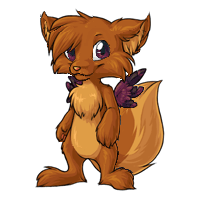
<center><img src=http://images.subeta.net/torrey.gif></center>
There is a <a href=/explore/polls.php?act=vote&poll=88>new poll</a> for you to vote in :)
Note: This post is for <u>constructive</u> criticism. That means tell us <i>what</i> is wrong with the pet, in your opinion. Personal attacks on the staff, or the artist responsible ('this fails', 'you suck as an artist', 'why did this get polled?!') will result in being banned from comments, and probably a warning :(. Be nice!
December 31, 1969, 7:00 pm by
kathyjsmith

the new one looks really cute 

December 31, 1969, 7:00 pm by
aquarius_518

I like the base of new one but what bugs me about it is face and wings color . It would be pretty if new version would have cream colored wings and eyes could be little different shape and mouth would also be prettier if it would be shorter ( I mean it would be like 10 pixels shorter ) . Eyes could be green too - but without them is that little Torrey looking cute too . 
December 31, 1969, 7:00 pm by
Jessi


Some people aren't good at describing what they like and dislike about a pet with words. Sometimes, red-lining is easier for them. They're not being malicious; they're not being mean, spiteful, angry, or rude. They're just using a visual reference instead of words.
Really... why punish people for going about their way to give good constructive criticism? No one is saying an artist has to use any one of these redlines, but it doesn't mean people shouldn't be allowed to post them.
December 31, 1969, 7:00 pm by
Deleted User
gosh can't believe someone said that that is well tight
anyway
i think it is great but i think the wings should be a different colour maybe brown
December 31, 1969, 7:00 pm by
Deleted User
I completely agree with Spiritfoxgirl's post. This new one is adorable, but it's missing something that I think the redline captures. =D
December 31, 1969, 7:00 pm by
Did

I know I'm the bajillionth one to say so, but ET's redline looks like a winner to me. It captures more of the cute, chubby cartoonishness of the original - the long, narrow snout on the new one just looks out of place, and I think sacrificing realism and going with the elongated ":3" mouth with the cute little line over the bridge of the nose just fits better with this sort of pet. I also think that the cheek fur looks better when the chunks of hair are more fat and puffy looking, instead of being so long and...sharp?, and the eyes seem friendlier when they're more rounded, with the "smiling" crease on he bottom...those huge almond-shaped eyes just seem sort of sinister. The whole chubby-stout build is a step in the right direction that saves this redraw from looking so much like a creepy anthro or a guy in a fursuit.
December 31, 1969, 7:00 pm by
NaandaWay

Ohmigod, it's so cute. But it's feet and legs are deformed :~
December 31, 1969, 7:00 pm by
Tjulan


I like the try from Cries_for_neo, thats how the face should look. But the form of the head is still not ok... should be smaller and... perhaps a little bit higher...
December 31, 1969, 7:00 pm by
pumpkins


I have no problems with the current look actually, but what i really liked about the original was the very wide smile it had. I personally, would love it if maybe if the current smile was lengthened/'shallowed' to just before the cheek highlight point
December 31, 1969, 7:00 pm by
SKRIL

ET's redline is getting a bit repetitive.
December 31, 1969, 7:00 pm by
Deleted User
The_Pie, you are an Artist it says under your name on subeta...do you also find people taking your artwork and altering it as rude like the redlining?...'cause i mentioned earlier how i felt users should stop doing the altering the artwork of the new Torrey too since it is such hard work to do art...i do graphic and web design so i know even with that how frustrating it can get to get it look exactly the way you want it to look...if i ever had someone take my hard done designs then alter them then i would be deeply hurt...i cannot imagine how artist(s) must feel on here...i mean taking the images of the pets and such to slap them onto forum text or signature graphic designs is one thing as long as they not altered in anyway but changing the way they look is something totally different...i not mean to cause drama...i just felt it was not respectful to the artist to alter or draw on their hard work
December 31, 1969, 7:00 pm by
ExeLord

new is better by all means, but my opinion is to make eyes and wings in color it was in old and body like Spiritfoxgirl posted 
December 31, 1969, 7:00 pm by
Magi


I think the same redline being constantly posted over and over by users is coming off as rude and demanding. Seriously guys.
December 31, 1969, 7:00 pm by
SpringMoon

I like the new one, and I like some of the ones posted as well.
December 31, 1969, 7:00 pm by
CrystalNightFox

Other then the eyes not being green, it doesn't bother me. It's pretty good. Somebody really should look at the tweaked versions though, some of them are hot.
December 31, 1969, 7:00 pm by
Pie

has the Subeta user base as a whole EVER liked a revamp and not created drama over it?
And I agree with Tche when it comes to the redline deal. Seriously guys. Come on. |:
December 31, 1969, 7:00 pm by
Spiritfoxgirl

definately this one.
December 31, 1969, 7:00 pm by
Spiritfoxgirl
I agree completely with ET. The edit done on that one is just fabulous -and it gives back that 'cute' look that was somewhat lost in the revamp. Very nice though otherwise!
December 31, 1969, 7:00 pm by
Sufie

I agree absolutely with Bastit ^^
December 31, 1969, 7:00 pm by
jeazard

Chou and Cries_for_neo made great new versions, those I'd love to see! But I still like the revamp, mostly, the eye color at least needs some tweaking, so do the feet...
December 31, 1969, 7:00 pm by
ChocoaKitty

i agree with Exterior.
December 31, 1969, 7:00 pm by
Bastit


I like Jag wor, and I like the improvements ET did with the red lines, because the original one is a little thin for my personal taste.
I'm sure the revamp will result lovely, like always. Keep the good work!
December 31, 1969, 7:00 pm by
Azaura


I like the new one better, however the head apears to be a bit to square...understand I can't draw stick people soI really appreciate the work that goes into the art..and I Love the Art on this site!
December 31, 1969, 7:00 pm by
Deleted User
*Is perfect, not i perfect, sorry!
December 31, 1969, 7:00 pm by
Deleted User
I think it's new style i perfect the way it is! Each and every artist has there own style! :3 Good job Subeta Team! You poeple can do way better then me! XD
December 31, 1969, 7:00 pm by
Magus

I like it! The art looks so fresh compared to the old one. The only thing that raised an eyebrow for me was the colour of the wings, but only because it was different than the old one. The longer I look at it, the more I get used to it. shrugs
I'm not really a Torrey fan so it's hard for me to critique it properly, but I think it's well drawn, even if everyone doesn't agree with all the changes on a personal level.
December 31, 1969, 7:00 pm by
SHANK

I like it, but the blue eyes are kind of random. Maybe the purple-y color the wings are or a darker color to match? The face seems kind of pointy though. But what do I know, I'm not an artist. xD
I think it's absolutely adorable though, good job. 
December 31, 1969, 7:00 pm by
moedeath

aww, i love it. i want to adopt a torrey now! (i just wish he had toes!)
December 31, 1969, 7:00 pm by
Deleted User
I absolutely love the new one, until I get to the nose and eyes... somethings not right there... though frankly I'm not the one to judge :/
December 31, 1969, 7:00 pm by
Rhinebeck

I just think its hardcore, period. Really, I mean, as soon as they decide the final design {whether it be this, or another} I'm still getting a torrey. I don't care, STILL getting a torrey. ;D
December 31, 1969, 7:00 pm by
Deleted User
I love the color of the eyes and wings, but maybe make them the same color so that it is more balanced.
December 31, 1969, 7:00 pm by
Hunter


I really dislike the pointy heel, and I don't like the change in wing and eye color. The legs are also awfully thin and the face is lacking fluff.
December 31, 1969, 7:00 pm by
draithypie


I'm definitely liking the updated art here. It's more smooth, and much more eye-catching in general, style-wise (in my opinion).
I do agree with a few comments regarding the wings, that if they are getting a new color, it might be neat to match them with the eyes, but it's not necessary. As they are now, I think they're nicer a dark color like this than the previously lighter, but they don't stand out quite as much now, whether that's good or bad!
The shading on this is excellent, especially the bend of the tail. I have no other "criticisms" ^^
December 31, 1969, 7:00 pm by
Sufie
Support changes of Dirnt, but while maintaining the green color of eyes.
Kisses ^^
December 31, 1969, 7:00 pm by
Deleted User
I love the new art except for one minor thing. I would love to see the wings a nice shade of blue to compliment the eyes and make them stand out more. Otherwise... so adorable and very well drawn!
December 31, 1969, 7:00 pm by
IrishJessie

Love the new shading and the new colors. But the pose bothers me, I liked the pose of the old one better. It's still an improvement though.^^
December 31, 1969, 7:00 pm by
Eeyore

I love it great improvement though I don't understand why the eyes and wings are different colors ...??? but a vast improvement, awesome ♥
December 31, 1969, 7:00 pm by
CelticRaiN


Wow, people are really picky these days huh?
I think it's perfect the way it is! ^-^
December 31, 1969, 7:00 pm by
Tere

I love it! It's so adorable.
But one thing that bothers me is the gap in between the legs, it's just like an arch, and I think that looks unnatural.
c: Other then that, good job!
December 31, 1969, 7:00 pm by
Marrow


I like it, although I do prefer the original pose. It would be nice if the eyes were... a bit darker blue? Or sort of an indigo colour to better match the wings. Lovely work. Well done ^^
December 31, 1969, 7:00 pm by
Deleted User
Keith wrote and i quote "That means tell us what is wrong with the pet, in your opinion."...he did not write to take the image and alter or draw lines on it to show what you feel should be different...plus Tche is a user administrator who told you all to stop with the red line drawing postings too which has not stopped...i am just a regular member who loves subeta but i think you all should listen to what they saying...write what you think should be different...summarize it...you do not have to write a whole paragraph...like say i like this & this of the new one and like this & this of the old one
December 31, 1969, 7:00 pm by
Tonne

Oops i can't spell xD wrong* (instead of wring )
December 31, 1969, 7:00 pm by
Tonne
I really agree with what m1str3ss said. We all will find little faults with this revamp, but in the end it truly is a great revamp and in my opinion a huge improvement from the original. There is really nothing wring with the art, but nothing can please everyone. So Kudos to the artist
December 31, 1969, 7:00 pm by
Deleted User
For some reason, this pet doesn't seem like a Subeta pet o__0 When I saw it, I thought it was a different site-style. It's mostly the face/head that throws me off the most.
December 31, 1969, 7:00 pm by
Wafflehead

I voted for the new one because...well, it looks new, and the old one is outdated. But, definitely: http://i22.photobucket.com/albums/b305/Eatknife/Personal/torreyredline.png There is something about this one made by ET that calls out to me.
December 31, 1969, 7:00 pm by
stelli

ok like 300 more comments later, I decided to edit the Torrey myself. Most of these issues I consider constructive criticism:
Okay, here's a grocery list of what I changed:
made the eyes smaller, pulled the forehead/top of ears down a bit, made the muzzle wider, removed the gap of space from between the arm/torso, therefore making it look wider, moved the tail so it wasn't sticking out awkwardly, made the torso/legs a TINY bit shorter, and I changed the eye colour to match the wings (which wasn't needed at all, but I thought it'd look nicer)
behold, MSpaint.
December 31, 1969, 7:00 pm by
Cinnamon


I do like the overall look. It's appealing, and it has a sort of feisty look to it. The only thing that's bugging me is the face. I think either the muzzle is just a smidge too far to user-left/pet-right, or the face is just a smidge too wide. That could just be me, though.
In general, though, it's a very nice revamp. Keep up the good work!
December 31, 1969, 7:00 pm by
Inknote


the only thing that specifically bothered me was the legs!!! i really really liked them when they were not spread!!!! it just doesn't really look right....dunno. but Zohkaro and Chou both have points i agree with fully.
December 31, 1969, 7:00 pm by
Deleted User
I love ET's redraw of it. It fixes what bother me about this one; the muzzle is way too pointy and small, and the eyes are too big. They're out of proportion. The shading, line art and everything is great, but that in itself unfortunately doesn't make this appealing to me. 
I think the only changes that need to be done are the nose (needs to be wider) and the eyes (the size is good... but... I don't like the triangular shape... ya know?)
I like ET's redline... but... I'd like to see those changes put into the artist's style... I like the artist's style (dunno who the artist is ^^ .
.
And yes, I find the repetitive redline rude. Everyone's saying, "This person is better than you." or something like that when the ARTIST was the one given the job. I know ET didn't mean any harm... but the responses to the redline are quite... rude.