<center><img src=http://www.subeta.net/images/hikei.gif></center>

New <a href=http://www.subeta.net/explore/polls.php?act=vote&poll=79>Hikei Poll</a> :o!

Please remember that we look for Constructive criticism! Saying that something is ugly doesn't help the artist improve it ;)

December 31, 1969, 7:00 pm by Cake_294
User Avatar

I really don't like it for the reasons people mentioned already also, PLEASE don't change the angelic hikei, i saved forever to get the potion ughh

December 31, 1969, 7:00 pm by Takumi_589
User Avatar

It doesn't really need that line there separating the shoulder from the body. Whether you're talking about a zebra or a wild ass, the top of the shoulder is subtle on both and it would be better represented by some light shading than a hard line. The neck could be a little longer, too; most equines, including horses, asses and zebras, all have a longer neck than that. The tails were just as unnaturally high on the old one, so that's fine.

Overall it actually looks less "chibi" than the old one, and better constructed (chibi isn't my thing, nor is two-dimensional). I didn't like the sharp brow ridge all that well if this creature's eyes aren't going to line up with it like on an equid, so I think its face actually looks somewhat better this way. The eyebrows, though not "correct", are placed about where the eyes should bulge, so while its face doesn't look like an equid's, it doesn't look terribly incorrect, either. In any event, it really is an improvement even though, yes, it could go a little further. I voted for it anyway.

December 31, 1969, 7:00 pm by Deleted User

I like Aijuko redo of it the best. i think it looks better than before.

December 31, 1969, 7:00 pm by Melon
Avatar Border
User Avatar

Wow! O:
Okay, so I like the headshape and angle of the old one better, it looks more...natural and not so bulky, but I really like the new one in general, it looks a lot cleaner and nicer..it's head is the only thing I would tweak a little. It's great though. Good job! C:

December 31, 1969, 7:00 pm by VintageDoll
User Avatar

The old pose looks cuter, but I like the detail on the new version. =3

December 31, 1969, 7:00 pm by Meep
User Avatar

It looks much nicer, now. More mature, and it'll fit in better with the other pets well. rnNow! For the constructive criticism. My personal opinion is that the feet would look more natural if the paws in the back were closer in size to the hooves, but that's not a big deal. The body seems very round, and the body and head both seem a little large for the size of the legs. Still, I like this version a lot better. The hair looks much nicer and the face more believable, if that makes sense. I'm voting for the new one. ^^ Good luck, you guys!

December 31, 1969, 7:00 pm by Zel
Avatar Border
User Avatar

After a day or two, I'm happy to say that this one's grown on me, and I'll be happy with it even if it's the final version. Funny how that works.

December 31, 1969, 7:00 pm by Baby_Succubus
User Avatar

oh yay another boooring pose >.> It seems a lot of the pets like to just stand there and stare of to the left (kinda like the new Malticorn revamp) rnrnAside from that I really like it rnrn

December 31, 1969, 7:00 pm by Carmine_Copia
Avatar Border
User Avatar

For the first time I am not such a huge fan of the new version. The head looks a little strange to me and the body seems a little short. The art is not as impressive as usual. I am not trying to be mean about it! I don't even have one so it's no big thing to me, but I wanted to voice my opinion lol.

December 31, 1969, 7:00 pm by happy_lori
User Avatar

Hmmm, well, honestly, looks from left to right, its not my cup of tea. So to speak. I do think its nice that someone has tried to incorporate the entire face. But, it looks a little odd to me. Sorry. I do not think I will adopt one. And, by the way, thanks for letting us have a say. (Sorry dearest artist, I know your great!)

December 31, 1969, 7:00 pm by Deleted User

its ok.. :/

December 31, 1969, 7:00 pm by ElectricMouse
User Avatar

So, I don't think this one is too bad, really. I think it could be quite a bit skinnier and the head more angular, like the old one, but as far as revamps go this is a pretty good job (I never really liked Hikeis anyway so...) It looks a little pygmyish too, compared to the other one. So just make it taller and skinnier. :3

December 31, 1969, 7:00 pm by Sunnie
User Avatar

Hm, I didn't see the old version, but I'm not too fond of this one. The two things that bother me the most are the face and the legs. I really liked the big thick legs on the old Hikei, and these seem too thin compared to the rest of it's body. They just strike me as odd. Fattening them out a bit should fix it, though. Also, the eyes look just a tad too big. They're very well done, so just shrinking them should also fix it. Little changes, sure, but I think they'd make all the difference.

Also I have to voice my opinion on this matter: all of the revamped pets over the last year or so seem to be losing their personalities. Great art, there's no question about that, but they're so stiffly posed and static. The old hikei was looking up, head tilted, with a smile and a bit of charm in it's general pose. This one is just looking at you, standing there, like a plastic horse. It's lovely, but where is the personality? I realize that users create the personalities for their pets, but it's nice to have the art have some of it's own, too.

I do like how you kept the tails exactly like the old ones, though - that's a big plus.

December 31, 1969, 7:00 pm by CaptainPhantom
User Avatar

I've waited several days sine this came out now and I still can't see the poll... It keeps logging me off >_<

December 31, 1969, 7:00 pm by Link_274
User Avatar

Well its not bad, BUT its my opinion that this is just a tad too cutesey for Subeta. =/

Keep trying!

December 31, 1969, 7:00 pm by greyscaleParadox
User Avatar

aww, i think its adorable, but two things i would like to see different 1, make him just a little thinner and 2, i kinda want to see the claws on the back feet a out little more ^^;

December 31, 1969, 7:00 pm by Deleted User

I really like the My Little Pony-esque look of the current one. That's the main reason I picked the Hikei as my first pet. I also like the back legs better on the current one; they have a...springier look about them, I guess. I like the feathers around the hooves on the redraw.

December 31, 1969, 7:00 pm by Lioness_227
User Avatar

I love it.

December 31, 1969, 7:00 pm by Deleted User

You need to vary the proportions more. For instance, the head is the same size of the neck, and the leg is about the same length as the neck and the head. If you make some parts longer and some parts shorter the design tends to be more appealing.

December 31, 1969, 7:00 pm by Deleted User

"I hate how people always vote for new versions because they are shinier and drawn "better"."

Probably because even if it isn't perfect, they feel it's a step in the right direction.

December 31, 1969, 7:00 pm by Mech
User Avatar

A little weird in some spots but i like it more than the other one

December 31, 1969, 7:00 pm by Deleted User

i do like it, but there's something about the face that doesn't look quite right, I can't put my finger on it really, but I REALLY like the rest of it, its SOOO cute!!!

December 31, 1969, 7:00 pm by Tangent!
User Avatar

The art itself is way better, but I think it looks a bit fat, not in a FATSO kind of way, but it looks rather chibi.

December 31, 1969, 7:00 pm by Mardraven
User Avatar

I really like it, but it looks a little short, and the hind paws are a bit less than satisfactory... The pink pads can go. Maybe posing it more like the other would fix it...? And change the chibi and I'll go nuts. Just so you know. But really, it's good.

December 31, 1969, 7:00 pm by Tribble
Avatar Border
User Avatar

I rarely like the redraws on pets, but this one is the exception to that.

I cannot find any fault with it at all, do not change a thing! And kudos to the artist

December 31, 1969, 7:00 pm by sinclair
User Avatar

I voted for the old version because I personally prefer my Hikei, Zeena, to be more of a cute girly-girl. But like 30 comments down I like CaveAdsum's version A LOT if it has to be revamped anything like this. But I will say one more thing: I hate how people always vote for new versions because they are shinier and drawn "better".They never look at the details and physical features. And I would like my Galactic Hikei to stay the complete same.

December 31, 1969, 7:00 pm by ShayBaby
Avatar Border
User Avatar

Honestly.. this is one of the only revamps I've actually liked. '8-) I agree that the nose looks a little pointy and the head looks chibi-ish (chubby), but other than that, nice work paying more attention to detail than the older version!

December 31, 1969, 7:00 pm by Kricket
User Avatar

Ok so the Hikei totally needs an update LOL. And this is a gorgeous update. My only complaint is that it looks very Chibi. The prior color revamps don't have that same Chibiness to the head. The chubbyness is awesome, however Aijuko's version of the face I LOVE! It just takes that Chibiness right out of it. The rest of that, the mane, feet etc. Ok I like the idea of arching the tummy upwards, and making the front hooves a bit thinner more muscled, less chubby little playful romper. This is supposed to be the "grown" version and not the baby version and all Otherwise, yes this is GORGEOUS!!!!!! And definitely needed.

December 31, 1969, 7:00 pm by LeCoeurNoir
User Avatar

i like Aijuko's version but it's a bit of the other extreme now! i would prefer the longer head but the mouth is still not round enough. i like that he made the stomach slimmer but it's a bit zu extreme now.

i would maybe make the stomach look like[/b] in the suggestion by dndrules3

December 31, 1969, 7:00 pm by Deleted User

The new one is nice, but I prefer the pose of the old one... and the old one's face was more horsey. The new one's facial bone structure strikes me as a bit canine, whereas horses have a steady, barely noticeable slope from their forehead to their nose.

December 31, 1969, 7:00 pm by Rajani
User Avatar

I love this one TONS better than the first try! Besides the tail being larger, the only other things I would suggest are to bring out the forehead juuuust a little and smooth out the nose- it looks a tad too pointy.

December 31, 1969, 7:00 pm by Tjulan
Avatar Border
User Avatar

Sorry for de second post.. I cant show it with a program, but... in simple Lines the old hikei is easy to draw with a 2 and a n. The 2 is the head, the neck, the breast. Put the and unter the 2s ending line and you have the skelett you can work with. Thats the charakter of the Hikei, the 2 head position. Like a chest horse. Now the neck is to short and the pose.. boring. Hope anybody understand my 2 and and explain... ^^

December 31, 1969, 7:00 pm by Tjulan
Avatar Border
User Avatar

I prefer the old one cause the pose is much more interesting. The old one has all Hoofes on one point and the head on the side makes he looks... well.. in german we would say "Kokett". It show his breast and and seems like a child or a youngster wo wanna say "Here I am..." I cant find this in the new pose. Its a good job but... you should try to keep the old pose. Thats the best at the old hikei ^^

December 31, 1969, 7:00 pm by ColdDragon
Avatar Border
User Avatar

"As for it being very chibi like- yes it is but don't worry, the revamped chibi version will be MUCH more chibiful even than this."

Oh great. The reason I went with the chibi in the first place was because I thought it was drawn better then the other colors. It had the longer face that actually looks like a horse instead of a fat, chubby, oddly predator like head stuck on a mostly horse body. Guess I'll be changing her species and not just her color if this goes through.

December 31, 1969, 7:00 pm by Tornado
User Avatar

The head is good. But the ears kooks like they are flowing to the right side for some reason... Make the body and the legs a little longer so it gets more lore like a body and not a barrel.

December 31, 1969, 7:00 pm by TheseHeights
Avatar Border
User Avatar

Oh, and please keep the cream colour as blue and yellow.

December 31, 1969, 7:00 pm by TheseHeights
Avatar Border
User Avatar

The back legs really, really bother me. So much.

December 31, 1969, 7:00 pm by Deleted User

The face looks WAY to distorted. Like a bumble bee bit him and its blown up or something. Other than that its okay. At least a bit better then the first redraw. Changing the face will make people like it more I'm sure.

December 31, 1969, 7:00 pm by StealthClaw
User Avatar

I personally don't like it 
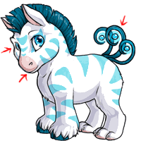
The head seems way too big, more fitting for the chibi version The pose is very boring. The face seems much to fat on the left. I much prefer the old version. nice lines and shading though (:

December 31, 1969, 7:00 pm by Lychee_277
User Avatar

hmmm i like the old one better.but at the looks of the votes i dont think the old will win. but still the old is better.

December 31, 1969, 7:00 pm by Roku_Sangria
User Avatar

I'm actually happy with this one 8D

December 31, 1969, 7:00 pm by fjorab
User Avatar

Ah, here's what happens when I don't read carefully all the way down. I guess seeing some of the other "redraw" colors, the face is similar - and I don't like those either. :-p I'm still used to the old basic Hikei and the Chibi version...neither of which have the poofy jowls showing. Maybe tone down that side just a tad and have the right jawline not go all the way down the nose-line? I really don't want to see the Chibi version go the way of the "cuddly newborn" My Little Ponies that are in toy stores these days...with big round chubby faces and stubby tiny muzzles. Ew. X-p But I'm OK with the regular MLP faces for the most part, for example.

December 31, 1969, 7:00 pm by Bowser
User Avatar

Actually after taking another look at parts of the Hikei I totally agree with most people that the tails should be moved down more and made a bit bigger since they appear rather small at the moment, should have seen that before but oh well. Also as some people have mentioned the lineart isn't exactly the smoothest and really that's only a slight nitpick but if it could be updated just a bit i think the pet would look even better. Like I said just a few tweaks and this'll be a much better revamp c:

December 31, 1969, 7:00 pm by fjorab
User Avatar

I like this except for three things. The first is a major turn-off: the right (our left) side of the face, it looks like it has massive hog jowls. The next would be to make the muzzle more like the original one, a tad larger with a slightly longer nose bridge. It would be nice for the hind claws to have some more definition, like the old one. I REALLY hope the change in the Chibi version is MINIMAL. It's one of the 3 pets that lured me to Subeta in the first place, and I would hate to see it get TOO cutefied.

December 31, 1969, 7:00 pm by Doe
User Avatar

I happen to like the old way the Hikei was drawn. I am a fan of chibi and that is sort of how this looks. It looks more like a pony now, to me. It's grown on me, though. I like that the body is a little larger and the hooves and feet are more visible, but the head seems a little big to me and, maybe it's just me, but I think the tail would look better longer.

But it is still drawn very beautifully.

December 31, 1969, 7:00 pm by AcaciaKumori
Avatar Border
User Avatar

I also agree with DreamsInPink. I tried the paper thing and just put my finger in front of the side showing and it looks amazing without it. Honestly, if there wasn't that side of the face, I would definitely love the Hikei. Before I was of the opinion that is was just a rainbow horse that wasn't as cute as the other pets, but now I know it would be adorable without that side showing. Try it yourself and you'll see!

December 31, 1969, 7:00 pm by missatralissa
Avatar Border
User Avatar

the head and body look all wrong to me. this looks more dog/cat like then the original Hikei, which i was under the impression was mostly horse. i have to say, if this revamp goes through this way i will possibly have to give up on the site, this will be the fourth or fifth pet of mine to receive an unflattering revamp.

December 31, 1969, 7:00 pm by Falorie
User Avatar

Well I wanted to say I was hoping for updates on that 'buff' version revamp, but after giving this one a good look over, this one is way better. I "heart: how chubby it is. With it tweaked in certain areas like others suggested (the tail, face, and maybe a slight tummy lift), I'd really be happy seeing mine updated to this. It's really nice to see it as just updated art, rather than a whole different looking species

Much love to the artist

December 31, 1969, 7:00 pm by Deleted User

Eh, sorry to have to say this but it looks like a small dog to me. First thing I thought when I saw this. The body is waaay too thick and fatty.

December 31, 1969, 7:00 pm by Satamoru
Avatar Border
User Avatar

I would like to agree with DreamsInPink - I used the peice of paper trick, and the look the Hikei has without the other eye showing really brings the whole thing together.

Everything else looks fine, to me - The Hikei always has had a sort of 'chibi' look, and I'm glad you stuck to that.

Leave a Comment

Use @username to mention someone. Supports markdown formatting.