<center><img src=http://www.subeta.net/images/hikei.gif></center>

New <a href=http://www.subeta.net/explore/polls.php?act=vote&poll=79>Hikei Poll</a> :o!

Please remember that we look for Constructive criticism! Saying that something is ugly doesn't help the artist improve it ;)

December 31, 1969, 7:00 pm by Elementary
User Avatar

I like it... somewhat. The art itself is great, but the shape/size of the head and the cuteness of it makes it look like a chibi pet. I think if the angle of the head, and perhaps length of the neck is changed it will look perfect [= The way the artist did the body and the legs looks really good.

December 31, 1969, 7:00 pm by Deleted User

I think it is great, but still needs a longer head to look more majestic. Same thing with the back. and like others said, longer tail and more dynamic pose.

December 31, 1969, 7:00 pm by Deleted User

It's not the big head that makes the revamp look off in my opinion. I think that it's the back eye, it sticks out a bit too much. Also, the back legs seem to be too far apart.

December 31, 1969, 7:00 pm by wraith_265
User Avatar

I don't like the head; I'd prefer it looked more slender and narrow, sort of more elegant, like the old one appeared. It would be nice if the tails were made a little bit bigger, too, to help balance out the image.

December 31, 1969, 7:00 pm by Flourescent
User Avatar

There's just some things I dont seem to like about it. For instance, the head is a bit too small and the muzzle is too short. For some reason I dont like the back feet and the tail's not as cute as before.

December 31, 1969, 7:00 pm by horizon
User Avatar

Aw I like the cute face. I like cute looking pets! The only things are the tail is a little high or something, like not placed correctly, the front legs are a little odd, and the head is a little fat and goofy. Other than that I really do like it. If the hikei has to change, this is a good redraw. Like I said, only a few little things that could be changed. Nice job to the artist!

December 31, 1969, 7:00 pm by Templar
User Avatar

NoirRaven, The Hikei always had feet like that;
http://images.subeta.net/pets/hikei_darkmatter.gif

December 31, 1969, 7:00 pm by Kage
User Avatar

Oh my gosh, it DOES look like a my little pony - although not as horrendous as they are now, looks like the old (good looking) MLP body style with the new head shape (new MLP = ///HATE/// but I still like this pic.) I thought the head looked funky, but I couldn't quite put my finger on it so I didn't say anything before. It looked really wide and triangular with the other cheek sticking out like that (actually kinda reminds me of a rattlesnake head, if that makes any sense.) One thing to remember when considering how to improve this revamp is that we don't want it to look too much like the Legeica. We already have a legeica. I would suggest moving one of the back legs, not the front.

December 31, 1969, 7:00 pm by Bellesgirl
User Avatar

The shading on this revamp is fantastic! However, the head is a tad too large and round. The body is sort of chubby, and it looks like it has bad posture. The previous one is proud and confident looking and is much more attractive. Even as it is though, it is and improvement. That's saying a lot as well, the hikei is one of my favorite pets.

December 31, 1969, 7:00 pm by MusIclOveR111
User Avatar

I like the new one a lot I think the animals should show more of the body like the new one does. The old one only shows the front of the Hikei. I vote for the new one

December 31, 1969, 7:00 pm by KeTTu
User Avatar

Well, I will say that the art is an improvement, but it is rather cartoony. It's just strange how there's been a rush of awesome and realistic-looking art, and now this. I'm not saying it's crappy, there's just a few things wrong. The pose makes it seem... kind of hunched over, as the old one gave it a more proud sort of stance. The side of the head with the other eye showing makes the head look a little funky, and the tails seem sort of short. Other than those little things, I like it =)

December 31, 1969, 7:00 pm by Varg
User Avatar

I really like this revamp. Perhaps it needs slight tweaking, but it looks good to me.

December 31, 1969, 7:00 pm by Jasper
Avatar Border
User Avatar

Can anyone else say "My Little Pony?" This revamp reeks of it. Which isn't necessarily bad but it will limit you when it comes to making this thing look vicious.

Cons:

  • Very short and stout.
  • Tail is rather short
  • Eyes look too large/eye mark is smaller
  • Head is too large/neck isn't long enough
  • Hmm... It could stand to lose just a little bit of weight...
  • Back legs don't look tall enough to support such a straight spine... Also, isn't the leg is supposed to be in front of the belly? The way you got it now it looks like it's going behind.

Okay, I gotta know. What the hell is with those back feet? Did the Hikei and Darkonite decide to switch body parts one day? o_ô

Pros:

  • Looks neither masculine or feminine
  • Coloration/Shading is improved
  • Better than last time but still needs work
December 31, 1969, 7:00 pm by alice_420
User Avatar

Hm, I am having a problem with the anatomy - it looks kind of stiff? I voted for the old one, for right now, but I love that we're redoing it. My personal thoughts are that (our) left eye is a bit off, compared to the angle of the head, and that the pose isn't dynamic enough? I also feel that the neck may be a little thick? I'm not a professional artist, and I hardly ever offer constructive criticism on art here, but I thought I'd put in my two cents this time. I must say though, I /adore/ the mane! It's beautiful =)

December 31, 1969, 7:00 pm by Sumire_147
User Avatar

I love the face and the new art, but I voted for the old version because the new one's pose is the only thing bothering me. It's just...kind of boring. I wish it was something more dynamic.

But great job with the art, I have no qualms about it

December 31, 1969, 7:00 pm by CaveAdsum
User Avatar

I'm not the best artist at all but I created a little suggestion how it could look better.

December 31, 1969, 7:00 pm by Jaaku
User Avatar

Some more work on the face would be good, because it looks a bit...mad? Anyway, overall I like the cute chubbyness, good job artist!

December 31, 1969, 7:00 pm by Deleted User

The new one looks like it has a lump on the left side of its face to the left of its eye. IMO

December 31, 1969, 7:00 pm by Mega
User Avatar

Oh I love it. And especially the hooves!

December 31, 1969, 7:00 pm by Kage
User Avatar

Kudos to whoever drew this, it's beautiful ^^ I noticed a couple of things, but I don't know how important they are. It seems kinda nit-picky.

  1. Although the art is good, the pose is very uninteresting. It also makes the hikei look kind of stumpy - even the pony has a body longer than the length of two heads. In every manga book I've ever read, it says chibis are two or three heads tall. By those standards this hikei, and probably a lot of other pets, are very chibi.
  2. It doesn't make sense to me that the hikei's ear should be pointing forward when its attention is clearly directed toward off to its left. The direction its ears point indicates attention given to something where the ears point to. With its ears pointed away, it gives the appearance that something else is happening off in another direction, and I think this detracts from the beautiful animal.
December 31, 1969, 7:00 pm by xoxoiloveme
User Avatar

Hmmmmm, it's a definate improvement from the original but it still has a few issuses. Like many people have already said it's head needs to be a bit smaller do it looks less chibish. And perhaps a larger tail would help, escpecially because the tail is so well shaded and drawn. Also, I think the stripes should go all the way down the hind legs so they look more realistic or even just placing the current ones in different spots would help it out. Overall though I think it is a much needed update on the old version. Good job.

December 31, 1969, 7:00 pm by CaveAdsum
User Avatar

I do not really like the new one.OK, it is better shaded and I just adore how furry and cuddly it looks. Overall it's better drawn but it lacks personality. It is too stiff, like a Horse on a Show which was brought to a proper stand. So it looks a bit constrained. I also have a impression of imbalance. At first I couldn't tell what the problem was, but I think everything its fine except the rear legs. Usually rear legs are a bit taller than the forelegs. Unimportant if it is a Horse or a African Wild Ass or any other four-legged Animal. That is why this one looks so strange! The paws should be bigger, so that they fit the rest of the Hikei. Then you should put more personality in its expression, maybe try eyelashes. Or let it twinkle. That are the reasons why I would prefer the old one!

December 31, 1969, 7:00 pm by Coydog
Avatar Border
User Avatar

Heheh... fuzzy butt

December 31, 1969, 7:00 pm by SilverSekhmet
User Avatar

Overall the form is pretty good, the only thing that is bothering me is that the stripes don't look like they are part of the Hikei, like someone just taped them on in some places (butt, face cheek)

December 31, 1969, 7:00 pm by Poet
Avatar Border
User Avatar

Haha, wild ass.

December 31, 1969, 7:00 pm by Deleted User

At first I thought the anatomy looked strange (big head, small body - like a chibi, as some have mentioned) but when comparing to the old Hikei, I'm going to say the anatomy is perfect. :/ The Hikei always did look funny to me.

But why does everyone think it's a horse? Sure, it's an equine, but I always thought it looked more donkey-ish. It's too small to be a horse.

December 31, 1969, 7:00 pm by PaintedSavages
User Avatar

Probably been said, but: Big giant head, squashed fat body, shading on belly and into the hind legs is too strong. Bigger tail might be nice.

December 31, 1969, 7:00 pm by Echo_818
User Avatar

Hm, don't like this one as much, though it'd make a great chibi. The face is a little too chubby for a horse in my opinion, a more pronounced nose would be better, more horse-like and less round. The front legs are far too fat around the ankles, but otherwise the body is cute. It'd be awesome if the tail were a bit bigger too. It looks fine, but it's so dinky!

December 31, 1969, 7:00 pm by Fuel
User Avatar

I love the new version (: Much more appealing, but there's just one thing that bugs me about it, seeing a little bit of it's other eye x) Otherwise great update. I'm not to crazy about the species itself, but this is definitely a step-up from the current.

December 31, 1969, 7:00 pm by Deleted User

I think it's perfect!No offense but I'm not as "picky" about a pet that I don't even have like some people.It's soooo cute please don't change it!I might get one!

December 31, 1969, 7:00 pm by Deleted User

When I first saw the news post I thought it was a chibi hikei. The head seems off.. I like Pants' idea of making the head smaller and the tail bigger. Maybe make the head more horse-like? It might also be the eyes making it look chibi. Overall I kind of like the older one better. Also, it looks more puppy-like than horse like.. But is there any chance of the artist changing it? I'm not the only one who thinks it looks chibi.

December 31, 1969, 7:00 pm by Jovian
User Avatar

I never liked Hikeis before, but I really like this C: I especially like the mane, for some reason...it looks a little too "cute" compared to the old drawing, I think, but otherwise it's a stellar revamp.

December 31, 1969, 7:00 pm by Camilla
Avatar Border
User Avatar

I voted old because the only thing I like about this revamp is the head. The body is way too compact/chubby and chibi-like. The head is cute, body...not so much. I'll have to find another species for Nightstalk if this one goes through...won't be easy since the Hydrus Hikei is perfect for him...sighs Still, nice artwork. Kudos for that.

December 31, 1969, 7:00 pm by Deleted User

I personally like the current drawing. I do not dislike the new drawing but I think it is much more masculine. I chose a Hikei because of its cute, feminine look.

December 31, 1969, 7:00 pm by Toni_675
User Avatar

This is the first revamp in a while that I have really, really liked. It's absolutely adorable and is built kinda like a shetland pony (which I have a horrific fear of), but the little orbs in the tail are the ONLY things that are bothering me. There's not much to improve on with little CIRCLES, however, so perhaps I'm just overreacting.

Maybe make them a bit more spherical? Idk, they seem terribly flat.

December 31, 1969, 7:00 pm by Deleted User

I personally like this revamp better than the first, because the shading is alot cleaner and so are the lines. And the style is really nice too c:.

December 31, 1969, 7:00 pm by Esperance
User Avatar

sorry artist but i only liked the head

December 31, 1969, 7:00 pm by Fincayra
User Avatar

*can't pinpoint why.

My bad. XD

December 31, 1969, 7:00 pm by Fincayra
User Avatar

While the art is really good as always, I don't particularly like this revamp. For one, I think the tails need to be longer and more pronounced, and for some reason it looks like a chibi hikei, although I can pinpoint why exactly. Maybe the lack of much neck, the stubby legs, and the chubby cheeks/head?

The art is very nice, but I just don't really like this revamp...

December 31, 1969, 7:00 pm by GlassesCat
User Avatar

It looks much better than the old one but like many others have said, it looks too much like a chibi pet. Perhaps making it's neck and legs a bit longer and thinner and making it's face less puffy and giving it a longer snout would do the trick. Also the tails could be a bit longer too.

Hope this helps.

December 31, 1969, 7:00 pm by Princess_Ashura
User Avatar

Overall, I think I like the new one better. It looks like it has more life in it with the shading of both the body and eyes. The pose of the original seems a little better or more natural though. There is just something a little off that I can't quite place my finger on with the new one but I do like the overall look of it! Nice job!

December 31, 1969, 7:00 pm by badger
User Avatar

Quote:

; border: 1px solid ; font-family: georgia; font-size: 10;">It's not a horse. It's based on the African Wild Ass.

Which is part of the horse family. 
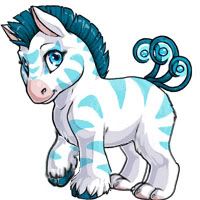
People will assume that the Hikei is based off a horse because Subeta pets, obviously, look different to the animals they are based off - and therefore it's fairly understandable that not everyone will realise it is, in fact, based off an American Wild Ass. o-o Particularly seeing as the Hikei (front end, obviously) does in fact look like certain stocky breeds of horses/ponies. In my opinion it looks close to the Przewalski Horse.

Plus, I adore Typhoon_Muffin's redline, it would be good if a few features from that would be noted and used. =) It just looks so much more in proportion, even though it keeps the slightly large head, but the body is lengthened slightly, which is probably why. It also looks more like an American Wild Ass. And the neck sorted out - and the angle of the right fore I pointed out in my redline.

December 31, 1969, 7:00 pm by Deleted User

i think it is a bit better then the old one but i don't like it. i think like most said the head is off. i like the old head better. i just think that it needs a little tweaking to the head, neck, and body length.

December 31, 1969, 7:00 pm by Harmoniousvibe
User Avatar

Not bad. I think the face needs to be a bit longer as does the tail. The one thing that I really don't like is that it looks kinda babyish, as in young, as in chibi. I know that the chibi version is different, but this one looks really really young.

December 31, 1969, 7:00 pm by SeriousGreen
User Avatar

Yes, this is a definite step up from the old Hikei...but, I agree that the head needs a little tweaking. There is a very odd line of dimension to the right side of the face (our left in viewing). It appears as though this poor hikei has a badly swollen cheek that juts out and doesn't follow a normal curvature up from the muzzle to the head region, which makes the face look oddly unbalanced. Perhaps, bringing out the forehead on the afflicted side would give a more proportionate appearance. Right now, its almost like a hikei version of The Phantom of the Opera with the bulging cheek and sunken right eye. Better yet, a slight turn of the head would allow for a more full-faced perspective??? As a proud owner of a gorgeous Spectrum Hikei, I would be happy to have my pet undergo an update, for the overall change is beautiful. But I would really appreciate the cheek/eye fix-up since I love my hikei's adorable bright-eyed face. I applaud the artist for trying to go for a more full-faced approach compared to the old one-sided image...a couple of degrees more, should add that realistic dimension. Kudos and congrats!!! =D

December 31, 1969, 7:00 pm by Poet
Avatar Border
User Avatar

I didn't receive my newsletter. I'll have to wait longer~

December 31, 1969, 7:00 pm by DarkFireFox
User Avatar

I think the eyes should be closer to the origonal ones, this one looks chibi actually... I think the paws should be revamped, i dont know how to explain it well...but they sort of 'curl' up more than they should. The tails should be a bit bigger, as with the belly. Its to bulged. I think the hair should also be resized into a smaller version. The front leg joint should be arranged at an angle much like what PonyCrazyHorseMad showed. :3 I think the hoofs are a little to big, but i really like how the fur covers part of them. It makes it look good. The chest is a little boring, i think it should be fluffier looking. Like a canine. And last, i think the small patch under the lip should also be colored like the snout. Good luck Subetateam! ^^

December 31, 1969, 7:00 pm by EMMA_778
User Avatar

I actually like the old version better. This new pose is less cute! And this one looks a bit...deformed, though I can't place why. If you went back to the old pose and redrew it, I'm sure there could be an improvement. But this one...not so much

December 31, 1969, 7:00 pm by Corgi
User Avatar

I don't believe we've ever told anyone not to go to .net, just not to .org.

News links will have a .net extension from now on, if you've received your newsletter

December 31, 1969, 7:00 pm by Wyld
User Avatar

Just do what I did change the .net in the address bar to .ws

anything can be fixed

Leave a Comment

Use @username to mention someone. Supports markdown formatting.