What pets do you think need to be revamped? v.2.5
Filter
Show Official Posts OnlyReplies
As is the case with all other feedback threads, users are welcome to comment both positively and negatively on the thread, including suggestions for pets, the nature of revamp feedback, or the existence of the board/brainstorming in the first place.
As users are continuing to discuss pet revamps and how such revamps are being handled, this feedback is appropriately located.
Thank you! :)
How are you counting the 'vote-in' system? Forum post likes? Actual additional votes? Like, do I have to post a list of the ones I agree with now?
also like 5/howevermanythousand subeta users doesn't seem like much. Why not just make a vote page and let everyone actually vote if that's how this is going to go down?
I'm counting forum posts that mention wanting the specific pet to be revamped.
And I like the idea of having a page to vote up/down pets that need attention! It would get everyone involved and it would be very clear/obvious which pets the user base wants revamped. The only issue I could see would be that nontraditionally cute pets (like say, the hippotu) would probably get "yes revamp" votes even though they don't need it.
Yeah, that's the issue I see.
I mean, the basic colors of the Montre need a revamp. However, the Montre is also the 2nd most popular pet on site, so a lot of people are going to vote "do not revamp", even if the pet needs it. The Archan is also 21st most popular, and while 8 Archan colors are on the 1st post, a lot of people might like the broken Archan as it is.
okay so im not gonna go through and see if a pet is newer than 2 years old because why should i have to try to figure out when it was released? if it looks off, it looks off, regardless of how old it is. feel free to ignore my suggestions if that bothers you.
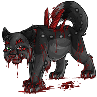
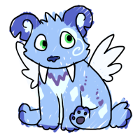
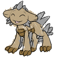
tigrean
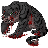 The mouth on this just looks incredibly off, and has always bugged me. It looks like either the bottom jaw is too far forward, the face is angled wrong, the teeth are in the wrong place, or it got hit in the face with a shovel and thats why its bleeding.
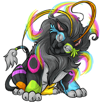
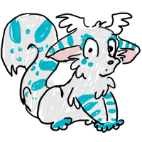
montre
 I'm pretty sure this was revamped recently but it just looks really... wrong? I can't even place why it is, possibly because of the super defined neckline, with the fluff looking like it only exists as an outline, on that one side. The shoulder is too pronounced, or the actual body is too thin. and then just, idk, the face? When you flip the image horizontally, you can see that the eyes don't look right, and the side of the face with the flopped ear is too big? not angled in the right way? something. the shading on the body also looks very plasticy, especially when compared to the tail fur or the head hair.
Not even gonna go into the dark matter montre, but still would like to see that one fixed.
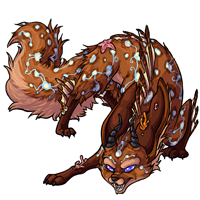
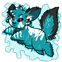
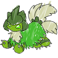
archan
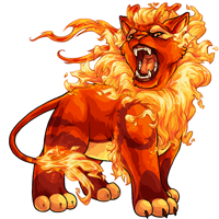
 also has a problem with the face, which is more obvious when flipped. I think it has to do with the fact that it doesnt look like hte jaw attaches to anything, and the muzzle just isnt very lion-like. Also, I think the whole species just needs a revamp at this point.
The special colors look like an animal that could plausibly exist
also has a problem with the face, which is more obvious when flipped. I think it has to do with the fact that it doesnt look like hte jaw attaches to anything, and the muzzle just isnt very lion-like. Also, I think the whole species just needs a revamp at this point.
The special colors look like an animal that could plausibly exist
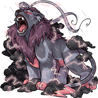
And then there is the regular color lion-on-steroids-with-a-sloped-back?maybe? Is it supposed to have a sloped back? Or a tiny waist? The common pose looks like it is part hyena or frog, but then all the new colors make it look just lion.
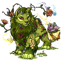
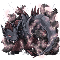
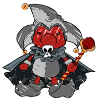
celinox
 Never understood why the darkmatter one had so much light color on it when the other similarly colored ones do not.
Also the crystals seem to be in a different place on the back in every pose? Some are in the shoulders, some are mid-back, etc.
Never understood why the darkmatter one had so much light color on it when the other similarly colored ones do not.
Also the crystals seem to be in a different place on the back in every pose? Some are in the shoulders, some are mid-back, etc.
 this pose makes no sense? even for a graveyard pet. the front leg looks like its placed on an invisible step, while the back-crease where the spine is, is aligned more with the back half, but the crystals are coming out of it? unless thats not the back crease and just looks like it, which then, the spine is still not in the right spot.
jollin
 Okay my friend pointed this one out to me and i have not been able to look at this pet the same since - that back leg that we can see, is very very awkward. it looks like its completely stiff and jammed into the ground, but with a leg that had broke and was fused together. it has like, no movement to it, in a pet that should look very fluid. maybe if the paw was turned the other way?
extras
also, the tail on the sweetheart kerubi just look really weird, and dosnt make sense to me. Or maybe its the stomach. idk. the back end just looks really off.
And the art staff should just get together one day and just look at all the colors side by side, and the species side by side, finding the ones that just STICK OUT, and make a list that way. Its what I was doing, but then I found too many inconsistencies and this list would have been hundreds of pets.
the lineart thickness and shading type seems to vary from pet to pet, color to color, even with brand new pets.
Take a look at the storm pets - The archan, popoko, clawison, kanis, look very flat, cartoony, celshaded,
while the Noktoa, serpenth, cadogre, escalade, are much softer, smoother lineart and more blended shading.
And those pets are all brand new, so I'm surprised at how different they are. I mean just look at the lineart differences
Also this;
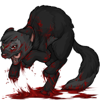 does not make sense at all, even for a weasel war dance, which is what i assume was trying to be done.
I'm afraid I don't have the means to check a pet color's release date. Nor do I know exactly what qualifies for "in desperate need of a revamp"? That is so subjective :/
Side note: while I adore well organized threads, I always thought staff went over our topics and edited their own lists accordingly. (Is there not an official, behind-the-scenes list?) I do think this is too much work for the OP, not only on this topic, but on every topic like this.
(Also, if it's meant to be only a "list up for voting" instead of "all pets revamp feedback", then maybe we should get those moved over to Suggestions? Or get a new area for those?!)
Anyway, my personal feedback is about scribble pets, that's one of my favorite colors. They technically allow for a lot more leeway, but I think some of them are way too outdated compared to newer ones and/or barely resemble the species they're meant to portray. D:
The Charlie, Clawsion, Kerubi, Keeto and Tigrean were some I found to be a bit dated at this point (but there's more too...),
SPOILER (click to toggle)
Especially when considered besides others, like the Donadak, Escalade, Noktoa and Warador (mostly new additions)!
cute new scribbles, just for reference!

I honestly doubt this will ever make "5 votes" so I'm not really sure why I'm bothering to mention, though.
Do post likes count as a vote, or do we have to post?
Either way, +1 to 's scribble pet comment

I actually don't like the "too clean" scribble like the Noktoa and I'd be sad if quirkier scribbles like the Charlie just looked like something that was messily done in a coloring book
I&;m counting forum posts that mention wanting the specific pet to be revamped.
Explanation: if a post mentions like 10 pets and the user is voicing an opinion about something, it's not really clear what's getting 'liked' on the post.
Here's what I have so far: Common Mahar: 2 (, ) Chibi Montre: 1 () Darkmatter Celinox: 1 () Graveyard Celinox: 1 () Hydrus Jollin: 1 () Scribble Charlie: 2 (, ) Scribble Clawsion: 2 (, ) Scribble Keeto: 2 (, ) Scribble Tigrean: 2 (, )
Edit: The BR tigrean and pherret aren't two years old yet, so I've taken them off the list. The reason I have that listed in the guidelines is to prevent newer artwork from showing up on the thread.
We do have our own internal lists of what needs to be done, we always have had. As I've said already, a thread like this may influence an artist on which revamp they attempt first, as opposed to which one they are going to do - we already have a good idea of which pets need revamping or slight touchups. But when I see multiple pages of people requesting archans and not so much manchus (even though I feel they both are in need of a revamp) I am given more information as which would be more beneficial to the user base to complete first.
My suggestion to create an organised thread such as this was based on the amazing voluntary work I'd seen done on threads like theTribute Items thread - it was not something required, but something that I thought would be a lovely addition if there was somebody who would like to put it together. There are people who enjoy creating organised lists, and this was something that could have benefitted different groups of people.
I apologise if my clearing out of some pets in the first thread came across as a power trip of some kind - that was not how I felt doing it at all! I was reluctant at first, but it was requested and so I took out 5 pets that I would have liked to hear more opinions/reasons for revamping through people’s voting comments. I had no intention of ever touching the OP again, this was a one time thing intended to set ’s thread in the new direction.
I do not want people making and upholding these threads if they aren’t enjoying running them. They are under no obligation at all. I also do not want to dictate users feedback. As such, I am going to return to keeping my own notes, and keeping an eye on what you guys want without getting directly involved. (Unless I am asked a question that I can reply to, or if I’m posting as a user - because I do still play the site, and I still enjoy pets and artwork!)
Rah image drawn by the dear !
I would LOVE to see Experiment get an update! (That's the penguin looking one.)
Other pets that are at the top of my want list for revamps are: endeavors, archans, and rreigns.
[tot=Gryphon]
I apologise if my clearing out of some pets in the first thread came across as a power trip of some kind - that was not how I felt doing it at all!
I've taken the rule off the first post- it made more sense when the board was started, but with the new system it does seem limiting. :)
I know it's already been added to the OP but I just want to agree that the common pose / colorfill Charlie needs a revamp badly. I'm pretty sure it's looked the same for the past eight years. I really like Charlies and I would love to see the common one looking as fresh as the new colors.
he/him / 31 / EST |  | My best friend is |
It's helpful to know that more users are interested in specific species revamps, even if they're already listed! Thank you for the extra input.
I don't know how old it is, but I would really love to see a tweak of the common fester and all the ones that are basically recolors of the same art. Something about the eyebrow ridge and the big anime eyes seems out of place on what's otherwise an excellent vulture design.
And I know it's already in the first post but I also definitely support some work on the default illumis and all its color-swaps. It kinda looks like it was drawn with a marker and the blacklight, galactic, glacier, glade, and graveyard art especially are so good that the original design looks even more in need of help by comparison.
As far as I know, the common fester was revamped sometime in the past three years (I'd say even less) so it's pretty fresh still and there are no actual art or anatomy issues. The eye style I'm guessing carried over from the previous design, though it's toned down. It used to look much more anime as you can see below.
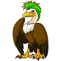
Personally I'm not on board with changing the eyes because I don't feel it would look like a Fester anymore? They're not obscenely oversized, just slightly.
Thanks for the old art! You know, comparing the two, I think it might just be something about the new!fester eyebrow ridge that's messing up their eyes for me. They just have these almost gorilla-looking eyebrows - I can't really put my finger on it any better than that though, I'm not very good at art terms. ._.
It's definitely not something that should be more than a low priority, if anything, but it is something that I'll be avoiding those colors for. Some of the newer?/"fancier" colors seem to be smoothing that feature a little, or even a lot, too.
No problem! I do see your point though-- personally it doesn't bug me enough to put me off of having a fester, because I remember the old festers and I find this one so much better.
I think a lot of it was trying to give it a mean expression and just being a little too heavy on the shading?
That seems right! Squinting at it, I think the gorilla-brow thing could probably be sorted out with a minor shading adjustment or a tweak to one line (maybe where the brow meets the beak). It just, yeah, seems a little too...3D? even for the piercing hunting bird look the artist seems to have been going for.
With that said, again, the entire rest of the new!fester is really excellent work.