What pets do you think need to be revamped? v.2.5
Filter
Show Official Posts OnlyReplies
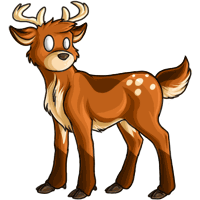
Oh boy, all of the standard Antlephores need some love. I've been using Subeta off and on for over a decade and I don't think the sweet Antlephore has been touched except adding new colors in the meantime.
 [/link]
[link=https://twitter.com/thespacejamber]twitter[/link] || [link=https://twitch.tv/thespacejamber]twitch[/link]
[tot=thespacejamber] || [tp=thespacejamber] || [egg=thespacejamber]
[/link]
[link=https://twitter.com/thespacejamber]twitter[/link] || [link=https://twitch.tv/thespacejamber]twitch[/link]
[tot=thespacejamber] || [tp=thespacejamber] || [egg=thespacejamber]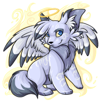
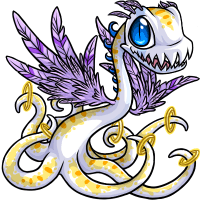

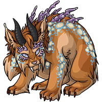
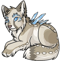
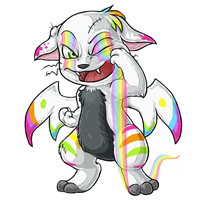
These guys! Imo they either look squished, a bit awkward, outdated, or the lineart just doesn't seem to match the others. I looove the angelic colors and would love to see a revamp on a lot of the species!
[editing this part, turns out Subetalodge just doesn't have the right image for the galactic ontra]
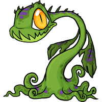
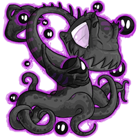
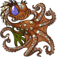
Speaking of ontras, the tail fins on the blacklight and spectrum are way too small. Others where the tail fins are a little too small, but not as bad as the spectrum/blacklight: angelic, darkmatter, nightmare...and maybe storm which also looks like the tail is a bit too long but it might just be my imagination?
I mean look at the blacklight compared to a some of the others
 vs.
vs. 

 I know the tail is farther away in the blacklight/spectrum ones but the fins still shouldn't be that small.
 </p>
</p><p>
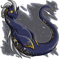
Galactic Ontra WAS revamped, though, I own one!
Oh I see. It just hasn't been updated on Subetalodge then.
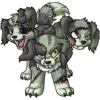
[edit] (editing since no one else has posted after this yet) EVERY SINGLE LASIRUS NEEDS TO BE FIXED! I don't have one so I hadn't noticed, but the new angelic lasirus revamp made me realize they all have that weird elbow-finger bone that people always mistakenly draw on bat wings! I know lasiruses aren't bats, but having that bone there just doesn't make sense and looks like it might hinder movement. They're wings, not fins.
Compared to the newer style of art I can understand why people are requesting a revamp of the Antlephore but I do NOT look forward to it. PLEASE if you must revamp it keep the proportions the derpy look in its eyes and its pose. I would ask you just not change a thing but then it wouldn't be a revamp. The only thing I might maybe change is to smooth out the gradient changes to create the shadows.
If anyone keeping tabs on this thread would be willing I would love to see a thread showing the history of revamps around Subeta. Especially since I would like to look back and remember some of the designs I loved and lost to revamps.
<p>If anyone keeping tabs on this thread would be willing I would love to see a thread showing the history of revamps around Subeta. Especially since I would like to look back and remember some of the designs I loved and lost to revamps.
it's not fully what you're looking for (and also six years out of date, oof) but the neocolors site has a history of the base pet revamps to skim through! I have a few oldies of beloved colors saved in a hard drive somewhere, but don't have access to them atm, that would be a fun thread to look through though!
[egg=roadkill] | | [tp=roadkill]
Thank you for sharing that link!! I just scrolled through the old designs and, man, was it a blast of nostalgia! I completely forgot about the Fester's green mohawk! Some of these old poses are still so charming!~


 The art on the fresher celinox colours is all stunning, and I'd love to see these guys join that standard. Especially love the concept of the crystals on the galactic, there's a lot of potential there.

 Swampies need more love in general. This one could use a revamp, but I'd also love to see them in more colours. The sheeta speaks for itself. The keeto is such a good concept with the aura colours, but the face looks pretty dated.
 These ones are closer to the current style, but feel a little stiff and could benefit from a subtle refresh.
 And these are even more current, but imo could use some small tweaks. For the legeica, I think that's just a small adjustment of the back height/slope - its face is so pretty and I really want to love it but there's something up with perspective, I think carving the back out just a bit lower would do wonders. The pherret is one of my faves but just needs to match the new species design.
And then a few things feel off about the hikei - the cheek stripes are missing, and the fire doesn't cast a glow effect on the rest of the body. The mane also feels anticlimactic - like it's pretty small as reborn fire goes, and not blowing/sweeping back in a way that feels mane-like. I think part of that is a space issue, which in turn I think is because the head is a little on the beefy side. The detail is gorgeous, but I'd love to see a dramatic mane more in line with the old one, and some amount of light cast from the fire. If the body were a little darker again that would help facilitate the lighting, plus the stripes would pop more. I also think it could look SO cool if the tails were lighter again and got the same kind of glowy ember effect as the donadak's spikes. At the very least though it needs its cheek stripes back.
 **donadak here for reference only, she does not need a revamp
, I'm so scared of revamps for the Celinox base and those specific colors! I LOVE everything about them. They're some of my very favorite species / color combinations. But, I do see how the lines and colors could be tweaked a bit to "update" them without really "changing" them. I still fear the "update" though because they're so perfect lol.
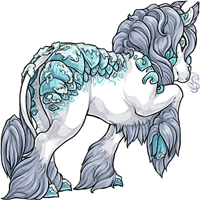
I would love to see a revamp of the glacier celinox though! The proportions have always seemed off to me, and the "vibe" doesn't feel like it matches the others of this species. The bloodred as well has always seemed a little off and kinda ... bloated? to me as well. And the angelic facial proportions / expression could handle a small adjustment.
everyday deeds of ordinary folk,
that keeps the darkness at bay.
Simple acts of kindness and love"
The Hobbit (film)
that's valid! My hope for the hydrus especially would be for a subtle refresh of lines and shading, that pose is perfect. I agree about the glacier, something about the way the head and the body connect is funny, like there isn't really a neck? There's a lot of cool potential with the ice shards there too, I'd love to see a full revamp with a new pose/concept. The bloodred I don't mind as is, but I wouldn't mind seeing a slight refresh either.
Ohhh, valid!
everyday deeds of ordinary folk,
that keeps the darkness at bay.
Simple acts of kindness and love"
The Hobbit (film)
Don't mind me, I'm just here for the forum post. LOL.I probably would agree with the Endeavor as others have said.
 Galactic and Darkmatter are already in the OP but I feel like the Glacier Charlie could also do with an art refresh.
 Hydrus Charlie was revamped a while ago, but the pose looks off to me, the head makes it look like its leaning and looking upwards whereas the old one was leaning and looking forwards. Old Hydrus Charlie for comparison.
 Bloodred, Spectrum and Scribble need at least a tweak to their wings to match the current Charlie design. Someone already brought up the Spectrum Charlie on page 13 and I agree with them saying it should be revamped to be closer to the original (I might be biased because I prefer the original design to the current one).
Edited to add the other two Charlies I have problem with.
Most of my beloved Bumbii are in good shape, but I def think Hydrus Bumbus could use a bit of freshening up?
ough........ i kinda feel like i'm not "allowed" to have an opinion about this since i've only been around for like a month, BUT!!!
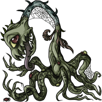
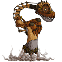
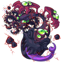
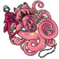
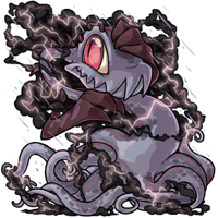
aeanoids are SO COOL conceptually (and in obtaining method!!) but almost all of their artwork is just....... very dated i feel. not bad, just kinda..... flat? stiff?? it doesn't really fit with more touched-up designs, especially the few newer (i'm assuming) aeanoid colours!! the design legibility of the graveyard and steamwork aeanoids is a bit off too imo and kinda makes it look like they have only one eye (unless that was the intent?)

compared to the likes of riftborn, sweetheart and storm, which i think look amazing:
(maybe i'm a bit biased bc those are just some of my fav colours overall HAHA)
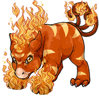
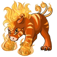
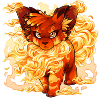
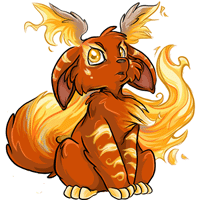
Look at these gorgeous creatures:
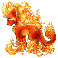 Detailed, intricate, and intense flames, lovely coloration that makes the pet seem to glow like an ember, and shading that implies the flames are a light source!
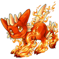
 Fluffy cheek ruffs, well-defined headwings, and a floofy tail!
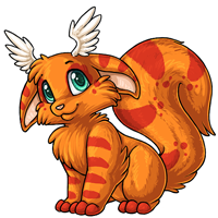
And you look at:
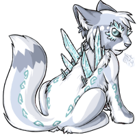
 Dull orange color closer to a Sun Kerubi than a Reborn one, fire is simplistic and doesn't really seem like fire, and shading is outdated. Cheek ruffs are droopy, the tail is lacking floof, and the headwings aren't well defined. Also, what is with the gray streaks in the tail? It doesn't even look like ash; just like the pet is old and getting gray hairs.
Please give the reborn Kerubi an update?
* Gives her pets stories
|
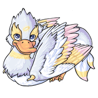
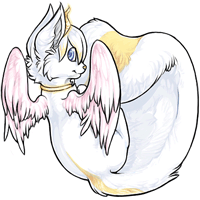
Oof some Sheeta love is needed.


For the record, I quite like the Angelic, but in this era of anatomically reasonable wings that we have entered, those need some work. The base (and I assume the re-colors would be included) and chibi are already in the first post.