
December 31, 1969, 7:00 pm by
Rabbit_Insanity

I love it its SO cute. much much much better then the old Ruffie. I don't like the old ruffie its so.. bleh. This one is cute and not bleh.
December 31, 1969, 7:00 pm by
Luka

I don't think I like those colors, but this is propably only habit. I like the pose.
December 31, 1969, 7:00 pm by
Deleted User
It's definitely about time for this guy! heheh I love the eyebrows!! 
December 31, 1969, 7:00 pm by
Jenflower

Ack @ revamps. I'm still mourning the loss of my adorable Turdle!
Well, I like this revamp a lot actually. Does the back leg need a tweak maybe? The joint line or the black line between the leg and body seems to be going up a little too high. Maybe. The colors are so nice and I actually have no issue with the ears. The face is so adorable - cute mouth, eyes, expression. Very nice, Rah!
December 31, 1969, 7:00 pm by
Rah


Honestly - working with a pet that only has two colours (and one of those colours being WHITE) is the most HORRID process when we have these gorgeous palettes with so many options.
I really really think you guys will appreciate the markings more when it comes to making other colours  For now it seems like a big change, but if you try to see past that to the colour potential this one has over the old one, I think you will be happy!
And I can remove the eyebrows if enough people hate them xD But I think they're so adorable!
December 31, 1969, 7:00 pm by
SailorGundam06

I voted for the new one because I like the drawing style and the shading. The pose is adorable, too.
However, the eyebrows don't cut it for me. They look odd. Also, I don't think the color should have been messed with as much. I kinda liked having the Ruffie blue. It made it a little less 'common'. Yes, I know this is the 'common' color, but I think it would be cute to have him still be a more fantasy color.
December 31, 1969, 7:00 pm by
tasogare

I voted for this revamp, but like many others, I think the colors should be tweaked a bit...the eyebrows are kinda odd though 
December 31, 1969, 7:00 pm by
Lea


Wow, um... I think it's a great improvement over the old one, but like people have said, it's just... too different. I think it'd be a lot better without the markings. Somehow, they just throw me off and make it seem less... Ruffie-ish to me. The color of the ears doesn't work for me, and... the more I look at it, the more I think the eyebrows should be in the light color of the paws rather than the blue color. I think that'd look better. IMO, it's a major improvement and very cute, but the markings are a bit much, something we could've done without.
December 31, 1969, 7:00 pm by
Seerow

I rather like the tan and blue once I got over the initial shock of seeing an almost-blue-Ruffie get changed to this.
The blue color used here is amazingly close to the actual blue color dogs have.
December 31, 1969, 7:00 pm by
Deleted User
I can see why people don't like the colors. To me, a different shade of blue might go nicer with the tan, but would look less realistic. :/
I sort of like the spots too, since it gives him a less plain body. They seem strange, but I think that might be because the current Ruffie doesn't have them. I do wish there was a spot on his left hip though, but I have no idea why. 
December 31, 1969, 7:00 pm by
Deleted User
err... i dont really like the colors. it looks kindof... grey... and it looks kinda scruffy. i liked the bright color and the strange but lovable poofiness of their fur. im not saying its a terrible picture, but i prefer the old one.
i gotta admit, the anatomy is really nice. it really looks like a dog its just the fur, i guess.
December 31, 1969, 7:00 pm by
Elijah

Woah.
I like it. But the colors freak me out a little. xD
December 31, 1969, 7:00 pm by
Deleted User
i'm glad the ruffie is getting a revamp but please do something with the color. ewwwwww tan with blue YUCK!!!
December 31, 1969, 7:00 pm by
Jounetsu

Don't like the colors... :/ mmh
December 31, 1969, 7:00 pm by
Baa

OMG! It's ADORABLE! I love Ruffies anyway but the new version is just SO pretty...before it was kinda like "I'm a dog-like thingy" now it's like "I'm a dog. Don't you wuv me?"
The colours are much better and it looks less like a cartoon and more like something that could exist. I actually WANT a fifth pet now...lol...
December 31, 1969, 7:00 pm by
Treepunch


The eyebrows are the one thing that almost had me voting for the old one. They look incomplete to me. >.< You should make them all one color [the blue or the tan] instead of some weird spotty combination of the two. Upon first glance, it looks like the blue ovals are the ONLY bit of eyebrow, and that's just silly.
But overall, it's a nice change. I think it's adorable. Except the eyebrows >.>
December 31, 1969, 7:00 pm by
Deleted User
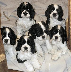
well, that last post didn't work.. http://www.zimfamilycockers.com/SixBlackAndWhitePuppies.jpg
I basically said that if you look at spaniel puppies, bernese mountain pups, labrador pups, etc, the face looks perfect. Puppies have really flat, short faces actually. This looks great to me.
And I think the colors are good, because the pale blue/white combo is so reminiscent of the really old-style pets (old kumos, anyone?). If the pets are goin to be updated, make them brighter and bolder, and the tan/blue does just that.
Actually looks a little like a coonhound now or an aussie
December 31, 1969, 7:00 pm by
Esmeralda_387

Loved the design and the pose..
but this face kinda scares me ;-;
looks like "ohohoho i'll eat your heart when ur sleeping o:" for me :c
but...he's so cute çç
i can't choose my vote </3
compared to the old one, this is better; i dont really like ruffies at all.. but the old really needs a revamp
i don't know ..
December 31, 1969, 7:00 pm by
Pink


I personally don't like it, but it's better art than before.

December 31, 1969, 7:00 pm by
zlau

THis has to be my favourite revamp ever! I LOVE it.
The eyebrows do bug me a little though.
December 31, 1969, 7:00 pm by
Seerow
I hope he doesn't get any bigger eyes, the eyes are already huge Big anime eyes scare me and if these get any bigger they will cross into over into that category.
December 31, 1969, 7:00 pm by
Bagheera23608

Ok I DO like this one better. I like that it has teeth. I like spots and eyebrows, lol! But the color is a bit weird and I am usually the LAST person to complain about anatomy since I can't draw a stick person but the paw is odd. Thanks for asking!
December 31, 1969, 7:00 pm by
Twi

i'm not a fan of the eyebrows... found a picture of a Bernese mt dog (one of my faves) and as you can see, the eyebrows kind of feather out in an upwards direction. not across the brow like a human. hope this isn't too huge 

that's my one and only critique... Rah, you've done an amazing job with the Ruffie!
December 31, 1969, 7:00 pm by
Deleted User
All I have to say is Awww!!!!
ok thats not all.. but thats what first came to mind lol.
I like this coloring better than the blue, it gives it a little bit more.
The spot are cute and a nice cluster, not too many, not too few.
Perhaps the eyebrows could be moved a little bit further apart.
The ears are nice and fluffy, and the way the coloring is done fits.
And the paw in the air reminds me of my Dalmation and the first time she stepped into wet grass (or when she is going to paw at me to throw her frisbee)
Nice Job. Can't wait to see it happen.
December 31, 1969, 7:00 pm by
Deleted User
I like the pose, but not the colours. Other than that it looks awesome =D
...
Oh! EYEBROWS!
December 31, 1969, 7:00 pm by
Windfall

Wow, I'm suprised at how many people don't like the color. I personally love the color combonation. :3 Having a ruffie as a pet myself, I'd love to see this re-vamp go through. And it's great that it looks different from the original color combo since the old one pretty much looked exactly like dusk and therefore made the dusk potion/elixirs useless for a ruffie.
December 31, 1969, 7:00 pm by
Keese

I chose the old. The other style looked more like an actual creation, with the colors, rather then some cartoon dog someone decided to draw. I say stick with the older colors, and it'll be better.
December 31, 1969, 7:00 pm by
AcaciaKumori


Rah, when you put it that way, I can live with the tan. =)
I actually hadn't thought of it that way. ^^"
As for position... his right forepaw needs a little tweaking. Right now it looks like he broke it. ;_;
The tail needs to be lowered a little, as of now it looks like it's not centered.
And slightly bigger eyes. I previously suggested the style of the HA Timid eyes, since he's a puppy.
That's all I can see at the moment. I hope it helps, Rah!
December 31, 1969, 7:00 pm by
Rah
Ooh Seerow, nice crit on the marking just below the ear. You're right, removing that would definitely work!
December 31, 1969, 7:00 pm by
Deleted User
Rah, I do like the eyebrows, but compared to the spots on its body (being the other lineless additions), I feel like the eyebrows look much "softer." The largest spot has such a nice "crisp" look, but the shades of the eyebrow seem to fade together, at least on my monitor (or to my eyes I guess) and I think they kind of look out of place (with the shading) compared to the rest of the Ruffie.
I don't know if anyone else agrees, but there's my opinion for ya. I do love this revamp though ^^. Glad to see you were finally able to get it out to the polls.
December 31, 1969, 7:00 pm by
jeazard

I like the new colors, but the pose looks a lot like the Nightmare Kumos, same way he lifts the right paw. The the legs look to short and he's too chubby for my taste. Artwise it's better than the old version, but it's so full of stuff I don't like that I'm gonna vote for the old one. Good idea, could have been executed better.
December 31, 1969, 7:00 pm by
Deleted User
<img src="http://www.zimfamilycockers.com/SixBlackAndWhitePuppies.jpg>
Hopefully the picture works...
I don't see anything wrong with the head at all. A lot of people say it looks flat, or oddly shaped, or that the ears don't seem right, but if you look at young puppies, their heads are shorter, flatter, and the ears are much floppier.
I think this woud be a wonderful revamp, and I might even consider getting one, depending on the colors.
Also, the color change is nice. The pale blue/white is too much like the older-style kumos, and it just is too reminiscent of the old art. If all the pets are being updated, brighter, bolder colors are needed, and the spots are cute
December 31, 1969, 7:00 pm by
Tropicandy


Rah~I would leave the ears alone. They would look odd if they had a tip or were lighter.
December 31, 1969, 7:00 pm by
Seerow
The colors are growing on me since my last post actually And you are right, the blue can be kept in the Dusk version (why do I always forget about dusk?).
Anyway, I think I would like it better if only the tips of the ears were kept the blue color. They look a little odd with them being fully blue. My first thought on seeing them was "wow, that's a large bow its wearing...".
If the tips of the ears are kept blue, I would move, remove, or make smaller that splotch on its back by the ears. Its a problem now too. The black line just doesn't define the two spaces enough for me and makes it look like some large ear run-on thingy or something.
December 31, 1969, 7:00 pm by
Christina

Erm. Not horribly fond of the colors. o_O At all, actually...
Besides that, it's nicer than the old one, since it fits better with the other revamped pets and so forth.
December 31, 1969, 7:00 pm by
Aras_887

The more I sit here and look at this the more I'm getting used to the dots/eyebrows. I think I know what threw me off though, I know dogs have those spots, I've had tons of dogs in my life, but maybe these ones need to be stretched a bit? That way they are similar in length to the eyes?
December 31, 1969, 7:00 pm by
Warlocked

If we're just critting on marking placement.. I would like the ears to be the same color as the base. ;x Other than that, I dare say I could live with them.
The ear markings just really threw me off.
December 31, 1969, 7:00 pm by
Tropicandy
Mmm I voted for old. Like a few have said, the back leg and claws are a little off but can easily be fixed. My real issue is just the color choice. Why did it go from blue and white to nazy and tan? The marking change seems a little too steep. Maybe do a simple blotch on the back?
I also think the eyebrows could possibly be as long as that odd light tan area around them. It looks like they were drawn out first in light tan then waxed off.
Overall, I love the shading and face
December 31, 1969, 7:00 pm by
Deleted User
Cute! Not so sure about the new markings (just because it's a bit of an extreme change from the original) but overall it's totally adorable and I like it. If the special colour Ruffies end up getting a revamp too though I just hope the graveyard one will continue to have 3 heads!
December 31, 1969, 7:00 pm by
Jio


Rah, dahlin', it looks FAB. If I liked ruffies at all, I'd get one now. =3
December 31, 1969, 7:00 pm by
Crysti

My hubby's dog has eyebrow marks too, and she's a very pretty dog, so those look somewhat normal to me. But I can't honestly say I know much about dogs' faces, except for the 2 we have. shrug
December 31, 1969, 7:00 pm by
Rah
As far as the colour scheme goes - I would like it if you guys would try critting the placement rather than the colours if you could? (that is, the idea of the spots, and the eyebrows - which some have already mentioned anyway, and the whole of the ears being darker rather than just the tips being lighter). I went with an odd colour scheme because no other subeta colour has this colour scheme.
The thing is with blue based pets is that making them dusk is such a pain. And angelic. And galactic. BLUEBLUEBLUE. I've had this problem with a few of my other pets that have blue bases. It's just nicer for me to have a bit of difference
And in all honestly, who is going to get a Ruffie and keep it common? Tan and blue grows on you...honestly! xD
OH and yes. Eyebrows. Because rottweilers have them. And bernese mountain dogs. And dobermans. And my own dog xD SO SO CUTE.
December 31, 1969, 7:00 pm by
Aicona

I don't like the eyes, they look...plain, and the muddy blue fur color. Ohwell.
December 31, 1969, 7:00 pm by
Deleted User
nope. I don't like it. I like the original. Even though it doesn't have any eyebrows.
December 31, 1969, 7:00 pm by
Natsu_792

[img]http://img.photobucket.com/albums/v124/NatsuChan/subeta/ruffie1.png[img]
Just a slight color change.
December 31, 1969, 7:00 pm by
Nectaris

I like this, the possible revamp is a pet I could at least respect, even if I don't want one.
December 31, 1969, 7:00 pm by
AcaciaKumori
I like the new style, but NOT the colors! Please use the original color scheme. D8
I like the pose, the eyebrows, and the fluffiness, but I think the eyes should be a tad bigger. Perhaps more like the HA eye style; Timid?
December 31, 1969, 7:00 pm by
Mryddian

I rather like this revamp, not enough to get one though
I think it's head looks a bit off though.
December 31, 1969, 7:00 pm by
Deleted User
I personally don't like it. I'm sorry but... There are so many things about this Ruffie that are disproportional. When I first saw this my first reaction was "Eww. :<"
It's right ear looks like some invisible hand is pulling it down. It should really be brought up a little higher and angled a bit to look like it's rolling off the side of it's cheek instead of it looking like they always HAVE to be over it's face. And speaking of ears, what's going on with it's left ear as well? It looks like you're trying to make them look like they're going up but at the same time having them flat against the side of it's head.
It's muzzle is way to oval like, and it's chin is far too round.
And what's going on with that paw? Dog paws can't twist that way and to me, while all the other paws have 3 individual toes, due to the paw pads, the right one looks like it doesn't have any toes at all. Like it might as well just be a blob or something.
As far as the colors go, I liked the old ones better, but that doesn't mean I won't get use to these. I like the two completely different colors joining together to help it stand out more. I can only imagine how cool the other colors for the Ruffie will look with those patterns. Unfortunately I don't like the shading either. It's really messy. Perhaps dumb down on the fuzzyness? I know the Ruffie is supposed to be fluffy, but maybe you went a little overboard there? Plus I noticed that you're outlining the first layer of shading. What's up with that? That's totally unnecessary.
There are more things I could point out about this, but they're really hard to explain what I mean, so I just listed the main things that really bother me.
Would the eyebrows look less... well less there if it was a dark tan maybe? XD