Montre Revamp Feedback Gathering
Filter
Show Official Posts OnlyReplies
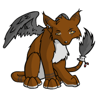
i prefer the older one. it looks more animated. it's more interesting to look at

I like the fact that it's more detailed, love the wings! I feel like the feathers on the old tail are nicer though, the new ones aren't accentuated enough I feel. And perhaps you could keep the chest fur a lighter shade?
What I prefer about the older one is that the posture looks more wild whereas this one looks tame...
[edit] Reading through older comments, it seems like a lot of people agree with the personality of the species doesn't feel the same.
And lol, it does look like it has a pot belly XD
And sorry if I wasn't meant to ping directly. Just did it out of habit D:
I have no issue with the overall look except for the muzzle which I agree looks a bit too much like a bull terrier for my liking. I always pictured montres as mainly being fox-like in their original incarnation so it doesn't really suit how I pictured the montre's overall look personally.
I also agree that the head does seem a bit oddly placed and like it's floating on the body rather than actually being attached as well.
Otherwise, I do like the rest of the body though.
The shading is a definite improvement (love the wings!), but as a few other people have already said, I kinda prefer the pose of the old one. I liked the bit of a hunch, which gave it personality even with a relatively blank face. Also, the way the front legs were drawn, while not anatomically accurate, make the montre look thin and tall. The roundness of the new one (the belly and chest, the shoulder)… well, I do feel like the new montre looks more generic.
I agree with the loss of the character qualities portrayed. I think it's the pose of the head and ears specifically in the revamp . Maybe if the head were a little more facing forward? And if the ears were less defensive (their tilt back reminds me of a scared animal) and more attentive like in the original?
It almost looks like the head doesn't quite match the rest of the pose, though--like it was pasted on from another version?
The body looks great. Shading, added details, etc are wonderful. The body pose seems a little more proud and confident than the head/ear positioning portrays.
[tot=Apanda]
I like the original stance and personality- Montre looked mean and intimidating and now it looks like a dog. The style needs updated with the new lines and shading but keep the mean expression- I do like the larger wings however, they look more functional.
It is really beautiful artwork but I absolutely don't like the pose at all. It is too stiff and rigid. It would look better if it where more hunched over. I also liked the sly expression it had which was created by the angle of the head and ears. I also see the Montre as something of a night-thing so I liked the slightly bigger eyes and ears of the original much better. It should also be more slim with longer legs, I liked the foxlike look it had and now it looks more like a dog. In the original the wings were more spread like it was about to flap them, this is now lost. Maybe spread them a tiny bit more?

I love it. My only observation is that the face/snout looks a bit off. Flat.
[img align=center]https://media1.tenor.com/m/EMKsXnPadg8AAAAd/emmrich-emmrich-volkarin.gif[/img]
PSA to everyone complaining about how stoic the Montre revamp is
First line of the Subetapedia, yo.
To me, there are 99 problems with the Montre revamp, but the stoic part ain't one.
The new one is really nice, I like details and shading yet I voted for the old one as it seems to have more character. The revamped version lacks mysteriousness and the glance is not as piercing. The original montre resembles a feral creature and the new one looks more like a pet.
[edit]Edited for typo.
[tot=BLACKBIRDS]
I voted old. The shading/coloring is an obvious improvement. But it stops there. There's no grace or "leggy wolf" look to this redraw. It has a pitbull head and not a wolf like head. I actually like the smaller wings. I like the larger eyes and the slouchy pose on the original as well. I have 9 montres. I'm invested in this. I have montres because I like montres. I have Kumos because I like Kumos. But this looks like a montre/kumos hybrid and frankly I'm not interested in that. All I ask is that artists SERIOUSLY consider the redraw suggestions from users on this pet. Please? You can redraw it without recreating it. Enough said.

While the art is lovely, I do have to agree with the fact that the older one has more personality. Even if it's meant to be "stoic", the older one pulls that off better. This one just feels kind of flat to me.
I actually LOVE the flatter looking muzzle, I think it gives a lot more character to the face actually? But what I miss is the kind of 'sulky teenager' hunch. I wouldn't say I want a return to the splay legged super sulky original, or for the Montre to look like an unhappy dog, though. The revamped pose reads more like "haughty cat" than "mysterious dog". It may have to do with how closely the front legs are tucked? Just a thought.
❤️tumblr❤️ ❤️About Lexigraph❤️Avatar Archive❤️
Just re-posting my News comment:
The face reminds me too much of a bull terrier. The muzzle is too flat and long, somehow 😔 It's the only thing really that bothers me about the revamp.
I love it! Specially the wings! I do see some things that I'd like to give feedback on, though.
There are only three things that I would look into when thinking of change:
- The nose makes the muzzle look to long and downward-directed. I think having the nose a bit higher would make it look more similar to the original desing...
- The eyes could be a tiny tad bigger, if the proportions of the current Montre were something that you wanted to keep.
- There's something that feels a bit... odd in the belly area. I feel that if that Montre lifted his leg, the body wouldn't be well connected. Maybe it's just me though...
I think I'd like the proposed revamp version better if it filled the canvas a bit more. It seems so small.
 (comparison of the current, proposed montres and common kumos)
I know the montre isn't a large species, but compared to the common kumos, you can see there's still plenty of canvas space to fill up.
 -->
-->  proposed --> scaled larger
I think by making the art slightly larger, the artist can add more details to really make this guy pop.
I don't know if I like the new pose because it reminds me of the kumos too much. The current one, despite its anatomical issues, I can at least identify it as a montre when compared side-by-side to the kumos. But the proposed one looks too similar.
I wonder if there is a way to make it look more like the original montre, like suggested:
Wanna know more about battling? ❤️ The Official Battle Guide v3.3 ❤️ Need to find books? 🌈 The Book Grind Guide v1.0 🌈
It's rather adorable! And it's posture is generally better too.
Montre's are my favorite pets, (I have three of them) and this revamp is pretty disappointing if it goes through as is. I like the wings, I like the textures but overall it looks weird to me. As others have said before the head looks really off. It's a lot less shaded than the rest of the body and the eyes look smaller and less prominent than before. I also like the tail where it is in the older version because you can see the cuff and feathers on it more clearly. The right ear might also be throwing me off a bit, because now it looks anxious where the older one looks a lot more approachable.
I like the revamp but the only think who bother me is the eyes and the face.The eyes or to small and the face it just flat no shadow or curve.
but in general it pretty nice
 🩷💛💙
🎨🌈✨Art by gezeichnet✨🌈🎨
💛🤍💜🖤[flower=Meowstic]💛🤍💜🖤
🩷💛💙
🎨🌈✨Art by gezeichnet✨🌈🎨
💛🤍💜🖤[flower=Meowstic]💛🤍💜🖤It seems a lot of people really dislike the face and I'd have to agree. I always thought the montre should have a narrower, more fox-faced look, and the new muzzle is way too sloped and broad. The bull terrier comparison is pretty spot on.
It also seems the ear further towards the back is angled out improperly. It seems like the ear shouldn't really curve out like that.
Morostide
[egg=Nogami]
[tp=Nogami]