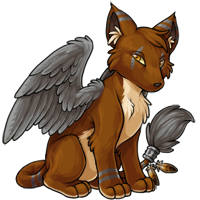
Montre Revamp Feedback Gathering
Filter
Show Official Posts OnlyReplies
I like the new wings.
However, the head is kind of off. The eyes lack the intensity of the original and the muzzle doesn't seem to be in the right angle or something.
It's definitely a step in the right direction (even though Montres are my favorite and change is hard sometimes) :)
[font=kristen itc]<3
[/font]
Sure, the art is updated, but I prefer the old montre's pose. It seemed less rigid and more natural.
I like it, except for the face. That nose, the muzzle, is waaay too steeply curved. It takes away the foxiness of the original.
There's no doubt that the revamp is beautifully done! But it does look very stiff where I loved that the montre always seemed more loose or aloof than the kumos. The face is kind of flat, I'd like to see more of a curve in the shout and maybe more definition around the eyes, like cheek or something so it doesn't look so flat. There's something really off about the front paws and it's driving me nuts but I can't explain it.
I like the older art because the montre looks more cautious, like it might fight or flight at any moment, which I feel fits better with the breed's personality. I also feel like the new muzzle is a little too... rounded? The new art is really well done, I just prefer the older art.
[tot=Cerelin]
Like many others, I really like the details and shading of the new version but I think the posture is too similar to Kumos; it has lost the slinkiness of the old Montre. And the muzzle is definitely off too, it should be much more fox-like. 's fix makes a big difference.
🌸 [flower=Morse] 🌸
Agreeing with assessments that the muzzle is too straight; it needs a little more curve and character to the face. The pose and expression seem very neutral, even bored. Even slight tweaks to the eyes and a more hunched pose would be good. The original art (especially on most of the special colors) has a very moody, sullen look, to me, and that gave the montre a LOT of character. This one doesn't have much at all.
The newer montre looks a bit too chunky and plush for my taste. I feel like the wings and ears should have a slightly slimmer profile, and the tail tuft should be less poofy (I imagine it having coarse, less dense hair). The body, wing, and tail shape is much better than the original (and the shading, obviously), but I feel like some of the features are just too cuddly.
EDIT: and have some AMAZING suggestions. Backfire's tweaked snout does a lot by itself, and odduckOasis's slimmer profile and other tweaks look much more like the original character of the montre to me.

I agree with what most people are saying. The body seems a bit rigid and the head is just odd to me. The head on the old one looks much better but I like the shading on the revamp.
[CENTER]CWs for Sale | WL 1 | WL 2 [/CENTER]
Overall I really like the improved details of the new revamp, but I'll echo what I've seen others say about the position. I prefer the more hunched over look. The new one looks so prim and proper. XD
Also the snout looks a little too straight/long to me, and I prefer the way the tufts on the side of the face on the old version make the face more...boxy? angular? Not sure what word I'm looking for.
And the little tuft of light fur in the ear seems to stand out a tiny bit too much. My eyes where drawn to it before anything else. Maybe there is too much contrast with the darkened shadows in the ear.
[Spoiler=Event Links]
- [egg=Woven] - [tp=Woven]
[/Spoiler]
[Spoiler=Stuffs]https://subeta.net/wishlists.php/627445">wishlist
I collect these:
[/Spoiler]
I like the revamp, but I definitely prefer the shorter muzzle of the original
An American Badger
I felt the old design had a bit more personality to it? The new art is better as far as bringing it more up to date, but i agree with the personality and anatomy comments of many other users and the pose is super similar to the kumos.
I think 's post has it pretty good.

This one seems to sit up straighter than the older incarnations of the montre. I'm not sure how I feel about that; it does kind of change my perception of the montre's temperament. Also, something about the muzzle/placement of the nose seems off to me, like it has a fat, round muzzle with a tiny little nose.
I certainly appreciate the fresh shading and improved detail/anatomy in the wings.
I love the 'guarded' pose of the old one....I mean the new one isn't bad but there are some issues with the bulkiness of the muzzle and the overall pose that's making me a bit sad. I love montres and I'm so happy they're getting some love but I'm not sure about this new pose. I'm sorry ;_;
[tot=Barghest] [egg=Barghest] [tp=Barghest] [flower=Barghest]
I like the change immensely. So much so, I kinda want one now. :3
Edit: But on a second look, I see what people are saying about the muzzle. The muzzle is awfully straight and starts curving down before the black nose part even begins, which looks strange. If the black nose part was bigger, that might help.
I think you are confused...
This is the artwork that is currently onsite...
THIS is the proposed revamp which has none of the points of crit you were saying in your post.

It sounded like you were critiquing the original work.... just thought you should know...
Heh, thanks. I know others have made edits and such, there's a lot of good input, but I appreciate the liking of my quick edit.
A lot of what I like and dislike has been said already, so I'll try and expand a bit -
The good: -Love- pretty much the whole body, especially the wings and how fluffy it looks! It resembles a real animal much closer now. The front legs and overall pose also look a lot less stiff, which is awesome.
The bad: A lot of people have complained about the muzzle being a bit off, and I agree. I think part of the problem is that in the original it was a bit more upturned, while here it's a bit downturned. I feel like if you could pretty much just keep the original headshape, this would be pretty close to perfect. The eyes of the new one are a bit small too, which I feel takes away from the expression a bit. The ears also look a bit off - I think it's because they're a bit thicker, and the tips are a bit too rounded, so it looks more like cartilage instead of tufts of fur.
Still, overall, this is a fantastic improvement over the old, and I'll look forward to seeing the completed version!
PFFF I know I must not come to the forums before 10 am because I do all the wrong things....
Thanks for letting me know ..
 ❤
❤🎉 | | | 🎉
The new one is better art in every way, IMO, save for the pose. It does seem kind of artificially posed, like it's waiting on a photographer. Next to something like the Dillema or Mahar, the pose doesn't convey much in the way of personality - even if they are intended to be stoic.
EDIT: Unrelated, but gah, why does my avatar keep bugging out. First I had no face, now I have no hair! lol
I almost never comment on these revamp posts, because generally there is nothing wrong with the new versions. But when I first joined subeta an eon ago, the Montre is the pet I fell in love with.
I love this revamp, but only the body. Something about the face is off, and I feel like if it were just angled towards us more like the pre-vamp, that could solve it. The nose (muzzle?) feels off somehow, and not being an artist I don't know how to specify what I'm talking about lol. Maybe it's lost a bit of that mysterious/snooty attitude? The Montre is clearly superior to every other pet, and he knows it. ;P
But other than that, amazing. The body is just beautiful.
EDIT: Now that I've skimmed the thread, basically what every edit that's been posted conveyed exactly what I mean lmao. Please, listen to them.
