<center><img src=http://subeta.ws/images/aerie.gif></center>
After a long period of silence and general disinterest, the aeries have decided to try and rearrange their feathers a bit! <a href=/explore/polls.php?act=vote&poll=77>What do you think</a>?
December 31, 1969, 7:00 pm by
Silverpaws

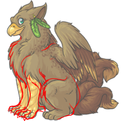
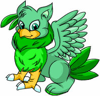
I agree with many others who have said this, and i like the old revamp better. I thing if the patterns and colors on the new one were put on the old one, and add the little feather earring thing to it too, it'd be absolutely perfect. 
December 31, 1969, 7:00 pm by
Keet


Is there any way the old revamp could be added to the poll? I haven't cast my vote yet. =)
December 31, 1969, 7:00 pm by
Meep

I definitely prefer the new one over the old one - it looks so much more mature. Kudos to the artist. ^.^ My only issues are that the tail and front legs look a little bit strange to me. The tails look almost limp, and the front legs look kind of stiff. But the more I look at it, the more I like it. Good job, you guys! Good luck. ^^
December 31, 1969, 7:00 pm by
Freckles

Also, to be honest. Another thing that gets me on this is the outline and the colors.
I'm not liking the light brown, dark brown, gold thing it's just so boring. I love how the old revamp had that touch of green. Makes you think of the Aerie we have now. c:
Same with the spots. I don't like the darker spots. I like the old revamped spots and how they were lighter than the rest of the brown feathers. They stood out more. I don't really notice the dark spots on the new one all that much.
But I LOVE the earing idea, still. Same spot, same ear, same size. It's cute just the way it is. But I'd like it better on the old revamp. xD;;
Sorry~ :c
December 31, 1969, 7:00 pm by
Deleted User
I hate red-lines with an unrelenting passion.
December 31, 1969, 7:00 pm by
Rabbit_Insanity

Tails look a bit odd, Wings need to be bigger, but otherwise it looks great so far.
December 31, 1969, 7:00 pm by
Fincayra

Oh, and I kind of noticed something else. The wings might be a little bit too small for the rest of its body. But other than that, I think it looks really good.
December 31, 1969, 7:00 pm by
LeCoeurNoir

the art is wonderfull really but it's missing all it's cuteness... i love subeta so much because the pets look so awesome cute
that's why i second this Quote:
; border: 1px solid ; font-family: georgia; font-size: 10;"> But the pose is what gets me. It's just such a boring pose.
the pose of the old revamp in combination with the awesome detailedness would be  and pure win for me!
kudos to the artist for that wonderfull work with colors, light and so on, but it should not loose all of it's cuteness and playfulness
and pure win for me!
kudos to the artist for that wonderfull work with colors, light and so on, but it should not loose all of it's cuteness and playfulness
December 31, 1969, 7:00 pm by
cpbmom


I don't have an aerie, so the final decision doesn't really affect me too much...I personally really love the earring feathers, it was the first thing I noticed! It's very well drawn, and I think the colors coordinate well. The pose does give a different...attitude? than the previous ones and I know that plays into some people's choices for pets as well. Overall, I like it.
December 31, 1969, 7:00 pm by
Fincayra
Wonderful job! I literally gasped out loud when I logged onto Subeta and saw this. I will admit that it is a really drastic change from the old Aerie, but one I like a lot. n__n;
I do have a couple suggestions though. Maybe you could make the front feet more like an eagle's, with the second claw in the back, as some people have already suggested? It just makes it feel more like a bird that way. And something looks really off about that hind leg facing us - I can't really place the problem. Maybe other people can. But beautiful job! I love the earring there, and how proud it looks in that pose. My compliments to the artist. :3
December 31, 1969, 7:00 pm by
Aicona

I like it very much exept the hindfeet, and it's a bit grey-ish. love the forelegs.
December 31, 1969, 7:00 pm by
Apostate_491

Now comparing the old revamp and the new, I can see what else is bugging me about this one.
The outlining on the new revamp is pretty thick. The thinner outlining on the old revamp somehow looks more impressive to me. Less like a cartoon, and more realistic. The feathers on the head that look like hair are gone. Why? The old revamp had a very friendly-looking face. I love its eyes, in particular. The eyes of the new one look more dull to me, and less alive. The shading on the new one looks…choppier? Whereas the old revamp has a nice flowing feel to it. The shading looked more natural. The pose of the new one is pretty boring.The positioning of the wings, tails, and the uplifted paw of the old revamp made it look more alive. The new one looks stiff. Don’t get me wrong. The new revamp is definitely an improvement from the current Aerie, but compared to the previous revamp, I find that the art is less impressive and that the Aerie is lacking in a personality. I voted for the old Aerie. Sorry artist(s), I'm not trying to come across as rude or anything. I just really wish the old revamp was still an option. Btw, to Widow – Not too long after the old revamp was posted, I believe Subeta had a problem and the news post was gone after the site came back up. It made me sad. xDDecember 31, 1969, 7:00 pm by
Keet
I REALLY agree with Bikuu that the old revamp would be wonderful if the earring was added, I really don't see what was wrong with it. The more I look at it, the more I think it would work better as the aerie revamp. But here's a quick redline I did of the current one anyway:
December 31, 1969, 7:00 pm by
Deleted User
The art looks great but.... it looks too bulky and too big for what I was expecting. I think it should look more elegant and thinner. This revamp doesn't even look like he could manage to fly... he looks too heavy. Birds are light weight and have light bones. I also don't like the front legs... they don't look Bird-like at all. Also... this Revamp looks like it could ONLY be a Male pet... looks too bulky for a female.
I think this one is SO much better

December 31, 1969, 7:00 pm by
Tammy


I think it looks fantastic, really, I have no suggestions at all. Great job
December 31, 1969, 7:00 pm by
AppleTea

Don't know where they got it, but I love the version that Pwnful_Darcy posted up u
Is there anyway it could be added to the poll? XD
December 31, 1969, 7:00 pm by
Bundy

It's certainly better than the old one, but for some reason I'm still at odds with the way its hindquarters look. Maybe if the darker brown area was a little less pronounced (i.e. make it smaller) and like someone else said, maybe adjust the size of the thigh to be a bit bigger? That might help. I do think it's missing something, but I have no idea what else that something could be.
Definitely an improvement though... I voted for it 
December 31, 1969, 7:00 pm by
Paint

I definitely would love to see the old revamp option followed through with, it actually seems more up-to-date with subeta's art.
December 31, 1969, 7:00 pm by
JrTinapay

- please delete my other empty post here*
i like it and it really has personality. it reminds me of a loyal dog that will bite your arm off, if that makes sense.
its so different from the previous one but change is good.
As for everyone else, i think the green feather is just a little reference to the old one.
December 31, 1969, 7:00 pm by
Panoply


Lol at the original Aerie. Great stuff
I am actually really liking that new/returning earring. I think it really makes the design and would be sad to see it go.
The only thing I'd do to improve it, would be to give it an backward facing claw on the front talons, as has been mentioned by others before me.
Otherwise, bravo Might have to get me an Aerie when this chap comes out!
December 31, 1969, 7:00 pm by
Deleted User
I like it for the most part, although it doesn't really have the same personality as the other one had. It's just sitting in place. I liked the fact that each pet had different postions. I'm not complaining, though. It's just a preference.
December 31, 1969, 7:00 pm by
JrTinapay
December 31, 1969, 7:00 pm by
Freckles
I'm really, really sorry. because it's such a beautiful drawing.
But the pose is what gets me. It's just such a boring pose.
I think the size of the earring and the place of it is just fine. it makes it a little different, being in that spot and not the suggested one. Earrings are always in that suggested spot.
The wings are a bit small compared to the body.
Honestly, I would much prefer this one with maybe a few touch ups. Like maybe adding the earring or something?
I LOVE this one. the pose and everything is just so cute.

Again, I'm really sorry. :c I know you worked very hard on it.
December 31, 1969, 7:00 pm by
Evey

My first reaction was literally -jaw drop-
December 31, 1969, 7:00 pm by
Linguist_159

Okay. 
December 31, 1969, 7:00 pm by
HollowBull

Seeing the old revamp, that I don't recall ever seeing before, I really like that one. True, it doesn't have the front birdlegs, or earrings, but I like it more for the pose. This pose and body seems a little bulky and unfun to me, whereas the old one was fun but it still looked very nice.
It is very nicely drawn, I just personally do not like it all that much.
December 31, 1969, 7:00 pm by
Kitty_768

Beautiful redraw! Good job, Jag and the whole artist team. <3
December 31, 1969, 7:00 pm by
Courtesy


The initially proposed revamp (as posted by Pwnful_Darcy) was much better.
December 31, 1969, 7:00 pm by
Deleted User
i think the new one is rather wonderful the old one is cute and dazzling but the art on it could use a touch up and for all you crazy people trying to change the new one if you hadnt notice by the other pets they are all a little odd in there own awesome way
December 31, 1969, 7:00 pm by
Deleted User
This one is so much better. It's just more detail, and looks just ohs-o much cooler then before!
December 31, 1969, 7:00 pm by
AriKiyo

Perfect. Period.
December 31, 1969, 7:00 pm by
NaRaNa

O.o it's... different.
December 31, 1969, 7:00 pm by
Keet
Thanks for posting the old revamp! Looking back I much prefer it, seeing as it keeps much more in the theme of the current aerie and has such a sweet face. Personally I think the original revamp was perfect, why was it drawn again?
December 31, 1969, 7:00 pm by
Luxe

 For those of you wondering about the earring and new feet, it's actually a throwback to the aerie's original design.
December 31, 1969, 7:00 pm by
Obaba

I voted for it, but I do like the previous revamp better. I like the fact it looks more like an owl than an eagle. It made it look more unique than "just another griffin pet". Also try to keep the green as the common color. Everyone likes the realisim, but sometimes in art and petsites you can go unusual.
December 31, 1969, 7:00 pm by
RoboBread

I love it<3 I only think the front legs could be thinned to look more birdlike and dangerous. Also a little more real. I did some three second red lines to show what I mean. Though they are not the best xD Just to show my idea.

December 31, 1969, 7:00 pm by
Will

i really love this revamp, and i think it's much better than the last one. i really like how the aerie is like, bigger and prouder if you know what i mean?
not too sure about the earring though...
December 31, 1969, 7:00 pm by
lull


the art is wow  I like the earring and the beak especially. On the whole I prefered the previous revamp and was really looking to getting one
I prefer the front legs to be more 'cat-ish' like the back ones, makes it a bit less like a griffin and more unique-ish
December 31, 1969, 7:00 pm by
Separatist

Oh i really really like it. ;O Now it looks like a Gryphon... And Gryphons are awesomeee. The Aerie needs a revamp and it must be like this. Good job artists.
And don't look at the colors peepz.... You have more colors to choise. (Dawn, Sun, Marsh etc.) >_>
Can't wait for these.
December 31, 1969, 7:00 pm by
Deleted User
I love the idea, and the earring. =D Only thing, the head looks a big small and the talons a bit odd..
December 31, 1969, 7:00 pm by
Deleted User
that looks well cool i don't think the green feathers on the ear go with it but it is much better than the old one
December 31, 1969, 7:00 pm by
Camilla


I've just made some redline suggestions. I'm not so sure about the thigh myself, just that I think it ought to be bigger.

December 31, 1969, 7:00 pm by
Deleted User
I like the idea for a revamp but I am not really fond of this one. The art is amazing but I don't get the feeling of the aeries anymore. Maybe move or remove the feather earring type things as well as possibly looking at the front legs again. I really love it and the artists are doing awesome! I also love that the artists take some of the users advice!
December 31, 1969, 7:00 pm by
Deleted User
Wow! It's so different!  I really like the one Pwnful_Darcy posted though. But it is nice too!
December 31, 1969, 7:00 pm by
krazysuperkam

I like the idea of giving the front legs. Gives it more of a mythical creature feel. What I don't really like is that the body seem too bulky. I liked the original Aerie because it looked graceful and petit. This revamp made the pet look huge.
But I don't mind the pose nor the colours. And I think it's a great revamp. It just gives the illusion that it's a huge animal.
December 31, 1969, 7:00 pm by
JessieWrong

I love the old try at the revamp that Pwnful_Darcy posted. What happened to that one?
The artwork on this one is obviously better than the current Aerie..but..I just really don't like the pose or anything.  Also, the head seems too small to me.
December 31, 1969, 7:00 pm by
Sherbet

The legs...GAH. They look like...a chicken to me D8 I think they should be a light-ish brown..The random yellow legs look ODDLY out of place. But otherwise, that art is GORGEOUS.
December 31, 1969, 7:00 pm by
Deleted User
I must say this is a HUGE improvement over the previous redraw attempt. But there are still some thing to improve on here.
The wings, when compared to the rest of the body, are too small, and the feathers seem clipped. I don't think this Aerie could get off the ground.
The front legs look like a cross between a lion's legs and a bird's legs, and it just doesn't work out too well. Since this is a griffin-esque pet, I think it'd be best to stick with eagle legs in the front.
The back legs are in an odd position. The fact that they are lower than the front legs make the Aerie look like it's sitting on an uneven surface.
The tail feathers don't seem to be part of the body at all; it looks more like the Aerie sat on some feathers, or maybe some really big squirrels. I would suggest trying to make the base of the tail feathers blend in with the rest of the body. The feathers are also rather squished.
The pose is rather boring. I know that not every pet has to have a fun pose, but most pet revamps just have the pet sitting or standing. I liked the pose of the original Aerie; maybe you could incorporate that into the redraw? Please, something a little more interesting than having it just sit there and stare at us.
December 31, 1969, 7:00 pm by
Jasper


So far I love everything but the ear piece. It's out of place, it's not really associated with anything, especially the eyes which are more of a sea green color. If you insist on having it there (for originality purposes or whatever,) then I suggest clipping it to the tip of the ear and shouldn't be as big or as noticable as it is. The way it's positioned and the way you've colored it, takes me away from the animals finer features.
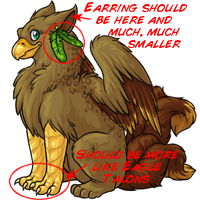
The only other complaint I have, that I can see is the feet. The claws on the forelimbs are much too small to bird like. (Which is the point of their design, right?) If you're going to give it eagle legs, it should have the talons to match. Tiny claws like the one it currently have, should've and would've been more suited for the back feet. However, if you must fix something, it MUST be that obstructive feather earring.
It's...alright. Awfully bulky and masculine looking. Bad for anyone who would want a female Aerie of this revamp. Doesn't really look like it could fly, or get too far off the ground for that matter. I'm a bit disappointed because I was SO looking forward to this one:

The front legs of the newer revamp don't look bird-like enough to me. The overall frame of the previous revamp idea is so much better than this one.