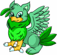
<center><img src=http://subeta.ws/images/aerie.gif></center>
After a long period of silence and general disinterest, the aeries have decided to try and rearrange their feathers a bit! <a href=/explore/polls.php?act=vote&poll=77>What do you think</a>?
December 31, 1969, 7:00 pm by
Deleted User
I like it, though I must point out two things.
1: The coloring of the previous revamp was STUNNING, you may want to consider using a bit of green on the wings and tail because it really sets it apart from other bland, brown griffins out there on the internet.
2: Please, please PLEASE go look at pictures of bird feet and redraw those front legs. It's really not that hard to google "eagle feet" and get yourself several dozen good refs. As it is, the front feet on this are... awkward and embarassing to look at.
Otherwise, I do like this revamp, it is much more "griffin" and much less "playful kitty" which I really think it needed. I also like that you put that feather earring in there to remind everyone of the ooooold design. XD
December 31, 1969, 7:00 pm by
Deleted User
Well, I actually like the revamp, but as said before, it needs some touch-ups.
-
The anatomy - The front legs look like a cat's with an overlayed pattern, to say it in some way. The lack proper "birdlike" structure, and if you are going for the more gryphon-like look, it's very important. The backleg looks akward, instead of looking muscle-bound its more on the "fat" side of things. The wings should be bigger, the wing-span of the current one would be unrealistic to make such a bulky, big bird fly. Also, I'd take some fluff of its chest, it makes it look definetely male.
-
The tail/s - They confuse me, it isn't clear if they are fox-like or just tail feathers. The flexibility they show in this pose is too much for just feathers, and the texture and shape look very fox-like.
-
The head - in my opinion, it looks great, I really like it, but maybe it would look better in a 3/4 angle?? It's just a suggestion,though.
-
Colours/markings - I understand you are going for a more "natural" look on common pets, but some of us seem to be very attached to the mint-green Aerie. I have nothing against this colorscheme, in fact I rather like it, but perhaps giving it more complex markings, as those in the birds in Zohkaro's pictures.
December 31, 1969, 7:00 pm by
Deleted User
And yes, the first attempt at a revamp was much more attractive than this one.

December 31, 1969, 7:00 pm by
Deleted User
Beautiful, except the hind legs. They look...odd. Also, I ADORE the tail feathers. They look very detailed. Overall, better than the old one.
December 31, 1969, 7:00 pm by
nacht


i would accept the "revamp" as new specie 'cause its cool and all! (i seriously like the beak... though the but/hindlegs seem a bit small... realy cool art!) ... but not as current Aerie. totally not... that's the first revamp i don't even SEE the old specie in! D= it's not the matter of art... but the total change fron Aerie to griffin (like... you find everywhere)
have no clue where that pic came from but i vote [img]http://img295.imageshack.us/img295/6627/aerieju7.gif[/igm] too! XD
December 31, 1969, 7:00 pm by
ElectricMouse

Wow, that's pretty majestic. I love the feathery earrings. xD The hind leg doesn't excite me as much. It looks a little odd sticking out right next to the claws. (Are Aeries based off of Griffins? I have no idea but that would be cool)
I really like the old pose, and the way the tails kind of swish like they belong to a horse. If you could somehow incorporate that into the new design I would totally vote for it! 
December 31, 1969, 7:00 pm by
AlkseeyaKC

I'm a bit late on this. I like this new revamp. Its FTW. I don't really like the one that people keep posting. its a but boring though I do like the spots. This new one looks more griffin. =3 The only problem I have with the new one is that its butt looks a but odd to me but not bugging me. =3
December 31, 1969, 7:00 pm by
8shard8

IMO, it's very beautiful. More detailed, looking more alive, and, as it's been said, doesn't resemble a similar pet form the other site anymore. It's prettier. :-3 Hoping to see it introduced soon. I'd adopt one for sure.
And waiting for the Malticorn redraw! I feel sorry for it when I look at the present version, which looks really funny among the newest gorgeous redraws of other pets... 
December 31, 1969, 7:00 pm by
Rajani

Gorrrrrgeous redraw!!! 
December 31, 1969, 7:00 pm by
Deleted User
Not liking this redraw, but I do like the older one that I have seen posted here. It retains more of the Aerie feel, IMO.
December 31, 1969, 7:00 pm by
Crrunk

I think we should go back to the old aerie design
 hahaha (:
December 31, 1969, 7:00 pm by
Deleted User
I think it should be completely green. 
But...I like it.
December 31, 1969, 7:00 pm by
Keshi


"Although I'm silently wishing that the person who decided to change the aerie would get a boot to the head, I'll still add some constructive criticism."
This is one of the most disrespectful things I have EVER heard. Seriously, some of you may need to think before you say something.
December 31, 1969, 7:00 pm by
Dessa

my only complaint would be that it looks almost exactly like what I picture the gryphons and gryfalcons in Mercedes Lackey's Valdemar series... NOT a pet.
December 31, 1969, 7:00 pm by
Roku_Sangria

it looks fat D8
December 31, 1969, 7:00 pm by
Windfall

Awesome! Now it doesn't look like a certain pet from another website anymore. :3
December 31, 1969, 7:00 pm by
Kabuto

I'm just going to be honest here..... Don't change a friggin thing 8C It's gorgeous and wonderfully done, I didn't even like aeries before I saw this revamp right here and its amazing. I don't like bird pets usually, but if it looks anything like this, I'd have to get one
December 31, 1969, 7:00 pm by
HollyAnnR

I adore this new version of the Aerie! I defininately like it better then the first re-vamping of it - it makes look more noble and proud 
Gorgeous!
December 31, 1969, 7:00 pm by
Thunderbird


Oh, another comment...compared to the "other" proposed Aerie revamp, this newer one looks too masculine...I cannot imagine a female Aerie ever looking like that. Sure, this revamp looks cool, but honestly, female Aeries would just look too masculine. That's why I prefer the "older" revamp - it isn't obviously feminine or masculine.
December 31, 1969, 7:00 pm by
Deleted User
i think he's cute!!! hes more of a griffin instead of a dog with a beak and wings, love the tails, theyr poofy =D, and i LOVE how happy he looks!!!
December 31, 1969, 7:00 pm by
Deleted User
i think he's cute!!! hes more of a griffin instead of a dog with a beak and wings, love the tails, theyr poofy =D, and i LOVE how happy he looks!!!
December 31, 1969, 7:00 pm by
Blir

I love this one, but I have to say, I prefer the older revamp better. The green color on the feathers, etc. is a lot more fun and appealing to look at. Plus changing the colors from green to brown is a little drastic. :/ That and the green feather earring just seems thrown in there. I like the concept, it just seems a little out of place.
The dapples are a great effect though, I'm definitely getting an aerie if the spots are still kept on the revamp. (:
December 31, 1969, 7:00 pm by
Deleted User
those furry tails at the back are weird o_O but overall, I like it.
December 31, 1969, 7:00 pm by
Deleted User
Short and sweet:
To save on time, ditch the earring all together.
More pattern on the wing I can leave or take.
Fix the front legs and neck definantly.
The tail feathers portray a fur feather hybrid. The redline suggests pure featherage. I don't care which you choose to go with.
Btw, "I did a redline just to show what parts I think could be improved on", which was basically everything redlined, which made me lol hard.
December 31, 1969, 7:00 pm by
Kalnu

Nothing much to say other than whats been already said.
But there is something that ...looks off to me a prominant eyebrow thing. (sorry I don't know what it would be called) and then there is something about that eye ... it seems too large or close to the beak.
(but don't take it from me, I don't know bird anatomy very well)
I don't much like the colour scheme though, it seems far too ... brown and boring. (brown is a nice colour mind, just not when its over used)
Keep the earring please! And that size! It makes it look a lot nicer with the current colour scheme.
Maybe add some more greens or golds with the actuall colour scheme? For an example:


(no garentee the pictures will show up)
Well, thats all I gotta say other than whats been said. kudos to the artists! this is really lovely. <3
December 31, 1969, 7:00 pm by
Hoshi

Wonderful work, Jag! It’s always enjoyable to see how you continue to grow and evolve as an artist with each and every revamp you issue. :3
That having been said... I'm somewhat torn about this revamp. I adore the addition of the feather earring, the scale-legs (kudos to whoever suggested the dewclaw!), and the bright, cocksure expression on his face. On the other hand, various aspects that other users have already mentioned--the awkward way the hind leg connects to the body, the undersized wings, and the bulky, confusing tails (whenever I scroll up to look at the revamp again, they’ll initially register in my mind as four individual fox-tails rather than two feathers for the first half second)—make this revamp fall short of fulfilling its full potential. I'm also not wild about the color scheme; although the feather earring lends a much-needed splash of color, I feel like this Aerie is drowning in brown. I understand that the staff is pushing for neutrality for the common colors, but perhaps you could add a few more gold accents on the tail feathers or wings? The colors almost seem unbalanced to me because there are two patches of bright, vibrant yellow in the front end and only a few subtle hints of gold in the hind.
I do with that it had retained a little of the sleek elegance presented by the first revamp, but I’d say that overall I’m fairly impressed with this Aerie. There are a few areas that I (and many others) would like to see improved, but seeing as the Subeta artists have always been so gracious about implementing user suggestions in the past, I have faith that the final product will be something that will take everyone’s breath away. :3
December 31, 1969, 7:00 pm by
Freckles

For the people talking about how the earring should be in a different spot and much smaller:
They're more than likely Aerie feathers. And I'm assuming an Aerie is about the size of a griffin so no, I don't think they should be smaller. An Aerie probably has huge feathers.
As for the spot it's in, I think the spot is perfect. It makes it so much more unique in the spot that it is.
Keep the size. Keep the spot. It's perfect.
But I still personally like the old revamp better and I'd like to see the old and new revamps go against each other.
And still, more kudos to the artist. It's still a good drawing. <3
December 31, 1969, 7:00 pm by
Summer_168

Sorry for the last post, it was an accident. If someone could delete it that would be good. :3
As I was trying to say, I'm also going to vote that I loved the OLD aerie redesign. I'd get an aerie ASAP with that redesign. But this one is definitely better than the current one.
December 31, 1969, 7:00 pm by
Summer_168
December 31, 1969, 7:00 pm by
Seerow

Quote:
; border: 1px solid ; font-family: georgia; font-size: 10;">The poll seems rather pointless to me, because it's a run of new art against old art. The choice seems rather obvious. Wouldn't it be more effective to run the new revamp against the old one instead? Because it's just silly the way it's going now.
Quoting this so that hopefully it gets read more!
Is there a reason why new pet revamp polls tend to just have the newest pet instead of the 1st and 2nd revamps as options? The Ruffie and Anyu polls were AMAZING since it had many more choices to choose from. Like someone earlier said, while users may not have been thrilled with the first revamp option, this new one they dislike more so of course they are going to bring up the 1st revamp.
December 31, 1969, 7:00 pm by
Kiarae


I've never really liked the Aerie before, so I really don't have an opinion on how it should be drawn, but I do like the colors a lot better than the green this time around.
December 31, 1969, 7:00 pm by
nari_lupin

Personally, I like this one much better than the old one, even better than the old revamp. He seems more regal now, like a griffin is supposed to look. Though I do agree with many people: the fromt legs do look kinda funny. I'd go with Typhoon_Muffin's "design", but with a few minor changes. (Here's the pic if you don't want to dig through all the posts again.) 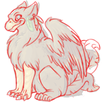 The talons should have a bit of a hook to them. Talons are supposed to be curved anyway. And the beak needs a bit of an overbite. Eagle beaks are never the same length on top and bottom. Like the new revamp beak, but just a bit longer.
December 31, 1969, 7:00 pm by
RyuuYouki

If they use the idea from Typhoon_Muffin's red line I will get an aerie in a heart beat! IMO Typhoon_Muffin's red line makes a already awesome revamp perfect! It tweak the heart just enough. Nothing too major,m just a little tweak that makes all the difference.
Great job to the artist! Even if you make no changes it is still a awesome revamp and I will love it either way!
December 31, 1969, 7:00 pm by
minno150

The poll seems rather pointless to me, because it's a run of new art against old art. The choice seems rather obvious. Wouldn't it be more effective to run the new revamp against the old one instead? Because it's just silly the way it's going now.
December 31, 1969, 7:00 pm by
sonderfox

I think it's... Eh. I loved the old revamp idea, the brown Aerie with the green tails and wings that everyone was posting pictures of. But maybe you could add the feather earring to that one? I think it'd look really nice.
I like-- The feather earring, the marking along to back.
I dislike-- The face. It's too mature looking for an Aerie. They seem like more graceful pets in my opinion. The face just doesn't seem to fit. The front legs. I think they should be less talon and more fur. It looks like they're too stiff to bend or something.. The tails. They should be more feathery. They look like they're just fur. The back leg looks a little weird, too. I also think the color should be the minty green instead, it was so much nicer than the brown. Brown is kinda blahh.. o_x Maybe the lighter brown could be the green and the darker brown on the wings and tails could be a very pale yellow, like the color of the tails on the Gold Aerie. The markings and earring could be dark green, maybe?
I'm sorry, but it's just not me. MUCH better than the old artwork, though.
December 31, 1969, 7:00 pm by
Tekkengal

It is a very beautiful redraw however, I do not really like the pose or the face, it reminds me of Foghorn Leghorn from the cartoons. I am sure this is one of the tougher species to draw and am appreciative of the fact that the colouring and shading look excellent! I just keep on expecting a "chicken hawk" to pop around to grab him, lol!
December 31, 1969, 7:00 pm by
Deleted User
I love it
December 31, 1969, 7:00 pm by
folklorist


I really like this new revamp. The old one that is being pointlessly and repeatedly posted is cute, but undignified. Yes, there are cutesy gryphon-type things out there. Yes, they work. But this revamp is both lovely and dignified.
However, the both fore and back legs look off. BitterLimeParakeet and Typhoon_Muffin's redlines both touch the problems well, with Bitter's best for the forelegs and Typhoon's good for the hinds. If you applied those changes, I'm sure there would be much less complaining. And less posting of the old revamp; it's very rude when it's been stated on more than one occasion that you should be paying attention to THIS revamp.
As for the earring, I don't really have a problem with it. I think it's an interesting placement, although the feathers COULD be smaller and it'd still look good.
December 31, 1969, 7:00 pm by
Malabui

Either revamp is better than the current pet. The one thing I'm not keen on the revamp (that you actually want us to comment on) is that the Aerie seems rather too stocky and heavy for an animal that (if had larger wings) should be able to fly.
December 31, 1969, 7:00 pm by
PANTS_721

Sorry about that blank post :/
Well,anyway, I really liked this one, as much as a lot of other people did
This one is still cute but the feet are a little weird.
Shouldn't the earrings be higher and much smaller?
December 31, 1969, 7:00 pm by
Deleted User
THis revamp I love. Unlike other people; the old revamp, I hated. A good jedi you will make!
Ok, ok.
THING I LOVE about the earie: -The line art is love! Good quality, it's not pixelated, it's clean and not too thick. -Love the colorof the eyes.
- I really like the detail on the back: the spot give it a more "furry" look on the body. -It's MUCH better than our current aerie.
THINGS I DON"T LIKE:
-The forelimbs seem all wrong. The front legs are stuck in between a raptor's leg and a mammal's leg. There is no definition tot he scales on those legs. The back legs seem..odd, for some reason.
-THe tail feathers need to change position because they are hard to tell apart. I think a few people agreed on this.
-I think it'd look better if the feather earring were higher up the ear and smaller, or just higher up.
Albeit the corrections it might need, it's still a huge improvement on the old revamp (i never liked the "canary cute" look )and even more so on the current Aerie. Keep up the good job!
December 31, 1969, 7:00 pm by
Veser

wait,if they revamp it well hydrus aerie change.i wanna 'cause i wanna get a hydrus aerie really badly
December 31, 1969, 7:00 pm by
Luxe

NOTE: Any previous revamp attempts have been discarded due to user feedback regarding the pose, beak, and paws. I am sensing some feli déjà vu. If you love a pet that much, make sure you vote for it and say so at the appropriate time. Please reserve comments for this new aerie or the current version.
December 31, 1969, 7:00 pm by
maniac_fire

This is a GREAT improvement from the current art. but I'm going to have to agree with some of the user here. I really do prefer the other revamp and I believe the older revamp would be the better aerie revamp.
 The green tipped feathers and tail have a more original quality. I also enjoy the leopard markings more on this one.
The only feedback I have on this revamp is the front talons and the tail. Something about the tail just puts me off. (Yes That was not helpful) The front talons make the aerie look unbalanced, adding back talons would probably fix that though.
But again I like this revamp and will accept it if it does push forward.
December 31, 1969, 7:00 pm by
LazyKat

It's a huge improvement in artistic quality, and very beautiful, but... it's lacking the personality somehow. On the other hand... goodness, the quality! But then again... Bah. Apples and oranges.
December 31, 1969, 7:00 pm by
GameCubeGirl

hm...im not sure about this one, took me a minute to realise that was its tail o_o i at first thought some other pet was hiding behind it cos it was that bulky XD i preferred the older pose..it was cute, it could maybe stand to look more like a bird and not a lion with beak and wings
December 31, 1969, 7:00 pm by
Satamoru


Well said Raven! I can't even begin to count how many times I've seen the other revamp on this thing. The admin's have already said THEY AREN'T GONNA USE IT. So stop trying to convince them. Worry over this revamp, the old one ain't gonna happen.
December 31, 1969, 7:00 pm by
ChillyKitten

Personally, I dont like the colour, and I don't like how it looks exactly like a gryphon, now. Before it sorta had.. Oh, I dunno. Originality?
Yeah. I know the old one really needs a revamp, but instead of copying a mythical creature, I would have much rather preferred the fur/feathers to remain on the front legs, the unique mispaced claw on the front paws, the socks on the toe digits on it's hindquarters.. I dunno. I like the old version's originality aspects much better than the new version. Nothing unique about it.
December 31, 1969, 7:00 pm by
Jasper


Oh for the love of God... Guys. They've already said to keep the posts relevant to THIS revamp. Posting the same image over and over and over, won't change a damn thing. (I know, I've tried!  )
)
Try to post improvements for THIS revamp instead of saying, "Make it look like this one! posted pic" e_e Brats.
I'm sorry to say, that I don't tlike this one one bit, and the fact that I own one makes me very sad. I like the older revamp that has been shown earlier in these comments. My poor aerie.