<center><img src=/images/mortiking.gif></center
The Mortiking would prefer you vote in the new <a href=http://subeta.net/explore/polls.php?act=vote&poll=78>poll</a> the nice way, before he has to ... navigate you to the booth :)
December 31, 1969, 7:00 pm by
Ryusaurus


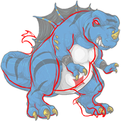
I think it looks so much like the bloodred. get rid of the mouth and give it a longer neck.
December 31, 1969, 7:00 pm by
Deleted User
Bitter- I must say I agree with your red lines. Those changes would make the revamp even better :3
December 31, 1969, 7:00 pm by
Deleted User
I honestly don't understand the chubby comments...the older Mortiking looked far more rotund to me.  The new art is fabulous, and the muscles make sense.
The only comments I can make towards possible tweaks, are having the foot claws extend further out (sharper), a peek of the tail tip showing would look nice, and the snarl a bit further back on the jawline.
December 31, 1969, 7:00 pm by
Deleted User
Bagheera23608, everyone's entitled to their own vote and preference of Mortiking. Just because you don't like the old one doesn't mean that everyone else has to hate it too.
And yes, the Mortiking isn't a real animal, however... it's still based on a type of animal, whether it be a lizard or a dinosaur. Most artists use references from real animals, even if they're creating fantasy ones. Sometimes they use many different animals as references. By doing that, it makes the fantasy creature feel real, like it really could have existed.
December 31, 1969, 7:00 pm by
Deleted User
I've always been a little more than content with the Mortiking, and even though the new revamp has much better texture, color, shading, and dimension... I do agree that it is too chubby and I absolutely think that in my opinion the face is completely, extremely disfigured... Or maybe atrocious. It seems this was too close, but I voted for the old one either way. I HATE the new revamp, change both the face and body size more like the Glacier and BloodRed PLEASE and I just might like the Mortiking again. Ty, and no offense or hard offensive feelings towards anyone. : oh
December 31, 1969, 7:00 pm by
hollo

Okay, let me tell you all something... There's the T-Rex argument going around, with the "T-Rex was bulky but not fat" deal and everything... First of all, you're comparing a standing, forward leaning creature to one that is pretty upright. The T-Rex's skeletal and muscular structure meant that it had to move around and stand with its body length and tail perpendicular to the ground. A T-Rex sitting like the Mortiking does wouldn't be able to pull itself forward into a lunge, run, or even a walk without difficulty. Therefore, we shouldn't be comparing the two, its like comparing apples to oranges. They're both vaguely round, and they're fruit, but the similarities end there. Technically, there are no "real life" animals that are similar to the Mortiking, in other words, there are no lizard-like creatures which sit, stand, and walk around nearly upright as we can deduce, from the different images, that Mortikings do. The closest example of similiar anatomy we have comes from a fictional source, and although most of you will roll your eyes and dismiss it, let's face it, it is, of course, Godzilla. And look at Godzilla. Destroyer of cities and whatnot, but he has the upright-lizard structure, and he has a similar wide stance and similar musculature on his body. (and I'm talking about the original Godzilla here, thank you very much) And don't look at the man-in-the-suit pictures of Godzilla, but the original poster art and such. Look at the models put out. Same basic body structure, same look, except the Mortiking is a bit shorter.
And as a last note: Honestly? The Mortiking is getting adopted, fed, and pampered by owners on Subeta. It should become pretty apparent that, unless you have a specific Mortiking which you let out to free range, it would become a little chubby. :3
December 31, 1969, 7:00 pm by
RyuuYouki

Quote:
; border: 1px solid ; font-family: georgia; font-size: 10;">This is ridiculous. It is just a redraw. Give your opinion, move on. Why discuss what species the Mortiking is. By the way, we all learned about dinosaurs in school. We dont need a discussion about the T-Rex. Take it to the forums.
If it bothers you so much don't read the comments XD We are free to discus how WE feel the revamp could be improved in anyway way we choice. * though I would prefer it be constructive and not rude towards DNA* If comparing it to a dinosaur "we all learned about" is one of them then so be it 
Forgive me and who ever else talked about the big bad Trex. We can't be perfect like you and stay %100 percent on track %100 of the time. wanders off to admire the new revamp
December 31, 1969, 7:00 pm by
Deleted User
The back spikes bother me, why are their facing different directions while the skin between them is not torn in any way? Did they just grow like that in random directions or is that a genetically deformed Mortiking? Other than that, it's pretty nice.
December 31, 1969, 7:00 pm by
Bagheera23608

OMG - I cannot believe this vote is so close.... How can you honestly prefer the old one over this one? And seriously folks, I don't know why this has to be repeated for EVERY redraw. THESE ARE NOT REAL ANIMALS! Artistic license is allowed. I'm done now.
December 31, 1969, 7:00 pm by
Deleted User
That is true DNA
And BitterLime.. I like how you made the tail whip back around. Nice job
December 31, 1969, 7:00 pm by
Navem

This is ridiculous. It is just a redraw. Give your opinion, move on. Why discuss what species the Mortiking is. By the way, we all learned about dinosaurs in school. We dont need a discussion about the T-Rex. Take it to the forums.
December 31, 1969, 7:00 pm by
Keet


Ok, well I did a bit of a red-line that I think addresses some of the concerns? I've never drawn this kind of creature before but I thought I'd give it a shot and I tried to make it a little less "chubby" as some people have said. I wasn't sure exactly where I should go with the face. Over all the quality of art is lovely and the shading and texture are gorgeous. =)
December 31, 1969, 7:00 pm by
Pigeon_634

I think I prefer the old one to be honest x: I've always been a fan of Mortikings, but this version seems to lose some of the sleek predator look and it just looks more fat and angry than deadly..
Of course, the old one could probably use a bit of an update and don't get me wrong, the art on this version is pretty awesome : D
December 31, 1969, 7:00 pm by
horizon

This is good but I voted for the old one. I agree with others that is does look kinda fatty and something about the pose is odd, like it's about to raise its right foot and is off balance at the moment. And honestly I feel like the art on the old one doesn't warrant a redraw. It still keeps up with the newer artwork. Still, good job to the artist, this turned out very nicely!
December 31, 1969, 7:00 pm by
RyuuYouki
Quote:
; border: 1px solid ; font-family: georgia; font-size: 10;">Tianaroo- While the trex was a big bulky creature, it was not a balloon. It's long muscular legs and giant head and tail helped to both support and keep the rex balanced. He scavenged because his short arms and giant size did not allow it to take down prey like the more slender, smaller velociraptor. While he was bulky, he was not fat for his size, infact he was all muscle, basically. he needed to be- in order to support his own weight and size. something made up of mostly chub would find it very difficult even to scavenge, because after eating a meal it would only be weighed down even more, and probably want to sleep rather than be ferocious. I like the ferocity in the mortiking. I like it's old spirit.
First, that made me giggle a bit XD Being a HUGE Dinosaure fan Trex being my fav it would be horrible of me to not point out that the Trex was not strictly a scavenger. YES, he did scavenge like ALL predators do from time to time. dude, if you where that huge you would steal someone else's meal too lol But he was also a hunter. this has been proven :3 You don't have that huge head and six inch long teeth for nothing. Thanks to who ever posted before this comment that the Trex did hunt. to lazy to find the name again
ANYWAY on to the sexy beast that is the Mortiking. VERY nicely done. Though I agree a Trex would be taller and blah blah blah, the Mortiking is a SUBETA pet and there for does not have to fallow any set rules He looks awesome. I would like to see a little more of his tail and "maybe" a slightly longer snarl, but otherwise he is perfect :3
December 31, 1969, 7:00 pm by
DNA_558

I never said not to say what you think. But saying what you think is not just reserved to all of you.
December 31, 1969, 7:00 pm by
little_mistress

hes too chubby, he doesn't look right. i'm sorry but i don't like him.
December 31, 1969, 7:00 pm by
Deleted User
Aren't we supposed to voice what we think, no matter what anyone else may think? Yes, it's supposed to be constructive, but some people just say what they think, at most times. But that's what being opinionated is. She was just voicing her thoughts, I'm sure she wasn't meaning it as an insult......
December 31, 1969, 7:00 pm by
Selene_130

We aren't neopets, and we aren't dumbing down our art.
Nice one
December 31, 1969, 7:00 pm by
Geisha_468

Ooh, I really like this redraw. Nice job!
December 31, 1969, 7:00 pm by
Deleted User
kudos to the artist*
I pressed enter by mistake XD
December 31, 1969, 7:00 pm by
Deleted User
I like this alot better then the old. Even though it does look chubby, the old version just looked well brring. this one has alot more detail so
Kudos
December 31, 1969, 7:00 pm by
DNA_558
Quote By akaMIZU:
; border: 1px solid ; font-family: georgia; font-size: 10;">Wow, I have never been fond of the Mortiking to start out with.
But now, I do not like it at ALL!
The face bothers me the most. I would say redo it all over.
No more of an insult than your comment.
December 31, 1969, 7:00 pm by
Selene_130
At least it doesn't look like barney. I'm glad we get to vote on the revamps and our feedback is actually read and taken into consideration.
December 31, 1969, 7:00 pm by
RoboBread

I really do not like this at all. It's a nice image, and it does look more 'grr' than the old, but... it's just so off. The head seems a little lumpier and rounded than it should be. Which, in addition to the way the arm was drawn, makes it look a little chubby. The arm bother me the most. Where they meet the bubble they don't look... right. They look as though they are connected by ripply fat, not muscles. And the angle on the back on seems a little off. The legs also look very lumpy and well, let's face it... fat. They're angles are a little off and there are lines and folds where lines and folds just look out of place.
It's much better than the old in art and quality, but in looks and everything I give it a nay. The head needs to be a little less rounded, and the mouth could be a little bigger, wider, and more threatening. I'd slim him down some as well, and make sure his arms aren't like... play doh'd on. Not dissing it, just saying what I notice with blatant disregard to the face that I likely sound very rude. Sorry, but this is just my opinion (:
December 31, 1969, 7:00 pm by
Deleted User
Not sure why it's .net, but that's what it said. I made sure to look when it said I wasn't logged in.
December 31, 1969, 7:00 pm by
Mikhail

I would give 1000 Kanvas to whoever drew the redraw!!! ^.^
December 31, 1969, 7:00 pm by
AKAMIZU_990

Quote:
; border: 1px solid ; font-family: georgia; font-size: 10;">If it's not your type of pet, don't worry. There will be plenty of montres for you later.
Is that supposed to be an insult?
I am just stating what I think. I never said it was an awful image. I just said I preferred the older one to begin with, and that I was not a big fan of it to begin with. Damn.
December 31, 1969, 7:00 pm by
Victoria_884

Just access the Poll Booth, which is located in Centropolis... easy and no logging out!
December 31, 1969, 7:00 pm by
pumpkins


Why's it .net? o.0
December 31, 1969, 7:00 pm by
Deleted User
It takes me to Sub.net and logs me out. So I can't vote.Or are we back at .org .net or whatever?? LOL
December 31, 1969, 7:00 pm by
tonwalsh2001

well I would love to vote but every time I try it logs me out and takes me to a new log in page??? 
December 31, 1969, 7:00 pm by
Deleted User
they are creepy looking
December 31, 1969, 7:00 pm by
Deleted User
The art looks great! I really like the body, nice and bulky, looks very tough. I think the design is very awesome, I love the detail and the total massiveness of the pet. I think Mortikings should look big and bulky like this.
One thing bugs me though... The mouth looks a little funky to me. The sneer is just odd. Fix the mouth and I'll probably get one. 
December 31, 1969, 7:00 pm by
Sasuke

I would of voted new but dislike the 'Elvis sneer'
December 31, 1969, 7:00 pm by
Strukla


Too muscular for my liking. Reminds me of a blue T-Rex rather than gator-lizard.
December 31, 1969, 7:00 pm by
Corvani

Something about this one bothers me. The black beneath the eyes makes it look like he has a bad case of bags, the face just doesn't seem 'snarly' or vicious and looks rather, well, wonky, to be frank. Something about the way he's shaded makes him look almost chubby and like one of those old rubbery Godzilla toys. The way the tail bends throws me off, too. Maybe if it almost wrapped around the other way where the tip is visible would help? Seeing as he appears as though he should be aggressive or defensive I'd like to see the tail loosely wrapped about his form as if to provide a barrier. It's just something you typically see on angry dinosaurs and dragons, y'know? Overall he seems pretty bulky to the point it almost crowds the little white square he's in. Sorry, but I don't really like the revamp at all. ;; It's nice and definitely needed, but I think a different redraw would do better.
On a different note: I do, however, like the amount of detail on his claws/horns, they look very sharp and shiny. The 'star' design on his belly also looks much nicer than the previous one; more symmetrical, really.
December 31, 1969, 7:00 pm by
CAPS_LOCK

The new Mortiking looks more.. geekier than stronger, and that's not good.
Maybe make his teeth/fangs bigger and larger.
December 31, 1969, 7:00 pm by
DNA_558
Quote:
; border: 1px solid ; font-family: georgia; font-size: 10;">Wow, I have never been fond of the Mortiking to start out with.
If it's not your type of pet, don't worry. There will be plenty of montres for you later.
December 31, 1969, 7:00 pm by
NaRaNa

i still like the current / "old" one better. it's so... unique. i'm just an average person, not an artist so i don't know what i should say about this revamp... it's nice but the current one is more... mortiking-ish ^^
December 31, 1969, 7:00 pm by
Penny_884

I like it, "fat" looks great on him! And the BloodRed is utterly ferocious, well done
December 31, 1969, 7:00 pm by
Wren


Bleh, I don't like this revamp at aaall. D; The older version is really badass and "I'll kill you". xD I don't care for the revamp's pudginess. Yeah, it's supposed to be muscular but it looks more like a beer belly to me. I say just start over completely on this one. :c
December 31, 1969, 7:00 pm by
fluffy_luvr

The new one is good, but I miss the grumpy expression instead of this new vicious one.
December 31, 1969, 7:00 pm by
AKAMIZU_990
Wow, I have never been fond of the Mortiking to start out with.
But now, I do not like it at ALL!
The face bothers me the most. I would say redo it all over.
December 31, 1969, 7:00 pm by
Templar

Since everyone is also comparing the normal mortiking to the new Bloodred, glacier and graveyards; Compare the heads to one another. If you look, the newer Mortiking does have a quite smaller head than the others.
December 31, 1969, 7:00 pm by
Alewiina


Quote:
; border: 1px solid ; font-family: georgia; font-size: 10;">kinda like if pete went to the gym...but it looks good!
LOL. That is SO true. xD
December 31, 1969, 7:00 pm by
Alewiina
I do like this one a lot. However I think the eyes on the old one were better (longer and thinner rather than rounded) and his head seems a little stubby.
Also the tail looks like it just cuts off... maybe have the end of it poking out from behind a foot or the other side of his body or something?
Other than that, I really like it. I adore the shading/texturing.
December 31, 1969, 7:00 pm by
NAT


Love this update. Great job DNA. I'd like to see any of you guys do any better. lols.
December 31, 1969, 7:00 pm by
loopa

slightly chubby, but at the same time muscular. kinda like if pete went to the gym...but it looks good!
I quiet like the art itself. Well the technique. But I voted for the old one, since since I love the sleek elegant deadliness of the old mortiking. This one doesnt look fast, and especially not predator like, as the old one was. I am especially bothered by the feet. They seem swollen and to large, I really cant imagine this fellow walking in a non comedylike way, sorry. I am usually not fond of skinny and abnormal thin characters, but i don't like the bulkyness. I can understand though, if the artist, is not fond of the old mortiking concept anymore, but still I liked it better.