Is Kaiba ready for the Spotlight?
Replies
I'm getting mixed results. Either you can see the background or you can't. Can I get some feedback on him here?
Cute overlay! But for me the background is pure blue and I really can't read the also blue text :/ it also seems a little off centre on my screen.
[IMG]http://i50.tinypic.com/mw5s1y.gif[/IMG]
Yeah, it's supposed to look like this:
I may have to go back to the drawing board here--
Yeah it is. I think I may have to tone it down a bit so it doesn't look like a blue screen of death as my friend put it.
Same here. All blue and text can't be seem.

They call you cry baby, cry baby
But you don't freaking care
aahha xD good luck with your pet though! I hope it works out :)
[IMG]http://i50.tinypic.com/mw5s1y.gif[/IMG]
That's three people who can't see it. I'm going to try and do it without the faded background and see if that helps it any.
Back to work!
Going to go ahead and guess that the hosting site you are using for background image is wrong somehow. Maybe it lets you see it because of cookies or because you are logged in on it but for me it's (also) a nope. I grabbed your profile bacground, hosted it on my dA and shoved that url into the code instead and it works for me.
Looking to adopt a December 31st, 1969 glitched date pet
Funny you should mention that, I was just about to try a different host. My original background had been on an image host that I can't upload to anymore, so I'm trying something different.
Well, my money is on that being the problem, let me/us know if you change the host? 8D
Looking to adopt a December 31st, 1969 glitched date pet
Changed hosts and my friends said it worked for them!
So now can I have some feedback? :3 Now that I know what was wrong, I can adjust accordingly.
- Both horizontal and vertical scroll is a huge turn off.
- I feel like the background underneed the text makes the text too hard to read
- Is there supposed to be a background behind the overlay? Because now you got a background and another background behind it.
- your tc is super small in a huge square, you need to fill it out more because pets do get rejected for not using the space right.
- With background art: do you mean the human art on the left? Or the art in the backgrounds? Because there are 3 things that require credit and there are two credits and it's a bit vague now what you mean.
[/font]

There shouldn't be a vertical scroll, I will have to fix that. It's supposed to be just horizontal. If the text is too hard to read, then I'll switch it with a cleaner version without the image under the description. Should I do this for the other columns as well, or just the text-heavy description?
The overlay? It's supposed to have a dark background because it looks choppy if left transparent. By background art, I do mean the human art since the other art that isn't that or the overlay are all official images.
Make sure to not just remove the scroll because then a part will be cut off :) I think it's mostly important to remove it from under need the text, but you have to see if it still looks consistent after you remove it.
Maybe clean up the overlay if possible? Because the background really looks out of place there. Official art also needs to be linked because it's copyrighted and belongs to a company.
Oh and I noticed your round corners have pixels missing.
[/font]
freaking double posts why does this happen still?
Wanna know more about battling? ❤️ The Official Battle Guide v3.3 ❤️ Need to find books? 🌈 The Book Grind Guide v1.0 🌈
Agreeing with Tobias; I didn't even notice the horizontal scrollbar. I didn't know that there was more to look at.
- Overlay is very nice, but the background colour used makes it difficult for me to see the clothing details (my monitor is old and dark). Turn it transparent or make it a white background colour. Any other colour tends to be distracting.
- I'd recommend changing the textbox backgrounds to a lower opacity. The font can be hard to read, most notably the minion text.
- you'll need to credit the company responsible for the anime in said backgrounds as well. I don't know the animation studio behind it, but credit them.
Wanna know more about battling? ❤️ The Official Battle Guide v3.3 ❤️ Need to find books? 🌈 The Book Grind Guide v1.0 🌈
Alright, I'm going to go see what I can do. Thanks~
I can't see the background either, but I'd ship itxD
I'll keep those suggestions in mind too, thanks. I'll make a couple of different opacities and/or without the image in the description to see how each looks.
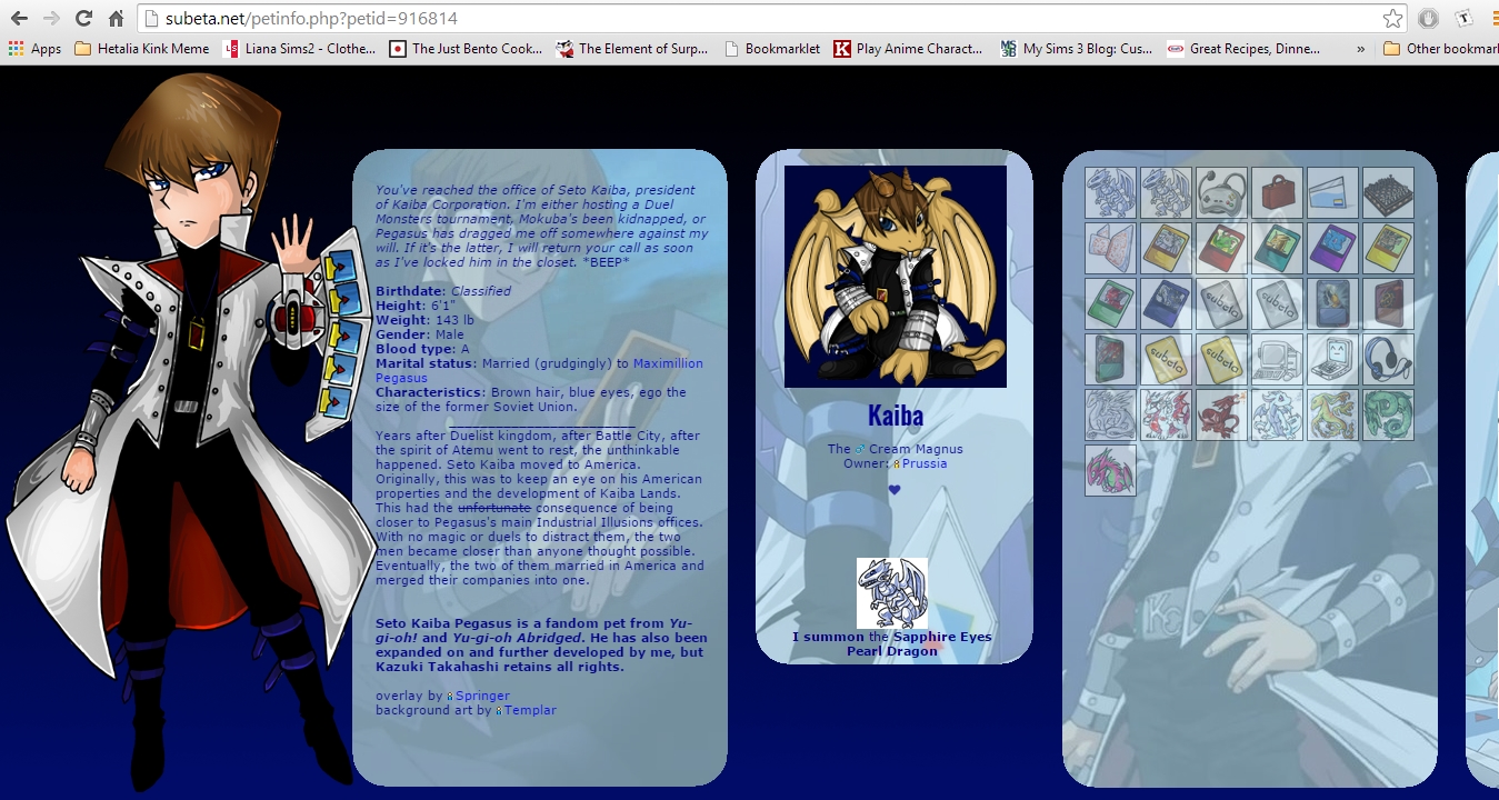
[edit] Kaiba
Here is how Kaiba's profile looks since I updated it. I can't really link to the official art because they're screencaps but I did credit the studios.
Any more suggestions for me? And is the overlay's transparency too choppy? Because I may have to put a border on it or re-add the background if it looks sloppy.