<center><img src=http://images.subeta.net/hikei_revamp.gif></center><br />The <a href=http://subeta.net/explore/polls.php?act=vote&poll=86>Hikei</a> is up for poll again! :) <br />(Note: As the artist of the previously polled hikei is no longer on staff, these proposed revamps are no longer an option. We are sorry for any confusion this may cause.)
December 31, 1969, 7:00 pm by
splinter

For me personally I a couple of issues with the new revamp.
-I really don't like the blue toes, and the postion on the hooves look a bit off.
-
Not sure why but the tails look to short, though, that might be because of the width limit.
-
And the mane in my opinion need to be longer and made a bit sleeker.
-
Not sure why but I also thought a hikei always had a 'bit of an attitude', being some what feisty, and now it looks cute and sweet, -prodes neo- I know that I'm probually on my own here but I really don't want that to happen here, with pets with no personality. ;_;
December 31, 1969, 7:00 pm by
Cavalier

I think it's cute, but maybe the eyes could be different.
December 31, 1969, 7:00 pm by
Sweetie

TheseHeights = I love the hikei pose you posted!! maniac_fire = I prefer your version over the polled version because you corrected the double looking ear that is in the poll choice, and I like how the top of the head is not so blocky, and I like the line you added to the bridge of the nose to give more roundness. Artist = please keep the dark back toes =)
December 31, 1969, 7:00 pm by
ChillyKitten

Hey, guys? Just remember that your posted drawings are used as a suggestion- not a guideline for the artists to follow. I think I even made that clear to staff in my 'adjustment' pic.. But yeah.
I don't think artists will ever use a specific pose from a user(And if they have, they shouldn't!  ), because it would most probably only create more dissaproval from other users.
It's good to know the artists use their own creative ideas, it serves as a sort of neutrality as far as choosing posing, colouring, and the overall pet revamping process.
On a positive note, i'm glad users are actually offering critisizm now, rather than blatant insults. Try letting nk know about all the nice things you like about the hikei too sometime. ;3 I personally love it's sense of character in this image. I also love the pose, it's unique and un-static. Hope things are working out as far as tweaking goes. ^^
December 31, 1969, 7:00 pm by
lunarules

Nevermind, I see the claws on the latest redline. My suggestion regarding face/tail orbs still stands though.
December 31, 1969, 7:00 pm by
lunarules
His face is still a bit too small. I would also like to see claws on the back toes and the tail curls open a bit wider so you can see the glowiness of the orbs.
December 31, 1969, 7:00 pm by
Zimt

The coloured toes are not that new, the DM and the Hydrus have coloured toes as well.
December 31, 1969, 7:00 pm by
Mark_470

I kinda liked the older revamp but too bad the artist is now gone...
December 31, 1969, 7:00 pm by
Lexiana


I really like the pose posted by TheseHeights
As far as this one, it's nice, but it seems a little...squashed? I'm not sure how to explain it. The nose looks a little too short in that pose, and he's maybe a little pudgy.
Reading through the comments, I agree with the person who said this looks like a chibi version. The hikei always struck me as elegant and tough, and this just doesn't.
I DO like the pose of the back feet, the new coloring on the back feet, and the added shine on the front hooves. Very nice scheme.
December 31, 1969, 7:00 pm by
Deleted User
Typhoon_Muffin's redline is gorgeous! I'd have no complaints at all about that version. ;D
December 31, 1969, 7:00 pm by
King_106

Back leg looks too long.
December 31, 1969, 7:00 pm by
Deleted User
i love the pose that theseheights did!!! its great. and typhoon_muffins is awesome too! please make it different!!! i love hikei!!
December 31, 1969, 7:00 pm by
Pog

I'm really digging Chillykat's and Typhoon_Muffin's redlines o: But I agree, the mane could be a little longer. A short one makes the hikei look like a..young..hikei a foal or something ahaha. Foal puppy.
December 31, 1969, 7:00 pm by
Deleted User
I like the old one on this.
The hair on the new Hikei is just too messy, I don't like the pose all that much, and the back paws look off for some reason...
December 31, 1969, 7:00 pm by
Seerow

So after having sat on it for a day, I actually amend my last response to this. I didn't like a single thing about this revamp when it first came out yesterday, but I do believe its grown on me somewhat. I still think the body is too blocky/ not defined enough, but that can be fixed hopefully. And while the positioning of the back paws seems off, I do actually really like them. I think it was just so a big change from the previous attempt that put me in such a bad mood over this one.
It also probably helps that I'm looking at in on a mac screen right now, and it comes out far more like its standard white then gray on here
December 31, 1969, 7:00 pm by
CAPS_LOCK

I like the pose.
But I think a little more detail can be put into the Hikei, like longer stripes and bigger orbs. otherwise I don't really have a problem with the revamped Hikei.
December 31, 1969, 7:00 pm by
maniac_fire

Quote:
; border: 1px solid ; font-family: georgia; font-size: 10;">I will say this one is much much better then the previous two attempts, though I made some tweaks in another redline ^^U I tried to fix the legs, stomach, face and hair a bit:With some tweaks to this newest one I think it'll be perfect c: I really do love the shiney-ness of the eyes though.
I really like this revamp I'm now considering a hikei as one of my pets. Just wanted to say thank you to ![]() nk<script type="text/javascript">toolTip('userinfo_nk_1', '
nk<script type="text/javascript">toolTip('userinfo_nk_1', '

Artist
Name: NK
Posts:: 1,360


', 'User Information');</script> for doing a great job.
Though I have to say I did enjoy typhoon's suggestions and maybe a little tweaking to it and it will look even better.
December 31, 1969, 7:00 pm by
Zimt
Pose is wonderful.. it reminds me at the current DM Hikei. So if the common pose would be so special, what about the special colours :/
December 31, 1969, 7:00 pm by
TheseHeights


First of all, I'm going to apologise for what I said in my first comment, because I know I was rude. I tend to forget that there are actual people who draw the art, and I'm sorry if I was hurtful.
Second of all, I decided to try a quick attempt at a different pose for the Hikei, because I think the main problem that's with the Hikei for me, with each revamp, has been the pose. Maybe you could try something more like this? It's rough, sorry: <img src="http://pics.livejournal.com/urthretards/pic/007aw350">
God I hope I got the coding right.
December 31, 1969, 7:00 pm by
Bowser

I will say this one is much much better then the previous two attempts, though I made some tweaks in another redline ^^U I tried to fix the legs, stomach, face and hair a bit:
With some tweaks to this newest one I think it'll be perfect c: I really do love the shiney-ness of the eyes though.
December 31, 1969, 7:00 pm by
Deleted User
squints I think my first reaction was, "Why is it so... flat?"
Not very constructive, I know, but I just think the personality, the vibrancy of the current Hikei just got... flattened... in this. Maybe you could try redrawing it while on a sugar high. You know, just to get into the perky sort of mood the current Hikei is in.
December 31, 1969, 7:00 pm by
Zimt
What I see is that many people like the revamp- but those who own several Hikeis, those who are really addicted to them, DON'T like the revamp. So I'm wondering if it would make sense to dissapoint the REAL Hikei fans.
December 31, 1969, 7:00 pm by
Deleted User
I really like it. Just wish the mane was a tad bit longer, but that's it. It's adorable and I love the blue toes. 
December 31, 1969, 7:00 pm by
Xiria


Oh wow, ET's idea is AMAZING! Can I vote for that in the poll? xD Also, I'd be happy to see ET's drawing right there be the Scribble Hikei. But they don't put art on the site from non-artists...
December 31, 1969, 7:00 pm by
Zimt
Stag, thanks. Now I'm scared lol
December 31, 1969, 7:00 pm by
Spider

Kazeriu - Eventually special colors would look somewhat like this. I say somewhat because as you can tell now, most special colors have different poses and what not to them. So yes, this would affect them as well Just not right away. Gotta give the artists time to think X3
December 31, 1969, 7:00 pm by
Zimt
Hm.. I'm kinda fresh on Subeta. If this revamp goes through, would this include the special colours like DM, Reborn, Angel etc?? Or just the base-posed colours?
December 31, 1969, 7:00 pm by
Zimt
Laurrase's eyes are perfect, thumbs up!
December 31, 1969, 7:00 pm by
missatralissa


i prefer the old one, but i do like ET's version. i'm not digging how far apart the back legs are, and the face/head look far too small.
December 31, 1969, 7:00 pm by
Laurrase

First off, let me say that this artist did much better at a revamp than the previous one. Kudos to you! 
That said, it's still not doing justice to the Hikei itself. I'm a Hikei collector and a BIG horse-nut so this revamp will hit me hard thus this enormous dissertation.
I've scanned through other responses, and mostly agree with the criticisms; they boil down to simple body/head awkwardness, stripe size and tail location/shape issues. Both ET and ChillyKitten did some nice re-working, but didn't quite eliminate the body-shape or tail problem, thus I'm adding my own version here:
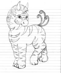 I apologize that it's a line drawing, but while I don't have your fancy art programs
  , I think I have a pretty good handle on equine conformation. What I tried to do was combine the original rotund, compact bodied Hikei look (with large stripes ) with the new position and expression the artist is suggesting. Additionally, I widened the pupils (that "psychotic/glazed" look came from a too small pupil IMO) and put the more zebra-ish "mohawk" mane back. I also enlarged the tail more in keeping with the old Hikei, but instead of rounding the tail stalks, I took a more ribbon-like take with it. It still has the same feel of dimension without the "wormy" tube look that lots of people felt was odd and creepy looking. As a final suggestion, I used a hind leg lift to give the Hikei's position more life. Lifting the front leg is both more common in art and (dangerously) close to the equine on Neopets so I wanted to offer another way to convey personality without getting you sued.
I hope this has helped!
December 31, 1969, 7:00 pm by
Zimt
I totally love ET's idea . Want!
December 31, 1969, 7:00 pm by
SKRIL

I really like it. It just needs to be less grey and more white, though.
December 31, 1969, 7:00 pm by
Picopepin

Why do yall keep drawing it with more of a beak?
I actually kinda like this revamp, but id be beating a dead horse.. like usual if I mentioned whats already been mentioned.
December 31, 1969, 7:00 pm by
Jasper


Ew... God no. I'm sorry but this... this fails in comparison to the last revamp. DX Can I list my reasons later? I gotta run. I just came on to check the news. BBS!
December 31, 1969, 7:00 pm by
cherche

the eyes look creepy.
December 31, 1969, 7:00 pm by
Spider
Hmm... Not to shabby. Though there is something about the neck and head that bothers me. Perhaps its because the neck is to short? I can't pinpoint what I dislike about the head, but it will come to me X3
December 31, 1969, 7:00 pm by
AcaciaKumori


Sorry about my last post! DX
Anyway, I wanted to say that I like the new Hikei, but I think it should be a little more smoother(ie. less muscle on the chest, more white than grey). I also think the mane should be more zebra-like, or at least more hair-and-moehawk-like rather than yarn-like. The last thing I want to say is on the anatomy; as someone else said, Hikeis have frequently been compared to "My Little Pony"s and I think the front legs should be thicker to portray that and to be cuter, as well as shortening the back legs a bit because as of now the fore backleg is about a quarter longer than the other legs.
December 31, 1969, 7:00 pm by
Rainchan

I didn't go through all the comments, so sorry if this is repetitive. The way the head connects to the back seems a little off to me, I think either because the neck is twisted too far back, or it's missing some neck xD. The tail can stand to be a tad larger! I liked the glowiness of DWM's revamp, maybe consider using a little bit of that in your modification NK?
But other than that, I really really like this. TIS A STUBBY LITTLE PONY, ONGZ. I like how the back paws actually look like paws, instead of hooves with toes xD AND THE SHADING, IS LIKE, GODLY. xDDD GJ NK
December 31, 1969, 7:00 pm by
Deleted User
I just realized how stupid the first bit was. X3;
Ignore now  <
<
December 31, 1969, 7:00 pm by
Deleted User
I can safely say that I don't actually like the tail. The pet itself is pretty cute and I can only imagine what it would look like in any of the other colours it could be. But the tail kind of just creeps me out.
I also think the back two legs should match the front, or vice-versa. :3
Other then that, you did a pretty good job.
December 31, 1969, 7:00 pm by
NK

Sketchess, thank you very much. I appreciate you pointing that out for me and in a polite manner. As I said earlier, thanks to those who are providing constructive criticism. I am taking them into consideration as I make my modifications.
December 31, 1969, 7:00 pm by
Sketchess

You guys are really something, you know that?
I mean...constructive criticism is great. As an artist myself, I know that sometimes you get so engrossed in a project that it's easy to overlook a mistake that may be glaringly apparent to an outside observer. But adding "no, just no," "boooo," or "I hate it. It's ugly" to an ill-defined list of critiques is NOT constructive. In fact (and the artists have said so several times before), comments like that are more likely to be ignored than considered.
Have some tact, folks. If the Subeta Team artists are able to respond gracefully after hundreds of unappreciative people callously insult their work, surely you can manage to show them a little respect in return for all they're doing for you. Please...even if you HATE HATE HATE the pony-shaped arrangement of pixels on your screen, try to express your displeasure in a helpful, courteous manner
December 31, 1969, 7:00 pm by
Khushi

i will go for the old one; this one is not cute, a lil stubby
December 31, 1969, 7:00 pm by
Tropicandy


I agree with pretty much everything said. I'm voting for old yet again.
December 31, 1969, 7:00 pm by
World

I was hoping for something more lithe and horse-like. >.> Don't get me wrong, I like the update, I just wish it was a little...I don't know how to explain it. "Skinnier" sounds bad. XD I like this better than the last one, though!
December 31, 1969, 7:00 pm by
Deleted User
I like the old version WAY better. The new one isn't even half as cute...
December 31, 1969, 7:00 pm by
fab

Defiantly better than the original, but I still am not pleased with it, so I just won't be voting on this one. For example, the eyes feel too busy, to crowded...and I don't like the mane, looks a bit like a horse buzz cut to me. As well as the muzzle looking similar to a beak of some sort. And then finally, the patterns feel bare, the body feels empty.
December 31, 1969, 7:00 pm by
Shuvva

While this revamp is nice, I think there is some room for improvement. First of all, I think the mane should be longer (like ChillyKitten's version). Also, I like ET's idea of having it lifting one of the front legs, so it would look a little less static. (Although that might make it look a bit like the Malticorn) Also, the neck bothers me a bit, like it's too fat or something. But I think this revamp could work with a few touch-ups.
December 31, 1969, 7:00 pm by
johnathan

Aww, it's so cute. I Love its face. holds it in my hands
If I sounded nasty yesterday, then I'm sorry. Even after a whole day, I'm still unable to find fondness for this revamp, except the eyes.
I say again that the main should keep a close resemblance to the traditional 'Trojan horse' style. Don't change something just for the sake of a change. It doesn't -need- to be done. The front legs still look a lot shorter than the back and that could be because of how it is standing. (The one leg up idea is nice). Tail should be a tad bit larger as well.
ET, love your little pose. So nicely done. And now because some people mention it, I'm nearly fearful for the Angelic... pets my Mosi I'd hate to have wasted twenty dollars for nothing.