
December 31, 1969, 7:00 pm by
Deleted User
i agree the new one looks like it has tenticles... i liked the hair look from the old one...
December 31, 1969, 7:00 pm by
Deleted User
*Pose
And reading the other comments, I have to agree on the tails. They resemble tentacles now, and they aren't fanned out like in the old version, which I had liked. They are all seemingly pointing in the same direction =/
December 31, 1969, 7:00 pm by
Deleted User
I like the post itself, but as other before me mentioned, it looks too thick and I personally don't like the shading.... I really miss the fur, as well. Its too... smooth? The old version has some fur on the back of the legs.
December 31, 1969, 7:00 pm by
Deleted User
Looking back again, it almost appears as though the skin is made of latex or shiny plastic.
December 31, 1969, 7:00 pm by
Deleted User
I have to agree, I'm not a big fan of how the redraw is shaded. I am personally voting for the old version ^^; if, however, it was re-shaded to look similar to CINNAmonfreek's version, I think many more users would like it, for I do love the new pose (=
December 31, 1969, 7:00 pm by
Deleted User
I dont care for how thick those 'tendril's are.. they used to look like wispy tails, but now it looks like vines or tenticles D8
shading looks... harsh, and something just looks a little off with the pose. Nothing much, but just something.. I cant seem to put my finger on it just yet, but it seems awkward.
It seems a little too thick for the pet that it is. It always used to strike me as one of the 'delicate' ones. Now it sorta looks chunky.
December 31, 1969, 7:00 pm by
Zansabar

The tails are what is bugging me.They are all stiff looking and have taken away the flowing look of the other Kora.
So if they were all to have their own uniqueness to them, Such as having two go to the left and the others to the right. Where they would be in a more natural state, then it would appear as more free and unconfined... I can't really think of the right words.
I think it looks too much like a monkeys tail, so if it was so much the same thickness all the way through it would be more like the original.
Then on the the original it is thinner at the base and then it flares out and there are the tails. I always liked this look. So it seems a little strange if the thickness is at the base is so thick.
December 31, 1969, 7:00 pm by
Romantic


I say the old one was perfectly fine.
December 31, 1969, 7:00 pm by
cinna

Here's a quick shading touch up. 
I know I missed a few little spots but... you get it.

December 31, 1969, 7:00 pm by
SailorGundam06

It looks too... shiny... Like it's wet. There's too many different colors in the shading. I don't like the pudgy look, and the curves of the tails and ears looks... strange. Also, it's hard to tell if the tails are curving forward instead of backward.
December 31, 1969, 7:00 pm by
Capybara


Ooh,I love the details in the face,but the curves in the ears,and the tails seem a bit off to me.
I also adore how pudgy an' cute it looks,but the shadows of the muscles look a little bit wonky.
Otherwise,Great work.
December 31, 1969, 7:00 pm by
Pad

i definitely love the old one; the eyes and the "flying pose"
December 31, 1969, 7:00 pm by
cinna
Another reason why it looks fat is because the chest and tummy are misaligned!
The tummy looks fine, the chest goes too low.
December 31, 1969, 7:00 pm by
lurk

With the old image, I always saw the Kora as flying/gliding. I really miss that aspect with the new one, and I'd love to see the position touched up.
Also, I agree that the tails look a bit awkward, I think it's because they look exactly the same, and aren't as shiny as the old ones (the tails, not the body.)
I voted for the old one, but the new one is not bad at all! I just think there needs to be a tad more melding between the two for it to be perfect.
December 31, 1969, 7:00 pm by
cinna
A couple of the darker lines of shading look very out of place to me, and the lighter shade looks too dark. There should be less contrast.
The shading does not look good to me at all.
Also, this one looks like it's standing on invisible stairs and it looks unnatural.
The tails should have more flow.
They look stiff, all bent over each other in the same direction.
It doesn't necessarily look fat, but actually, the way the back paw connects to the leg looks a little off somehow.
And there's your constructive criticism from an artist. c:
December 31, 1969, 7:00 pm by
Jinjah

I like the new chunkier body and more upright position of the new kora. Personally I prefer it to the older style.
December 31, 1969, 7:00 pm by
angelembryo


Good point about the forehead gem being so low. That does contribute to the malicious look and takes away from the Kora's original cuteness.
I'm also in agreement that it's not actually fat; but it looks fat, and impressions are everything in visual media. The parts that draw attention to that are the protruding chest, the far too rounded left hind thigh, and the bulbous musculature created by this shading style. Streamline those things a bit, and thin down the ears and tails as Nestly pointed out (great visual, by the way), and complaints should be far less.
December 31, 1969, 7:00 pm by
slick_990

I don't understand where everyone's coming from with this 'too shiny'. o-o I think it's amazing.
December 31, 1969, 7:00 pm by
Lust

He's wayyyy to shiny.
Not to mention, with this revamp, the overall cuteness of the Kora has disappeared-- and it looks a bit larger than one would think. I'm not saying it should be slender, since that's going a bit too far, but this kora is too fat.
Besides, I imagine the Kora coming up to my knee at most-- this kora somehow looks a LOT larger. x__x; AND. I love the furry parts on the back of the legs-- I think Kora's are meant to be fuzzy, and with this one, it doesn't look like it has ANY type of fur. ANDAND. Those eyes creep me out. Too shiny.
December 31, 1969, 7:00 pm by
Deleted User
I loved how the head on the old one was right between the "paws" which is why I found it so appealing. I kind of wish they kept that pose, but I like the shading on this one.
December 31, 1969, 7:00 pm by
Mackenzi


Well, the art is pretty good. I'll just go with what everyone else is saying and mention the chubbiness look, since that was my first impression. But the shading doesn't really bother me, and it seems well drawn. In comparison to other recent revamps, this one is very awesome.
December 31, 1969, 7:00 pm by
Okiama


Oops I mean He is too chubby and he is really too shiny.
December 31, 1969, 7:00 pm by
Okiama
His a bit too shiny and pudgy.
December 31, 1969, 7:00 pm by
Kishi_Kat

I think the only thing that really makes the thing look 'fat' or 'pudgy' is the right hind foot's placement. Try using your thumb or finger to cover it and have another look. The body isn't that 'fat'.  The left hind leg may be a tad thick though...not sure without actually adjusting it, and I won't touch other artists' stuff without permission.
I voted for old because I don't like the shading on the new one...maybe a little bit of 'fluff' to the shading?
Like on the Popoko or the Telenine's rump...not obvious -fur-, but a bit of jaggedness to suggest that it's furry...even just a -tiny- bit. (Like a wet otter? They're sleek, but you can tell they have some fuzz...that's how I see the Kora in my own head, if it helps.)
It also does give off a malicious sort of vibe as well...but again, I can't figure out a particular thing that makes it so.
...scratch that...I know what it is...the little gemstone is moved farther between the eyes. It makes it seem like it's scowling even though it isn't really.
And to pinpoint why I feel people are saying the eyes are 'buggy'...The old Kora's eyes slope towards the front of it's head. (If you look at the top line of the eye, it has just a -tiny- bit of line extending at the top of the eye (towards the gemstone). The new one slopes out the opposite way (which, would probably be anatomically correct on an animal), but makes it look foreign to the folks who are used to seeing a more cartoonish eye.
...
Sheesh, I tend to ramble on. :| I tried to be as helpful as possible as to why I feel things are 'odd' looking.
December 31, 1969, 7:00 pm by
Neori

Make it thinner? Its too fat.
December 31, 1969, 7:00 pm by
infinite_436

I like the old one more. If it gets changed, I'll cry ;_; Ok, not really, but I don't like the shading. It looks very square O__O And the eyes don't look good, almost evil.
December 31, 1969, 7:00 pm by
Deleted User
I don't think I like this Kora as much as the old one.  Nestly pretty much summed it up for me in her visual. The only thing good going for the new Kora are the tentacle/tails, but it is too chubby, the eyes look strange, and the back leg looks like it was caught just before it was about to pee.

December 31, 1969, 7:00 pm by
Deleted User
I don't like either one. On the new one, theres too much shading and it looks pregnant. On the old one, the tentacles are too thick and the mouth bugs me, it looks inda depressed.
December 31, 1969, 7:00 pm by
Morticia


I like the long tentacles of the new one. But I liked the face of the old one better.
December 31, 1969, 7:00 pm by
Hex_863

Aww, and I just elixired my Kora a couple of weeks ago. xD;;
Oh well. I think this one is a big improvement! The face is ADORABLE and I love the ears. I think the shading could be a little better in some places (mostly the torso and the back legs) but it looks fine, really. The only thing that really bothers me is that the body and the front legs look a little too small for the size of the head. I realize that the Kora has always had a pretty big skull, but it looks a little awkward in this. xD;
December 31, 1969, 7:00 pm by
jeazard

It looks a little chubby. Okay, not just a little. The shaidng makes it seem as if it had just skin, no fur. Also, the old oone looks flying/floating, the new one doesn't have this.
I agree that the face and tails-thingy of the Kora need work, but other than that I'd keep close to the original and not change so much. It's cute the way it is, DON'T change it too much.
December 31, 1969, 7:00 pm by
Tangerine

I think the shading is incredible.
The only thing that gets me is the appearance of being pudgy.
It's fat.
I adore the ears. 
December 31, 1969, 7:00 pm by
Mistrice

Hmm, it's not bad, the new one, but I've grown rather attached to the old one. The new eyes are cool, but I like the simple playfulness of the old one, as well as the fluff on the legs of the old one. I can deal with the pudginess, but the sleekness, eh. I like fur
December 31, 1969, 7:00 pm by
zisagoodletter

I have read a few that agree with me already, but I'd like to put my opinion in as well:
There is too much shading, which creates the image of looking super muscular or pudgy. Also, the eyes looks very bug-eyed. It could be that they are too pointed or just the over-shading again. The other Kora has nice, smooth-looking furry legs and tentacles, but on the new image, they just looks ugly.
Basically, it looks fine, it just needs reshading and possibly some work on the tentacles/leg hair.
December 31, 1969, 7:00 pm by
NIDOKING

The new one is great, and I think go for it, though the furry-legs on the old one made it look rather cute, and...the ears and tail seem to contradict each other, since they look so much alike.
A lot of people have said things about the shading being over-done, and I have to half-agree. After looking at it more and more, it seems to fit. The eyes are also more...mischivious. Even the 'pudgyness' that people have seen makes it look hugable, to me.
December 31, 1969, 7:00 pm by
Deleted User
I like the new one, but do think the paws could use a little work. But I think it's cute!!
December 31, 1969, 7:00 pm by
elf

I agree that the shading is just a bit too strong on this revamp. However, it does look beautiful. I happen to like the change of temperament. It looks like more of a mysterious pet now with the potential to be playful.
December 31, 1969, 7:00 pm by
Deleted User
The new one has a lot of potential, but the pudginess throws me off a bit. The older one looks as if it's playful and trying to leap out, but the new one looks as if it's serious and just walking around. But still, I really like the art of the new one.
December 31, 1969, 7:00 pm by
fluffy_luvr

I don't like the new one at all. It's TOO shaded, looks pudgy, and what happened to the fur? It lost the cuddly, furry look Dx
Please let us keep the old one.
December 31, 1969, 7:00 pm by
Deleted User
I'd probably like the revamp more if it looked a bit furrier and not quite as... pudgy? the over shading/highlights also seem a bit overdone.
I like the new eyes though even if it does make it seem a bit less innocent than before ^^;
The tails on the new one make me think more of a sea cretaure too >.>
I think someone else also mentioned that the tails don't seem to be really connected to the body. Seems kinda off to me ;>_>
December 31, 1969, 7:00 pm by
Nestly

Nestly: Oh the artist is Rah! O:
Well I see much improvement on your pet art Rah, so kudos to you for that. :3 Good luck on the Kora.~
December 31, 1969, 7:00 pm by
dreamcatpaws

It sort of looks more like a battle creature now. Before it was cute and innocent. I'm gonna have to think on this one...
But the ears are kind of creepy. Also, the leg to the left looks odd.
December 31, 1969, 7:00 pm by
Nestly
Nestly: Um, let's see if I can't help. (Since I've always adored the Kora's unique design)
I like the new one better. :3 But yes, it could use some possible improvement.
I'm using the previous Kora revamp to compare. I hope no one minds; I just really liked that one and was confused to why it wasn't as liked.
I always think visual critiques are more helpful:
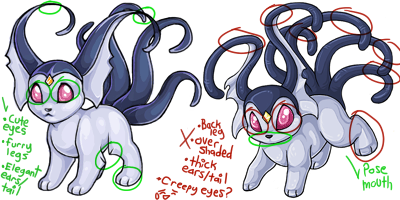
I loved the way the previous attempted revamp kept the little furry legs, and sleek ears and tail. The only thing I didn't like about it was the boring pose and how you could see its mouth. While this newer revamp fixes those faults, it left out it's elegant flow and... the shading is a little much I think. xD I also liked how the previous revamp gave the Kora the cute innocent eyes and soft coloring, along with a pretty shine in the darker blue areas.
And like many others have stated; the legs could look less bulky and more petite, if possible.
It'd be really cool if the artist could possibly incorporate these features to the new revamp. :3 I think the Kora would look splendid then.
And whoever the artist is; good luck! x3 Must be overwhelming to go through so many crits.
(And I hope none of my coding gets messed up as I post. D8)
December 31, 1969, 7:00 pm by
Deleted User
I like this one.
December 31, 1969, 7:00 pm by
starfish


I voted old, I prefer it b/c: the new one is too... shiny? Also, the front legs looked better thicker, these appear too tapered. But most of all, it's the expression. Before it looked kinda harmless and the new one has a harsh expression, something about the eyes. Also, the colors on the old tails were better, these look too much like the ears. I don't own a Kora though, hopefully those who do are happy with the changes. It does need a revamp for sure, just not crazy about parts of this one.
December 31, 1969, 7:00 pm by
Deleted User
I voted new. I do like this one, but yeah, it looks bit round. Like Pac Man xD The tail thingies are also bugging me, as are the eyes. It looks kind of freaky. Kind of annoyed? I don't know, the yes just look a bit to angry and less innnocent than before. It's like the cuddly-ness got stolen from it x.x;
Overall, the art in the revamp is better than the previous, but it just needs some kinks worked out.
December 31, 1969, 7:00 pm by
Deleted User
At first, I thought it was too pudgy, but after looking at it, I have decided it's a stunning revamp.
The kora really needed one, as well.
I really like this, and I hope it does through!
December 31, 1969, 7:00 pm by
Deleted User
Nice, very nice! Except the ears are a tad bit too long.
I voted for the new one. I'm just concerned that it looks a little chubby. Maybe slim it down a bit?