Proposed Montre Revamp!


We've got a new poll for you to participate in! BUT WHAT ABOUT THE MONTR...oh wait :O

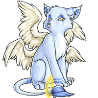
The montre is going through a revamp! We'd like to hear your feedback - both what you like about the proposed revamp and what you dislike. Please take feedback over to the revamp feedback forum as it's easier for us to go through it there.

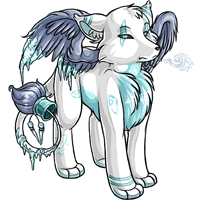
Note: We have not forgotten about the manchu revamp! The artist is still working on the feedback amongst their other duties, and it won't be released until we're completely satisfied. Thank you for your patience!

October 27, 2015, 4:07 am by Autocracy
User Avatar

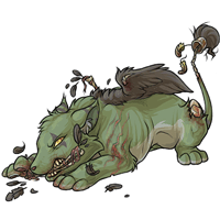
The ears are off and the body is very stiff.

October 24, 2015, 8:24 am by rawnie
Avatar Border
User Avatar

The face is off to me.. I don't like the roman nose it seems to have. I like the rest of it, especially the wings, oh my, but the face.. I like the muzzles they have now, not this roman nose style. It needs to have a more defined nose bridge/stop o.o Like what other users have posted in their alterations.

October 22, 2015, 8:08 pm by mischevious
User Avatar

I like the shading and pose of the new montre, but it's lacking that sly look that the original one has, as well as a clear muzzle. In my opinion, the muzzle is too round, and doesn't resemble a canine muzzle as well as it could.

October 22, 2015, 2:29 pm by Random
User Avatar

I think my issue with the nose is that it reminds me too much of a Bull Terrier and (no offense to bull terrier lovers!) they have always looked ridiculous to me XD It doesn't fit the Montre in my head.

October 22, 2015, 2:25 pm by Random
User Avatar

Well I was going to respond in the thread but it is locked.

I like everything in the revamp better except the face. I much much prefer the smaller snout of the older version, with the curvier look instead of the straight-nosed look (if that makes any sense). Everything else on the update looks really nice, but the face 100% made me vote for the older art.

October 22, 2015, 11:29 am by bipolarness
Avatar Border
User Avatar

I feel like the tail needs to be longer and also the face looks flat and the eyes look weird. I prefer the old art. ):

October 22, 2015, 5:29 am by creep
User Avatar

I haven't read any of the other comments, so I apologies in advance if this comment repeats what many others have said. Although I really like the shading of the body and the colour is very rich and the pose is very shy/cute like I originally read the montre to be; the face is very strange. I think it's because of the rounded face and awkwardly sloping snout/nose bridge. The nose seems lower than it should be, and lacks any hint of a defining point. The legs also seem short, and imply a younger animal. The original montre has longer/thicker legs (not too much though, because at least one is not relaxed, but bracing against the ground), and I would like to see the new montre reflect that a little more. Special recolours often have slightly longer looking legs as well, it would be nice to see it as a common trait between colours. I also feel there is something amiss between the shading through the light-touching areas of the body and the head, but I'm not good enough with art and perspective/lighting to really know what I want to say/describe. It looks nice, and I would prefer it to the old montre, but I would be lying if I said it were an overall great revamp.

October 22, 2015, 2:03 am by Misty_182
User Avatar

Leave the watches alone please. After finally giving my first (and favorite) pet an original Bloodred pose, you're going to ruin him. Enough is enough.

October 22, 2015, 1:41 am by Akita
User Avatar

Also i want to mention that I think the reason people are thinking this montre looks like a chibi is because the legs are really short, especially compared to the long elegant legs of the previous montre.

October 21, 2015, 11:46 pm by quailien
User Avatar

I agree with Ahreinya. I like the new body, but I prefer the old face. Montre is my all time favorite pet so this is a big deal to me.

October 21, 2015, 11:46 pm by quailien
User Avatar

I agree with Ahreinya. I like the new body, but I prefer the old face. Montre is my all time favorite pet so this is a big deal to me.

October 21, 2015, 11:37 pm by Ahreinya
User Avatar

I really prefer the face of the old one, but the details of the new body are better.

October 21, 2015, 11:34 pm by Necolasa
Avatar Border
User Avatar

Also it's front leggs are too short compared to the old version and all the other colors. There's a lot of wasted space so I just moved the image up in the 200x200 square and enlongated front legs (done quick and dirty) as an example:

October 21, 2015, 11:27 pm by Necolasa
Avatar Border
User Avatar

Here's what I did: -moved actual nostral area (black part) on the nose more towards the top of the snout -shortened snout -upturned snout slightly to give a stop (which is missing completely in original) -shortened eye -realigned eye -added brown shading into the neck more so the head doesn't look so detached from the body -widened ear a bit so there's not a weird gap between it an the head

Still needs work though...i'm tired and didn't feel like going crazy with it lol

October 21, 2015, 10:45 pm by Donteatacowman
Avatar Border
User Avatar

Eh, I think I'll abstain from this one. The art is obviously higher quality on the new one, but I don't like the changes to the actual design. The face looks narrower (not ugly by any means, even more dignified, but I'm a sucker for the cute fluffy face) and the pose is more confident and less shy. I like the little tucked-away cute fluff face.

I don't want to vote for the old design though, since like I said, the art is older and of lower quality. Ah, well, at least I zapped my Montre so I don't have one anymore, so I don't need to worry about it. >>

October 21, 2015, 10:43 pm by Alison
User Avatar

I knew the Montre art was dated, but up against this new art its just shameful. New art is SO damn nice. Much better posture, but still has the same attitude. I think I want one.

October 21, 2015, 9:06 pm by Altruism
User Avatar

I'm not sure why everyone's worried about it looking less like a fox. I never saw it as a fox anyway.

October 21, 2015, 8:40 pm by Merlin
Avatar Border
User Avatar

I think the muzzle needs to be thinner and more straight out from the face rather than a gradual slope and a wide muzzle. (more fox less canine) otherwise i think it's good! Would have posted on the topic but it's closed and I still wanted to say what I thought haha

October 21, 2015, 5:40 pm by Lisa
Avatar Border
User Avatar

Not a fan, honestly. But I'll pop over to the forum and explain there. :/

October 21, 2015, 5:22 pm by Frankenstein
User Avatar

amber told me it wasn't supposed to have a mouth & to point that out so V:

October 21, 2015, 5:21 pm by Saint
Avatar Border
User Avatar

the basic design across all colors is supposed to stay the same so i think it having no mouth was less an anatomical feature and more a .. strange stylistic choice, but i mean they dont just grow mouths upon having a potion dumped on them i assume LMAO

October 21, 2015, 5:18 pm by Frankenstein
User Avatar

.. this is for the original montre tho and the original montre has never had a mouth??

October 21, 2015, 4:53 pm by Lindsey
User Avatar

There's something so awkward about it. I normally love revamps but I can't get behind this one at all. It's definitely something with the face and wings. The wings look so tiny, the head to big and awkwardly angled. I wish I could pinpoint it. But this definitely needs some final touches.

October 21, 2015, 4:24 pm by Saint
Avatar Border
User Avatar

this is actually incorrect friend

October 21, 2015, 3:40 pm by Lavy
Avatar Border
User Avatar

I do like but, as everyone else is saying the head is a little off?

October 21, 2015, 3:12 pm by Kellijuana
Avatar Border
User Avatar

Yay for updated art!! <3 Nicely done! Not to be the odd one out but, am I the only one who doesn't follow the logic of anatomy issues? These pets are artistic representations of imaginary creatures... They could have boneless skulls and feet on their heads... or bendable bones with a consistency similar to taffy... or joints that are more like sleeves than a hinge or ball and socket.... I get that the artists may use real world animals as references, but I don't get the picking...

That being said, I love the face on 's drawing. ^_^

October 21, 2015, 3:06 pm by Nova
Avatar Border
User Avatar

I voted for the old because... I can not stand that face. It just, doesn't look... correct. I'm sure it's the snout as others have mentioned but sadly even the edits aren't looking enough corrected for me. They're relying more on shading to add a bridge and that isn't what it needs. It needs to be more like the old face/skull and actually slope outward.

Everything else about it is fine, in my opinion, but that snout needs work. The wings and tail are lovely. I love how soft the tail seems, even in image alone.

October 21, 2015, 3:02 pm by stars_water
User Avatar

Somehow the new version just looks really off.

October 21, 2015, 2:54 pm by Socialist
Avatar Border
User Avatar

I like it! Although I slightly prefer the positioning of the head in the old version.

October 21, 2015, 2:04 pm by Briar
User Avatar

I forgot to mention, I noticed everyone loving the wings, however being someone who studies wing anatomy, the wings are horribly mangled and broken. They LOOK pretty but they are very non functional. Again, a great start but it needs a lot of work.

October 21, 2015, 2:01 pm by Briar
User Avatar

I want to say the new one..... and rarely do I vote the old design. But something about the new one is disturbing, maybe it is the facial anatomy (which is horribly broken) or the very stiff not very montre like anatomy. I agree there needs to be a revamp but this just isn't it..... I'll post more issues on the forums when classes are over. It's a good attempt but it needs a lot of work.

October 21, 2015, 1:40 pm by Stacie
User Avatar

I'm going with the old design. I do love the wings, the shading, and lineart look amazing in the new one too, but as everyone has pointed out something is wrong with the face. I also don't like the pose, it's very stiff. The old montre is more sort of leaning a bit and sitting casually. The muzzle is too large and just oddly slanted down, and the head looks detached to me for some reason. Like he's a bobblehead or something of the likes. In fact the more I look at the new Montre design, it just looks like a winged Kumos with very faint differences.

October 21, 2015, 12:59 pm by Abaven
User Avatar

I do love the overall design, but I have to agree with what others have said about the head. (Personally, I like the original narrow-nose-look) The new one seems a bit off, but if the head was fixed, it would be perfect.

October 21, 2015, 12:51 pm by Let_me_delete_my_account
Avatar Border
User Avatar

It is quite nice, but I prefer the old one. The new one is to way to stiff and distanced for my opinion. D:

October 21, 2015, 12:48 pm by Sable
User Avatar

Reminds me of a bull terrier in the face, that's the part I'm not fond of.

October 21, 2015, 12:45 pm by witchywoman
User Avatar

The downward facing muzzle reminds me almost of a Koala. I love the old pose, it just needs to be exactly the same with updated shading!

October 21, 2015, 12:23 pm by FireFlea
User Avatar

Great revamp, though I certainly agree that the muzzle is not correct/ seems off. I would correct this before continuing :)

October 21, 2015, 11:54 am by BabyGirl1516
User Avatar

looks pretty good, but there is hardly any face shading, the muzzle doesnt look quite right....and need to see more of the second wing

October 21, 2015, 11:41 am by Separatist
User Avatar

Sweet little puppy, everyone pat the puppy

October 21, 2015, 11:20 am by Cathii
Avatar Border
User Avatar

I definitely like the new version better, although the head does seem a bit off -- it also has less shading compared to the body, which makes it look rather flat looking.

I may be partial but I think it'd be nice to see a bit of wing on the other side, it really looks like the montre only has one at the moment (and not just because perspective is hiding the second wing!)

October 21, 2015, 10:59 am by Pewy
User Avatar

It's really well drawn but there's something really off about the head. If they'd redrawn the head it would look so much better.

October 21, 2015, 10:05 am by Aperture_168
User Avatar

I liked the broader face on the original Montre, but the art is definitely a huge improvement!

October 21, 2015, 9:42 am by Deadpool
Avatar Border
User Avatar

This is my favorite pet hands down. I'm pleased to see it getting some lovin' but I agree that there is something off about the snout/face. Overall the details are lovely but the face suggestions down below are great critiques!

October 21, 2015, 9:29 am by SpoonyBard
User Avatar

Most peeps here stated it already, just gonna give my 2 cents:

The overall improved a lot, I like that the details from the old one, like the feathers on its tail and the grey strips still remained. And it looks way fluffier now, which makes it just 10 times cuter. Just the snout seems a bit off and (what I haven't read up until now), its ears are a tad too thick and bulky, the ones from the old one are way slimmer.

Overall, yes, I approve :D

October 21, 2015, 9:23 am by Flight
Avatar Border
User Avatar

Oh dear. That face is pretty bulky even if the art is an improvement in general.

October 21, 2015, 9:07 am by Jillian
Avatar Border
User Avatar

I would like this more if we could see the other wing. I feel like it needs to be shown.

October 21, 2015, 9:04 am by Stiles
Avatar Border
User Avatar

I don't personally have a Montre but have thought of getting one.. that being said, I prefer the older version and honestly think it should just be built up more. Like add more texture and detail, not completely revamp like the suggested new version. It's absolutely no offense to the artist, the art is really great, it just doesn't look like a Montre? It seems the newer is winning the poll so far, though, so I can always just use an overlay if I choose to still adopt a Montre :)

October 21, 2015, 8:57 am by HYPEBEAST
Avatar Border
User Avatar

The face reminds me too much of a bull terrier. The muzzle is too flat and long, somehow :/ It's the only thing really that bothers me about the revamp.

October 21, 2015, 8:50 am by Mad
User Avatar

I like the update from the neck down, but the head just looks off. Flat, and uninteresting, and wrong.

October 21, 2015, 8:35 am by TracyH
User Avatar

I like it personally. I believe one time a long time ago it was said that Subeta pets are not always one breed of animal. I am almost sure it was said that a sheeta was a combination of a cheetah and a sheep. That could explain the reason that the montre's facial features are not 100 percent canine.

Now my only beef with revamps and new pets is I wish all the current pets were drawn in every color that that is available on Subeta before moving on to revamps and new species.

Leave a Comment

Use @username to mention someone. Supports markdown formatting.