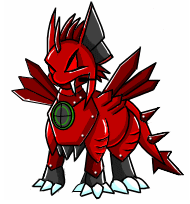
Cadogre Upgrade Feedback! (Where are the Claws? D:
Replies
<p>Just curious -- how come folks with constructive criticisms aren&;t making a revamp feedback thread? Several pets have been modified post-release due to user request! If there are anatomy issues or if the attitude of the pet has been totally altered, artists seem pretty willing to consider tweaks... just not from offsite comments or news post replies.
 |
|  old | new
(thank you to for the images!)
old | new
(thank you to for the images!)
So plenty of good and not-so good things on these guys!
to quote my original comments:
<p>also curious why the targeting system has been turned into a misplaced looking random dull orb on its chest?</p>
<p>if we&;re turning them into robo-housepets now, why even keep it at all? aesthetics?
(basically, there&;s no inner light that a working radar screen should have, thus making the orb dull and muted)<a href="edit">/quote</a>
[quote]the more I look the more that non-symmetry of the head is bothering me. really, really bothering me. like, eyetwitch-level bothering. it&;s such a small thing to focus on but once it was pointed out it&;s just... THERE.
PROS: (both mine and others I've seen) -bulkier, has a more "machine"-like weighted look -lineart and shading upgrades -"confident" pose of tail -overall pose has remained consistent -removal of mic -eyes look more focused -more lore friendly -better design for housepet -shorter fangs -plastic/stronger metal looking coloring (less shiny)
CONS: (again, mine and other's. note that some pros may be considered cons by different people, and the other way around) -extreme rounding of pointed edges, to the full removal of claws entirely -what happened to the claws -WHERE ARE THE CLAWS -radar/targeting system is dull/turned off -eyes are darker, less life -new softer shading appears less metallic and more plastic/toy-like/organic (versus robotic) -front legs appear small/out of proportion -tail in awkward position -head spikes are angled to the right (our left) instead of straight down the face -tail is curved but not segmented to allow movement -shorter fangs -chestplate "bib" -neck doesn't appear to sit inside the torso well -much less fierce, domesticated, robo-housepet
OTHER: -man, Calvin's HA really needs an upgrade now too
any others like to chime in? :v
[egg=roadkill] | | [tp=roadkill]
Yeah, the claws should have stayed pointy, I'm not sure why they're so round.
and just a note here to say I'm just paraphrasing a number of comments, I won't quote anyone's crit without permission. I will edit them in if you'd like though!
[egg=roadkill] | | [tp=roadkill]
I like the changes made. :) Had to get one as soon as I could.
I can see where people are coming from with the criticisms, especially with the claws/toes and the head spikes. Overall though, I really like the change.
As for the plastic vs. metallic texture, maybe there is a plastic exo-skeleton or something like that? It says in the Subetapedia article that they're made out of lightweight materials that are still meant to be durable. So maybe it's not quite plastic but not quite metal either, IDK. Or they have paint or some kind of finishing that looks plastic-y.
I do definitely prefer the pointier claws, but that's about the only thing I liked about the older design. It was all metallic and pointy and edgy, which made sense for, y'know, robot soldier dragon-dog-things, but in a lore-friendly light this makes more sense.
The shading looks way better and more in line with other pets now, the chunky sturdiness is great, and the body as a whole looks a lot more realistic/believable that it could get up and move now. The previous one didn't have that.
I love the chunkiness. So much. It reminds me of the ancient Cadogres.
I loved them so much, with their cute round bodies and well-defined front halves. Awful anatomy, but they were charming.
edit:
Also, I really hope that if they revamp the Bloodred Cadogre, it looks like the original in some way? Even just the funny snake-attachments. There was a charm to how weird it was.
The plushie never got updated. :')
the more I look the more that non-symmetry of the head is bothering me. really, really bothering me. like, eyetwitch-level bothering. it's such a small thing to focus on but once it was pointed out it's just... THERE.
[egg=roadkill] | | [tp=roadkill]
I like the shading. It could do with a bit of shine, but it's good and more consistent with shading for other revamped pets on the site.
I do not like the sizes and shapes. I prefer the longer, sharper claws of the original to these newly shaved down ones. I also like the shape of the old Cadogre a hundred times better. The revamp looks very stocky and blocky (semi-intentional rhyme). While the original Cadogre seems cool and dangerous, the new one reminds me of a friendly toy.

For me
Pros: The texture is tangible like I can reach out and touch it. Drawn pretty well.
Cons: Needs its claws back.
Does anyone else think that the chestplate looks detached and kind of like a bib? In the old one It kind of merged with the neck differently which mechanically didn't make sense but it didn't look like a bib.
Fangs look kind of small. Lack of glow in the chest orb and eyes makes it look kind of lifeless (the twilight one is actually perfect on this front).
Negotiable: The former one looked sneaky like it worked with the Hustler. The new one looks like it's all about justice and Optimus Prime stuff. I liked the old one but I can get used to robot justice.
mentioned the old bloodred cadogre.
 Image now enabled thanks to :D
I think the new ones look great! I think they'd look even better with a few adjustments mentioned here. I also liked the pointy claws and the suggestion of making the sonar thing more glowy would be really cool
<p>

I can&;t see any images I&;m posting but maybe others can see it idk.
You need to link directly to the image, not the imgur gallery page. :)

Maybe it's just me, but I prefer the current Bloodred version,
I also like the stockier build. To me that makes it look more like something that used to be a big tough battle robot before it became a friendly pet.
I like the revamp, but have to agree that the rounded claws takes away a part of what made the Cadogre look like a lethal machine. Also, the softer shading doesn’t really help it. While I like the revamped shading, it could have stronger highlights, slightly deeper shadows, and sharper shading, considering even dull silverware will have a harsh shadow and reflect back bright lights when you shine light to them.
Overall, it’s a great revamp and while my suggestions may seem nit picky, even the tiniest detail can change the entire feeling of the art.

I have no comment on any of the other critiques of the new version, but I will say that I've worked with a variety of metals and a variety of plastics during my schooling (MS and BS in mech engr).
The old material shading of cadogres reads to me either as super polished absurdly clean chrome finish metal or more realistically as shiny plastic. The new shading actually looks like a really nice approximation of an aluminum alloy which would be a good choice as you can make tough and strong aluminum alloys that are naturally both lightweight and corrosion/oxidation resistant. It looks like pretty darn good red anodized aluminum alloy. Also if it it's metal and not the natural color of that metal then it's gotta be colored by something. Often the coloring comes from powder coating which actually improves the corrosion resistance of the metal and looks somewhere between a metallic and plasticy finish depending on the thickness and the powder coating material.
Overall I think the shading choice makes complete sense for the materials you'd make cadogres out of. Also, most of the advanced robots that are out there don't have shiny metal outer plating as it's just infeasible weight-wise. They primarily use plastics, or if they need something really strong, CFRPs so I wouldn't say that plastic equates to toylike.
The first thing I noticed were the now nubby toes instead of claws. They don't appear nearly as threatening as they used to look. I got more of a sense of danger when the claws were sharp and pointed. I also agree with crits about the spikes being too rounded now. Overall the pet looks way too organic now, opposed to looking like a machine or robot. Having the pet look shinier would help a lot too.
I like that the fangs were shortened a bit to be more proportionate with the lower jaw, so it looks like they can actually be used for something. I also like the more narrowed eyes. However those are the only things I do like about the revamp.
Forum art by me
Does anyone else think that the chestplate looks detached and kind of like a bib? In the old one It kind of merged with the neck differently which mechanically didn&;t make sense but it didn&;t look like a bib.
I think this is due to a combination of the shading and the changes made to how the neck connects to the body. The neck doesn't look seated into the torso, and that's because the new version's chest plate doesn't wrap around the neck and go over the back like it does in the old one. As a result the line drawing looks flatter and the neck floats disconnected from the body. It also makes the radar look off center. The shading reinforces this flatness by being stronger to the side than it is on the bottom.
Question: Were all the special cadogres revamped simultaneously? If not then they'd already phased the radio/mic out with the special cadogres a while back.
I kind of get why all the spikes were dulled based on their subetapedia article. I'm not sure how many people would want essentially a robot dog that had a million opportunities to cut or puncture their owners.
I don't think it necessarily looks like a bib but I get what you mean. Just to me looks like it's non-flexible plating which stops at the neck because it needs degrees of freedom past that point. I think there needs to be a bit of thin but dark shadow on the bottom of the neck that follows the rim of the body's collar bit to make it clear that bit goes over.
Sorta like:
 but with a neck like this (shorter obviously)

Is the radar not off center? Does it just look like it is?
I think only the basic colors were updated the other day. The special colors may have been released a while ago, but sometimes pets will be drawn with better art in their new colors before the basic ones are updated, if the artist knows that they'll be revamping the pet at some point and has an idea of the direction they want to go with the pet. At least from what I've noticed.
And I agree about the more rounded edges and such from the Subetapedia article, it makes sense for the new version to look a bit more friendly and approachable but still somewhat menacing. That seems like the kind of thing that could be fixed with custom overlays as well, if people wanted to.
I think the new version fits pretty well with what they're trying to do with the pet's lore. Although I still think the claws could look a bit pointier, but that's about it.
I'd have to redline it to be sure because there a lot of things going on that lead to me thinking it's not lined up quite right. It could just be an illusion.
Yeah I just was wondering because the mic being gone is listed as a con but it's sort of been a thing for a while now if they non-basic colors weren't updated at all.
It definitely looks like a pet that was once very weaponized and was then made more friendly when it became a consumer electronic. And I'd agree that making points sharper wouldn't be too difficult to fix with custom overlays.
Yeah I think the claws could be a bit pointier as well because generally claws are still sharpish on dogs and cats. Then again, just imagine the nightmare those old sharp metal claws would be for wood flooring or furniture.