Fixed!
Filter
Show Official Posts OnlyReplies
Nooooooooooo, it was so well placed at the bottom!!!!!!! I don't want to have to scroll past it every single time!
I know whick item I've just clicked on! If I want to know the colours, or if I want to buy the item, I can scroll down!!
Please move it back, this makes me not want to use my wardrobe, and I love the new wardrobe!
You guys totally agree right?
I see what you mean... that is annoying. It also makes the page jump every time you add something new to the avatar. :P
Looking for
I agree! Please put the preview back to the bottom. It just takes up too much room when its above the listings of clothes. I thought this was already agreed on when everyone on another thread...were so pleased to see it down below. This new change makes me very sad. The wardrobe is a very important part of subeta.

Yeah I'm not sure why this was randomly added back to the top, I preferred it at the bottom as well.
Why was this changed back to being at the top, ? I thought you put it at the bottom to resolve all the problems & extra scrolling that it had being at the top in the first place?
It definitely needs to be back at the bottom please!

My CW shop ~ forumset by [/font]
I agree. I mentioned it on the wardrobe thread here.
I'm slightly frustrated because I gave some feedback related to this a while back (">like here, I gave some detailed suggestions for ui/ux) but it's been ignored.
The new change makes me want to stop using the wardrobe too.
🐝 ☕ bug (he/him) | your friendly neighborhood code wrangler. stay in the loop! join and check out the latest admin post highlights
The forums were changed and then had a whole host of problems, but they were abandoned in favor of the wardrobe revamp. The problems that the wardrobe had were abandoned in favor of the forum search. Now that the forum search has been broken for ~a week with no acknowledgement of course the focus has been shifted once again.
Subeta has this problem with starting too many projects at once and never finishing any of them. It's been brought up before and I'm sure this won't be the last since it just keeps happening.
As for this problem in particular, it's cosmetic, but I don't like it.
But I have bigger questions like, did Keith stop working to find out what was causing the layer scrambling that's been plaguing firefox users for months? I haven't heard any news about it in quite some time despite experiencing it consistently. That is what's making the wardrobe almost unusable for me.
Sorry if this seems super salty I just... I'm starting to lose patience...
he/him / 31 / EST |  | My best friend is |
Hopefully they were messing around with other things in the wardrobe and it got put back at the top temporarily...
I use chrome, so I've never had that problem. I'm sad the forum search has stopped working though, it's such a useful feature.
Basically when trying to build an avatar normally, just clicking on clothes and adding them to the HA, they start to add themselves randomly to the items worn list. Then when you try to re-arrange the layering by moving one item in particular, other, unrelated items start to reposition themselves. It's a nightmare to change clothes and at this point I've learned to just save my outfit repeatedly in the shared outfits page, and close and re-open the wardrobe as many times as it takes for me to finally finish the outfit. Because for some reason opening a fresh wardrobe puts the items where you intended them to go, but it doesn't stop the layer scrambling from starting again immediately when you try to re-arrange the layers.
I did not have this problem in the V3 wardrobe so whatever's been changed in the V3.5 is what is doing this.
I'm sad about the forum search too, I was so happy to see it come back, but when I started trying to use it seriously, I found out that it was broken again.
he/him / 31 / EST | | My best friend is |
Mh. I haven't had this problem. In the last wardrobe I had something similar though. I would try to move an item and it would select all of my items, so I couldn't move them in relation to each other.
That doesn't happen in the new version.
Overall, I like the new version better than the old one, except for a couple things. And the fact that drawers still aren't fixed. But this preview at the top thing is so stupid it really bugs me. Especially since it was fixed and now it's unfixed.
Yeah Uh, Definitely hate that. I already tend to play Subeta on a smaller window since I'm at work and don't want to make it super obvious I'm playing on here during work. Which already makes pages like the wardrobe frustrating because everything is so big and menus jump around with every click and I have to scroll to keep seeing things.. But now literally every item I click is going to cause the page to jump down.
I really wish they could size things down a bit. There's so much white space and giant text. Like the current list of items you're wearing could be moved over to the left more, I hate having to click the items tab and then open the filter to actually sort through my items, Why isn't that just naturally open to start with when it's been a key set of features to the wardrobe for YEARS and clearly necessary for the user base to sort through some thousands of items most of us have?
And then apparently Subetans are assumed to be going blind because the text for everything looks huge to me. I pretty much load the Wardrobe and instantly drop the zoom down to 80% just so I can almost see everything without scrolling.
Now this. Whyyyyy?
I agree with you 100%. I'm gonna quote my post ">here because I think the mock-up and points I made would be worth considering:
The wardrobe&;s interface is functional but could be arranged more effectively. Here is a quick mock-up illustrating my suggestions for rearranging the layout:</p>
<p>
 </p>
</p><p>I only made a few changes:</p>
<ol>
<li>
<p>I placed the item preview image next to the avatar preview, rather than under it. This is easier and more natural for most people, since we&;re so used to seeing related images laid out side-by-side rather than under one another (think before-and-after images, etc)</p>
</li>
<li>
<p>I placed the item info under the two avatar previews, where it&;s nice and easy to see. On the current interface, the item info pops up below the list of search results. Since this info doesn&;t show up until you click an item, it sometimes causes the entire page to get longer (which can cause a scrollbar to suddenly appear). Also, especially when the search options are open, you have to scroll down to see it sometimes. It&;s better to place it right beneath the previews, where it is both easy to find and can take up a fixed amount of space regardless of its content, so it doesn&;t mess with the layout when you click on different items.</p>
</li>
<li>
<p>I decreased the padding of form elements, so that they are more compact. I still think they take up a larger percentage of the interface than is warranted though...</p>
</li>
<li>
<p>I made the search results box a little bit smaller. I don&;t think this section needs to be as big as it currently is, nor is it important that it take up a lot of space. So, to make room for other elements to fit on the page, it&;s totally fine to make this a bit smaller.</p>
</li>
<li>
<p>Super small change, but changed "Order By Options" to "Search Options" as an easier-to-parse description of what those are.</p>
</li>
</ol>
<p>Please note both the mock-up and these suggestions aren&;t exact - just some general ideas I had thinking about the interface. I also had some thoughts on the tabs at the top (and some other minor things), but I&;ll organize my thoughts better before posting about it.
🐝 ☕ bug (he/him) | your friendly neighborhood code wrangler. stay in the loop! join and check out the latest admin post highlights
I agree! I noticed it yesterday and said Eww... I do hope it's changed.
Seriously. Driving me nuts because it resets everytime orz I'm on a 13" laptop so my screen gets messed up each time the item preview changes :/ It was so perfect at the bottom /sob
 |
|I absolutely agree with all your points. You reminded me of another thing. Because the Item Info pops up and elongates the page causing the Scroll bar to then show up for the entire page, I often find myself scrolling through the search item results , only for that to suddenly run out of results and then it scrolls the whole page down. Then I have to move my mouse back out of the search thing, scroll up to get back to being able to see everything and basically readjust my page back the way I had it.
It's minor but infuriating. I also really have no idea why the left of the page needs so much space. As well as why there is so much space between the tabs up top and the main stuff on the page.
Don't get me wrong I think the overall thing is a major improvement from before but I just hate a few things about it that really complicate the process of building an avatar.
Yeah, I definitely preferred it at the bottom, or like what did with it underneath the HA. The jumping when the items pop up is what throws me off.
can anyone post a screenshot/browser information? i'm not able to duplicate this in safari/chrome/firefox.
okay we're good i know what y'all are talking about now

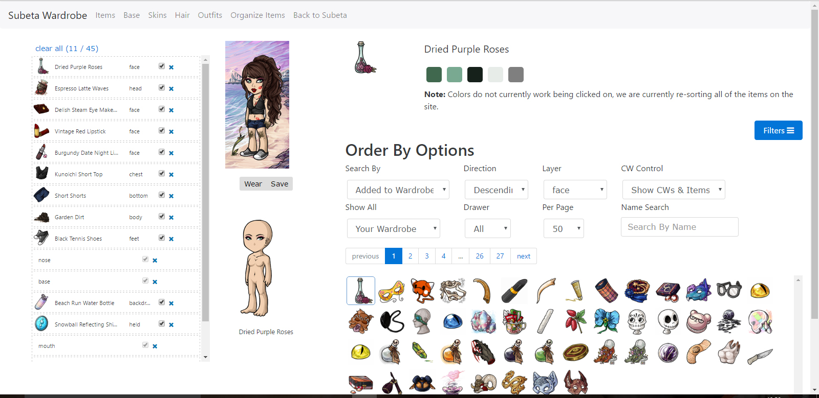
We're talking about the item info element, up top there. It used to be under everything.
🐝 ☕ bug (he/him) | your friendly neighborhood code wrangler. stay in the loop! join and check out the latest admin post highlights
I've got a screenshot at this link (blame imgur for not uploading it :P) - when you cick an item, the item preview (colours and item image / name) appear at the top rather than at the bottom where Keith moved it a week or two ago.
My CW shop ~ forumset by [/font]
thank you! i thought you guys were talking about the overlay preview since... the topic title says preview 😂
keith's looking into it! :)