Kumos/New Wardrobe Layout Feedback
Labels
Filter
Show Official Posts OnlyReplies
I wanted to give some feedback about the layout & some of the related functionality of the kumos wardrobe!
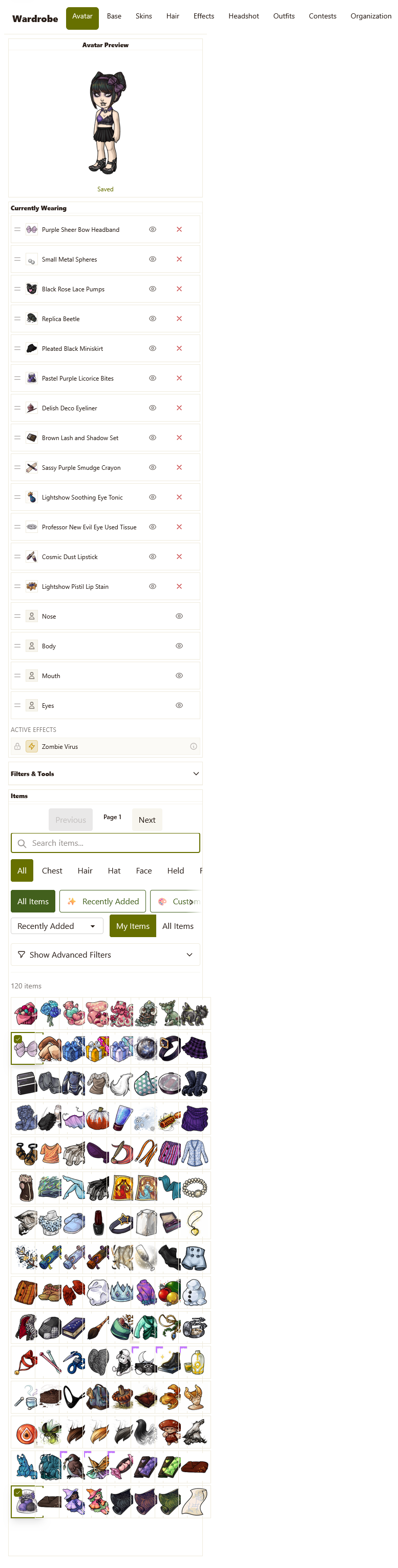
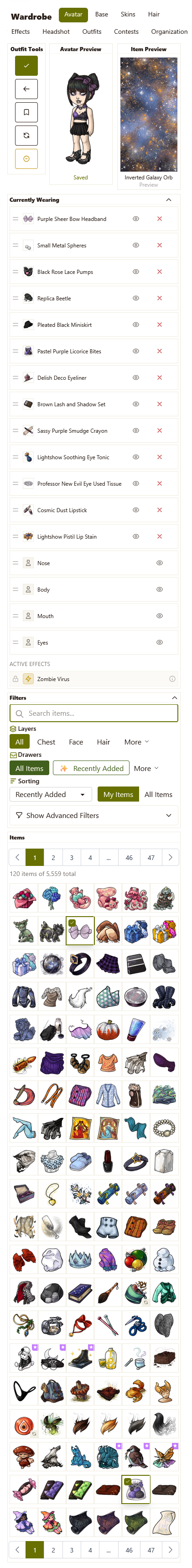
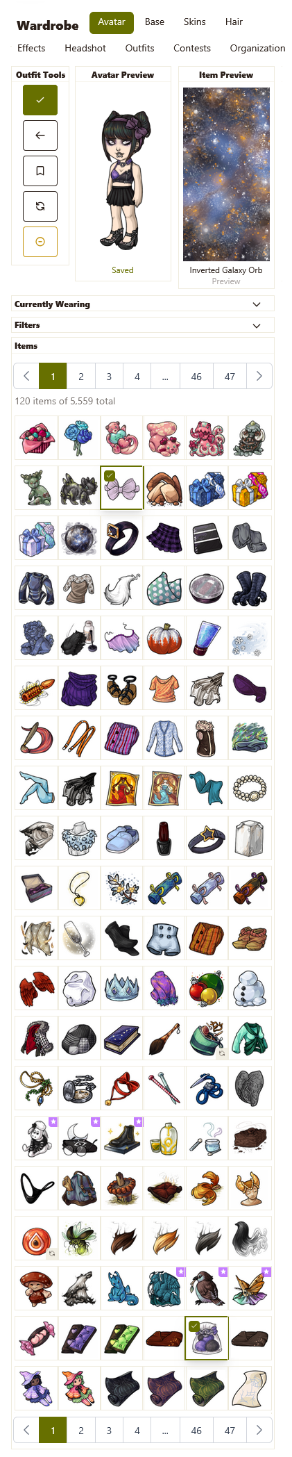
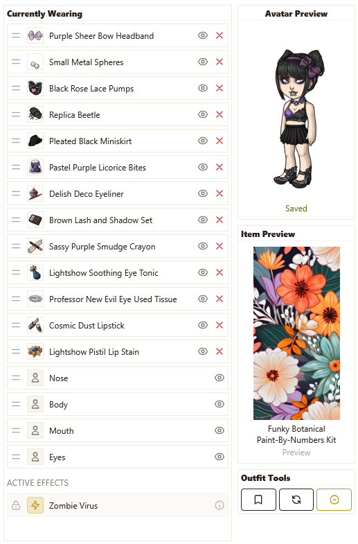
Comparison Images + Mockup
"New"/legacy:
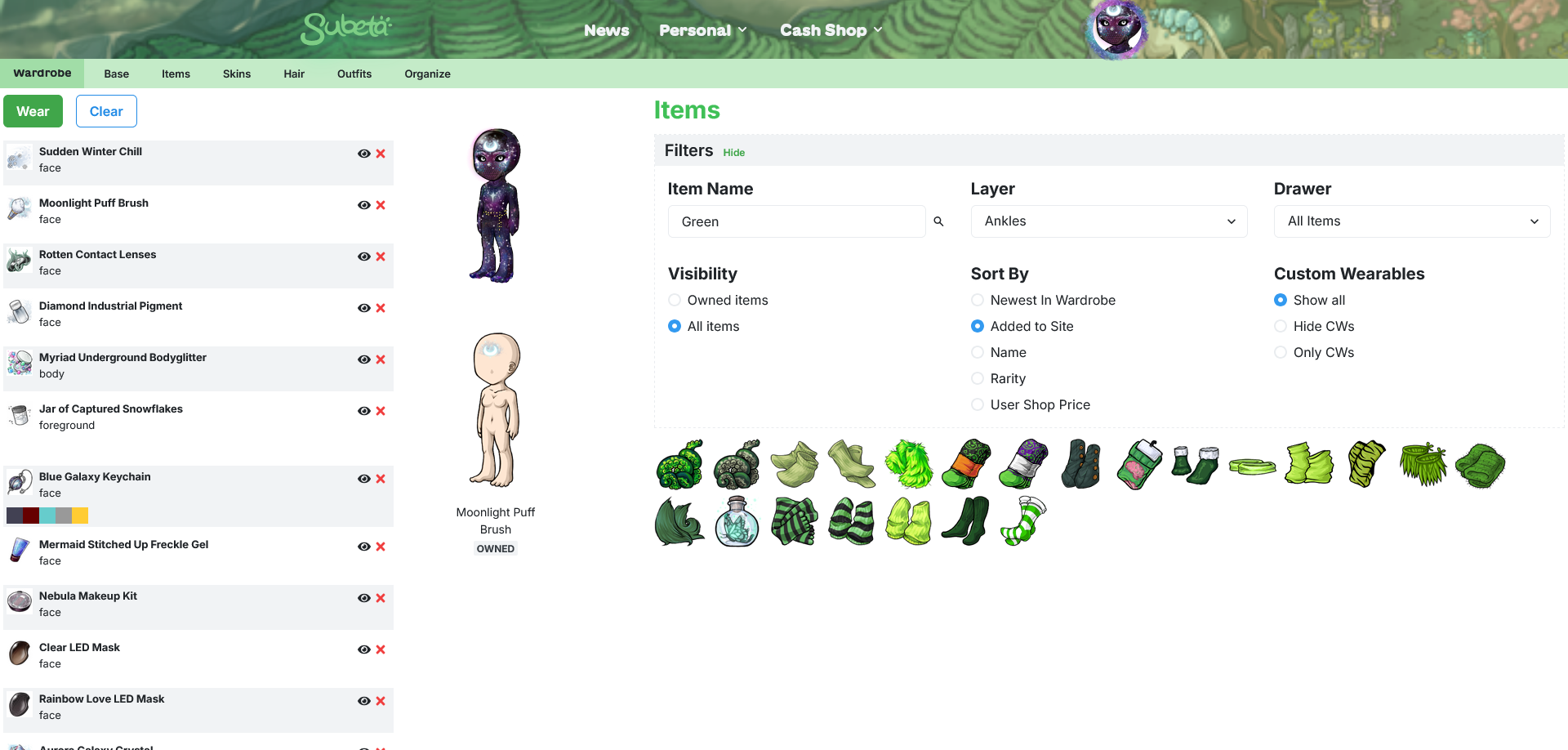
Kumos:
Rework:
I'm going to try to organize my thoughts by areas of the page so hopefully it's easier to follow.
- Avatar Preview
- The avatar scrolling on top of the layers is too inconvenient, I think - if you want to change something about a worn item the avatar is covering, you have to scroll up the whole page and potentially lose track of where you were in the list of items you were browsing through.
- Also, not being able to see something because you need to scroll up and not being able to see something because something else is covering it feel different - I think having the avatar cover the worn items does not feel good.
- For the above reasons, I moved the avatar preview into a second column in my rework. To save space in this new position, I made the box about as skinny as possible. This entire column should also be fixed in position.
- At the moment, the yellow "unsaved changes" banner goes on top of the avatar when scrolling down the page, making it so you cannot see the top quarter of the avatar anymore - these definitely shouldn't overlap like that; the avatar should always be fully visible.
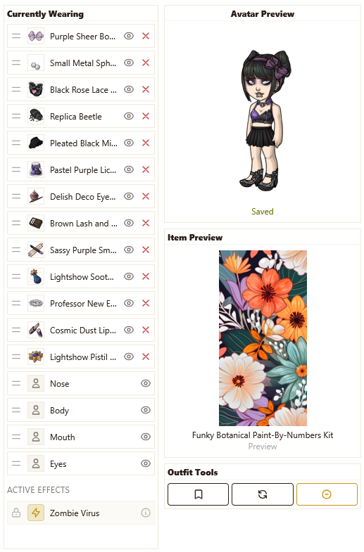
- Currently Wearing
- I think this section needs to be a fixed position box that scrolls independently from the page, like it is in the legacy wardrobe - this makes it much easier to quickly see items that you are wearing & make any changes to them, wherever they may be in the list.
- At the moment, if your list of worn items is longer than your page length, you can hold an item and drag it all the way to the bottom of the list but you cannot do the same to get an item to the top of the list.
- You can no longer see previews of the items you are wearing by hovering over them - in theory, you put the item on so you should know what it is, but in practice a lot of items don't match up with their wearable image so this may be difficult for some users to remember, especially if putting an old outfit.
- Item Preview
- I think the fixed preview area has to return. In theory, the hover previews aren't that different, but in practice they are so much more difficult to use because your eye has to move around so much. In the legacy wardrobe, you can keep your eyes fixed on the preview area as you scroll over the items without really looking at them, making it very easy to look at large amounts of items quite quickly.
- Previews should not include default facial features, because it means you essentially cannot preview what items that give you facial features actually look like.
- It would be nice to have a link to shop search for unowned item that opens in a new tab unlike legacy. Another feature that might be nice would be the ability to wishlist items directly from the wardrobe? (& these wouldn't need to be visible for owned items, of course.)
- Outfit Tools
- In my rework, I placed this at the bottom of the viewing area with the idea that it would be fixed in position like everything else in the first two columns.
- I like the inclusion of an undo button!
- What is the point of the "outfit status" that has a sort of progress bar for layers used? Are we returning to having layer limits? I just removed this in my rework because it doesn't seem to serve any real purpose & I was trying to maximize space.
(I just want to acknowledge that the above changes do largely equate to "return to the legacy layout" which I know is not the goal, but I just struggled to come up with a different way to lay things out that would easily show a lot of information all at once. I did consider placing the avatar preview & item preview above a slightly widened currently wearing section, but I think that limits how many worn items you can see by too much.)
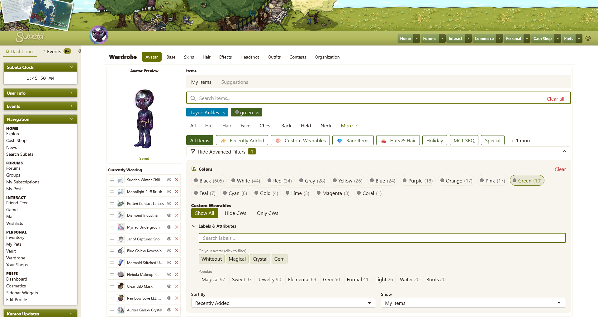
- Sorting Filters
- Currently on kumos, these are all hidden in the "advanced filters" section - I don't think these options are "advanced" and honestly they are probably options that get used very frequently, so they should be visible by default.
- I changed the my items/all items toggle to a switch just for fun, but I think buttons like the custom wearable visibility options could also work. I just don't think a dropdown menu is necessary when there's only two options.
- (Also, speaking of the custom wearable filter, isn't the default "custom wearables" smart drawer sort of pointless since one of the filters does the exact same thing?)
- Layers
- There definitely need to be more layers shown at once, because I think (or, at least, for me personally) this is the most common way to filter through the wardrobe.
- The order of the layers seems like they're meant to be top to bottom on the HA but then there's stuff like "bottom" after "feet" that doesn't quite match that?
- The layers chosen to always be visible on the page also seem weirdly selected - like, "back" is one of the smallest layers with only 1,506 items/434 official items in it so why would that be one of the layers that should be most easily accessible?
- In my rework, I changed the order of the layers visible by default to be biggest to smallest layer (by official item count) because presumably those larger layers would be accessed more often. So now instead of "back" we see "backdrop" which has 7,277 items/1,923 official items.
(Just a little note that I added section titles for the sorting, layers, and drawers because I think it's best to be clear about what's what as it may not be that intuitive for newer users. Also, I made it so that this entire section - now "basic filters" - could be collapsed like the "advanced filters" to give the ability to focus on just the items if desired.)
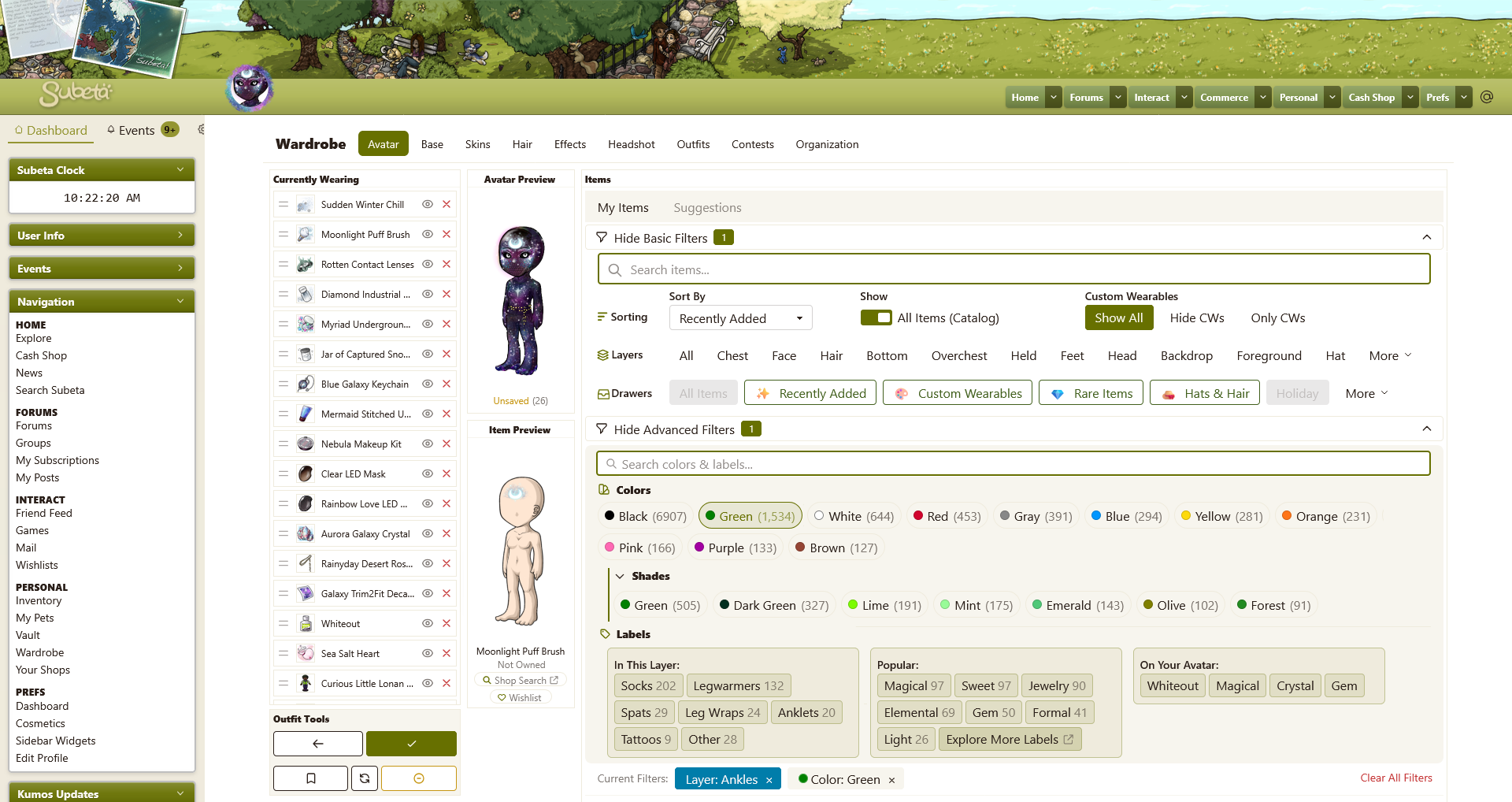
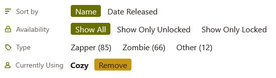
- Color Tags
- I assume this is probably just a mistake/error, but the circle by the color name should definitely match that color rather than be grey.
- I think I will make a different post to discuss this further, but basically: I think we need some secondary shade tags because realistically, each of the primary color tags is going to have thousands of items in them. Plus, it would be easier to select "green" and then view shades of green instead of having them be completely separate entities as they currently are, because either the list of colors will become ridiculously large and/or you will have to guess which shades of a color have their own tag (i.e. green vs lime currently.)
- You are also able to search for labels of colors using the labels & attributes search bar that are independent from these colors - I feel like those shouldn't be separate like that because it's redundant? Though wearables probably do need distinct labels/colors for the wearable version vs the item itself.
- At the moment you can only select one color at a time - it might be nice to be able to select multiple, which I think should pull items that have all of the selected colors rather than any of them.
- Labels
- As above, I think I'll mention more about labels in another post because I do think they need some refinement, but they're definitely a fantastic addition to the wardrobe that will be super helpful! You can kind of see part of my thought process on labels with the "in this layer" section I added in my rework here - these would be labels that would be specifically targeted at breaking the wardrobe down into more bite-sized pieces and bringing additional clarity about what to expect to find in each layer.
- In my rework, I added a link to the labels page in the "popular" section because it seemed like it could potentially be a useful discovery tool? But if this gets included, it has to open in a new tab!
- Currently, selecting multiple labels shows results that match any of those labels. I personally think it would be more helpful to show items that match all of the selected labels i.e. I select "magical" and "boots" and I get to see magical boots.
- I don't really think the labels section needs to be independently collapsible, but if it stays like that: currently when you remove the last/only applied filter that is a label, doing so also collapses the "labels & attributes" section.
- You can click on a color tag to deselect it, but you cannot click on a label to deselect it.
- When you have a label selected, it shows up twice - once with the other filters, and once in the label section under the label search bar. I don't think that's necessary - it only needs to be in the overall filter list, I think.
- I changed this section into columns in my rework because I was trying to break up the monotony of the rows a bit, but I will acknowledge that it might be too busy looking; the whole "advanced filters" section has a lot of options but, then again, it is the "advanced" section so that's probably fine?
- Current Filters
- Again, added a title to this to make it clear what it is.
- Currently, a selected layer will say "layer" in front but none of the other filter categories do this. I see they're all different colors, but I think the additional label keeps things neater in a way & wouldn't mind seeing them all include that.
- I moved this section to below all of the filter options in my rework because it felt like the more logical spot for it? Since it's after the area where you select them & closer to the items they're filtering.
- Item List
- Most users will not own that great of a portion of all wearable items, so that means that when they view the all items category, almost everything will be faded with a red lock - it just doesn't look great and makes it a little harder to look through unowned items. If anything, items you already own should be the ones that have some kind of indicator but it should not obscure the actual item in any way (so, like, a colored border or something minor like that.)
- I like having a CW indicator within the wardrobe, but I think having a relatively large box over the item itself obscures too much. Would using the legacy site CW stars be possible instead? Or just a colored border around the item? There could then be a label that says custom wearable next to the item preview instead, to explain what the chosen indicator means in a place where there's more room to do so.
- I mentioned above that I don't think item previews should remain as a hover next to the item, but if they do: hovering over an item pops up both a preview of the item and a tooltip of the items name, and the tooltip covers part of the HA preview for items with a longer name.
Bugs:
- At the moment, you cannot preview items you do not own.
- All items is pulling things that aren't clothes - per subetalodge, there should be 39,645 wearable items and the kumos wardrobe says there are 154,609; I think that's all items on the site plus opponent weapons.
- When viewing all items, there are no page options so you can only view one page of results.
- Trying to filter by layer or change the "sort by" option does nothing when viewing all items.
- When viewing your own items, it just says "120 items of total" instead of giving the actual number of items in the section you're looking at.
- The "black" color tag in the wardrobe is currently including lineart so it is made up of mostly not-black items.
i need to make it so that i can react 10 times to this post. thank you so much, i'm going to dig in to really absorb it, but I really appreciate this level of feedback!!
💖 ✨ 🤗
Wow that ended up being a lot of changes, enough for a changelog entry! The three column layout is back with the hover previews gone is major news story!
💖 ✨ 🤗
Much kudos to you for being able to put so many good suggestions on the table! I look forward to seeing the wardrobe increase its ease of use thanks to these ideas! And thank you to Keith for implementing and approving them!
ꭥ
- Thank you for taking the time to post everything out so nicely. ;; 💖 Hope you don’t mind if I take this as an opportunity to piggy back since the conversation is a flowin’.
Not sure if we shoulddddd ping you abt these types of things but I wanted to add some things while the convo is going.
-
Outfit Tools - Is it possible we could have the icons on these updated to text, or something more apparent? If you aren’t familiar with the wardrobe at all, their function isn’t obvious with just icons.
-
Pagination - As it stands, it’s going to take me forever to page through my wardrobe going a page at a time xD I’m sure that’s not a problem everyone has, but I’ve accumulated a lot of stuff over the years. Clicking “page 1” highlights a box, but doesn’t really give me the option to change the page out of my total amount. Would it be possible to implement that, or something closer to what we have for pagination on new.subeta so I have a broader range available straight off the bat to select from? For example, my hair layer alone on new.subeta is 20 pages long. That’s 17 clicks to get to the last page. Flipping the filters arounds solves that, but doesn’t really make getting to the middle items any easier regardless of which way you flip it.
-
Sorting Options (Verbiage?) - Right now, oldest in wardrobe vs recently added feels very much like the same thing in reverse? Having both of these seems unnecessarily if the pagination works a bit better. The Newest in Wardrobe vs Added To Site that we have now seemed less confusing overall (made it more apparent to which is useful for searching sitewide) but that could just be the years of how it’s been speaking. xD
 ~ CW Group ✰ CW Releasing Thread ✰ My CS ✰ CW Wishes ~
Forum graphic by
I removed the limbs and saved, then added this hair item and saved. You can see the item number is still showing in the left column on top rahter than the item name and icon! and that my limbs are still showing here on forum even though in wardrobe image not.
Thank you & no problem! I'd love for anyone who wants to add their feedback here. Also, I think you brought up three very good points! :)
Thank you so much for making changes based on my feedback again! I'm really happy to be able to help & I hope other users also find the changes helpful!
Here's some more feedback based on these new changes:
- Column Widths
- At the moment, the first column (currently wearing) is the skinniest, while the second column (avatar preview, etc) is very generously spaced (HAs are 125px wide & this column is 278px wide.) I think the widths need to be switched around at least a bit - a lot of items have pretty long names, so having the currently wearing section be so skinny means that almost every item name is severely truncated.
- Item Preview
- The item preview is currently showing the HA without any limbs - there are more items that do not reposition the limbs vs those that do, so I feel like it's probably better to show the full HA here instead? Mainly because it looks so incomplete without them there.
- The item preview is only available while the cursor is over an item, as opposed to the legacy wardrobe where it would remain visible until another item is hovered over. This change means that the shop search & wishlist buttons are not possible to click!
- The item preview for items you are currently wearing is not completely working, and I'm not entirely sure why. For my current HA, 3 of the 21 items will show a preview while the rest do nothing to the item preview box.
- Page Height
- Instead of having the first two columns be fixed position on the page and the third column static as with the legacy wardrobe, all three columns on kumos are now the height of the viewport. The trouble with this is that the page will (I believe?) always be longer than the viewport due to the sidebar and it's fairly easy to accidently scroll further than the wardrobe columns into the empty space beneath it. I think having two fixed, one static like the legacy wardrobe would be preferable.
- Titles for All Filter Sections
- I just want to try one more time to advocate for titles for every different section of filters including the "non-advanced" ones, because I really think it could be confusing/overwhelming for newer & more casual users to be presented with this huge selection of choices when they may not even know what those options represent. Having colored icons by these titles, like in my mockup, can also help make the different sections stand out more from each other.
- Item Column Padding
- I didn't mention this in my feedback originally, because I saw you respond to some other users about it on another thread, but I'll mention it now while things are being adjusted: I think the padding between columns of items is too large & I would love to have the option to make the items closer together!
And a few more minor things:
- The "clear all" button for current filters still shows up inside the item search bar - since they're on opposite ends of the filters section now, I think the "clear all" needs to get moved next to the current filters so it's more obvious what it is for.
- All items is showing every item as unowned, even items that actually are owned.
- Owned items still does not give totals for the section of items you're looking at, while all items does.
- Really, really minor thing: the "wishlist" text is larger than all the other text in the item preview box.
- The yellow "you have unsaved changes to your avatar" box is now the only fixed thing on the page, so it covers all other sections if you scroll at all - which, again, is fairly easy to end up doing.
Are these changes already being implemented or am i just dumb and missing something? i can only access the “new“ subeta wardrobe still and can't create drawers atm either 😅
🕷️ wo die stimme schweigen ☘️
[flower=allnightforever]
You are not dumb! These are only if you've enabled the new NEW wardrobe at https://kumos.subeta.net/wardrobe - I need to make this more obvious, I'm sorry!
💖 ✨ 🤗
thank you, I managed to figure it out eventually thankfully lol. And thanks for confirming I'm not dumb, needed that today working retail tbh 😂 👍
🕷️ wo die stimme schweigen ☘️
[flower=allnightforever]
I have a few other things and come with screenshots! xD
These things aren’t all necessarilyyy wardrobe related so just lmk if you’d like me to move them elsewhere. I feel like they’re impacting the new wardrobe for me at the v least so im going to mention them anyways.
For context, im probably in the minority, but my daily device is an iPad - iOS 26.2.1 on the latest version of Safari. I primary use it as a mini laptop these days in preference over my… ancient laptop which is prolly more of a liability at this point. But I digress. If you can hang tight I promise my train of thought makes sense lol
The sidebar - I know the transition from legacy to new subeta to kumos is kinda a wild ride, but the one really nice thing about the new subeta wardrobe is how well it utilizes the screen space. That being said, I find the best experience for me in the kumos wardrobe is with the sidebar collapsed.
It’s not super bad in the wardrobe itself since its a smaller page (length wise), but the collapse icon is always right at the bottom. Would it be possible to make it float at the bottom of our widgets instead so it’s more accessible on longer pages?
 Which leads me to the below:
As an iPad user, the only way I have to force the wardrobe into the desktop mode is to zoom out, which is less than ideal as the HA and everything are already kinda smol as it is. With the sidebar collapsed, is it possible to have the wardrobe default to the desktop version with the added space?
Which leads me to the below:
As an iPad user, the only way I have to force the wardrobe into the desktop mode is to zoom out, which is less than ideal as the HA and everything are already kinda smol as it is. With the sidebar collapsed, is it possible to have the wardrobe default to the desktop version with the added space?
 For comparison, here’s me using ctrl and - to zoom out one and force the desktop version:

~ CW Group ✰ CW Releasing Thread ✰ My CS ✰ CW Wishes ~Forum graphic by
Haven't really used the site in a long long time but the depth to the wardrobe system is fantastic! Seeing how the site is modernizing has me coming back.
It would be nice if the avatar preview was positioned sticky, like when I scroll past it, it stays at the top so it's always in view. And then maybe the preview could either show it on the current avatar, or temporarily overlay it on the base when hovering? I'm not sure, something about the limited height of the wardrobe system, plus the scroll of the items, plus the scroll of the page is throwing off my experience a little. Maybe it's having only the items in my wardrobe be scrollable, with the search and categories static above it, not in the scroll box.
Also, remembering checkbox states in each category tab, like checking "Show only unlocked" when I'm in the hair, then I go to another category, and go back to hair and it still showing me the unlocked hairs. Even if just for the session.
Oh this is really helpful - and I imagine a lot of people use their iPads for doing the wardrobe, I'll fish out mine from a couple of generations ago and give it a look.
💖 ✨ 🤗
With survival coming up, I also wanted to touch on the skins section in the kumos wardrobe!
Images
Kumos Currently:
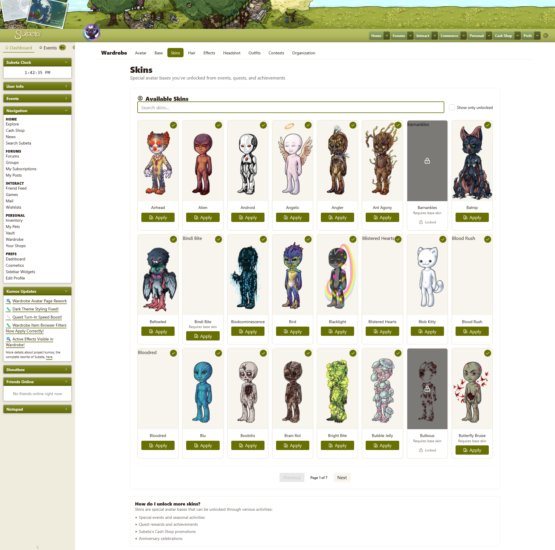
Rework:
Filtering
- Like mentioned in Kumos Skins filtering less functional, the filtering on kumos is less robust than in the legacy wardrobe. It would be preferable to have the same options: sort by name or by date added & filter between all skins, earned skins, or unearned skins.
- I think it would also be exceptionally helpful to have a label system for skins, so users can easily tell when/how they are able to earn any given skin. If this is added, it would be nice to also be able to filter by skin type, like mentioned in Skin Tab Wishlist .
Images
- The skin images are being sized with "aspect-ratio" instead of "height" & "width" so they are stretched larger than 125x250 on big screens and shrunk smaller than that on small screens; I think ideally they would always show at their actual size.
- The preview for a skin seems to always default to male, compared to the legacy wardrobe where it would match the gender of your current HA.
- Conversely, skins that are the same for both male & female bases are not showing up because the image file it's trying to pull up is for female, i.e. Barnankles should be 'https://sapi.subeta.net/images/avatar/base_special/fingers_b.png' but it's trying to show 'https://sapi.subeta.net/images/avatar/base_special/fingers_f.png'
- The skins that don't cover the entire base say "requires base skin" but don't show the base skin; they should probably show the base beneath them, like in the legacy wardrobe, so it's easier to tell what they actually look like. This is especially true for some of the experiment zapper skins that are pretty minimal like experiment 104 or dream rhino/1983
Functionality
- Once you put a skin on, there is no way to take it back off!
- The lack of selectable page numbers makes it slow to go through skins; it would be nice to be able to select a page instead of only being able to go back one or forward one. (The lack of page numbers is also a bit of an issue in the item part of the wardrobe, along with the other things I mentioned in my post above)
Miscellaneous
- I personally feel that the locked skins being so visually distinct from the unlocked skins (blacked out with a lock over them & no button to apply them) means that the unlocked skins don't really also need the green checkmark on them; it just ends up being extra clutter on the page.
- I don't think the color swatch svg has relevance here - it doesn't seem like a logical match to what applying a skin is.
- Minor thing: some of the skins saying "requires base skin" make the "apply" button not even across a row.
- The "how do I unlock more skins?" at the bottom of the page is almost all false information? "Subeta's Cash Shop promotions" - there are no cash shop skins; "Anniversary celebrations" - there are no skins associated with Subeta's anniversary; "Quest rewards and achievements" - there are no skins from quest rewards and only ~two skins earned from achievements (Flameo is from burned, while the Lace skin gets you the Lace Skin achievement but technically isn't earned from it.) That leaves "Special events and seasonal activities" which is true, but I feel like if this was to be truly helpful, it would specifically mention survival & morostide because those are where 99% of skins are from.
Hmm. Looks like my outfits didn't migrate over completely when I tried to do so -- all the names are gone, a lot of the previews didn't work, all the ones with salon hairstyles are bald, and a lot of my outfits are missing. I did get an error while migrating, but I can't migrate them again. =/
But the new wardrobe is super pretty, and very quick! I like the drawers, and the layout. I think perhaps there should be previews for base eyes and mouths and noses, instead of just text, but that can come later.
The way some people spell makes me wonder about their pronunciation. My CW shop, and my ping group
I'm still not a fan and find it hard to use after these changes. Here's an image showing my main gripes (note: the layout colors were changed by my self via snippets and any colors clashing or displaying badly are my own fault)

I couldn't figure out where the item preview was, because it's in the strangest place possible: hidden in a scroll box at the bottom of the worn list. ...Why? In this screenshot, I moved the avatar slightly to the left and copy+pasted it next to itself and there is more than enough room to have the avatar and preview next to each other??
And the other complaint is that the layer controls are incomplete and cut off. I see half of the word foreground and most of the layers are missing. There's no horizontal scroll bar so I don't see any more if they're there. However, when I collapse the sidebar (which, by the way, doesn't ever fully collapse and looks very strange as a result) I do get more layer options, and I assume this is how it's supposed to look.

That being said, I still feel that the item preview being hidden at the bottom of the worn list is an inconvenient and strange choice.
final note: My tone is meant to be neutral with a bit of perplexed mixed in. I apologize if it comes off as aggressive.
he/him / 31 / EST |  | My best friend is |
How do you clear the skin in the kumos wardrobe? Edit: Never mind, I found out you have to apply a skin before you can remove it.
CWs for Sale or Trade https://subeta.net/user_shops.php/shop/24266
I really hope outfit migration gets fixed soon so that I can maybe use it. That is all.
Thanks for updating the skins section of the wardrobe so quickly! I really like that the skin type totals update when you change between locked/unlocked.
Just a heads up, there are 5 skins that aren't tagged correctly:
- Rottgeist is tagged as zombie, but it shouldn't have a tag - it was a prize option from morostide composting
- Batnip, Biodoominescence, Clamorous, & Stalacbite aren't tagged, but they should be marked as zombies - they're the strains from last survival
- (Plus the 4 new zombie strains aren't tagged as zombie yet)
I do still think that the limbless HA base for previews looks quite awkward, both here and as the item preview in the main part of the wardrobe. Additionally, the Experiment 870 skin is missing the base behind it, for whatever reason?
I thought of this after making the mockup images & didn't get a chance to add it before the page was updated: because of how many skins there are, the option to remove a skin should probably always be visible, even if the skin itself isn't (like it is in the legacy wardrobe.) Here's a quick little idea of what that could look like:
Lastly, it looks like all the skins released before November 2014 (When the skin section was added to the wardrobe) don't have date information, so they're all jumbled up. Is there any way to correct that behind the scenes? I guess ultimately it doesn't really matter, but it just feels like it would be nice to have the correct order on the site itself.
Here's the order the old skins should be in
- Feb 2009: Boobitis, Foot Rash, Love Bug, Virus
- Feb 2010: Butterfly Bruise, Eyesore, Freckle Fever
- Feb 2011: Bindi Bite, Brain Rot, Faceworm, Heartburn, Naughty Nip
- Oct 2011: Blu, Darkmatter, Deer, Experiment 164, Experiment 886, Experiment 893, Experiment 2285, Fish Tank, Galactic, Giger, Hydrus, Magma, Water, Wood
- Feb 2012: The Baker, Blistered Hearts, Crack Head, Dolly Dreadful, Lobster Face, Pinkie Patch
- Aug 2012: Android, Cloud, Copper, Dream Rhino, Experiment 84, Experiment 333, Moon, Nacht, Nebula, Nighmare, Scaley
- Oct 2012: Alien, Bird, Dog, Koi, Little Gray, Nostalgic
- Oct 2013: Blacklight, Experiment 0507, Eyebawls, Pumpkin, Scribble, Spectrum
- Feb 2014: Bulbous, Creeping, Lotus, Sticky, Stinging
- Oct 2014: Discoball, Experiment 585, Wildcat
On a different subject: I also agree with 's two points above. As far as the layers getting cut off - if it's possible, I think it would be best for both the layers as well as the drawers to only show as many options before the "more" button as actually fit the page, so big screens would see lots of options & small screens only see a few. If this isn't possible, maybe these just go back to being dropdown menus like in the legacy wardrobe?
Also like Luck showed, the avatar & item preview should easily be able to sit next to each other on smaller screens. In fact, I think that can work even on mobile, which frankly feels almost unusable at the moment.
Mobile wardrobe rework ideas
I'm just gonna link to these images because they're quite long: kumos current & rework & rework collapsed
From top to bottom on the page, these changes I made are:
- The navigation banner for the wardrobe needs to break into multiple lines on mobile, because otherwise it stretches the page by a lot. (Also, an aside: this navigation doesn't include a link back to the new front page of the wardrobe, where there's the breakdown of your wardrobe stats & such.)
- The avatar preview & item preview should be able to fit together, and I think even the outfit tools should be able to fit here too?
- The currently wearing info must be collapsible. At the moment, you have to scroll to the top & the bottom of the page over and over and over as you're trying to create your avatar. I'm assuming making this whole box smaller & scrollable probably wouldn't work so well on mobile, but that's another possibility in addition to being collapsible.
- Currently, the filters are entirely part of the items section - I think they should get their own section which should also be collapsible. This way, it should be possible to collapse everything other than the previews & items and actually be able to see both at the same time.
- Even with the currently wearing & filters section collapsed, the avatar & item previews would be off the screen when viewing the bottom part of the items list - my immediate thought is that the row of outfit tools, avatar preview, & item preview should be fixed so they stay at the top of the screen while scrolling through the items but I don't know if that might be too inconvenient on really small phones. That does seem akin to what most dress up phone games do, though, so maybe it would work okay.
- As mentioned above, layers & drawers shouldn't show more options than what actually fits on the screen.
- I am once again adding titles to these filter sections haha. I just really, genuinely think the clarity is needed when there is so much information being presented. I do also think the little colored icons help as an anchor point between sections as well as just making things look a little more polished (I mention this because the skins section did get filter titles added but not icons.)
- The pages of items need to have number options, both on mobile & desktop.
- I don't think the page numbers need to scroll with the page, but if they continue to do so, the way they scroll needs to be adjusted. At the moment, if you scroll down and then up a bit or vice versa, the page number gets awkwardly stuck in the middle of the page, covering the items. In my rework, I put the page numbers at both the top & bottom of the items section on the assumption that they would be static.
- The amount of items per row needs to be able to adjust for smaller screens. At the moment, it's fixed at 8 items across, which results in the item images being all squished together on small phone screens.
- Like I mentioned in a previous post, when viewing all items you get totals for any items you're looking at regardless of filters but your own items never show a total.
I also wanted to revisit some of my previous feedback:
-
First I wanted to add a comparison image for the width of the first two columns. Again, because the "currently wearing" column is currently the skinniest, almost every item name gets cut off. But, keeping the combined width of the first two columns the same, the first column can easily be made wider so the item names are readable. Then the item name listed in the item preview box can simply break into multiple lines, if needed.
Comparison images
Current vs Rework
-
And secondly, while I was making this current avatar in the kumos wardrobe I ran into exactly what I had mentioned in my previous post: I was constantly accidentally scrolling the actual page up and down a bit, either because I was continuing to scroll after hitting the top or bottom of the items section or just because my cursor wasn't in the right place. That meant the actual content of the wardrobe would slowly get pushed off the edge of the screen with every little accidental swipe and I kept having to carefully reposition it back in the center of the screen. I really think that the first two columns being themselves not scrolling but fixed and the third column being static would be much easier to deal with. (As a bonus, this would probably also help eliminate the issue of the item preview clipping over the top of the avatar preview on very small screens that has been mentioned elsewhere.)