Testers Needed: "New" Wardrobe!
Filter
Show Official Posts OnlyReplies
Hello Everyone!!
I've been hard at work on a big project (involves writing a system that can turn existing Subeta pages into legacy pages...) and part of that involves the code that touched what was lovingly called "wardrobe v4". Instead, we're rebranding it as ⭐ the wardrobe ⭐! very creative!
What's New?
Speed! Built on an incredibly fast and smart backend, you'll notice much faster fetching of things like your avatar, item listings, etc. We went from a request like this that returns hundreds of items to be filtered on the front end to this very snappy request which is almost entirely chaced.
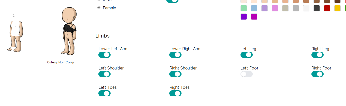
Limbs

Ever wanted to just ... lose an arm? Now you can! Just go to the base tab and start removing!
New Systems This wardrobe is approached like every piece is part of the same system (duh!), and builds toward a much larger Subeta effort than just the wardrobe.
An example is this filtering, which is now easy to add to any page that lists a number of things (items, users, feed, etc!)

So making it so that you can filter on pages like the hair salon now takes minutes to build, instead of days (and making things more complicated)
Organizing items in the wardrobe!

You can now remove your items directly from the wardrobe, and we can plug it into the same filtering system. I'm planning to add more filters here, and obviously get the drawers dropdown to work, but this is a good first step!
Work to do There is tons. Some obvious things:
- Make it so that each section is contained in a space that can be scrolled, so you don't have to keep going down the page. I'd prefer for content that needs to be scrolled to be paginated, so I'm working on that!
- The views on the individual saved outfit and hair salon pages. These need some major work, and hair salon styles need to get their highlights back
Feedback I'm looking for:
- 🙏 Things that you like! I know there will be a lot of critical feedback but sometimes it's nice to see the things that you like or that you feel are improved. It makes it easier for us to make more things like that!
- 💡 Any ideas that you have for improving the features in the wardrobe. I know there are a lot of topics where we've already asked for this, but a lot of change is already here so seeing some fresh thinking would be great!
- 🎨 Design feedback: Things like scrolling, visuals, text, etc!
- 🐛 Bugs! Things that are broken or not working how you expect. Please be as specific as possible, and attach what browser you're using.
Thank you for trying it out, and I'll be updating it with your feedback!
Known Issues
- Removing an item takes multiple clicks, or clicking in the exact right spot
- Mobile layout is not good
- Items page contains non-wearables (tree items)
- Sometimes removing items makes them to go to the top
- Some limbs have broken images
- Limbs have small gap of overlap that is weird
💖 ✨ 🤗
Browser - Uptodate version of Opera - Since I have limited items in my wardrobe I noticed right away. All of my tree ornaments are showing within the wardrobe as actual wearable objects.
Need to add sort by name back. Lot easier for me to find exactly what im looking for if i know what it starts with rather than when I got it. considering I have over 20k items in there.
Bathory is hungry for MORE MORE I SAY. - If you think you are unattractive just remember you look like your ancestors, and hey all of them got laid-
Thank you for this! The wardrobe must be my favorite part of Subeta.
It looks so cool so far, this is a whole new design but I didn't get lost at all. The navigation is essentially the same to the original, that's cool! The limbs feature was such a great idea, as I love layering tons of stuff for my skin I won't be able to use that much though!
I'd like to give some feedback!
-
The item names size became huge! All of the names of the items I'm wearing are cut two words in, and not being able to see their full names when hovering them makes it more difficult to read. Is this normal? I'm using the latest version of Chromium, on Windows 10.
-
Is every item made included in the Wardrobe now? For instance I'm seeing the new Endeavor plushies there. I suppose this is only temporary but we never know!
-
As for the design, as much as I love monospaced fonts, their presence makes me feel like I'm on a whole different website. I think the fonts should be the same than on the rest of the website!
-
Just a suggestion, but I'd love to have an "Added to Wishlist" (sort of) option so I could easily try the wearables I've added in my wishlists. Could it be possible?
-
Oh and, the "Item in wardrobe!" check thing was so important! I hope it'll be in this version too. I didn't understand at first glance that the green checkboxes were there for this purpose... But maybe that's because I'm used to the other way.
LMAO I just posted this in the Gold Account forums bc I thought that's where it needed to go, but I'll repost here for convenience, especially since it deals with design feedback that you specifically requested!
Some graphic design suggestions/observations (in which I'll also point out some obvious things just to be thorough): -- The monospace/Courier New font is... not great. As someone that also programs, I get the appeal, but it ends up wasting a lot of important visual space, especially in the case of the currently worn item list. -- Speaking of which, after some snooping, I would suggest changing the text divs in the item list from "w-3/5" to at least "w-4/5". Maybe "w-5/6"? My reasoning is that almost all of the item names are cut off, followed by unused white space. -- The grey background when hovering over an item is shifted down from the actual item box. Through some dirty troubleshooting I found that removing "padding-bottom: .25rem;" from the "py-1" class fixed this, but I assume you're using something similar to bootstrap (?), so that's not practical. Still, I wanted to mention it in case it helped. -- The gradient on the item page pagination is really cool????? But there's a lot of unnecessary space between the "Next/Previous" buttons and the number tabs. Also, could probably use an ellipses between the highest and second highest number tabs, bc the jump between page 8 and page 22 is confusing visually. -- The little green checkboxes under items are interesting bc it's nice to immediately recognize that you own an item, but it looks awkward, especially when in the same row as items that you don't own. Not sure on suggestions for fixing it, just wanted to point it out. -- The big Subeta banner feels unnecessary and takes up a lot of valuable visual space. It could very easily be merged with the wardrobe tabs banner (base, items, skins, etc.). -- PADDING!! around the edges!! please!! ;w;
Usability suggestions: -- I personally prefer "Search Shops" to the "Buy Item" button, as "buy item" feels like... I literally click the button to buy the item? Rather than searching in order to potentially buy the item. -- The "Clear" button being so close to the "Wear" button makes me nervous ;w;
I've got to admit, I don't think the v3.5 wardrobe design is that bad?? It's obviously simplistic, but it has very good bones! And people are used to a lot of aspects of it! Don't be tempted to change things up unnecessarily just to make v4 look new and fancy. The dropdown menus on the item page on v3.5? Good! The look of the avatar item list on v3.5? Pretty good! Everything fitting on the same screen? GOOD!
Overall though, I'm excited and I look forward to further improvements!
[edit] Some other stuff: -- Toggling "Left Foot" in the limbs section of the base tab also removes the head and torso of the avatar. -- The "item preview avatar" is significantly lower than the actual avatar. -- The new avatar base with the thinned lines is exciting!! But, the line between the chest and the right arm (our left) is suuuuper pixelated. Also, where is my thumb? :0 Could we possibly have an option to toggle whether the thumb is in front or behind the HA too? -- I LOVE that the items area takes up more room on the screen now! I like that the item icons aren't scrunched down! But maybe the item area takes up a little too much room atm?
 ⨯ They/Them 🌿
Cw Thread [sup]🌿[/sup] Cw Shop [sup]🌿[/sup] Ping Group
☆ Large HA Templates Download || ▷ Includes B1-10, B18-21 ◁
⨯ They/Them 🌿
Cw Thread [sup]🌿[/sup] Cw Shop [sup]🌿[/sup] Ping Group
☆ Large HA Templates Download || ▷ Includes B1-10, B18-21 ◁
Can you take a screenshot of the item names so I can be sure what you're talking about?
And thank you for the other feedback! I tossed the monospace font up there to test out the general feeling, right now we're doing a lot of internal testing on what we want Subeta to "feel" like in general, since there hasn't been a ton of work done on that in the past (it's changed year by year, essentially)
Everything on the page is built from the same components (buttons, headers, etc), I just toggled a few to alternate styles to see which people move toward the most
💖 ✨ 🤗
It'll take some getting used to, but I like that we'll soon be able to use those different posed items without having to use a white background and the whiteout pens. I found that it only works on the plain base, so I guess the whiteout pens will still have a use with the different skins, I was worried about them no longer being relevant after this.
Event Actions
First Impressions:
I like the styling with the green.
I like the X to get rid of a wardrobe item being red, but I'm not fond of the "eye" to temporarily not show it being at the end of the item name, rather than the beginning. It's just not as quick and intuitive to find it. Also we now need to click only the tiny plus sign at the beginning to grab and drag the item- I don't like that as much because it's harder to be precise, grabbing and dragging the whole thing is just easier.
I like like LOVE that you can scroll to see more items without having to load another page. I'm not so sure about the spacing of them, which seems a little crowded and chaotic with the green check marks. But I might get used to it as time goes on. I'm assuming those show what is in your wardrobe, maybe unneeded if you only select what you own anyway? But I love the idea of seeing what you own without having to mouse over it if you select all items, that's a very good thing.
The "sort by" options also look a little crowded and basic right now compared to version 3 spacing. But maybe I'm just used to version 3? Idk.
I think the hair salon is not done, or maybe I just can't find the place to change colors? But I think I'm gonna like it a lot better when it is, than the current one.
Outfits: "You have a 500 limit on the number of saved outfits that you can have. " good to know, and great limit!
If I had a top request it, would be having more drawers than a limit of 50, maybe 100? They are so useful!
Base eight female - if I have the lower left arm showing, there's a broken image icon at the top left of my HA (and the arm doesn't show). If I click to hide that arm, the broken image icon disappears. If I then save my HA (female base 8 with that lower left arm clicked to show), my entire HA is a broken image. If I hide the lower left arm, my female base 8 HA (what I am currently using) shows up fine.
[edit] Same problem with: Base 8 female lower left arm Base 10 female lower right arm Base 10 male lower right arm Base 24 (the green one) lower left arm

My CW shop ~ forumset by [/font]
I was unable to change my "sort by" selection. Currently, I'm sorting by "added to wardrobe" but I can't change it in the beta back to "name".
Also, I didn't see an option to add items to drawers.
Some of the items in my drawers weren't showing up.
Not a whole lot of feedback from me yet, I just started poking around.
But one thing I like from the current version of the wardrobe that would maybe be nice to have in the new version is being able to choose how many items get shown on each page. Right now, it's showing a lot of items at once, which means a lot of scrolling. I usually prefer to have fewer items on a page at a time so I can see them all pretty easily and quickly skip to the next page if I don't see what I'm looking for. That's hard to do when it's showing a few hundred items at a time.
2 quick things:
- default Hair styles (grey border): can they have own filter? Or show up with owned (like they do in 3.5)? I'm not using them that much, but looking for thin gray border in (currently) 23 pages of hair styles... yeah, I'm too lazy for that.
- in 3.5 we had option to pick "None" drawer. It's useful for checking what is still unsorted into drawers and I used it for items that will be in WR only temporarily (say, for achieves). I don't see that option here. And what was already mentioned - ability to pick how many items is showing, 25, 50, etc. Otherwise, seems alright on first look. Didn't try to actually build whole new HA yet.
infinite parallel universes containing every possible situation.
It makes me happy, because I know, somewhere, you love me back."
I still miss the colour option. (There is a "color" button but no reaction) I think the outfits should load more to a page. I don't like the green. It really glares. I like the other organize option that has more per page, these are huge and take up a lot of room. There are too few "owned" hairstyles. There were more before. And where is "bald"? What is the check mark for in the items section (next to each item)?
Skins: where is the remove button? I can't get the newest idea to work, I have a skin on and can't see the base.
I like the item page. Though the items are huge there are a lot on the one page. Makes looking for an item easier when you don't know what it's called.
I also suggest not having all those green checks if possible. It's cluttered. And yes, I use base 8 female and clearing all the items...also cleared my right arm lol Salon hair doesn't appear, and clicking the hyperlinked words instead of the image is eh.
It is very neat how we can sort the salon by styles unlocked!
Maybe I'm blind and don't see an option to see a save option for the HA. I can save up to 250, but there's no button.

Google chrome - base female seems to have extra thin lines where the arm and body meet towards the left. The hair salon only seems to show the redeemable wigs hair you have. I miss the sort by name feature.
Please move the Wear button back under the HA image and the Clear button back on top of the item list. With a 30-40 item limit now, having to scroll up and down is a pain. Plus when I first opened the page I thought the buttons had vanished entirely; it's a kinda... unintuitive place to out them.
selecting to remove the left foot removes the left foot and the face/face outline of the base
selecting to remove the left foot removes the left foot and the face/face outline of the base
was just going to say that. I'm on firefox 74
removing the left foot removes the left ankle (toes showing), the entire torso and head for me.
he/him / 31 / EST |  | My best friend is |
Please, please, please add sort by name back. Also, please let us sort ascending or descending within each category.
Would love to have the scroll box back that you mentioned, so I'm not scrolling the entire page. Also, allowing us to choose how many items per page would be nice, sometimes it's overwhelming to see 500 items at a time.
I miss being able to click on the entire name to rearrange the layers, it will have to take some getting used to clicking only on the arrows icon ( ) to move items.
Sometimes it's not letting me remove a piece of clothing, then I have to find it in the wardrobe and remove it by clicking the icon instead of the red X.
Will there ever be a color matching system re-incorporated like the original wardrobe had? That was so handy.
Also, when I try to turn off the left foot, the entire torso and head disappear as well, as shown below on Chrome (shown using base 3, but is the same for all base colors).