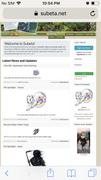
The home page is updated :o
Filter
Show Official Posts OnlyReplies
I was logging into the site on mobile and saw.
And new players get 100ksp for signing up. I checked the August updated and this wasn’t mentioned so I wonder how new it is or how blind I am.

I do believe pushed it today! I believe he mentioned it on uh, the new users thread that it was coming. <3
Oh, I like this!
One little detail: it might be good to hide news comments for users who aren't logged in (if that's possible). :'D Things can get a bit heated in news comments sometimes.
[edit]Editing to clarify the reasoning for hiding news comments: if Subeta is going to keep users who aren't logged in from seeing the forums, doing the same to the news comments seems logical. idk about anyone else, but news posts (& occasional news comment drama) being flaunted as the only viewable example of the community here kinda doesn't feel right.
aaa i really like this!! linking to the subetapedia is a really great touch especially!! ' v '
I noticed this today and was so happy! I think it's a much better representation of the site to new users. And the boost to the sign-up bonus is perfect.
I like that the white-on-pale beige of the login has been eliminated. That was hard for me to see to sign on with those colors even when my screen was magnified.
I don't agree with hiding News Comments. If the conversation wouldn't get anyone warned or banned, it's an accurate measure of the level of discourse here. New users could get the ability to understand how things work here better and be able to make a decision on whether they might like it here without being unpleasantly surprised later and ragequitting.
If it would get warnings or bans, then some action on it should be taken on these threads so new users don't get the wrong idea.
For those who were puzzled like me, means the thread more players? on 30 August 2019 is when said the front page would be changed. It's post for me.
I wear my sunglasses at night. So I can, so I can Login to Subeta All the white is blinding me tonight!
seriously.....dont go there in the dark. I made that mistake last night.
[flower=CastlesInTheSky] [tot=CastlesInTheSky] Dear users who keep blocking me....Remind me again, who TF are yous? ¯(ツ)/¯
I enjoy the new layout. It feels cramped but I can manage it just fine. However, there is too much white. I've said it a lot of time already but Subeta is making my eyes bleed (and cannot imagine the nightmare at night).
Oh wow, that is loads better. So much cleaner and simpler and way more informative about what Subeta is like.
Also, I really like it that you can click in the menus to see the map, games page, and even browse the NPC shop before hitting the "no sP" or "must be logged in" barriers!
useful threadsThe Giant List of Usability and Random Improvement 2.0 Comprehensive Guide to Battle Opponents (v2) [topic not found]
|
[topic not found] |
Sorry, I don't know if you've seen this before so apologies if you have but I found this custom night mode CSS by that I've been loving that's a bit easier on the eyes. :)

[sup]babycat by ♡[/sup]
I am SO happy to see this !! It looks wonderful!
Hasn't updated for me at all, must be a mobile thing.

It shows on desktop too, but only when you're signed out. If you're already logged in and try to visit subeta.net on its own, it just redirects you to the regular news page.
Looks snazzy! I agree with though about the too much white comment.
We're happy to take suggestions on how to further improve it. This is like a "first iteration" because we feel it was long overdue for an update. But I know it's not perfect yet and I'd love to hear any ideas, suggestions, constructive criticism and so on <3
Also - for those who have missed the announcement, I'd bookmark the Admin Post Highlights page and check it every once in a while. I know we sort of have admin posts all over the place, so this page is our effort to sort of get them all in one place for your convenience!
🐝 ☕ bug (he/him) | your friendly neighborhood code wrangler. stay in the loop! join and check out the latest admin post highlights