Item Directory Revamp
Filter
Show Official Posts OnlyReplies
Listen.. I know this is barely rolling out, but I'm gonna go ahead and say that I think this is a bad change. We went from having roughly 300 pages in the directory to over 1000.
The way that items were listed before worked really well. It was no trouble at all to load the pages and then to click the item name if I wanted more information.
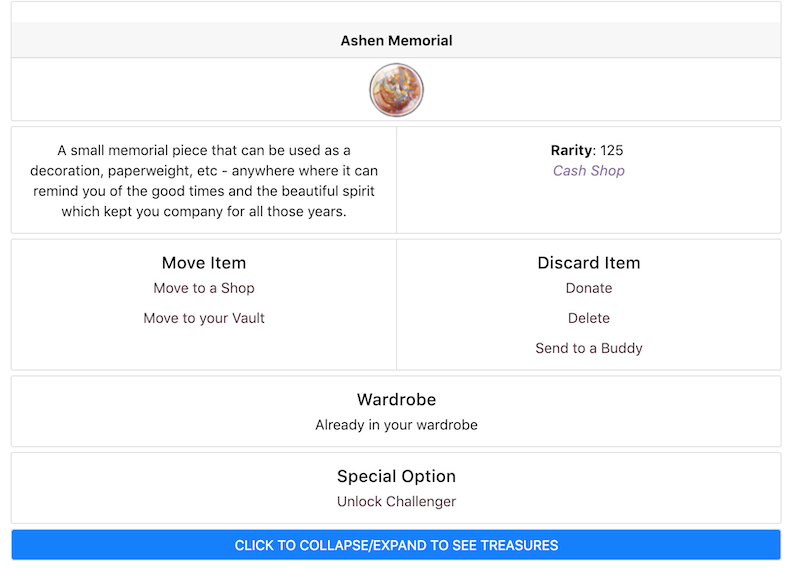
There is no reason whatsoever to have the item descriptions stretching the page, nor to list out in words "Shop Search, Account Search, Trade Search"
The hourglass account search and the shopping cart shop search would be more than enough. When you click shop search on literally every other part of the site that uses those buttons, it also tells you if there are copies in trades.
The page showing the item info when you click the name definitely got a nicer revamp, but again, the buttons that direct you to account/shop search would still be sufficient there as well.
This now causes way more lag when I use the directory, which makes it a less useful tool. I don't need or want all of that cluttering up the page and meaning even more pages to have to scroll through.
It's also unusable easily on mobile because you can't click the item images to bring up the wish list add option anymore....now it auto directs to the item info page (and so does the item name, so there's really no need for both to be clickable links). That means tons more loading and back and forth just to perform a simple task, which doesn't work well when I'm on mobile. The page has just been rendered virtually useless while on mobile for me. And I'm on mobile a good chunk of the time. I already have custom case to make drop-downs function correctly, it's frustrating that now I either have to make a new code for this or just completely ignore a valuable resource because it doesn't function at all. Especially with an event about to start.
Restock location in the item details page has also been removed even though that was pretty useful information to have :/
[edit] I failed to mention that I do love the new search methods. I think that it's definitely far more useful the new way than it was in the old, it's very helpful to be able to select ascending vs descending and to have so many additional options.
It's going to take me some getting used to but I don't mind the change, at least on some small degree. The fact I can see the new items right on the top of the page without clicking a bunch of times and scrolling forever does make life easier.
| [flower=Damon] | [tot=Damon]
For the most part, this is a great change. The only thing I don't like and hope changes is the descriptions. It's so much extra clutter and when you can hover over each item to see the description right there, it seems really unnecessary.
It may just be me I think ? but I use the directory to help me quickly wish list items at the start of events so that I don't accidentally miss click in the shops / etc. I liked the previous set up of this being really quick because all the items were more compact / there were more on the page. It's not too much of a hassle to go through more pages but... it's going to suck when the site is barely loading because of event lag and that makes me already feel stressed for pandemic. T_T
fingers crossed hoping it's not 100% ready and that's why there hasn't been a news post about it yet
You could always do that - you set it by item ID and then just click to the last page.
I mean, I'm not opposed to it having the same search options as the wardrobe, that's fine, I can get behind that. But adding a bunch of unnecessary text to each entry makes it lag and means there are now over a thousand pages to scroll through if you are hunting for something specific, instead of roughly 300. There's no reason for that.
it looks slick and that's cool. i like the toggle for the search, and the option for melody items.
it would be nice if it switched back to a compact front page, and all the extra bits (account search, description, etc etc) just stayed on the item-specific pages. as it is now, there's too much on the page -- it's like the cash shop front page; there's too much information slapping you in the face, it's a little overwhelming.
also this may be a browser specific problem (curse you, safari) but the "back to search results" link on the item-specific pages does not work.
that's exactly what i use the directory for -- wishlists and preview threads lmao. i'm hoping this new directory doesn't make the survival preview thread take longer than they already do (assuming i'm the one that does it this year, i mean). (also i would assume that this is one of bug's saturday sprint tasks, so... i'm waitin' for that ping :p )
I definitely think the descriptions are unnecessary. Searching by description? Fine and good. But the item hover is literally right there if I want to read the description and it looks very cluttered with it on the page.
I don't really mind the changes otherwise

There hasn't been a news post, because it was rolled out as part of our General Updates here! wants to make sure any issues are fixed before we news post it!
Like someone else said earlier, it'll take some use to it, but personally I like it!
I agree that the descriptions are lengthier, although im sure some people would enjoy them. Maybe having an option to filter out the info we want to see would be nice (hide descs, number of items per page etc.)
Plus it's consistent with the new vault, so it's not too hard to understand!
Cathii's CW shop ❤️
I would rather not see the description too. Some items have lengthy descriptions. Like Shinwas Trading Card description is way too long. I do like the other bells and whistles.

Forum Art by
Signature Art by
I like the new search options on the top of the page but the description (some are super lengthy!) and account/shop search and all other clutter is ridiculous. That's what item hover is for. And searching trades? Shop search tells us already if something is in trades. So why?
infinite parallel universes containing every possible situation.
It makes me happy, because I know, somewhere, you love me back."
I also greatly prefer the more compact layout of the ID. I don't really care about item descriptions - most of the time they add nothing to an understanding of an item. They don't need to be right there. All this extra bloat is already covered my the individual item pages and the hovers. We don't need the same information repeated at every opportunity.

tbh half of the reason why I use the item directory is to look at the descriptions of new items. So this saves me a lot of hassle.
I do wish the page would fit more items on it if you have a huge screen, but I understand that Subeta's moving away from that.
Overall I like it, but I feel that it's kind of lacking a sprinkling of something. Right now it's very white and blah when you have the search box collapsed.
 A tiny splash of colour behind the item description, maybe? Just enough of it so it's not as blindingly white.
[edit]The official price when viewing an individual item needs to be tweaked too. As do a few more tiny things on that page. Example
Instead of: Official price189441
Maybe make it: Official price: 189,441 sP or 189 441 sP Having the numbers all clunked together makes it difficult to read. ;) And yes, the colon is v important.
It would also be nice if the individual item pages had a wearable preview. Male & female if possible? or at least a mention if the item has a gender-specific overlay like some wigs do. A link to the shop where the item restocks (if it restocks), or a link to the shop where it's usually found (token shop, cash shop, various holiday shops, etc.) Have the specific holiday currency listed for holiday items, CS items, loyalty items, token shop items, etc. A brief explanation of the rarity would also be nice! (R101 - retired, R125 - cash shop) For items that restock in several places (Reborn Potion, for example, gets dropped into the token shop as well as restocking in the apothecary), it would be good to list both restocking areas as well as their separate official prices.
No such thing as too much info on an individual item page, imo. Especially applies to items like old plot prizes, sitewide boss weapons, etc. Subeta's old. Ain't nobody got time to remember e'rrything, so at the very least listing which plot & year they're from would be 👌.
Also if you're going to add notes about plot prizes & the likes, a search by notes would be a godsend.
i am all for having the descriptions being more accessible (and i think there are some monthly collections books that got really long stories? so i'm curious to see if i can get at those from the directory), i just don't think it's useful to have gigantic open spaces when things have good story descriptions, at least for the reasons i use the directory
SPOILER (click to toggle)

(and just to get ahead of anyone who's like, that's just the melody items, just unclick that button -- the november and december collections that year both had big descriptions for their items, which i love and appreciate but don't want to see when i'm just trying to gauge how many items are related to a thing)
Oh yikes! 😬 I forgot that some items almost have novels in their descriptions.
I wonder if it would be possible to have a character limit on descriptions in the main directory? You'd still have the whole description visible on the individual item page. Limit it to 165 characters on the items page, maybe? The Beast In The Cave description in 's screenshot has 1210 characters, spaces included. And I'm pretty sure that's not even the longest item description we have on site.
It just hit me that the Item Directory and Amber's inventory revamp have totally different ways of displaying rarity, even though they're being worked on at the same time. It would be nice to see some standardization here.
I went looking around the site, and basically every place that displays a rarity seems to make up its own format on a whim:
Formatting differences


So out of six locations that list rarity, no two pages use the same format.
And then shops (both viewing and editing), vaults, shop search, Search Subeta, and account search don't list rarities at all. (Not that they necessarily need it, but I'm just being thorough.)

I don't care for descriptions, especially if they're going to make us scroll more to get past a novel. I know some people like them, but I don't think it's the most important part of an item since they rarely have anything actually important.
I would say give us the ability to turn them on or off, but then again, that's what item hovers are.
That is a really good point that I missed completely - but thanks for pointing that out. It would be nice to see the rarity explained on the full page the way it will be in the new item menus.
I couldn't remember what Shinwas Blessed Water is for. I tried looking in the new Item Directory but I couldn't discover any way of finding out. I had to go to SubetaLodge to learn it "Heals your pet for 1,000 health outside of battle."
When I knew what it does I experimented - as far as I can see there is no way of searching for anything that heals because there's no option for this under Item types and uses
[tot=Ciannwn]
Love, love, love the search options. Love the fact that you can now search for partial item names. Love that multiple items come up (in the past you could only search for 1 item at a time).
However, I must say I agree with the OP, there's too much info on each item. I use the item directory for two main things.
- to find out item uses.
- to quickly wishlist new items, event items in particular. The old set up with simply a bunch of items with no info at all, made it easy to see all the new items on one page, two at the most. The hover let me know if the item was a wearable and I could click on the item if I thought it might have multiple uses.
For item 1, the new page with all the info doesn't really make a difference one way or another. For item 2 however, its going to be a PITA. Lots of extra scrolling and potentially more page loads - a little back and forth trying to figure out where the new stuff starts and so on. Too much info on the page to see things at a glance.
In loving memory of Need posting achievements?Then join Posting Frenzy Achievement Items - searchable list List of Borders and cutouts New at Fresh and Flavorful Ping Group
Oof, that's a lot of words. I definitely agree that having the item descriptions is unnecessary (considering you can just hover over the item for the description). They make the page waaayy too cluttered/busy, plus it make some of the boxes uneven but that is just a personal pet peeve of mine.
Other than that, I think it's great.