The Official Illustrated Guide to CW Denials
Replies
The Official Illustrated Guide to Custom Item Denials
Have you ever had a custom item denied and were not quite sure what it meant or how to fix it? Well, this guide, put together by and I, is here to help!
Navigation Lineart Shading and coloring General Quality Subeta Item Standards Tributes Text Rule-breaking
See also: The Official Custom Wearable FAQ!
This guide is 90% complete - I say 90% because there's always the possibility of adding more examples or more denial reasons in the future! However, we think this will serve as a very valuable tool to those of you who make customs, commission customs, or have anything to do with them! We hope you enjoy reading through this as much as we enjoyed making it - it was truly a labor of love!
Lineart
Lacks lineart
- While we allow some portions of Subeta artwork to go without lineart (for example, auras), we expect that all artists submit their items and overlays with black lineart in order to mesh with existing items.
 In this example, the hair against the bottle lacks any lineart.
Shaky, rough, or inconsistent lineart
- “Shaky” lineart is unsteady, jittery lineart. “Rough” lineart is jagged lineart. “Inconsistent” lineart varies in line weight without reason. This denial does not necessarily mean that your lineart is shaky, rough and inconsistent! To solve these issues, we recommend that you go over your lineart and smooth out any problem sections.
Sharp and/or pixelated lineart
- Note that there is also a separate denial reason for over-sharpened artwork in general; this denial reason refers specifically to the lineart. Lineart can often become sharp and/or pixelated if the edge of the brush is too hard or if your program automatically applies some sharpening to your lineart. If this is the case, you may want to adjust the brush settings in your program of choice! The edges of your lines should be fairly hard to maintain crispness, but they should not be so hard that there is no transition at the edges. Additionally, this often happens when a thin layer of bright highlights has been drawn right next to the lineart. While backlighting is fine, it can often cause lineart to look sharp if not done properly. In general, it is good practice to continually check what your item looks like at its final size while working in order to ensure that the elements resize well. Please note that while sharp and/or pixelated lineart is often thin, lineart need not be thin to get this denial.
 In this item image, the lineart around the lollipop portion is extremely over-sharpened, giving it a pixel-like quality.
Thick or heavy lineart
- If the line weight is so heavy that it is outside of the acceptable range for modern Subeta artwork, it will be denied for this reason. Keep in mind that line weight can be affected by more factors that the size of the brush! If the lineart is soft and less opaque, it can often look fine on lighter items but suddenly appear thick on darker recolors. Lineart can also appear to be thick when heavy shading is done next to it; the shading often “beefs up” the lineart and causes the illusion of thickness, even when the lines alone aren’t thick.
Thin or weak lineart
- If the line weight is so light that it is outside of the acceptable range for modern Subeta artwork, it will be denied for this reason. Your lineart may look thin/weak if the brush size is too small or if the lineart is not opaque. As mentioned earlier, the color underneath the lines can affect the way lineart looks. Lineart that looked fine on an item might look too thin when a lighter recolor is submitted. Be aware that you may need to adjust line weight (among other things) when you submit recolors!
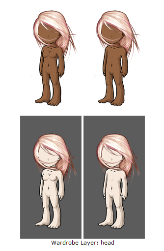
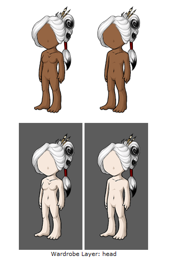 In this example, the lineart is so thin in places that it almost disappears, especially around the face.
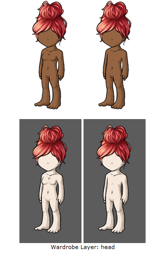
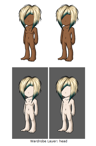 In this example, the lineart again nearly vanishes around the face, as well as around certain spikes in the hair.[/ul]
Colored lineart and/or lineart so thin it appears colored [ul]While you are allowed to use colored lineart on auras, some inner/detail lines and parts of backdrops, Subeta art standards require that black be used to line artwork.
But I didn’t use colored lineart! Lineart can appear colored even if you’ve used black lineart. This often happens if the opacity on your lineart is low or your lineart is very thin, as the underlying colors can bleed through. You can fix this by going over your lines and making sure they are opaque. Be sure to check how they look at final size!
 In this item example, the lineart is blue. Although there is an aura around the deer itself, and that is fine, the actual deer needs to have black lineart.
 In this example, the lineart is actually pink, not black. This could be because the artist simply used a pink color to line, or because the color bled over the lineart. This would need to be corrected to be completely black.
Colored lineart is allowed in some cases, such as flames, some auras, etc. However, this is judged on a case-by-case basis!
Sticker effect: flatness due to black lineart around the edges and colored or missing lineart inside
- While inner lineart is allowed to be colored, artwork can take on a “sticker” effect if black lineart it confined to the outlines. When black lineart is used exclusively for the outline, it can have a flattening effect on the artwork. To fix this, you may want to go back and line the most prominent elements in black. It can be effective to taper black lineart into colored lineart while lining inner details.
 This overlay suffers from sticker effect due to the inner lineart being completely colored, as well as the shading and highlighting being very soft. Adding lineart around the bun portion especially helps this achieve a look of hair, rather than a sticker.
Shading and coloring
Flat artwork
- This is a denial reason for artwork that appears flat in general. Several problems mentioned in other denial reasons can contribute to artwork looking flat (sticker effect, details being shaded individually, stiff artwork, perspective issues, other reasons related to shading), but this denial reason also encompasses general problems such as the design itself contributing to the flatness.
Details shaded individually without taking the entire form into account [ulSubmissions denied for this reason are shaded as if the details are several distinct pieces instead of being parts of a whole. The resulting effect is generally flat; by shading each section individually, the form of the artwork is often lost. It can also cause the artwork to look unnatural, lifeless or oddly textured, especially if the details are shaded in a very uniform way. This mistake is commonly seen on hairstyles (it is tempting to shade each strand individually from root to tip) and clothing with ruffles. It can be helpful to use the first layer of shading to define the shape of the artwork as a whole, using subsequent layers of shading to define finer and finer details.[/ul]
Pillow shading [ulArtwork denied for this reason is shaded as if the light source is shining at the center of the artwork (or at the center of each section of the artwork). Pillow shaded artwork tends to be a gradient from light to dark, starting from the center and extending to the edges. The end result is unnatural and can lack depth. To avoid pillow shading, choose a single light source and keep the form of the object in mind so that the final piece has dimension. Also keep in mind that for overlays, the light source should be from the top left![/ul]
Blotchy shading
- Blotchy shading is irregular, mottled or haphazard shading. It can detract from the artwork because the shadows are often poorly defined, or because mottled shading can give the appearance of a strange texture. It can help to edit the shading layers so that they are crisp, well-defined and serve a purpose in depicting shadows rather than being haphazard!
Overlay light source not from top left
- All of our overlays are shaded with an overlay from the top left of the canvas. As such, we require submissions to be shaded this way to remain consistent with the rest of the artwork on site. We allow submissions to be lit from other directions if an alternate light source is provided in the image (for example, an evening backdrop with a lantern to the right of avatar’s feet may be lit to reflect that); however, we strongly suggest that artists plan their submissions with a light source at the top left so that their items will mesh with existing items.
Ambiguous shading/light source unclear
- The light source on ambiguously shaded items changes, such that different portions of the artwork are lit from different angles. To fix this, decide where you’d like to put your light source and make sure the entire piece is shaded to match. Again, keep in mind that the light source should be to the top left for overlays!
Gray artwork, possibly from shading with black and/or highlighting with white
- This denial reason is used for artwork that looks dingy, discolored or washed out due to the shading colors used.
But I didn’t shade with black or white! While you may not have shaded with black or white, your shading colors may have caused the artwork to look gray. We recommend that you choose your shading colors such that they complement the base colors! Keep in mind that one shading color may not work across the entire image; you may need to pick different shades to complement the various base colors in your artwork.
But my submission is a black/white/gray item. Why did I get this denial when my artwork is supposed to be gray? While your base color may have been fine, the shading colors may be washing the artwork out (bright, white highlights are often the offender). Also keep in mind that it is not necessary to shade a gray item with 100% desaturated shading colors! Under normal lighting conditions, black, white and gray items are not completely void of color. A white, black or gray can be warm or cool, and thinking about this can be helpful in setting up a palette that is lively even for a primarily gray item!
Certain colors are more prone to ending up gray than others! These include pinks and yellows especially.
 In this example, the yellow looks almost washed out and dirty due to gray shading.
Shading is too faint
- The opposite of the “too much contrast in shading” denial reason, this reason is used for artwork with shading layers that don’t have enough contrast. When shading layers are too faint, the artwork can end up looking flat and under-shaded even if enough layers of shading are present. To fix this, make sure that the layers of shading are easily visible and distinguishable from each other. This can often be achieved by tweaking the shading colors or increasing the opacity on the shading layers. Keep in mind that shading layers that are easily distinguishable at working size may not be as easy to see at the final size!
 In this example, it is nearly impossible to tell if there is enough shading on this overlay! This is a great example of smaller sizes losing the shading that may have been more dramatic on a larger image; overdoing the shading so it shows up best when resized is a good way to adjust for this.
Not enough area shaded (too much left flat and unshaded)
- This denial reason is reserved for submissions that leave too much of the artwork unshaded. These submissions often look incomplete and flat, even if enough layers of shading have been used. Make sure you are shading enough of the artwork to show that it has dimension.
 Although the dress is meant to be sheer in this example, there is not enough shading covering the entire overlay to give it shape and definition.
Not enough layers of shading (Subeta artwork should have 3-5 layers of shading)
- Please note that Subeta artwork needs to have a minimum of three layers of shading, not including the base color.
Too many layers of shading (Subeta artwork should have 3-5 layers of shading)
- Subeta items and overlays must fit into very small canvases (64x64 and 125x500 pixels, respectively). Small details often get lost when resized, and shading layers that may have been crisp and distinct at working size may blur together and look like gradient shading when shrunken. We recommend that you stick to the standard number of shading layers and keep the final size of the artwork in mind while working on your items.
Gradient or soft shaded instead of cel-shaded
- While soft transitions between base colors are allowed to some extent, the shading itself must be cel-shaded. Cel-shading is shading with a limited number of discrete, crisp layers. In contrast, gradient/soft shading features smooth transitions from lit areas to areas in shadow without distinguishable, hard-edged shading layers. Subeta artwork must be cel-shaded with 3-5 layers of shading.
Dodge/burn look or too much contrast in shading
- Using the dodge/burn tool is not recommended for shading artwork to submit to Subeta, as the result will likely not match the site style. We recommend that you choose shading colors that will complement the base colors instead of using the dodge/burn tool to shade. “Too much contrast in shading” refers to layers of shading or highlighting that are so much darker or lighter than the base colors that they look unnatural. To fix this, you may want to tweak your shading colors or lessen the opacity on your shading layers. If you’ve used the dodge/burn tool, you may need to redo shading layers using the cel-shading technique to better match the site style if it’s not possible to adjust the dodge/burned shading after the fact.
 In this example, the contrast is especially great for the shading layer, which is much too dark and out of place when compared to the base color and the highlights.
Oversaturated
- Saturation is one of the dimensions of color. It is how colorful we perceive a color to be relative to its brightness on a scale running from completely desaturated (gray tones) to completely saturated (the purest and most vivid possible). While many of our items are more vivid than comparable items would be in real life, artwork that is too saturated will look out of place on the site. If your artwork is denied for this reason, you may want to change the oversaturated colors by dragging the color slider a little closer to gray.
But I wanted my colors to be that saturated! We do allow items with very vivid colors, but unfortunately we need to deny artwork that falls too far out of the acceptable range in terms of our site style. Saturation is just one of many possible issue that can cause artwork to look out of place!
Garish colors
- Garish colors refer to colors that are excessively bright, saturated, and/or clashing, and can refer to the color scheme of a submission as a whole. Bright, bold or saturated colors that can look great alone or as an accent on a piece may look garish when combined with too many other strong colors. If your item is denied for this reason, it may be helpful to adjust the color scheme such that the colors are more harmonious. This may mean changing some colors so that they complement each other better, or muting some colors if too many bold colors are competing.
Too dark
- An item is too dark if the base color, lineart and shading layers are so dark that they are hard to distinguish from each other. This can cause the artwork to look flat for the same reason faint layers of shading can cause artwork to look flat. The fix is easy: just lighten the shading layers and if necessary, the base color until each layer is distinct at final size.
But I want a real black wig, not a dark gray one! Keep in mind that black objects are not black in real life. Your black hair, coat and boots are not black under normal lighting conditions, and neither are their shadows. You do not need to use black for your submission to read as black!
 In this example, the overall top of the hair is so dark that it is hard to see shading layers, as well as the highlighting layers looking very pillowy and standing out! The shading on the colored parts is near-black and too dark as well.
General Quality
Artwork does not match Subeta style, quality, or level of detail in general
- This denial can be applied for multiple reasons, but it generally means one of the following:
Not matching style: This usually refers to the artwork having too much of a painted, soft-shaded, stylized or photo-realistic look rather than being drawn in Subeta’s style. This tends to happen with backgrounds more than anything, such as:
Although this background is very beautiful, it has almost an ink-painting or wood-block art feel to it. This certainly does not make the background ugly but it does make it stand out significantly from the majority of Subeta’s official art, and for that reason must be better integrated to match art around the site. Keep in mind that while official backdrops drawn in classic painters’ styles are released through the Delphi Art Gallery, user-submitted content is expected to match Subeta’s style.
Not matching quality: Artwork denied for this reason is not drawn to Subeta art standards as outlined on the submission page and this guide. This reason is reserved for submissions that have severe flaws and/or several flaws, and we strongly recommend having a peer critique your artwork if this is the case.
Not matching level of detail: This reason pertains to submissions that may be nicely drawn, but are too simplistic to fit in with current Subeta items.
Choppy animation
- This denial reason can refer to animations that appear to be missing a frame, jitter from frame to frame, have abrupt transitions or are not smooth in general. To fix jitter, make sure your images are aligned from frame to frame so that the image isn’t jumping around. Choppy animations may need additional transition frames to look smoother. If your animation loops, don’t forget to transition the last frame into the first frame! Also, please check your animated items in a browser before submitting them to make sure that they aren’t playing back too quickly or slowly!
Color bleeds and/or stray pixels
- Color bleeds are colors that extend past the edges of the lineart, while stray pixels are unintended stray marks on the canvas. To avoid submitting artwork with color bleeds, it can be helpful to check your artwork on dark and light bases and dark and light canvases before submitting. The preview on our submission page should also enable you to spot bleeds and stray marks! Keep in mind that color bleeds can occur due to lineart not being completely opaque, so you may need to adjust the lineart in addition to erasing bleeding colors if the lineart is the culprit. Also keep in mind that color bleeds may be more obvious with certain colors, and it’s necessary to check recolors (especially light recolors) for bleeds even if a previously accepted version didn’t appear to have this issue.
 In this overlay example, there are white pixels bleeding into the avatar’s base color; this is primarily visible on the darker base.
Over-sharpened artwork
- There is a separate denial reason for sharp lineart, but this denial reason is used for artwork that is too sharp all over. As mentioned in the description for that denial reason, the culprit may be a too-sharp brush that leads to transitions between colors and/or shading layers that are too hard. If this is the case, you may need to decrease the hardness of your brush and make sure your program isn’t applying automatic sharpening to your artwork. Again, your brush should be hard enough that lineart and shading are crisp, but not so hard that the transitions between colors is completely absent. Another common mistake is applying too much sharpening to the complete image! While a small amount of sharpening can enhance your artwork, too much sharpening can change the texture of your artwork, add unwanted noise or cause sharpening halos.
Blurry artwork
- Blurry artwork may be caused by using a brush that is too soft, or by using soft, gradient, painting or smudge techniques to shade. It may also be the result of artwork that resizes poorly due to attempting to fit too many details into a small area, causing the entire area to be blurred together at the final size. If this is the case, you may want to simplify some of the fine details so that they look clear once the artwork has been resized!
Stiff artwork
- Stiff artwork is artwork with elements that appear to defy gravity or appear more rigid than they should be given the material. For example, a stiff skirt may be flared out in such a way that the material looks like cardboard, and a stiff hairstyle may have strands held up in an impossible way. A creature may also look stiff it’s holding an unnatural pose. Exceptions may be made when the stiffness is clearly an intentional, stylistic choice (for example, a skirt that’s meant to be starched or a couture hairstyle that’s highly gelled or held up by accessories). In order to avoid this effect, it’s helpful to consider the effect of gravity and weight on the item you’re drawing. Photo references are very helpful here!
 In this example, the dress seems to resemble clothing on a paper doll rather than being worn by our avatars. It does not have any flow or definition, but is instead simply flat against the avatar.
Anatomy or perspective issues
- Anatomy issues refer to problems with the structure of living things in the artwork. This may include anatomically incorrect skeletal structures, musculature, relative proportions. It may also include poses that are awkward/uncomfortable for the creature in question. Keep in mind that even fantasy creatures need to have plausible anatomy!
Most of our anatomy issues tend to be with companion creatures, such as in the following examples:
 At first glance, this bunny looks okay. However, closer examination shows that its back legs could not function properly, it has no neck, and has human shoulders as opposed to animal shoulders.
 In this example, there are more issues; the front legs are too long, and if this creature was shown standing, its back legs would be held off the ground due to the length of its front legs. Its back legs are bowed, and although it is hard to see, the tail is not a continuation of the spine.
The second issue we see often are with wings. It is important to remember that wings are supposed to function similar to hands, and would have bones and bends in them!
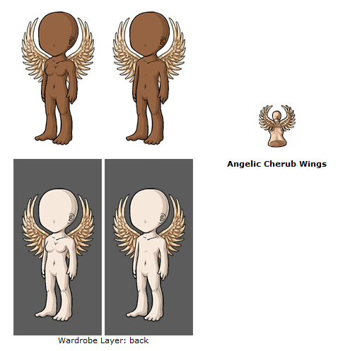 In this example, the wings lack any sort of bone structure. Try using a guide for bird or bat wings to get a wing anatomy just right - the following image may be of help to you!
Perspective issues encompass a number of problems having to do with how the object is perceived in space. For example, a backdrop may be denied if it lacks depth or if various objects inthe artwork are drawn from conflicting perspectives. (See below for the denial reason that refers specifically to artwork drawn at an angle that conflicts with that of the avatar base.)
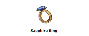 In this item example, the ring band has what is known as a Mobius Strip - it is an infinite loop, which would not work in a wearable image such as this.
 In this example, the perspective on the ground appears to make the ground going straight up into the sky, rather than following along the ground and into the horizon.
 In this example, the falling water and the ground that the overlay are standing on do not appear to be at the same angle or plane, and this extends to the grass running next to the chocolate river as well.
You may want to consider the following depth cues (among many others!) while addressing this issue: Overlap: Objects closer to the observer obscure objects further away. Diminution: Distant objects appear smaller. Convergence: Parallel lines converge as they recede into the distance. Foreshortening: The visual distortion of objects due to the angle it is viewed at. Atmospheric perspective: Distant objects are less saturated than nearer objects, with less contrast between light and dark. They are often lighter, bluer, and are less well-defined. Texture: Details are less visible on distant objects. Lighting/shading: Lighting can be used to define the form of an object. Shadows can also be used as cues to show the relative positions of objects.
Overlay perspective conflicts with the 3/4 angle of the avatar base
- This denial reason is often used on overlays that have been drawn as if the avatar base were facing forward, while the actual avatar base is at more of a 3/4ths angle.
![]() In this example, you can tell by the buttons and the line in the shirt that this was drawn as if the avatar was facing us head-on, rather than at a 3/4ths view.
In this example, you can tell by the buttons and the line in the shirt that this was drawn as if the avatar was facing us head-on, rather than at a 3/4ths view.
Dithering and/or save quality issues
- Items may appear dithered, have unwanted noise or suffer a loss of quality upon saving for web. If this is happening frequently, you may want to look into your save for web settings.
 In this example, due to a color profile in Photoshop, there was a discrepancy in the colors between the item and overlay.
Subeta Item Standards
Drop shadow
- Drop shadows on Subeta items are not allowed. Although you may find some (much older) official art on-site that still contains a drop shadow, these are being removed from items over time.
Colors do not match between item and overlay
- Any elements shared by the item and overlay should match, such that the item is an accurate representation of the overlay. If the item and overlay appear to match in your art program of choice but do not match once uploaded, the culprit may be your save for web settings. You may need to adjust your programs settings so that your working file colors and final .gif and .png colors match.
 In this example, the overlay is a duller white blonde where the item is very bright yellow blonde. One of the two will need to be changed to match.
Does not work on both light and dark avatar skintones
- Although the lighter avatar bases tend to be the most popular, overlays must look good on a range of avatar base colors. This tends to happen the most with makeups, particular blush, when it is not tested on all avatar bases. Highlighting on a light base can often look more like acne or boils on a darker base.
 In this example, the highlights the dark base are giving it an unfortunate effect, like that of a skin problem.
Does not take into account differences between male and female avatars (waist, chest, crotch)
- A male and female version should be uploaded for items that are close-fitting enough that these differences would be seen. Keep in mind that the female avatar has a thinner waist than the male avatar, which is important not only for wearables that hug the waist but for backdrops.
Male and female versions may only differ to compensate for the avatar base
- The differences in the waist, chest and crotch should be shown if applicable, but the design of the overlay itself should be the same. Male and female versions are meant to portray the same item on two different figures and are not meant to be alternate designs.
Artwork replaces features and/or edits the avatar base
- While we now allow custom wearables that change the position of the arms and legs and add unique base features (horns, ears, mermaid tails, etc) we still do not allow facial features including mouths, eyes, and noses to be submitted at this time. This includes makeup that gives the illusion of closed eyes.
Does not sit properly on avatar base
- This denial reason refers to artwork that seems to be a few pixels off from where it should be when viewed on the avatar base. It often refers to background artwork that has too much of a gap around the avatar base cutout or eats into the avatar base. Please use dark and light avatar bases on dark and light backgrounds to check if your overlay is a good fit!
 In this example, the background is eating heavily into the avatar’s lineart, especially around the feet.
One good solution to this is to replace the outline of the avatar yourself - many artists will redraw the lines around the avatar to make sure it fits appropriately.
Item is small and does not make good use of the canvas space
- Item artwork should be planned so that they make the best use of the 64x64 pixel canvas that is possible. Long, thin items may need to be drawn diagonally in order to make the best use of the space. Other items may need to be positioned or drawn from angles that don’t leave too much white space in the canvas.
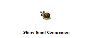 In this example, although the item is obviously a snail which is a small creature, it should still fill up the majority of the 64x64 avatar!
Artwork does not fit in the canvas and/or touches the edges of the canvas
- Items and overlays should be entirely contained within their canvases, with no portion being cut off by the canvas edge. Keep in mind that this also applies to auras, which should also fade entirely at the edges without being cut off by the side of the canvas. This denial reason may also be used for artwork that contains an unnaturally flat edge in order to fit inside the canvas, even if none of the artwork is actually touching the edge. Designs should be planned so that they appear complete and natural while staying inside the canvas.
 In this example, both the item and overlay touch the edges of the canvas, and in some places go completely off of it.
Item background is not white
- All items must be submitted with a solid, white background. Several items are submitted with slightly off-white backgrounds. If you’re not confident that you’re able to see if your background is off-white on the submission preview page, you may want to colordrop an area of the artwork that’s meant to be white and check if it indeed is white. If you get this denial reason, fill the background layer of your item with white and resubmit. If you’re finding that your background layer is white in the working file but changes when you save for web, you may need to investigate your save settings or color settings.
 In this example, the item background is actually an off-white/grey, rather than white!
It’s also important to make sure that images are NOT submitted as transparent .gifs!
Overlay background is not transparent
- All custom items must be submitted as a transparent png file in order to work with our avatars! The largest offender of this is the artist often tests the item on a blank avatar and then submits the item with that avatar still underneath. This is a very easy fix (and a good thing to double check before an item is submitted!)
![]() In this example, the overlay was saved with a preview female HA behind it and uploaded as such, rather than a transparent .png.
In this example, the overlay was saved with a preview female HA behind it and uploaded as such, rather than a transparent .png.
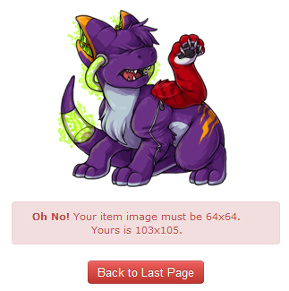
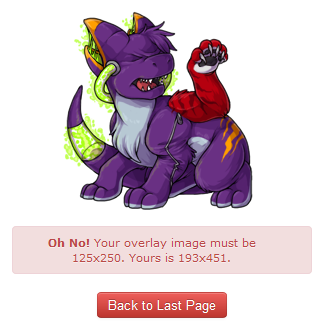
Item is not a 64 x 64 pixel .gif and/or overlay is not a 125 x 250 pixel .png
- Please make sure your item and overlay are resized to the proper sized and saved as the proper file format for upload! If you attempt to upload an image as the wrong file sizes, you will receive the following errors:
Item must be tangible and not an icon or concept
- Custom items must be an actual object that could potentially be seen or handled, and not something abstract.
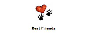 In this example, the heart and two paws do not represent an actual physical item, but rather an abstract icon.
Item does not accurately represent the wearable
- Overlays and items must be symbiotic and represent each other well. For example, an overlay of a dress cannot have an item that is a necklace.
http://img.subeta.net/artist/155904_0_both-itemdoesnotrepresentoverlay.png">
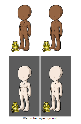
In this example, although a seal would certainly play with a beach ball such as this, as it is not visible in the overlay nor does it show any parts of the seal in the item, the item is not representing the overlay in this case.
(In this example as well, the item name is not representing the item image!)
Item is something that could belong in a Subeta collection, e.g., sticker, plushie, beanbag.
- Customs cannot be anything that can be in a collection on Subeta - such as the above. We also discourage making custom wearables that are nothing but books, since CWs cannot be read to pets!
Wrong layer selected for the overlay
- Occasionally a mistake may be made regarding which layer to put clothing on, or there may be some confusion! In this case we will deny the item and tell you which layer to put it on when it is resubmitted. Note: This is something we can fix post-acceptance, but as it currently messes with the item's location in the cash shop, we try to catch these as denials!
Submission can be logically separated into two or more items
- A submission will be considered separable if it spans two or more layers, with the layering being achievable with separate items. Exceptions can be made if the particular layering desired is not achievable unless the artwork is submitted as a single overlay (for example, a shirt and vest combination that has the shirt’s collar peeking out over the vest while the rest of the shirt is layered under the best) or if it is reasonable to submit the artwork as a single overlay (for example, a belted dress). Keep in mind that artwork may be denied for this reason if the number of layers included is unreasonable, even if the particular layering used is not achievable otherwise.
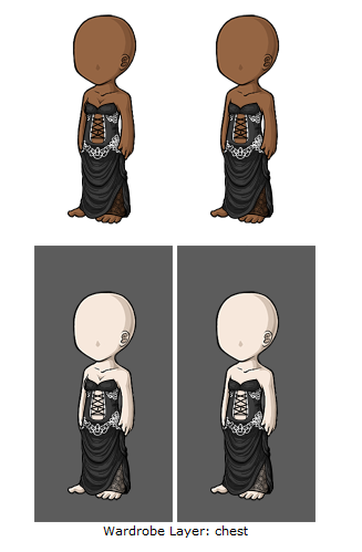 In this particular item, rather than looking like a singular dress, it looks like several pieces: a top, a corset, a lace belt and a skirt. There is nothing on the overlay showing that they would not be able to be layered in this same manner as separate items.
Tributes
Tribute reference and/or four changes from the tribute reference were not provided
- All tributes must be identified with references and changes provided in the notes section upon submission. Failure to do so will result in a denial and your submission will not be evaluated until the proper references have been provided, even if the four changes have been made.
 In this example, no image or changes were provided.
Not enough changes from original tribute reference; there must be at least four changes
- Tribute designs must be four legitimate changes removed from the original. Keep in mind that several listed changes may be counted as a single change if we feel they are a single change. For example, the changes “changed the collar to white, changed the placket to white, changed the buttons to white, changed the cuff to white” might be considered a single change to the color scheme.
 In this example, it is clear four changes have not been made from the source material.
Changes from the original tribute reference are too subtle
- Tribute items can be denied for this reason even if four changes have been made and listed if the changes are so subtle that they cannot count as changes. The four changes should be fundamental changes to the design. Examples of changes that are too subtle include a change to a color that’s so close to the original that it’s unnoticeable, an addition of an extra button/stripe/lock of hair that requires careful inspection and counting to see, or an alteration to a detail that’s so small that the change is hardly visible. It may be helpful to show the artwork to a peer and see if four fundamental changes from the original can be identified quickly without seeing the list of changes.
Text
Item name does not accurately represent the item image
- When the item image and overlay differ, the item name should represent the item and not the overlay. For example, a dress overlay submitted with the dress in a shopping bag as the item might be named something along the lines of “Mint Vintage Dress Gift Bag,” but it should not be named “Mint Vintage Dress.”
If this is the only problem with your item, you will generally receive an event asking you to submit a ticket with a new name, rather than it being rejected and you having to resubmit. If there are multiple issues with the item, you will then see this as a denial reason and should address it for resubmissions.
Non-unique item name
- This happens when an item has been submitted with the same name as an existing item on-site and must be given a new name.
If this is the only problem with your item, you will generally receive an event asking you to submit a ticket with a new name, rather than it being rejected and you having to resubmit. If there are multiple issues with the item, you will then see this as a denial reason and should address it for resubmissions.
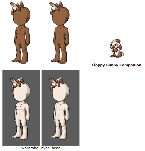
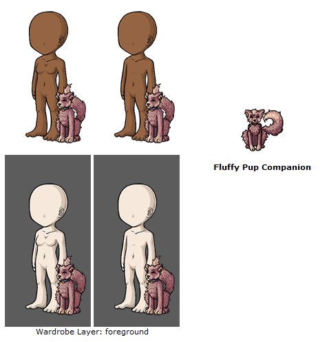
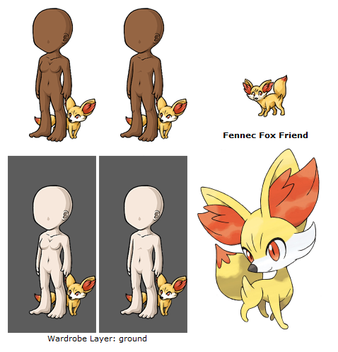
(Animal wearables) Item name should include "companion" or some other indication that it is not a minion
- Minions are not allowed to be wearables, and when it comes to custom items we require the use of a marker word to show it is not a minion. Adding “companion” or other similar words (“buddy”, “guardian”, “familiar”, etc) to the end of an animal item is a good way to distinguish your item from a minion.
If this is the only problem with your item, you will generally receive an event asking you to submit a ticket with a new name, rather than it being rejected and you having to resubmit. If there are multiple issues with the item, you will then see this as a denial reason and should address it for resubmissions.
Uses a designer or brand name rather than a descriptive one
- Custom items are not allowed to have a “designer” name, like our Subeautique sets do, for example. Although you can have a descriptive “set” - such as the Royal Rose Cape, Boots, One Piece, and Shoulder Drape, these names must go together and match the actual items. The easiest way to think about this is: Your item names may be similar to a Costume Trunk name, but they may not be like a Subeautique/Designer set name.
If this is the only problem with your item, you will generally receive an event asking you to submit a ticket with a new name, rather than it being rejected and you having to resubmit. If there are multiple issues with the item, you will then see this as a denial reason and should address it for resubmissions.
Name, description, or image references a Subeta user
- You may not submit a custom item that uses your username or a part of your username and does not describe the item.
For example, the user “Crown” may submit an item that is a crown and call it “Gold Jewelled Crown”. The user “Darling” may not, however, submit a crown called “Darling Crown”.
Typo or grammatical error in the item name and/or description
- Subeta items must have correct grammar. If English is not your primary language, we recommend having your items proofread by a friend on-site who has better English skills!
If this is the only issue with an item, we will generally fix it ourselves behind-the-scenes, as long as the errors are small. If the entire description needs re-writing or you are a repeat offender with submitting items that constantly need fixing, it will be rejected and you will need to fix it yourself.
There is now a useful sticky thread that goes over common errors and how to fix them found here!
Item name does not follow standard capitalization format
- Each word of an item name should be capitalized, unless it is a particle (such as: to, an, a, the). The first word of an item should always be capitalized regardless of what kind of word it is.
Correct: The Hair of the Queen
Incorrect: The Hair Of The Queen; The hair of the queen
Use of non-American spelling(s) in the item name and/or description
- Subeta uses American spellings for all words, and this must be adhered to with custom items. Below is a list of common words we often see in British English instead of American English:
Colour instead of Color
Grey instead of Gray
Fibre instead of Fiber
Honour instead of Honor
If this is the only issue with an item, we will generally fix it ourselves behind-the-scenes, as long as the errors are small. If the entire description needs re-writing or you are a repeat offender with submitting items that constantly need fixing, it will be rejected and you will need to fix it yourself.
Rule-breaking
Facilitates the creation of offensive avatars
- Sometimes items - whether through innocence or through malicious intent - can make an avatar look inappropriate. In cases like this, the item will be rejected and we will ask for the overlay torco be reworked so it can not be used inappropriately around site.
If your intention was innocent, it should be an easy enough fix - generally it requires moving the image a bit or perhaps a small drawing change so it can no longer be used in this way. If your intentions are actually malicious, we ask that you please reconsider even trying to submit the item; this keeps us from looking over legit and appropriate custom items.
Please note that this applies to submitting two separate CWs that may be innocent apart but create an offensive image together is also covered in this denial. If you do submit something of this nature that manages to get past us and get accepted but is later found out, it can result in an official warning.
 In this example, this overlay may seem innocent, but due to positioning can be used to create an inappropriate avatar.
Item name or description contains a word blocked by our filters and/or attempts to evade our filters
- Any word that is blocked by our filters cannot be used for custom items. We also do not allow any offensive words or slang or any swear words, even if they are technically allowed by our filter. In most cases, we will event you to chose another name if there are no other issues with the item!
Suspicion of unoriginal artwork
- This denial is used when we need to have further proof that an item is original and not traced or containing unoriginal images. Please note - just because you may receive this denial does not mean we think you are an art thief! We often use this to just reassure ourselves or to check up on something if the quality differs greatly between two items.
If you receive this denial, we will request that you submit a ticket containing your .psds or proof of work, uploaded to a site like YouSendIt or Dropbox. At that time, the files will be reviewed by a member of the art staff. Once you are cleared via ticket, you may begin to submit customs again!
As long as you have not stolen anything, you have nothing to fear from receiving this denial! In 90% of cases, the artists prove their originality with no problem and are allowed to submit customs again immediately.
Use of unoriginal textures or brushes
- You may not use any brushes, whether default Photoshop (or other art program) brushes or brushes created by people around the web, in custom items. Brushes are generally copyright to their creator, and they require credit and permission to use - and some even cost money or royalties. Because of this, if you do use a brush in a custom item, it must be uniquely created by you.
If your custom item is denied for this reason, you will have to supply proof that you hand-created your brushes yourself.
 This item and background example use default Photoshop brushes for the leaves and grass. Both are unacceptable.
Hello, ! After way, way too long, I have finally had the time to hunt down, fix, and reupload the original guide to custom wearables!!
and I made this a few years ago as a very long-term project. Unfortunately when we had to switch the forums around, this was one of the posts that was lost. I was saddened to see I didn't have a backup -- but luckily through the use of a few internet tools and finding an old Google doc, I was able to find the original pieces and get it back together! It is now backed up on my computer as well, so this shouldn't happen again (I hope - knock on wood).
There are a few things I would still like to add/edit on here, but for now it is back up and ready to help!
(Note -- I am editing the 'navigation' in the first post now. I had to wait until I moved it back to the forum it needed to be in!) Done!

This is actually really, really useful and clears up a lot of stuffs I was confused about. I'm happy you brought this back!! Thank you! ;o;
 ~ CW Group ✰ CW Releasing Thread ✰ My CS ✰ CW Wishes ~
Forum graphic by
You are both very welcome!! It's been my intention to bring this back for ages and just a matter of hunting down all the various parts (and finding the time). I'm pleased as punch that it's back up and will be useful to you guys!
"Facilitates the creation of offensive avatars"

5EVA UPSET

Thank you so much to you and !! :D This is very helpful!!
I do have one question concerning tributes that I have been having trouble finding the answer for anywhere and I was hoping would be in this guide. If the tribute is a hairstyle, does it need credit and changes? Also (one more question, sorry!) if the tribute is a garment of a type that was actually worn historically or is used across several different fictions, does it need to be changed?
Thank you SO MUCH for this guide! It's just what I needed. Very sad, though, as I use a painterly style rather than cell shading, so I have a feeling my first ones are going to be denied. :(
i laughed way too hard at the sausage
p r e s a g e .[/font]
We tend to be MORE lenient with hairstyles (I say "more lenient" because if it is a hair style that is VERY unique and specific to a character, we still want to see changes!) -- HOWEVER, you should still mention it is a tribute. Not doing so can result in a warning for scamming. It is very important to mention if something is a tribute when it is, no matter how small it seems.
Historical things tend to be tricky. There are some historical things - clothing, buildings, etc - that hold VERY strong copyrights. The biggest we see isn't actually clothing, but landmarks - like say, the Space Needle, the Eiffel Tower, the Burj Khalifa, etc are all copyright by design and therefor need changes in tributes. We really need to be fair across the board with things like that, so yes, historical items should be changed.
x)