New site font
Filter
Show Official Posts OnlyReplies
Looks really nice! I like this change, it's way easier to read than the old font. :)
🐝 ☕ bug (he/him) | your friendly neighborhood code wrangler. stay in the loop! join and check out the latest admin post highlights
i like it, but the sizes are a little off in some places - sidebar and forum topics are way too big, and certain buttons (like the post button) are too small.

To me the font is insanely tiny? I thought there was a bug. I'm hoping it's not a permanent thing if it won't be made bigger.
[edit] Just saw the site update. I'll be changing my custom css looks like.
Forum art by me
ahaha, i thought it was my browser at first and came to see if it was an actual update lol.
i think it's actually a little bit harder to read than the old font... i just saw the update, too, so i think i'll be changing back.
All my pets pages look messed up now. The font is huge on their pages and the format isn't ok anymore. Hoping this is not a permanent change or it'll be made smaller or something, idk ;_;
This font also hurts my eyes. :(


yeah, same. i removed my custom css and the forums/news are no longer huge, but i would rather go back to verdana. i'm not touching my font settings in chrome or my system because i hate dealing with them and i'm happy with how they are, but i hate what it's done to the site :c
Segoe UI is way too narrow. Just look at the clock:

I try to avoid using too much custom CSS, but I can't stand this font and I'm going to have to change it.
This inspired me to look around and see what other sites use as their default fonts, and Segoe UI is hardly used. Arial is super popular (my favorite), followed closely by Helvetica and Verdana. And I'm talking about big sites like Google, Facebook, Twitter, Reddit, etc... sites that Subeta likes to compare itself to. I don't really understand why Subeta is breaking from the norm here, especially if they have to follow it up with "PS, you probably won't like this change so go fix it with custom CSS."

It's making my head hurt with the crazy different sizes, some things are so tiny and some things are SO BIG and the font is not pleasant in the slightest. >_< Does anyone have any css that i can copy? T_T
i didn't even see the announcement, for some reason it didn't pop up. Rip me.
Pretty much how I feel on the whole issue. I'm not sure what the significance of this change is. Worst part about this is now I have to redo 60+ pet profiles to fix the font on them now. Probably more, since I'll likely have to fix my friend's pet profiles too. My recent PS winner now has an absurd amount of blank space on her profile that didn't exist before the change, and this is after tweaking some things.
Forum art by me
i'm... not really sure how i feel about this ; - ;
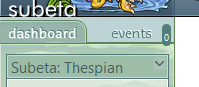
on one hand i kind of like the font but on the other it seems to mess up a lot of stuff?? the 0 next to 'events' on my dashboard looks like it's falling and the heart on naruse's profile needs to be re-aligned to the main profile now ugh
Thought it was my computer/browser at first but good to know it's not just me.
I like it!
[tot=Sundance]
I like Segoe UI. It's crisp and clean. I'm fine with it minus the clock issue that mentioned and the Events tab counter thing mentioned. The default font on my android phone is nice, too, whatever it is.
I do feel that, by default, users should all see the same font no matter what their OS is. Obviously, there will be people who change it via css or their browser settings, but at the base, I rather have the site have its own fixed font (as oppose to it being decided by the user's OS). It just seems like better practice to me.

[font=mistral]r i p t i d e[/font]
Would it be possible to move text on forum posts to be at the side of the HA again instead of having to scroll down to read what people are saying because it's now under the HA? It's so weird.
I don't mind the font but I'm having the same issue as and it's making navigating the forums a little inconvenient
I feel like it's a clunky and sterile sort of font, but to each their own. I will get used to it. ugh hope my pet profiles aren't very messed up D:
... It's very ugly. The most fustrating thing is that I need to apply a CSScode to make the site better for my eyesight. I had to apply the Verdana code linked but wtf? Basically if you don't use that, things like pet profiles are broken.
But! Come on, why in the world are these areas (and more!) not even working with the rest lmao? If you want a site-wide change ... make it change for all ha ha. (drag imgs to see them bigger)


/flips table
