potion revamps
Filter
Show Official Posts OnlyReplies
NEW - OLD

[IMG]http://i162.photobucket.com/albums/t256/lullsub/x%20old%20items/potion_nuclear_zps3psec9pp.gif[/IMG] [IMG]http://i162.photobucket.com/albums/t256/lullsub/x%20old%20items/potion_reborn_zpssqd40iow.gif[/IMG]
If anyone has old pics they would be greatly appreciated ^_^
@ lull
Old Art

I'll admit, I really liked the old art for the Nightmare potion. I'm surprised it got updated. I didn't think it was that old for a potion colour.
Wanna know more about battling? ❤️ The Official Battle Guide v3.3 ❤️ Need to find books? 🌈 The Book Grind Guide v1.0 🌈
i like most of the old potion art. the colors are vibrant. the bottles are clear. when i look at them, i have the instant feeling, i want them.
most of the new ones have too much details for a small picture. looks like a lot of dirt on the bottle. they look good nonetheless, but they lost the wow factor. nightmare potion feels less nighmarish. bloodred potion doesn't look so bloody anymore, more to bat morphing potion.
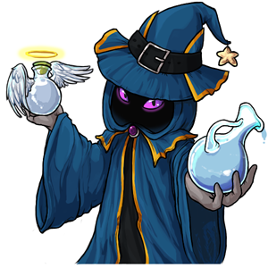
The one thing that's driving me slightly nutty is the inconsistency between the official item art and the ones being held by the Potion Lottery Harvester.
The common potion held by the Harvester is missing that curl at the end of the handle, while the angelic's stout has a much longer, skinnier neck compared to the short, fat stout on the official art. The halo on the held angelic potion looks rather odd too.
But otherwise, the rest of the Harvester art looks fabulous! The shading in the cloak folds is very nicely done.
Wanna know more about battling? ❤️ The Official Battle Guide v3.3 ❤️ Need to find books? 🌈 The Book Grind Guide v1.0 🌈
Where did the bat head go on Bloodred? It's just a cork, now. Major downgrade.
Sans Field, which I think could have used a total overhaul design wise, the colorfill potions are fine. But for the reposes, oh man, I think Miracle, Graveyard and Glacier are the only onse I like better.
I like the new Harvester, major upgrade. As for the potion, I'm not too excited. I really love the new angelic and twilight potion, but some of them look dirty for some odd reason. I'm alright with them anyway.
I prefer old Nightmare :( Also, the colors are overall a bit dull? Kind of like if someone had thinned the potions out with water or something. The bottles do look bit dirty, or like they're covered with dust!
I love how there are major discrepancies between the official item artwork potions and the potions being held in the official harvester art.
It's significant enough that it was pointed out nearly immediately by users, but it still made it through being approved by the art department like that?
What.
As has been pointed out before, what is with the potions varying between what the Harvester is holding and the actual standalone potions??

They look gorgeous. I'm especially fond of the angelic potion. That new harvester is such an improvement, too!
I think they all look great. It might have been nice to see some blood dripping off the Bloodred Potion like the old version had, but that's probably the only thing I'd change.

Ooh...you're right. The new one looks far too clean. I'd love to see some blood edited into the art.
Wanna know more about battling? ❤️ The Official Battle Guide v3.3 ❤️ Need to find books? 🌈 The Book Grind Guide v1.0 🌈
admittedly, i'm not a fan of how desaturated all the liquid looks in comparison to the old potions. i was always a fan of how vibrant the colors were, even if the art was sorely outdated. that and well, the new ones strike me as a bit overrendered.
also that nightmare revamp strikes me as a real downgrade :/ the aura is weirdly... "stringy" now as opposed to fog-like and oppressive, which was always very fitting for the theme of the color. i dunno, the art on that potion seemed relatively recent, not sure why it was redrawn.

oooh, they look amazing! but the bloodred potion could have some blood on the bottle... and I'm not a fan of the nightmare potion :(
I REALLY love the Sun and Lilac ones the most :D But I do feel like the Twilight Potion's colors need to be changed a bit since they are nearly identical to the Silver Potion colors.
Also, I wonder why the Spectrum Potion didn't get a revamp.
That harvester looks amazing! It looks so cheerful, such a great improvement! The potions themselves, some of them look great and are such a big improvement (the glacier is stunning, now it looks more like ice!) but I miss the old ones as they show the vivid colours of what they represented.
Now most of them are too reflective/shiny to show the colours so it doesn't capture the essence of the colours they represent. I do miss the bloodred potion's bat head as that's missing the potion's key characteristics (needs more blood too!). Also, there is a chibi item that uses the bat head and now it seems a bit pointless to completely reconstruct it. I'm surprised to see that the nightmare potion's been revamped as I thought it was alright, it now looks more wispy rather than eerie. I think the spectrum potion was already revamped when the blacklight potion was released so it's probably why it wasn't done again.
I feel that the Bloodred Potion art is too clean for its corresponding color, and it bugs me that the Nightmare Potion's "cloud" is massively asymmetrical now. Other than that, I don't feel too strongly about them.
I really dig the new Harvester art.
It would be nice to hear a response from staff about the issues with the harvester art.
I like the harvester's pose. I don't like the glacier or marsh potion bottles. They just don't look like a bottle. One looks like white clay, and the other looks like some dirt. I know they are supposed to tie into the color / world palette that they represent, but they look too half-formed.
It's a very similar pose (mirrored), and other than some lichen type stuff on the potion, I immediately thought of the fruit before recognizing it as a potion bottle.
I don't think we will. All I really want is to see some small edits to the held potions so that they better reflect the new potions.
It almost looks like the harvester art was done well-in-advance of the potions revamp, and wasn't revised to match the final look.
Wanna know more about battling? ❤️ The Official Battle Guide v3.3 ❤️ Need to find books? 🌈 The Book Grind Guide v1.0 🌈