Pet Spotlight + Support Group IV
Replies
just letting you know that the heart is for pet "likes"; they don't really have any bearing in spotlight itself. hope that helps!
- Ohhh okay! Well I suppose that makes me feel better in that regard. Thank you!
Edit: This explains why I couldn't figure out how to move the heart- I assumed the coding would be associated with the pet spotlight. I figured out how to move it now so thank you very much!! ♥
June looks really cool, kudos!
love the color scheme and background!
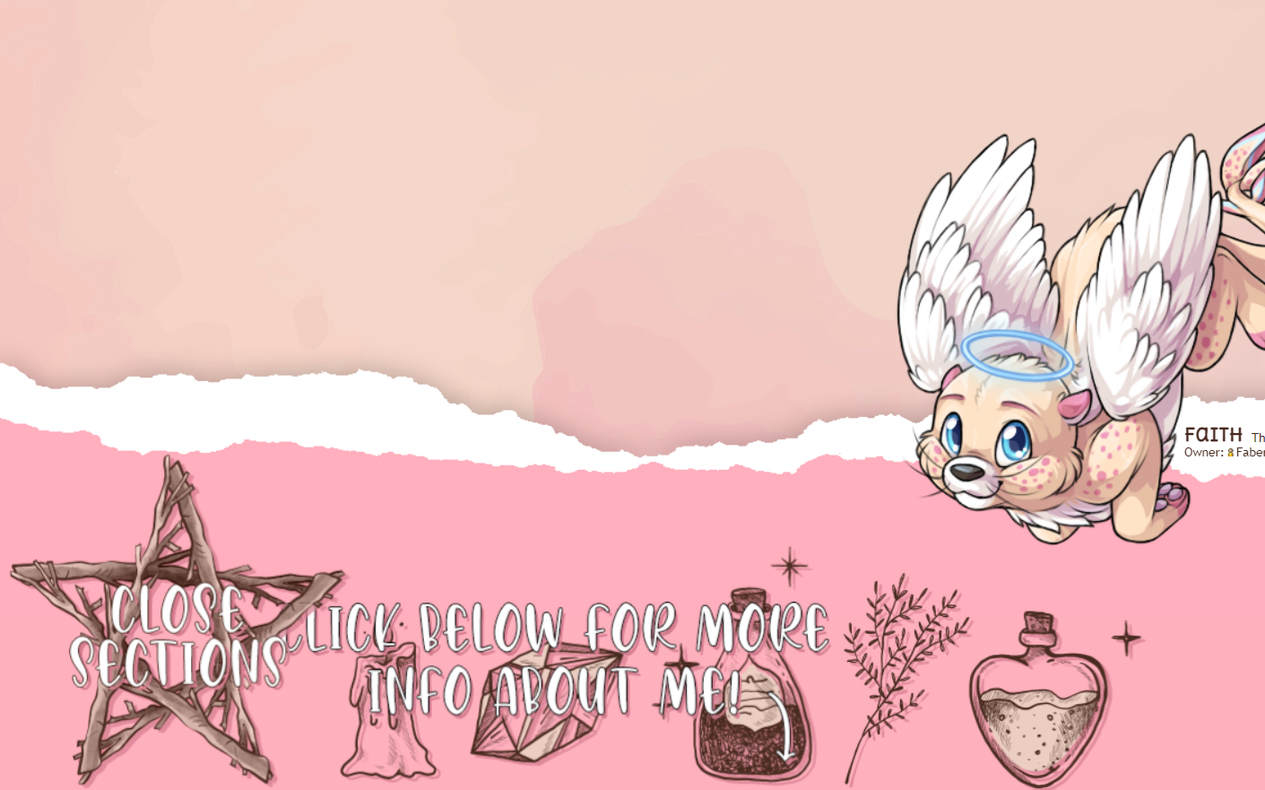
I have Lell who I've had forever who finally has a profile I’m happy with, and also Faith with a different sort of profile that was one big experiment that turned out fun, both hopefully should be about ready for the spotlight c:
I LOVE the overlay for Lell! Just beautiful. And the profile is lovely and goes very well. I couldn't read the minion's text tho. Too close to the background color. But overall, really nice. Faith's profile is wonderful! I love the background and how the navigation is straightforward and easy. So many times I simply can't move through a profile that requires clicking on different parts. But this was exceptional.
Hello, I've got worrying's overlay approved so all work on her is done. What do you guys think,? :0

WOWOWOWOW absolutely FANTASTIC pet!! as always tbh. cannae find a thing to nitpick and she's already been nominated!!
 banner by
 dayummmmmmmm that's amazing! Love it. The art and story is top notch.
I'm curious why the first treasure chest slot is empty? Must be a code thing.
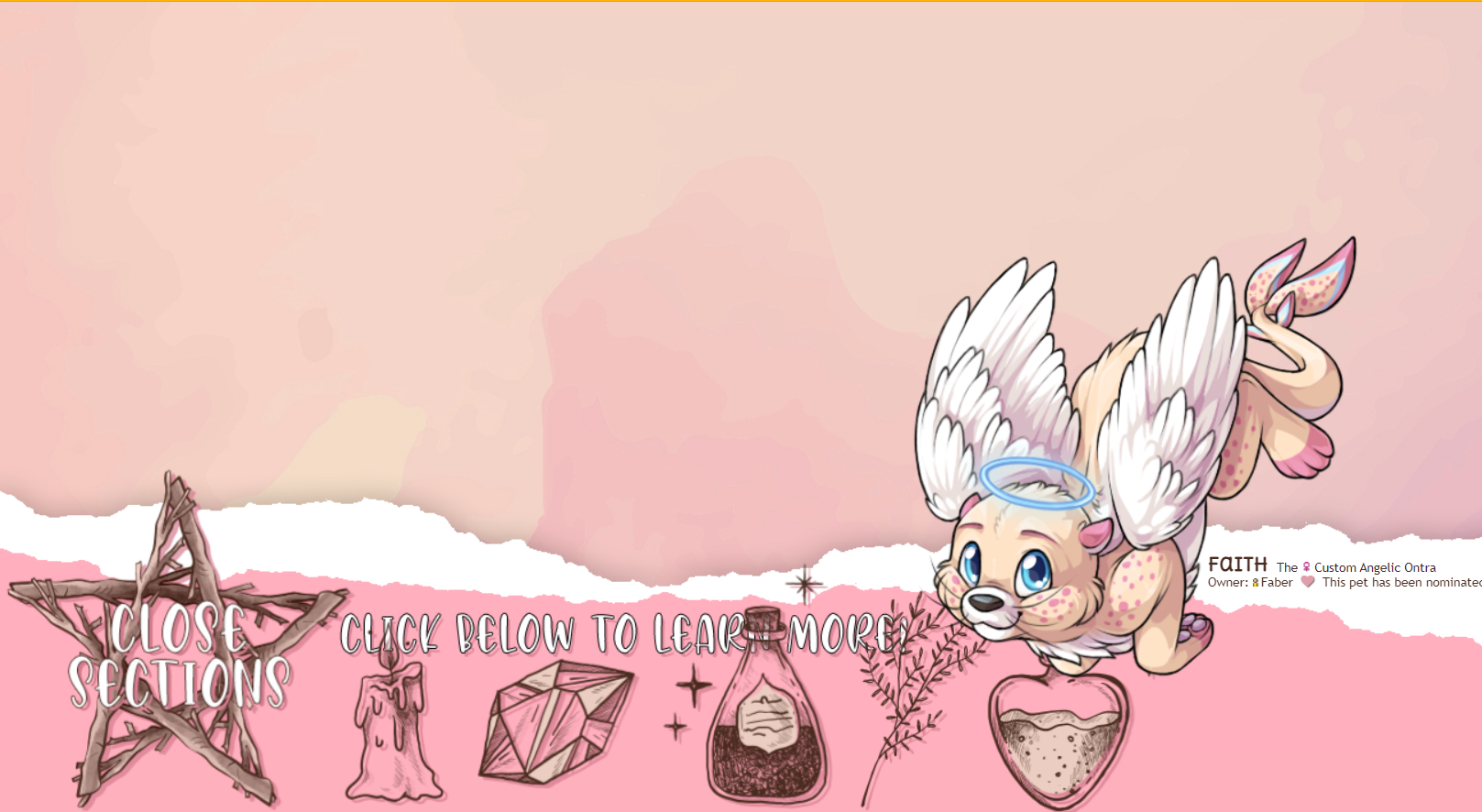
I couldn't click Faith's links, like the "click below" is over the top of them (only credits and gf) ... LINK
[img align=right]https://media.tenor.com/images/54bd2e6450371a66f5ba295081c6bbac/tenor.gif[/img]
and I dance dance dance,
I dance dance dance
My Wishlistmy CWs[/font]
thank you for the feedback! I'll change that font color to make it easier to read, glad to hear Faith's profile was easy to navigate.
love the pet, very cool profile and lovely art, the profile does not work well on mobile but looks very sleek on a computer!
edit: sorry , I missed your ping! I was concerned that would happen for people with smaller screens, I'll see if I can make that graphic smaller so it has less of a chance of covering the other image links. Thank you for the screen shot!
well I'm on 1920 x 1080 ¯(ツ)/¯ so not a small screen..lol
[img align=right]https://media.tenor.com/images/54bd2e6450371a66f5ba295081c6bbac/tenor.gif[/img]
and I dance dance dance,
I dance dance dance
My Wishlistmy CWs[/font]
thank you all ;v;/ i'm gonna pretend i didn't see the borked profile on mobile, this is computer friendly zone only xDD
that's weird, my screen is that resolution too, but the screen shows way more: https://i.imgur.com/libjpNg.png but I made two changes, I made it so that graphic would go below the links instead of on top, and I made it a bit smaller to hopefully help with that issue, this is how it looks for me now: https://i.imgur.com/FnCaUAR.png Thanks again!
edit: no worries, I understand that pain 100%. mobile is such a pain to work with!
I have my font set to 125% due to eyesight? I didn't think it would affect graphics. I CAN click all the buttons now, and I see this: https://i.gyazo.com/d9dd53acfab1bbc64d9b84a322c1255d.png
[img align=right]https://media.tenor.com/images/54bd2e6450371a66f5ba295081c6bbac/tenor.gif[/img]
and I dance dance dance,
I dance dance dance
My Wishlistmy CWs[/font]
not sure, I've tried to figure out why browsers display different resolutions than screens and fell down a rabbit hole of things. basically it's way more than just the screen resolution, so who knows! I'm glad you can click them now! it's still not as clean looking as I'd like for that configuration, but I'll keep playing with it. thanks again for the screen shot!
If it helps any, this is the screenshot of what I see. My reso is 1440x900.
yes, thank you! It does help :)
looks great! You just need to move the Owner info on the side up a smidge as it's overlapping the name. https://i.gyazo.com/ed33d1c30efb33c4e4081bd4ffe261d1.png
[img align=right]https://media.tenor.com/images/54bd2e6450371a66f5ba295081c6bbac/tenor.gif[/img]
and I dance dance dance,
I dance dance dance
My Wishlistmy CWs[/font]