☀ CW Denial / Help Thread! ☀
Replies
omg im so sorry i procrastinated on this HAHHA thank uuu xDD
MY HERO ❤ that helped a ton! v i had a feeling i had to redraw xD cant be helped! but ahhhh at least i know what i will have to do now, thank uuuuuuuu!!! v
p r e s a g e .[/font]
I hate having to redraw stuff too T_T I've needed to do it a lot lately too. Once because of a denial, and a couple more times because I've gotten to the end and I realized the mistake I made and it wasn't an easy fix. hugs
no worries bb! hopefully it's not as much work as you might have initially thought?
thank you so much (as usual) for your awesome insights and help <3 <3 <3
silent squeals im still very very sucky with shading and general cws and i just had a peek at your cw tutorial you linked // bless you so much!! tyyy
 [sub]by [/sub]
Awee you're a sweetheart, thank you! If you ever need any specific help, let me know, I'm more than willing to offer a hand n_n
OTL I come crawling back with a denial
Username --- Link to the overlay(s) --- female, male
What do you need help with --- I made some changes (comparison image here) but I don't know if they're good enough to satisfy the 3/4 perspective.
Was there a denial --- Yes: Your custom clothing Box of Breezy Lightweight Fabric was denied for the following reason(s): • OVERLAY: Overlay perspective conflicts with the 3/4 angle of the avatar base • OVERLAY: Does not take into account differences between male and female avatars (waist, chest, crotch) • NOTE: Right now the shape and shading on this is giving it the appearance of being a little more face-on than we'd like to see! • NOTE: While you did eliminate the breast outline from the male version, the folds on the fabric and shading still indicate breasts.
Optional Can we redline --- Yes, please!
So, I think the main problem with this item is the shape of the bottom of the dress, rather than the bust are (at least in terms of the perspective denial). To match the perspective of the HA base, I think the shirt should curve a little upward on (our) left and downward on (our) right. Right now, the curve hits in an identical spot on both sides. You might want to add a couple of areas of darker shading on (our) right of the dress, especially on that side of the "breast" area and the waist, to indicate that those areas are more shadowed. Imagine the HA as a 3D shape and try to think of where shadows would fall naturally from that angle.
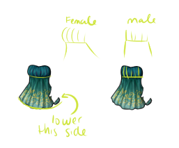
Your edited version does a pretty good job of "flattening" the bust, which I think is necessary for the male version of the overlay. When you think about it, most males don't have large, rounded breasts, so there's nothing there to push out and create the "rounded" look of the bust area of the dress.
Hmm okay. I did have the right end farther down in one of my earlier versions but thought it was too uneven. I don't know, it looks really uneven to me.
...Ohhhhhh wait, it just occurred to me that you might mean lower the angle of that little corner bit? I can see how it gets blurred when scaled down to normal HA size. Something like this?
Haha, nope, I meant the whole curve of the skirt at the bottom. I don't think the angle of the curve needs to be EXTREME, but it will end up being a little "uneven" because that's how perspective works when you're thinking of an object in 3D. Let me see if I can explain a little better! :)
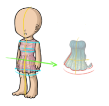
So, if you're looking at the HA, it's standing in 3/4 view instead of staring straight ahead, right? So in 3/4 perspective, you can see the the left side of the HA is slightly higher than the corresponding part of the right side. See the lines I drew at the shoulders, bust, and bottom of the skirt? There's a slight decline there. That will help you figure out where your overlay is supposed to go if you think about it in those terms. The yellow lines also help indicate the 3D shape of the HA, which can be useful in determining perspective. Notice that the verticle yellow line is the midpoint of the HA, but it's not exactly in the "middle" of the image, as it would be if the HA was looking straight at us. The horizontal yellow line shows that we see less of the left side of the dresses than the right side.
I did a quick redline of your dress to show the ideas above on your dress, hopefully it makes sense! I cut off part of the dress on the left side, because perspective tells us that we would see less of than side. And I lowered the curve of the bottom of the skirt just a bit. Does that help any? Sorry for the rambling!
Ahh thank you for the guidelines and redline! So it looks like my problem was making the hem far too curved with respect to the guideline and consequently bringing the sides up a tad too much. Hopefully I've got it now?
Yeah, as far as I can tell, it looks good! In your case it's so subtle. I hope staff will accept it this time!
Username --- Link to the overlay(s) --- click click Link to the CI --- click click
What do you need help with ---  I have never made a custom wearable before and was hoping someone could tell me if anything needed to be worked on?  I have my own thread that explains the item and has a working size image here: click click

Was there a denial --- No, I have not tried submitting yet.
Thanks very much for any feedback anyone can give me! <3

I can't offer help on the anatomy or anything since animals aren't something I'm good with, but I can offer some input on the other parts n_n Item Image: I think the texturing and the lines are really great on this, but I do think you need a little more shading. Right now it's a little unclear where the light source is coming from. Remember to shading things as a whole, rather than each individual part. Overlay: I think the shading and everything is really good on this, again I can't comment on the anatomy since I'm not even really sure what kind of anatomy is applicable here =P but I will say some of the lines look a little thick in places. For example, the antennae and the 'armpit' area between the belly and the wings.
Ping me if something didn't make sense or you need more opinions / etc. n_n
Thanks very much for the input! That's okay, I know the anatomy is a little weird, because the thing I am referencing is a little weird. xD I am not sure if you had a chance to look at the thread I posted, but it's going to be a tribute item to this odd magical bird. I will put the image here under spoiler tags:
Fwooper

I specifically mean the black line of the antennae. n_n' sorry I wasn't more clear lol. Hurm as for the Fwooper's anatomy, I'm so not sure since that's only a front view and I don't have any idea if it looks like a real bird or not! Hopefully someone else can help, if indeed you need any! For all I know, you're just fine =P Animals aren't my jam usually. I'm more of a 'people' person lmao.
Mesmer's already pointed out the lines (I think the fluffy bit on the head and all internal lines are a bit too thick personally). But something I've been meaning to bring up is... I think the eyes are shaded backwards. Looking at the large version you posted on your discussion board, you have the white dot + darker shades on the right side, and the lighter iris shades on the left. Since the light source is from the top left, the white dot (which is the light hitting the eye) should be on the left, similarly that's where the actual shading is dominantly going to be. The highlight on irises (and gemstones) is on the opposite side of the actual light source. Light hits, causes a white/near white spot, and shines through to the other side, creating a highlighted spot there.

Thank you both for the advice! I hadn't noticed the eye shading, Muerte, thanks for pointing that out. I made some changes to thin out the lineart, and I adjusted the shading on the item version. Do you think these are an improvement?
Adjustments


I def think that looks much better now! n_n