☀ CW Denial / Help Thread! ☀
Replies
Aww, don't be like that! Talking down to yourself just makes you and everyone else feel bad. It's totally okay to ask for help, it's nothing to ashamed of! The whole point of this thread is for cw artists to support each other and help each other learn how to be better artists. :)
Ah. Not an actual CW artist. Or don't think you can consider me that. Or an artist...I am more of a hobbyist in truth. Ended doing this by chance.
Don't want to bring my friend trough another denial so me not being able to visibly fix the shark even after redraw does mean I should let it to someone else. No point in creating a mess. Unfortunate though. Would have liked fixing it.
Though I am very grateful for the help and have screen captured everything since maybe one day it will aid me.
Sooo happy this group exists and that I found it.
Link to the overlay(s) --- overlay with black BG and with HA !!! Both images are edited to the new version, the first one is visible in the second link.
What do you need help with --- This would be my first time submitting a CW that I have drawn. I'm really unsure if this would be something that might get approved, so before it gets officially denied I thought I might get myself some critique from more experienced artists to hopefully prevent this. I'm quite proud how the water turned out, but not too sure if the planks look ok.
Was there a denial --- nope, did not even try to submit yet ^^
Optional Can we take a look at the PSD files --- I'd rather not. Can we redline --- Sure.
Edit: was dumb and got the same url twice
hi there!
It looks pretty good! n_n
Off the bat, the only thing I can see maybe the lack of light source, which should be top left. So you'd make the right side of the wooden planks darker, as well as adding more depth/shadows onto the right side of the waves. Maybe a couple lighter highlights on the left side to further enhance the light source direction (:
^ which can easily be added on top of the layers you have, no need to redraw anything here!
Cathii's CW shop ❤️
I love the details in the waves, the ocean is gorgeous! Honestly, I feel this is a great CW so far, but I agree with Cathii that the light source needs to be more defined, and right now it all looks a bit flat. I tweaked it a little in photoshop to explain what I mean, hopefully it's useful!

• Added deeper blues and blue greens to some areas of the waves (particularly toward the front), to create depth and vibrancy. • Used reddish and yellowish tons on the wood logs to give the colors more visual interest • Deepened the shadows between logs and on the nearer sides of the ropes to create the illusion of rounded logs and strengthen the light source • Darkened the shading on the right side bottom corner to further strengthen the light source • added a yellowish (more eyecatching than white) to the shark's fin to make it stand out from the white crested waves
Overall, you had a great start, and these are minor changes I accomplished with just a few quick color overlays. My biggest suggestion is to work on adding a variety of colors (not just blue, but blue with green, yellow, teal, etc, for example), because you've got the technical drawing aspect pretty down pat! :)
Thanks you both so much for your feedback! That really helped. I had the lightsouce in the back of my head when doing the planks, but totally forgot with the waves. I tried giving both the waves and the wood more depth with darker shadows and more different colours added in. Also made the shark way more visible. It's a bit more comic style now, but at least people will be able to notice it without me pointing it out.

Hiii guys haha I'm having some issues with wings here because I suck at those xD
Username --- Link to the overlay(s) --- click click
What do you need help with --- Well basically it's being denied due to perspective issues;; but I honestly have no idea how to fix it??? I did flip the wings, but I also adjusted it for the HA's right side; so it's not 100% flip; if you layer one over the other it's not gonna be the same. I just wanted to keep both sides as "symmetrical" as possible but also changing the angle. Shading is not really copy + paste. I always shade things separately hehe
Was there a denial --- "It looks like maybe this was drawn for one side and then mirrored/flipped for the other side? That's overall fine, but it does need to be edited to fit the HA! In this case, it is VERY face-on rather than 3/4ths, and the shading came out rather mirrored as well, rather than matching the light source for the HA."
Optional Can we take a look at the PSD files --- I'd rather not since it's not for myself ; x ; Can we redline --- Yes of course! That's what I need help with haha
Thanks a bunch in advance :D
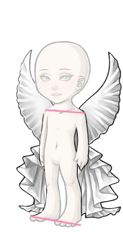
Hope this is alright ! Did this quickly before skipping off to bed. CLICKY-CLICK Basically bring the one over/in slightly, and the top down slightly, while bringing in the side (I should have also [slightly] brought down the part that goes over the shoulder and brought it in more on this side). Also bringing down the other side a bit on the bottom to help the shape be evened out. Sadly can't help with the shading right now though (and I mean, there are people ten times better, you included) These are amazingly stunning.

Thank you! But I also think they were talking about the bottom part, not only the upper ; v ; still super helpful!!
i utterly suck at wings buuuut I used this super amazing perspective tool on sai just for the kicks!
Off the bat, I'd say it's mostly that our left wing is just as large whereas it is supposed to pull a bit in the back. Like I said, quick edit with the perspective tool because i can't draw wings to save my life so pls ignore me haha QQ

Cathii's CW shop ❤️
ahhh idk if i can be of any help ;-; im horrible at doing overlays overall but maybe im not so bad at picking out tiny details idk T_T maybe this can help a little? aaaa i hope other lovely artists can help you and i love your art so much q.q
p r e s a g e .[/font]
 [sub]by [/sub]
I think has the right idea about using a perspective tool (I tend to use it on the initial sketch to get the proportions right), but she went the wrong direction. If you take a look at the HA body, the further away side (our left) is slightly higher than the side closets to us. So the wings should reflect that as well. Logically, the HA's face and shoulder would also be blocking part of the view of the farthest wing, which helps the illusion of perspective as well.
I also tweaked the shading a bit so that it looks more individual (less copy-pasted), since staff seemed to be taking issue with that. Really pretty design though!
Thank you very much for creating this thread, it's very nice of you, guys!! :D
Username --- Link to the overlay(s) --- click click Link to the CI --- click click
What do you need help with ---
With the shading of both CI and the overlay (especially the CI).
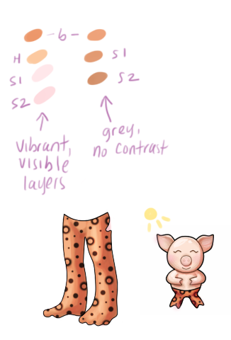
I don't really understand why the overlay's shading is incorrect, since these tights' overlay (made by myself) has the exact same shading and it was approved: But anyways! The only way I can think of to fix it is adding another layer of shading (more sheer than the 3rd existing layer of shading) that follows the other layers' shape. Would that be correct? o:
Also, I'm not sure if black is the appropiate color for the overlay's shading. I have tried using a dark orange, but the shading wasn't very visible (maybe I should have tried with a darker orange, or upping the opacity of the shading layers D: ) What do you guys think about these ideas? o:
What I'm quite clueless about is the shading of the piggy CI (and shading in general xD) I really like how it turned out! Though I knew that it could be denied. In the denial info it says that the Item has "Gray artwork, possibly from shading with black and/or highlighting with white", but I didn't shade the CI with black, I shaded it with a dark brown and did the highlights with a pale orange (close to white).
The shading is looking soft because of the gradient shading layers I made, right? o: Would upping the shading layer's opacity help? Or do I have to shade it in a different way? o:
Was there a denial --- Yes, here is the info:
1 • ITEM: Artwork does not match Subeta style, quality, or level of detail in general 2 • ITEM: Colored lineart and/or lineart so thin it appears colored 3 • ITEM: Gray artwork, possibly from shading with black and/or highlighting with white 4 • ITEM and OVERLAY: Shading is too faint 5 • ITEM and OVERLAY: Not enough area shaded (too much left flat and unshaded) 6 • ITEM and OVERLAY: Not enough layers of shading (Subeta artwork should have 3-5 layers of shading)
Optional Can we take a look at the PSD files --- Yes! Can we redline --- yes/no (What is redline? :o)
Thank you very much in advance!! :D
If you want to post the PSD files, don't worry about holding back on my account (for this commission or others, although I hope it isn't necessary for other works going forward. ;_; I'm sorry to have given you a difficult task). Whatever you're comfortable with in terms of getting it to site.
- - -
Signature art: Original pencilwork by , digital lineart and coloring by
Heyo! You're right, the opacity of the shading on the orange tights just isn't very visible, and looks greyish (regardless of whether or not you used black and white for the shading - sometimes it can be tricky finding a color that creates the effect staff wants.) Try increasing the opacity of the shading, and also try using a more vibrant color. Shading orange with more reddish color, or a purplish color, etc, will create a much more vibrant effect than shading with a darker orange. Below, I've used two shades of pink on "multiply" mode in photoshop, then used a light pinkish orange as a highlight. My color choices are on the left, and yours on the right. See what they mean by your shading being "gray" with "faint shading"?
When the tights are scaled down to final size, you can clearly see at least 3 distinct colors, it's not soft or gradient. This is what they mean by 3-5 layers of shading.
As for the CI, it's a bit simplistic, which I suppose is what they mean about not matching subeta style, etc. Try adding some additional details like blush (see example), or maybe a bow? It's up to you. Again, you need to be a little more aggressive with the colors you choose for shading, and make the shading more prominent. Use the little sun I drew in as a stand in for the light source. See how I added a much darker shadow on right side, opposite the sun? Thinking of the piggy as a 3d object (round head, chubby round arms and such), will help you see where a natural shadow would fall. Here's an example of another CI that's similar in style that's already on site (credit to ):

See how distinct her layers of shading are? It looks kind of harsh at this larger size, but when shrunk it will be more subtle!
EDIT: I forgot to mention, generally you shouldn't add darker shading to the left side of the object. On the ci, you have shading basically up against every black line, regardless of light source. Staff didn't mention it, but this creates a "pillow" effect. Use shading only where light would actually create a shadow. On the left and top sides of objects, a highlight is more appropriate on top of the base color.
Oh I see! Those colors look really good together and are clearly more visible :D The CI has a blush, but it's very very soft haha xD I'll try to add more detail! A bow sounds lovely c: (I can't see 's pic :o)
Thank you so so much for all your tips, this really helps me!! :D hugs
I think I'll have to re-draw the piggy, since it says that the lines are too thin o: Would you by any chance know if there is a way to thicken a Linework layer's lines in SAI? x:
Thank you so much once again!!! :D
Oops! Sorry, I edited the post. Forgot to put the pic in there. XD
I'm glad it was useful! Sometimes denials can be really flabberghasting, but in your case I hope it was pretty straightforward. As for the CI, I missed that denial! The overall outlines aren't too thin - that denial is almost always related to the "inner" lineart, like the mouth, nose, etc. The lineart is either not black, or so thin that it appears to be not black when the image is shrunk. SOME colored lineart is doable with cws, but you have to tread really lightly on this issue.
Hehe no problem! :D Oooh okay! I colored the inner part of the neck and ears, and also the eyes, nose and mouth o: I think I'll keep all those in black, since that could help the lines appear more "thick", right? :o
Once again thank you so much!!! :D hugs