☀ CW Denial / Help Thread! ☀
Replies
I may be 100% wrong here, so take this or leave this, but I actually think the problem is that the part is making this look like two different wigs put together? It looks disjointed to me and because of that piece of 'bang' on the HA's left side, it looks like the hair SHOULD end right there, instead of continuing on. (It makes it look like that is where the back of the head 'is'.)
(I am a visual person, so I did a mock up to show you, because I'm terrible or at least I feel terrible at explaining with words; LINK)
Your edit is fabulous and looks so natural! (Also thank you for the visual reference, I am also a visual person so that helps a lot.) I'm still not sure if that's what the denial is talking about though, but you DID move the part down so maybe? confused
@ Tartelette
Oh, this is a tough one because technically I think it's alright, but the bulk of it (which I am in love with, give me that huge hair) just makes things seem off.
I personally think the other side may be the portion to focus on, though. Either making the back area a bit less voluminous, adding a bit to the hairline, or both.
I did that here as a quick edit:
Back a bit less bulky--both hairline + back in--Just the hairline
 Each one is subtle, but does change things some. Maybe enough to get it through, or I could just be way off. Like I said, this looks good already so it's tough.
Edit: I am so late, and so sorry ! Feral's advice and edit is 1000% better.

I could be completely wrong! Maybe it'll help you to see what I saw though?
When I first looked at it, I saw this part as being the wig: LINK And the rest of it looks added onto the back.
You can see on the HA's left that that chunk of hair looks really natural without the back part? So it makes it look like that's the back of the head (it gives it the illusion that it is, anyways) and by changing the part in the edit, that no longer looks like the 'back', but the rest of the wig you drew does all the sudden?
Again, I could be wrong LOL
Thank you both so much for your input! You both pointed out potential issues that I hadn't even thought of. This is why this thread is awesome. Hopefully my edits for round 2 will iron some things out. ^_^
Username --- Link to the overlay(s) --- click click Link to the CI --- click click
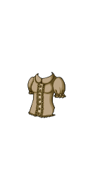
What do you need help with --- Looking for any 'subeta-style'-type shading tutorials? sadly, the videos sonatine did are now private, so half the things in the google drive from page 1 can't be used anymore. I know there's other things in there, and that did this post, but I'm hoping for more help specifically for clothing rather than wigs, if that makes sense? IDK if anyone besides sonatine's done a twitch stream or youtube video showing how they color clothes, but that's help a bunch if I could look at their process to see how other artists do 'subeta style'!
Was there a denial --- Yes, they have been very patient with me, but I'm sure they want to rip out their hair whenever my UN pops up in the queue by now though: ITEM AND OVERLAY: Artwork does not match Subeta style, quality, or level of detail in general ITEM AND OVERLAY: Sticker effect: flatness due to black lineart around the edges and colored or missing lineart inside ITEM AND OVERLAY: Pillow shading ITEM AND OVERLAY: Shading is too faint ITEM AND OVERLAY: Not enough area shaded (too much left flat and unshaded) ITEM AND OVERLAY: Not enough layers of shading (Subeta artwork should have 3-5 layers of shading)
NOTES: First, your lineart is definitely getting better! The help you got with your brush settings is making a lot of difference. The biggest issue here is the shading - it's just very very flat. There isn't enough of it, and what there is is only against the lineart, so it creates that pillow effect. There is also some lineart on the item to help indicate folds in the fabric which works rather well, where the overlay itself lacks any of this added effect!
Optional Can we take a look at the PSD files --- no, I use Clip Studio Paint, they're .CLIP not .PSD Can we redline --- yes
[/center]
I don't currently have the time to provide a redline but, what I can suggest is looking at the shading on items that exist on site to help you.
Here are a few good examples I think;
Maybe try to find some things you really like the look of, and study them and see if they inspire your future reshade of this project. (And obviously, as I'm sure you know already, but just make sure you're not copying something directly!)
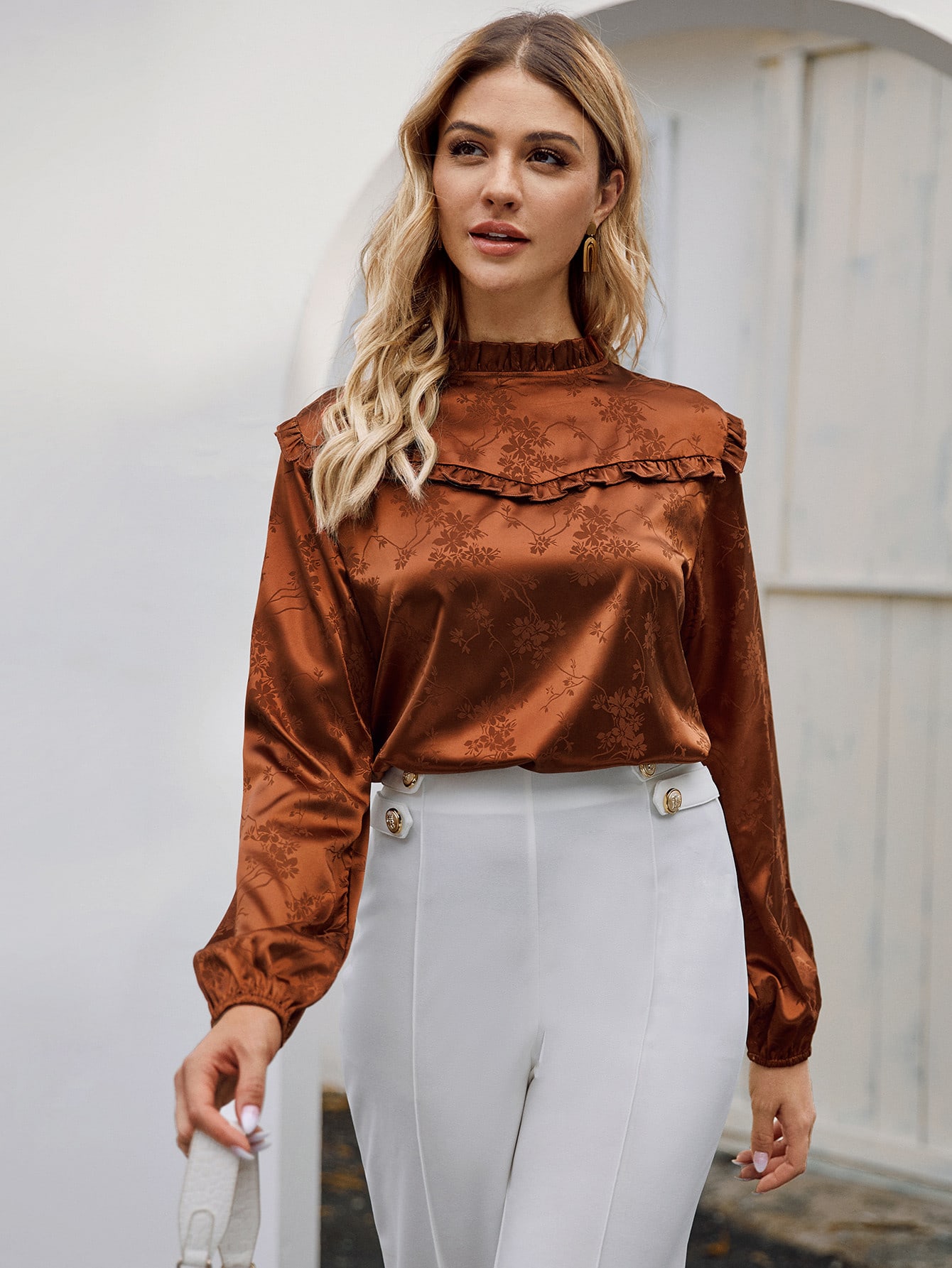
If you're still having a hard time with learning the lights and darks of shading, I highly recommend looking up clothing made of satin, as it's very reflective and shows a lot more contrast than other clothing.
Like maybe something like this: LINK might help with the shading on the chest area perhaps?
Anyways, hopefully someone else can come along and provide additional info for you!
I agree with finding references for similar clothing and even things like clothing shading/fold tutorials (there are a wealth of them!) will help a lot with learning about shading. I still look up references often if I feel like I'm struggling with how something should look.
There really is no hard and fast subeta style method of shading anymore - but learning the basics of shape, shadow, and how clothing falls on a body will help a lot. The pillow shading denial refers to how you've basically shaded around the edges of the shirt, instead of creating more realistic folds and shadows within the shape. It also looks like you're only using one shadow color, which accounts for the other denials. I haven't used CSP to make any CWs (though I have tried - it's hard to find good brushes!), but I would suggest drawing on the double sized base if you're not already. Trying to make clean, non-pixellated lineart on the tiny 250px HA is nearly impossible!
I did a quick redline/reshade to try and demonstrate what you should be looking for:

Firstly, the sketchy version is the size I normally draw at. It makes a world of difference drawing on the 250 x 500px base than on the actual size HA, if you're not already drawing larger. Just shrink the overlay down before you save the .png version, of course! In this sketch I'm trying to illustrate a technique I used when I'm coloring CWs, which is to start first with a grayscale shading. It makes seeing where the light and shadows should go easier, I think. Make a base layer, then clip shading layers on top of that. First, a light gray shadows to indicate where the light is blocked (under the breasts, the lower part of the shirt/sleeves, within folds, and the right part of the shirt/sleeves. Then, another layer with a darker gray to deepen the shadows where needed. The third layer of shading is the highlight, which would be where the light hits most strongly (shoulders, collar, top of breasts, and something the top of folds, etc). This is something you learn from studying other clothing and drawings, really. After you've perfectly the shading in grayscale, you can recolor it to be the actual color you intend it to be!
As for the redlines, I adjusted the shirt a bit to have more cloth-like shape and folds, as though it is hanging on the HA's body instead of drawn on. The CI actually has some nice shapes to it that could be applied to the overlay, like the folds at the waist, the less rigid shape of the sleeves, and the gathered area of the sleeves - so you're going in the right direction for sure! This wasn't mentioned in the denials, but your current CI doesn't match the overlay (it is a different color, and has neckline detail that your overlay doesn't have.)
I've already written a novel but hopefully this helps! If you have any questions please ask, sometimes I just muddle through explanations like these lmao.
Username --- Lezluv
Link to the overlay ---https://imgur.com/a/21MR5FX Version 1 was denied, Version 2 has not been submitted
What do you need help with --- Lineart and shading, overlay only. I mostly want to know if I should make further improvements with shading. I want a slight gradient of orange-yellow-white without it looking soft-shaded.
Was there a denial --- Denial of Version 1 OVERLAY: Artwork does not match Subeta style, quality, or level of detail in general OVERLAY: Shaky, rough, or inconsistent lineart OVERLAY: Sharp and/or pixelated lineart OVERLAY: Thin or weak lineart OVERLAY: Gradient or soft shaded instead of cel-shaded OVERLAY: Color bleeds and/or stray pixels
NOTES: You are improving with your submissions so much! Hair is really difficult, and this needs some refinement still. It does have a few color bleeds, so you'll want to check that first. The lineart here isn't quite as clean as we'd like. Shading hair should be done to add more depth with the strands, rather than more gradient like it is here. This is one where I think some more experienced CW artists would be immensely helpful in providing feedback and helping you :)
Can we redline --- Yes
Thanks for reading!
I think the shading is looking better in the new version! :) Though unfortunately I feel like the gradient you were hoping isn't really coming through. Maybe a stronger color, more of a brown than a dark blond, would help? To be honest, gradients can sometimes be tricky for subeta shading because it somewhat obscures the actual shading, but you'll get there!
I think the biggest problem is that your lineart looks very rough and pixelated around the edges still, almost like you're using a textured brush instead of a smooth brush. Can I ask what program you're using to draw your CWs?
I wanted to avoid the gradient looking like shading in general and more like it was just the hair changing color. I’m thinking of making the top redder or maybe removing it :/ But I definitely want the bottom to be white.
I’m actually using a program on my iPad 2 and drawing at the 125x250 scale. It’s not the best program for lineart, but I’m using a round brush with it.
Thank you so much for your input!
Yes, it can be really hard to get a gradient to either be seen through the actual shading, or to prevent it from COVERING the shading. I've definitely struggled with that myself. Maybe it would be easier to try coloring it without a gradient first, then apply a gradient after you perfect it?
I suggested this last time, but I think drawing at a larger size is what's really going to help with your lineart! The site actually provides double size bases to draw on here: female | male
You've already got the drawing skill, all you need now is to tweak your process a bit to make the skill line up with what the site wants/needs. :)
Oh! Yeah that’s what I did. The gradient is a multiply layer of flat color on top of the shading I’ve done. I think it was too subtle before to look like any actual color change.
I agree too, I was just stubborn when I’ve worked through it before and resizing had to be juggled between two devices. Omg thank you; I needed those.
Thank you! That’s always the case with me lol; technique. You rock and your critique rocks 🙌
Okay, that makes sense! That's what I would do because it's too much of a headache to have the gradient and shading on the same layer, haha. I think you're right about it being too subtle, but you can keep tweaking it. ^_^
Ahh, yeah, I feel you about not wanting to juggle devices! It's such a pain to not be able to just do everything in one fell swoop. I'd really like to try drawing CWs on a tablet, but switching between the tablet and PC is an annoying step so I keep avoiding it haha. Glad to be of service on the bases! I knew they existed and I still had to really search for them on the new CW info page. There's a lot going on there!
Always glad to be of service. You'll figure things out! I dealt with a lot of denials early on too, but with patience we all get to a better place eventually!
Yesss Omg I need a pro tablet in general. Both my devices have their flaws. I’m happy to learn :3 Thanks again :D
Any help would be much appreciated at a loss on what to do next
Username ---
Link to the overlay(s) --- click click
Link to the CI --- click click
What do you need help with --- Denial "Although the shading has been darkened, it still isn't giving this much depth or form. It needs to be shaded to show the shape of the mask. "
This is my third denial so I am getting kinda worried about getting to many more here are the previous submissions:
SPOILER (click to toggle)
Second attempt:
First attempt:


Was there a denial --- See above
Optional Can we take a look at the PSD files --- yes Can we redline --- yes
Username --- Lion mask Link to the overlay(s) --- click click Link to the CI --- click click
What do you need help with --- "Same as above for denial, aslo though the shading is very soft/gradient rather than cell shaded! The overlay, however, still has issues with the lineart being very dithered. It may need to be relined completely. " - I can fix the lineart easily on this one and hopefully fix the softness
Was there a denial --- (paste denial here if any)
Previous denial


Optional Can we take a look at the PSD files --- yes/no Can we redline --- yes/no
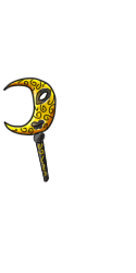
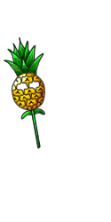
Username --- Pineapple mask Link to the overlay(s) --- click click Link to the CI --- click click
What do you need help with ---shading, keep getting denials for shading issues
Was there a denial --- Last denial info "Although the shading has been darkened, it still isn't giving this much depth or form. It needs to be shaded to show the shape of the mask. "
Previous submissions
second attempt

First submission


Optional Can we take a look at the PSD files --- yes Can we redline --- yes
I highly recommend looking at on-site examples and trying to study how other people have tackled some of these types of shapes. Here are just a few that I found from a quick search;
The lion might be harder to find examples of, but perhaps looking at crystals and their facets might help (if that's the type of texture you want? Maybe metals instead?)
And here are a few for the pineapple;
What this boils down to is kind of just learning more about shading. I recommend looking at tutorials for shading, and practicing on basic shapes like circles and cubes until you feel confident applying that knowledge to more complex shapes (like the face of a lion, which is made up of a lot of those simple shapes!)
I personally feel like you're off to a really good start here, but some of the problems you're having, we can only bandaid fix for you (if you don't get how to do it yourself, and we just tell you how we'd do it, you might not be able to apply that knowledge elsewhere later). You could spend a little bit of time learning some fundamentals and then when you come back, we can help point out more specifics to help you stay on track :) I know no one wants to hear 'practice!' but I feel like you're doing really great and that's the best next step for you in my opinion!
Thank you for all the references! This really helps!
Username --- Link to the overlay(s) --- resized and original Link to the CI --- click click
What do you need help with --- Tried submitting this 3 times, I see the reason of the denial but I don't understand it as a problem, so idk how to fix it, and I'm already using layers of cell-shading. Any advice would help a lot!
Was there a denial --- It was denied 3 times for gradient shading, this was the last note:
Optional Can we redline --- yes
