☀ CW Denial / Help Thread! ☀
Replies
Oh hi. Uhm, I use sai so I probs wont be of too much help. and i wanna say your items aren't too bad for subeta, figuring out the subeta style and getting your own style to match or fit into this style can be difficult. That being said, your items look really pixelated! I'd suggest messing around with some brushes in the program you use, and try to find a softer one. 'o' and on the fox legs, the shading isn't...sharp? enough i guess aha. Like it's hard to tell where the shading is coming from, and where the shading on the legs end. also, already stated but the lines are super thin. i use a size 4 brush in sai, i saw you use size 2? maybe increase the size by a pixel or two and re-line.
As for the anatomy, I think if you rotated the legs so they look like they're floating above ground instead of uhm, off to the side you ought to be fine. Right now they do sort of look like they're reclining. One floating legs item i can think of now is cherub's . See how they're upright? vs at an angle
 This is the brush I use for lining. I know I could download more brushes but I have no idea how to find any; they all look the same to me, really.
It looks like I can download a free trial of that program to see if I can look into this better for you. I need to run to the store / run a few errands and then I need to do some work first, but if you can give me maybe until tomorrow at the latest I will try to have some better information for you to help :)
(Also don't let denials get you down. I've been here since the day that CWs started and I still get denials for the same things you get denials for. I just got a denial last month for thin line art, and I've had to redo plenty of items from scratch. It just takes a little time to get used to the queue specifically, but once you do, it will get easier and easier, I promise!)
[edit]
I downloaded the free trial but no matter what I do, it will not accept my tablet. The whole program will not stop making my cursor shake violently. It won't accept any pen pressure from me what-so-ever, and I've spent well over an hour trying to fix the issue but I think because of how old my tablet is, it's just not willing to function together. (I have the same problem with Photoshop. Only Sai will let me use this old POS.)
I was able to somewhat play with different pens and while I do think that 2.5 px is the right size for a 2x canvas, unfortunately with this program is reduces all the brushes I was able to try into a pixelated mess. I'm at a loss on how to help you, if only because I cannot get the program to work for me. I'm incredibly sorry. Is this the only program you have access to? I'm not sure if I've ever seen another cw artist using this program, so I'm not sure who to refer you to for guidance. :S
- I messed around with the brush settings in clip studio to figure out what would come close to the brushes that I use in photoshop. The closest I got was this. It's not perfect, but it's relatively close to the lines I made on a 250x500 canvas. I hope that helps!
[edit] Also there is a tool called "blend" that you can also use if you're still struggling with really hard, pixelated lines. To use it, you can use a really large sized brush on a low brush density (around 20-25) and just click once over the lines you're trying to smooth out a bit. That helps to soften them up.

 How do I stop getting rejections for 'Sharp and/or pixelated lineart'? It looks lovely and smooth full-size but as soon as I resize (from 128x128 or 250x500) everything seems to go to hell. (Ignore the non-white bg on the small one, that was my program being an ass and I'm aware of it)
when you resize images down make sure they are resampled to bucubic not nearest neighbor bc that will pixelate edges!
 ITEM and OVERLAY: Thin or weak lineart
NOTE: Your lineart for both item and overlay is just a little bit too thin at the moment! When thickening lineart, consider using a soft, lower-opacity brush to avoid problems with the lineart looking sharp or pixelated when resizing. :)
ITEM and OVERLAY: Thin or weak lineart
NOTE: Your lineart for both item and overlay is just a little bit too thin at the moment! When thickening lineart, consider using a soft, lower-opacity brush to avoid problems with the lineart looking sharp or pixelated when resizing. :)
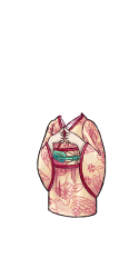
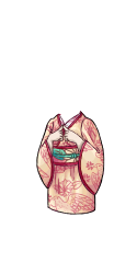
...how is this too thin?! It's the same thickness as pretty much every other item in the wardrobe!
Heyyy friends, I could use some input! <3
Username --- Link to the overlay(s) --- click click Link to the CI --- click click
What do you need help with --- See denial below - how in the heckie do I fix this denial without drastically altering the image? The held pillow is hiding the HA's hand, so I can't just remove it. The commissioner also specifically wanted a short cardigan vs the classic giant sweater, so the hand can't be hidden in that way. Help me understand how mine differs from the examples below??? I'm so confuseddddd
Was there a denial --- (paste denial here if any)
• OVERLAY: Submission can be logically separated into two or more items. • NOTE: This item can logically be split into both the pillow and the sweater.
Optional Can we take a look at the PSD files --- no Can we redline --- sure!
In the examples shown, the hands are physically interacting with the object that they're holding, or the object is layered in such a way that the object could not achieve it's layering if it was removed.
The 'Hand' of yours is resting on top of the pillow, rather than interacting with it, and the pillow itself is below everything (minus the very tip of the ear, so it's possible staff either didn't see that, or felt is was so minor it didn't count).
I would recommend possibly making the ears slightly larger to show that if the pillow was removed the ears would clip badly under the sweater, or show the hand in some way causing impact on the pillow (wrinkles for example) :) And also showing examples of what happens if the item is removed (using a clipping mask to erase it / etc) may also help to show staff it's importance!
PS. this item is wildly cute and I can't wait to get my copy lol
Thank you for the explanation/ideas!! That all makes sense, since right now it just look softly squished under the forearm rather than in the HA's "grip," since I was worried obvious/realistic wrinkles would make the cute kitty face look janky. :p
It's been resubmitted with an explanation/image example of what the sweater would look like sans pillow, we'll see if that helps. If not, I'll have to find some way of integrating the two items together without ruining their separate "integrity," haha.
Also thank you so much! I'm really happy with how it turned out.
I partially feel that a fix is in works in Wardrobe 4 that'll allow us more freedom with body mods, but it's not here yet, so hopefully staff understands the predicament you're in with your item. Honestly I hope they let you keep it as it. =P
 OVERLAY: Issues from previous denial were not sufficiently addressed
NOTE: This is looking somewhat better in terms of light source, but it's still not quite hitting the mark. You may want to seek the assistance of more experienced CW artists - there are posts and threads on the forums which can help with this more extensively, and can help you get this just right! :)
OVERLAY: Issues from previous denial were not sufficiently addressed
NOTE: This is looking somewhat better in terms of light source, but it's still not quite hitting the mark. You may want to seek the assistance of more experienced CW artists - there are posts and threads on the forums which can help with this more extensively, and can help you get this just right! :)
Last Denial (I think? Or was it the denial before last?)
Your custom clothing Twilight Orb of the Kitsune Seer was denied for the following reason(s):
• ITEM: Thin or weak lineart
• ITEM and OVERLAY: Ambiguous shading/light source unclear
• OVERLAY: Anatomy or perspective issues
• ITEM: Item background is not white
• NOTE: The anatomy on this, while much better than the last submission, still has a few issues! Here's a quick redline: https://i.imgur.com/gwp5p1K.png
• NOTE: This doesn't seem to have a really defined light source - it's rather ambiguous and confused. On a related note, with fur and other similar fluffy textures on a canvas this small, defining your textures with simple shading, rather than multiple complex sections of fur, tends to read much better! This is a quick paintover that takes fur texture and light source more into account: https://i.imgur.com/Iv1unGO.png
• NOTE: Item lineart is extremely thin and pixelated, and the tail suffers a lot of the shading/light source issues that the overlay has!
I think I've reached the end of my tether here.
@ magnusthered I don't do animals at all, but I figured I would see if I could help in the slightest shading wise. Of course the anatomy needs to be fixed first so use the redline provided in the feedback as a reference (do not trace)

my shading is super dark but it's giving it a lot more definition. I did 2 extra layers of shading and a shade/shine layer with lowered opacity to give it that extra brightness pop in the areas that get the most light. I put a nice little sun where the light source is as a reminder on how I should visualize it. But also try compare the redline/paintover as a reference for changes. Also, look up other butts that have been submitted for reference on how they shade/do fur!
Hopefully the difference between your submission and my alterations gives you a better understanding. You're almost there and it's looking great, so don't be discouraged! You've got this!!!
edit: also! there is a denial page of your most recent denials if you need it for reference! >>>DENIALS<<<
I did fix the anatomy, though. That's why they only mentioned the light source in the last denial. I also don't want it flat black to the point where you can't see the details and it might as well be a solid block. I want it dark grey. I can't seem to find any dark grey animal CWs, just black and white or silver.
And I've looked on the denial page but it only shows the most recent five, and the last rejection for this item has been shoved off the page by other items I tried in the interim. That's why I wasn't sure if what I put under the spoiler was the last denial or the one before last - it was in a Word doc but I didn't date it.
ohhh I see i totally glossed over the recent denial. If you're going for the dark grey look then I would lighten the base color up so when you do add layers of shading it'll darken to the level of your liking without getting black. It's just looking flat but totally fixable

I think you can totally pull it off just by brightening the base grey and going from there.
• ITEM: Item background is not white
I don't understand, can someone please help? Why should the background be white?
Oooh wait they said item... So not wearable image but the item image should be white of background, so wearable should remain transparent of background right?
To keep things consistent all item artwork must have a white () background. It's in the rules for CW making.

Thanks! I got confused because I thought they were talking about the wearable image instead of the item image haha xD I can't believe I overlooked it!
I am so lucky though, I expected to have to revise the wearable itself, since it's my first submission and all :P but all I have to change is the image of the item :P
Generally people differentiate them by saying overlay or item (item can also be shortened to CI, meaning Custom Item). To limit confusion in denials they'll start each reason as "overlay," "item," or even "overlay and item" so keep a close eye on that so you'll know what needs to be fixed. If something has to be clarified they will also do a "note" at the end (sometimes more than one, depending on the situation). For instance I got this denial:
ITEM: Thin or weak lineart
NOTE: The lineart on the tail of the fish is extremely thin and weak compared to the rest of the item!