(Done!) What's wrong with my overlays?
Replies
Previous Question
I love harvest felis but I'm not a fan of the orange fur color base, so I was messing around with it in GIMP and came up with this:

I think it looks good, but I may be missing something. People with a discerning/practiced eye, can you point out any flaws for me to fix? I'd like to fix them before I spend CSC to make it an official overlay and then notice it and have it bug me forever.
Edit: I have this one now too.

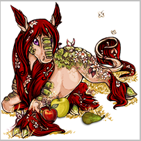
I've been trying to make an overlay for my harvest legeica, Caesura. Now, normally if I can find a bigger version of a Subeta pet made by the original artist to work off of, this results in a better overlay. This time I used the glade legeica pic available here, and I was really happy with how everything turned out while it was big, but when I tried to shrink it down to 200x200, things went south.
This looks lovely:
Caesura Big

Caesura Small

Other Options


Can someone please advise me how I can keep the deep red color without it looking terrible when shrunk down?
P.S. Now I'm looking at it in comparison with the harvest legeica - and the harvest legeica ALSO looks oversaturated and busy! So maybe my eyes are just warped from looking at the bigger image? Maybe something's wrong with my computer settings? Maybe it's 2 in the morning and I need to go to bed? I dunno. XD Most up-to-date version of Caesura is on her page.
was it rejected before though? for pet overlays they aren't too picky about it
No, I'm looking for feedback. Like about weird edges or coloring or inconsistent shading, or maybe it just looks good only on my computer, etc.
looks great, I would add a bit more cell shading for the first one, since it's all soft shading except for the wings
the seconds looks like, too perfect PX if there's Any comentary, I would make some of the light on the cat be purple/blue so it's like reflected from the bubble
Thanks for the feedback!
What is soft shading? I never really learned the names of things - I just basically fiddle around with stuff until I think it looks good.
Maybe that's what's been bugging me about the dark brown part over her head. It's a layer set to multiply with approx. half opacity and just quick coloring. I'm not sure how to make it sharper like cell shading though. Maybe using a different brush?
P.S. I'm kind of scared that the cat in the bubble is an aberration because she's supposed to have a twin who I haven't started to design yet, and I'm really pleased with how bubble-cat came out. And now I have to somehow make the twin have the same level of goodness. XD
Also originally the rainbow was more rainbow-y, but it made me sick of rainbowness. Observe:

maybe that rainbowness can be only in the top area?example (use a clipping mask if it's in photoshop, feel free to look that one up since there's guides for it)
I think that might be it, what I would do it leave it as it is (soft shaded) and add a bit of the contrast on top of it with a tiny bit of cell shading (for example the cat in the bubble has cell shading )
I'll see what I can do. The cat in the bubble only has cell shading because I followed the original Subeta artist's shading as I removed parts I didn't want. When making up my own shading, I feel like someone trying to walk to work blindfolded, you know?
I might try my hand at the masking too. I've done a few masks before but there's always so many steps to them that I have to look up how to do it each time. I use GIMP not Photoshop, but it has similar capabilities.
Thanks again for your help!
don't know if you ever solved your legeica problem but i resized the given image myself as-is just to see and it doesnt look near as crunchy so it might be your program thats the issue
That does look better. What program did you use?
I just tried scaling image with linear interpolation instead of cubic, and the result does seem to be an improvement:
result

I have no idea what that means though.
i use photoshop cs5 and scaled it set to bicubic so it wouldn't auto-sharpen anything you may have to try downloading different programs if only to see if some scale images better than others
GIMP doesn't have a bicubic setting that I can find, so I'll see if I can find another free program that does. Thanks for your help! :)
The large glade image isn't great quality in the first place, you can see rough edges especially around the ears, tail, and hind feathers, which is probably why you're having trouble. I'm guessing you upped the saturation for the dark, ruby red which is why it looks especially harsh, increasing saturation will sharpen edges between colors.
I'm not really sure if this is fully fixable other than redrawing the rough areas, but desaturating a little bit and maybe a super mild blur could help.
It's not a true saturation, it's a burn overlay layer, which can sometimes have that effect, I think.
Burn layer does up saturation If I were you I'd probably move it slightly toward a slightly more brownish deep red, the accents are already green so that will make the mane pop regardless. also, when i edit overlays in gimp i usually use multiply layers, i have a feeling the burn layer might just catch some grayish pixels of the lineart and amplify them making this look extra jagged buut i will have to wait testing that until i get home :') i do not have gimp on the work laptop!
....dump tip for you too, i personally find that gimp kinda. does better previews when you zoom out in the window than the result when you actually size down images, so i will sometimes set view to 50% and. screenshot it lmao
Looking to adopt a December 31st, 1969 glitched date pet
The problem with multiply is that I'll have to be more careful with staying in the lines - I like modes like burn which don't show up except where there's color. But you're right - it is a less intense color, and even more naturally a brownish red.
You don't find that screenshots result in lower quality?
Edit: Playing around with it more, I'm not a big fan of multiply because it also masks a lot of the highlights/lowlights of the original drawing.
Yeah, you are right I suppose, the problem here lies with process differences, typically when I do overlay edits I will first make the background transparent followed by turning the image grayscale and using multiply/overlay/lch color blending. I will also boost highlights back up if i think they went too low by playing with contrast on that section.
As for screenshots it depends but on several occasions i found it helped to make things more smooth instead of jagged.
Looking to adopt a December 31st, 1969 glitched date pet
How many layers do you usually end up with?
On this one I have about eight just dealing with color alone. I have a grayscale bottom, then the layer that gives the tannish body color is in color mode, then for some reason the scales need two layers: one is on color and is brownish, the other is on burn and is green. Then one to make the eyes purple (color), another to turn a couple of leaves from blue to red (hue), another to change the grass into straw (color), another to make the blossoms pop/more pinkish (hue), and then the mane.
Is this normal or have I gotten to this in a really roundabout and unnecessarily complicated way?
I mean can't speak for everyone and it has been a while, but looking at some freebies I did a while back I seem to end with 12-15 total for the more strightforward recolors+minor edits? so that sounds about right. I dunno, don't stress about it either way, whatever gets the work done as long as your computer can handle it :')
I'm currently working on something for my own use which is a more complex edit and I'm up to 40 layers there, like 10 of them sketch/reference layers though haha.
Looking to adopt a December 31st, 1969 glitched date pet