Guide to CW art-Critiques,Sticky threads,and Tut's
Replies
Updates-newest
*Changed intro
*Added download link to avatar bases with backdrops,all bases in ONE PSD!!
*FORM ADDED
Want a critique?
I have given you access links to sticky threads for those who are new who might have missed it, it is a massive list of helpful things to read over! Before you start making cw's please read the rules! And read up on the tutorials listed. Also knowing photoshop or your painting program is something I can't help much with since it requires your effort to be comfortable knowing the controls,shortcuts,and experience in general
You may ping me or cwcritique for help on your denials and attempts. However please understand the rules for pinging cwcritique and similar groups. However, you definitely can ping me for cw help and denial help! My reply may or may not be delayed due to work load.
Also take note As a general rule I will try to follow, I will initially start off with a description of things I see wrong. If you are confused,You can ping back for a paint/red line over your subeta overlay/ci( this will be just for demo purposes and quality will be just enough to show you the general idea. Not so much a complete redo since it is up to you to see the general idea and make your own improvements. So with that being said, No painting over my demo's or tracing over my lines. You must ask for it first since I wont do it without your permission. If I have a hard time explaining, I will ask you permission first. If you want to skip the written critique because you are at your wits end, please let me know in your first post!
Also important, please understand success depends on how much persistence, practice,and patience you have! Staff can still deny it even if I say it looks good because I am only one person and I may have missed what they did not. I do not mind follow ups and such, if my advice has not helped, I apologize. If you feel you need more reviews on it other than myself, feel free to ping critique group(s) out there. If I can't give you any advice, I can ask around for you if you do not know anyone!
PS. If you are an artist,want to share a helpful video,tutorial,resources,please ping me and I will link it here.
sticky threads for beginners
Sticky Threads found here
Most of us know where these are but for the people who are new to the site/cw making. It is the top threads that are with a star next to it.
Resources,bases,etc
PSD DOWNLOAD of four male and female bases(dark brown,medium,light,and white skins) thanks to for providing the bases on tumblr. I merely merged all bases in one psd,with solid preview backdrops-Click on the dots by trash can to download
CW video clips,CW speedpaint,and cw live
my videos here-These are mine so Im sorry these are old but may be of use to someone
Backdrop cw made by OddduckOasis
Backdrop cw made by odduckoasis
Cellshade and other painting clips by shalashaska
Live events by phasma
Tutorials
Important-How to vector mask great for CW art
This is my not so secret-secret. It helps me blend hair,clothes together,backdrops,and it helps my lineart so if i 'delete' pixels I can easily restore it. Also it helps when I have to remove outside pixels.If you dont know how, Please read it. Ask me for help if you are confused
CI tutorial by Mesmer
CI tutorial
CI tutorial
CI tutorial by Mesmer
stickied Bean's cellshade wig
[spoiler=CW HELP FORM][/SPOILER]
Is this a denial?if yes-include the denial and the images of the overlay/ci
sticky threads for beginners
Sticky Threads found here Most of us know where these are but for the people who are new to the site/cw making. It is the top threads that are with a star next to it.Resources,bases,etc
PSD DOWNLOAD of four male and female bases(dark brown,medium,light,and white skins) thanks to for providing the bases on tumblr. I merely merged all bases in one psd,with solid preview backdrops-Click on the dots by trash can to downloadCW video clips,CW speedpaint,and cw live
my videos here-These are mine so Im sorry these are old but may be of use to someone Backdrop cw made by OddduckOasis Backdrop cw made by odduckoasis Cellshade and other painting clips by shalashaska Live events by phasmaTutorials
Important-How to vector mask great for CW art This is my not so secret-secret. It helps me blend hair,clothes together,backdrops,and it helps my lineart so if i 'delete' pixels I can easily restore it. Also it helps when I have to remove outside pixels.If you dont know how, Please read it. Ask me for help if you are confused CI tutorial by Mesmer CI tutorial CI tutorial CI tutorial by Mesmer stickied Bean's cellshade wigIf not a denial, leave your wip of the ci or overlay
List your working sizes,what program you use,what brushes you use and any useful info you may wish to include
[b]If you need a red line at all,etc
[b]do you wish to contact me via smail for privacy? feel free to send this completed form. All images posted in my smail will not be shared, all of it will remain private. including private commissioned pieces(provided your client and yourself is comfortable in sharing)
Number's 1 and 4 of the CI tutorials are by me B) I also plan on making a new one because wow those are both just super terrible xD But it may be a while, so I'll try to remember to come back and give it to you C:
Hi, nice of you to do this thread. :)
I have been working on this piece:

Item and overlay got denied for being flat and undershaded, but I don't know how to change that. Do you have any tips on how I could improve it?
------❤️
alright, i suck at redlines when it comes to these sorta denials and i suck at explaining so i toned down the overlay you sent, and just drew on top. the areas where i shaded is areas of interest for you.
basically if you look at the base,you will see the areas where it should be darker. you dont have to go crazy like i did, it can be subtle tones. I would add at least two more layers of shading. basically think of it as a 3d form vs 2d. I know it is a light creme color,those are always tough ! so best to look up items on subetalodge with same color tones. and then eyedrop for the shades.
and then if you do it in another layer, if its too bold you can always tone down the opacity until its right shade. basically,once you get that right, it wont look flat and it wont be undershaded. as for the ci, same thing as well. that one probably will be the hardest since folded clothes are easily to look flat. i would reference real life folded clothes and i know some items have been folded as well(sorry these you will have to research yourself)
im sorry if my words and image doesnt help much, most of the sound advice i have been given is look whats been approved and real life items. also databunny explains this very well here, full credit goes to her and since seeing it has helped me.. ha grid
if you make an edit before submitting, i can take a look at it. (up to you though)

Thank you. :) It's good to have a basic idea on where to change something. I'll try to work with that.^^
------❤️
Can anyone help me with grey lineart for this CI?
Your custom clothing Jinxed Rocket Braids was denied for the following reason(s): • ITEM: Issues from previous denial were not sufficiently addressed • ITEM: Shaky, rough, or inconsistent lineart • NOTE: The lineart has gotten more jagged with this edit. While the line weight itself is not a problem, the line art on the braid portion of the item is still coming across gray.
 This is the full size, and the lines obviously doesn't look grey to me
However...
 Does it look good when I resized?
I feel like they mean the braid on the top portion. I would suggest removing the coloring on the 'outside lines' around the braid there, as it is making it look gray instead of black. Also to help w/ the line art issue I suggest resizing the merged file to 128x128 and then 64x64, since 200x200 does not evenly divide down. C:
Ah thank you, I fixed the problem, and hopefully it goes through this time!!! ;o;
Can I ask how it's possible to get tiny details to look decent on Custom Item images? x: I'm having a very frustrating time because my details on items either look crowded or it's impossible to tell what they are even if I'm lining them with a 1px brush and both of those are the last thing I want. For example, your has fine details but they appear clear. I've given myself a headache trying to figure this out haha. I'm using Photoshop CS5 and an Intuos5 Touch. I'd really appreciate any insight on doing fine details!
It is very time consuming and hard to do! but it depends on your size of your image and what brush you use. i use 150/150 and i zoom in 300 to 400 percent. I found when I did images larger,it would take more time for me and sometimes when you resize it doesnt always transition. But i still have trouble from time to time. What I do is make sure to use 150/150 with a 1 px brush to line, 2px to shade,1 px for fine detail. When I feel it is looking good- I check what it looks like on 64/64 gif. If I spot any unconsistant dark areas either from shading or lineart, I go back to zoom,Then i either thin down the lineart or use the shade next to it but slightly brighter. take it for example my pearls were too dark and hard to read, so i used a lighter shade next to the lineart. I find personally,details get obscurred by having too dark and whenever I use 2px to line, i find its more blurry compared to 1px.
I would suggest you try to produce cleaner cel shade,line with a 1px and a slightly higher resolution compared to the standard 128/28. It may take a lot of practice to find your perfect sizes and some items are easier than others. the potion bottle took me a long time because i have to work hard to produce decent things,one of the reasons I am not fast. I am a perfectionist and hard on my own art, i do this to push my self and my skills. so i cant say this will help you without seeing the item your working in question but this the method I use. for every ci and overlay I do. also knowing how to contrast properly,I made sure each area contrasted with eachother so it would stand out. so I would also work in sepia or greyscale,until you can do it color. if that is too strange,then do your typical shading process but play with adjustments like curves and sometimes bumping up the saturation helps too if your shading is too dull.
a few tips on how i do it but every artist works differently,so not sure if it will work for you but persistence,practice,and patience will help you for sure.
and i look forward to hearing your progress,feel free to contact any time with help,wips,etc!
Thanks so much, both of you! ;o; This really helps! I got SAI last night and so far I'm finding it to be much easier on working with lines than Photoshop. I'd love to share what I've been working on but it's a commission so I can't quite yet. I think I got things right though. c: Should it get rejected I'll definitely come back for critiques on correcting it, you've been awesomely helpful!
This thread is a very good idea , thank you for putting it up!
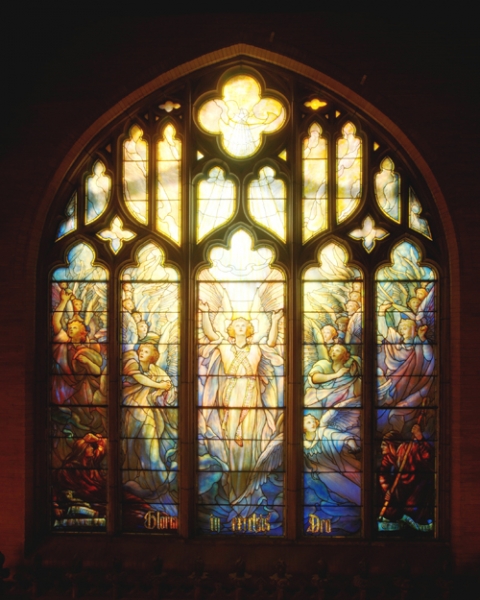
Im sorry to ping you all but this is important,just recieved most uglyest of denials- i thought the art in question was fine but obviously not...can anyone help me to see what I missed? or maybe ping someone you know who might help?
thank you! Your custom clothing Luminous Sanctuary Window was denied for the following reason(s): OVERLAY: Artwork does not match Subeta style, quality, or level of detail in general ITEM and OVERLAY: Thick or heavy lineart OVERLAY: Flat artwork ITEM and OVERLAY: Not enough area shaded (too much left flat and unshaded) ITEM and OVERLAY: Not enough layers of shading (Subeta artwork should have 3-5 layers of shading) NOTE: While we understand that much of the artwork is stained glass, it's still looking a bit undershaded/could stand to be closer to our site art style! Right now it looks undershaded and the architectural elements are also lacking in depth. NOTE: The line weight is good overall, but there are some places where the lineart is a bit heavy.


the white on the panels is semi transparent-the red roses/cross is more opaque, i wanted to show backdrops behind it but still show the stain glass in detail
I thought the art looked fine too ;w; Hmm the only problems I could see might be the roses? I think you need to add another layer or two there.
As for lineart, the lines on the little rose in top left corner of the CI might be a tiny bit thing?
honestly, i think reworking the arches/pillars/wall in general (there's an architectural word that i'm entirely spacing on for this, geez) will solve the denial.
the shading you have on the floor is very rich and varied, and there's a definite light source coming from the windows. the arches don't reflect that same depth or light source, so by comparison they look very flat and under shaded; with the light coming from the windows, there should be heavy, dark shadows with a very thin/fine highlight on the edge that would catch the light.
i suck at wording things, so i found a visual example! the walls are still very dark and cast in shadow. i don't think the shading on the overlay translates that as well as it does on the floor.
shading stained glass on the teeny-tiny-HA-sized background is probably gross and painful, because it's so slight, but it largely depends on the light source, too: i have an example again because i suck at words, but essentially even if the light source is behind, unless it's a very strong, head-on light, the colours won't be uniform. even with a uniform light source, the thick-and-weird (a highly technical term) nature of the glass will make the edges a lot darker by default, but it's still possible to have internal shading. that reference has a LOT of contrast going on, but it makes it easier to see-- it also has quite a bit thicker glass compared to the first image i linked, as well, so less light is passing through it.
i REALLY REALLY blathered on a lot, so I hope all of this is at least a little useful to you ;v;!! it's an absolutely stunning piece and i really want to see it on site.

I agree that the pillars needing more shading is one of the biggest things sticking out for me, and perhaps the top of the wall, above the stained glass where light wouldn't be filtering in. Are you intending for it to be able to be overlaid with other backgrounds, or is it just a standalone? If it's a standalone, I think the glass could use a little more sheen, and some shadows where the architecture encasing it falls over the glass. The glass is probably set back into the wall, so it should probably have a shadow box feel where the light isn't touching? Imagine the black paper at the back of this box is the glass and hopefully you'll see what I'm saying about the shading because I'm not sure if I'm communicating well.
The art looks overall fine though to me other than the shading. I thought that the lineart seemed pretty consistent with most Subeta-released items? But yeah, I agree with Riot that it may help fix the problem to run over the lines in the finer areas with the eraser and thin them up a bit.
THANK YOU FOR THE HELP SO FAR, SORRY FOR MANY CHOICES..I'm making this as i go along, i have no clue litterly how to fix it so these are my attempts
Im kinda confused on what you wrote but think i understand? Do you mean to have the walls/pillars darker compared to the window, and have the edges lit up by the windows? I tried it out here one not so dark ,and other about medium darkness. yes it is suspose to be layered with backdrops, I have gave the white glass some sheen to it and shaded the glass as well I have shaded the actual stain glass-which helped some..
I am undecided as I like both dark and medium tones of the stone. I shaded the roses some- I tried to add some light near the windows, but im not at all sure if this makes it better so here is what i came up with----
slightly darker (gray tinted) with bg base to show off some sheen of the glass and made the cross/roses 90% transparent-
 only thing different compared to the first-is the stone is more tinted with purple-darker stone

without the bg-transparent(be hard to see against white)

The first example looks really lovely imo! But then again so does the second one ahhhhh. Adding the highlighting on the right side of the pillars really helped I think. I'm rubbish at backgrounds so it looks pretty good to my eye, but I think it would also benefit to add the faintest amount of light filtering through the top two windows too? Not as strongly as the middle section, but just enough so that they glow like the rest of the windows. Otherwise though I think you've done a good job with using the shading to add more depth! I'd wait till someone with a more experienced eye than mine comes along and adds their input though haha.