I got rejected, can someone give me tips ??
Replies
What was the rejection for? Knowing will help narrow down what we should be assisting with C:
I got this: Thank you for your patience on this while I had a member of the creative team review everything. We do believe this is original at this point - however, it needs a lot of critiques and refinement! Right now it looks very 'pasted' on, and the item is very undershaded. We recommend having the artist get some critique from a few more experienced CW artists 😊 In the meantime, you may resubmit CWs, and I'll go ahead and close this ticket.
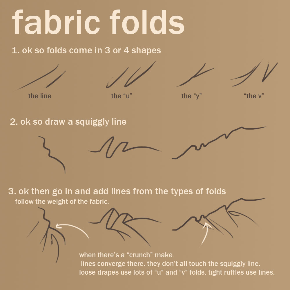
Okay so the first thing I think you should work on is the line art and the way the folds look! Right now the lines are very thick, and the folds look a little bit cartoon like, particularly towards the bottom where they're round and don't seem to hold much weight. It may help to look at some other items on site with long skirts to get an example of technique and how folds may sit on the HA's body C:
I will try though I have trouble working with thinner lines
I'd agree with mesmer on the both the lines and the folds. Though particularly it looks currently like the clothing is made of really think pvc vinyl fabric. The folds make it look stiff and sort of like it isn't resting on skin but is hovering a little above it.
The shading is also sorta strange cause it also is reminiscent of plastic fabric in that is it extraordinarily shiny but with not enough gradiation getting there. Also, it is nice at times to change the precise hue for shadows and highlights, but it's extremely stark here and gives it a dodge burn look.
I just have no idea what you mean by any of that x.x I don't really know about what different between stiff/normal? or stark and dodge burn/gradiation? I'm afraid I'll end up shading it basically the same way anyways x.x
I realized that it'd probably more helpful to give visuals. So for clothing lines/flow/folds I'd take a look at these: http://solfieri.deviantart.com/art/Clothing-Folds-Tutorial-194453484 http://41.media.tumblr.com/tumblr_m0wqalQ1Tx1r2pfc4o1_1280.jpg
Andddd for shading if you use the dodge or burn tools in any art program it's a huge no no is what I mean. Shading examples would be: http://getty.deviantart.com/art/Tutorial-for-soft-cell-shading-27544088 (you have to press download to actually view it cause it's enormous) Really you could also do more painterly shading but I see that rejected far more often than anything cell or soft cell shaded because often it downsizes poorly.
thank you so much for the links! I'll check them out :D
would something like this look better? x
Right now the lines are really, very thick. I know you have a hard time using thinner lines... Might I suggest using the eraser to thin out the ones you have? Would that perhaps be easier? The general shape / outline of the dress seems to look a lot better now than it did, however I don't think you need all those inner lines. Maybe only about 10% of those are really needed, and the rest should be shading. Right now the fabric looks soaking wet, like it's clinging to the HA because of how creased it is. Only really important / dark folds should have shadows or it becomes super line art heavy. (This is looking a lot better though! C: )
I'm gonna agree with Mesmer on their critique again! If you are willing to share your .psd or .sai file I can do a redline for you? Is this meant as a fancy gown or a sari?
I think I'll definitely try the erasing the lines idea... here's the .psd file thank you so much, I would love help with doing the line around the hand, I can't seem to get it without spending like half an hour on it Dx it's supposed to be a sari

 So the thing with saris is that the bit on our right side is tight to body because of the front being part of that continuous piece. Also the bottom of the skirt is my rushed garbage attempt to draw pleated folds.
Also for a sari that right part really cant look like a sleeve as it's part of the front wrap. To get the sleeve look you have to have like a crooked arm to be able to get it to hold and crease which you cant do with hang down arm. With our HA base it'd just fall forward.
So the thing with saris is that the bit on our right side is tight to body because of the front being part of that continuous piece. Also the bottom of the skirt is my rushed garbage attempt to draw pleated folds.
Also for a sari that right part really cant look like a sleeve as it's part of the front wrap. To get the sleeve look you have to have like a crooked arm to be able to get it to hold and crease which you cant do with hang down arm. With our HA base it'd just fall forward.
Also the shading is incomplete but it was meant to be rough