Very sandy wig and Dr who/Blade o.t.i. tribute wig
Replies
[IMG]http://i3.photobucket.com/albums/y65/Tjulan/SandKopie.png[/IMG]update:[IMG]http://i3.photobucket.com/albums/y65/Tjulan/SandKopie-3.png[/IMG]
[Spoiler=Done, thx for help]Some more ideas or do you think it's good now?
This is a double Tribute Item... the male version for Manji from "Blade of the Imortal" the female Martha Jones from Dr Who.
[IMG]http://i3.photobucket.com/albums/y65/Tjulan/ManjiKopie.png[/IMG] [IMG]http://i3.photobucket.com/albums/y65/Tjulan/Martha-1.png[/IMG][/spoiler]
[Spoiler=Done, thx for help]Female [IMG]http://i3.photobucket.com/albums/y65/Tjulan/Custom/unionfKopie.png[/IMG] with withe shirt [IMG]http://i3.photobucket.com/albums/y65/Tjulan/Custom/unionfwKopie.png[/IMG] Male [IMG]http://i3.photobucket.com/albums/y65/Tjulan/Custom/unionmKopie.png[/IMG][/spoiler]
Might want more layers of shading? Looks a bit flat right now.
loving it so far. but i'm a sucker for union jack stuff anyway :C
[font=palatino linotype]
Maybe because it's in a larger size it's hard to see and also the color of the navy but maybe just a little bit more? I mean it looks great and all but I've heard that the staff normally mentions things like more layers of shading. You could always give it a go though. Still looks just a bit flat in my opinion.

- Okay this arrow isn't very clear now that I look at it but I was pointing to the dark red line in the middle. I feel like this line could be a bit more shaped and pointed at the edges, at the moment it just looks like a random line.
- There is a faint white line here and most of the edge, I don't know it was intentional but it looks like a colour bleed.
- This shading blends too much it needs to be more prominently cell-shaded. I'd also add a little but of lighting where the arrow points, that sleeve looks a little dark over all.
- I'd add some more shading to the left of where you already had done, 'cause the big unshaded patch makes it look really flat across the middle. 5?) I also can't decide if it maybe needs to be a little longer?
Remember you will need a male version too! :)
I like the design though. I think it will be popular with Americans who like British tv shows maybe (a.k.a like, everyone xD).
Also If you don't mind me saying it looks like the shape was traced off the Black Spider Web Shirt or similar recolour [preview=black spider web shirt]
Just saying if I can notice it straight away, the staff / artist of the item will probably notice it and I'm not sure how well it would go down. I know other people have had issues with supposed tracing and their items didn't get accepted.
Aaw... thanks... Yes, I know, I need a male version but I first wanted to look what people think about the shirt.
Thanks for the critiques, I'll try to fix. It's not so easy to make a clear shading on a dark shirt but I'm working on it.
I had a look at the different subeta shirts, that's right. I always have a look on other wears cause I want to wear my clothes with them. But I finaly find out the Shirt I wanted to do is a top... Rose finaly opened her Jacket. So i don't think there will be arms at the female version... goes to make a bigger change
No problem!
Yeah, when the item is so small it's quite hard to make the shading not smudge together! Ahh, the woes of being a CW maker xD lol
Oooh, a sleeveless one would be pretty cool! (:
That looks great! ^__^
[edit]
I think the sleeve on the HA's left looks slightly baggier than the other one, now that I look at it again? But I this design and the shading looks better :)
Thanks ^^ I just hope it's possible to wear it above a white T-shirt. I'm still not able to look at my wardrobe. Maybe I look at subetalodge.
DO HO HO HO HO IS THIS A DW REFERENCE I SEE? eue
I think it looks pretty good, but the female version is very boxy. It might need a bit more shading to define the chest area or possibly a bit of a nip in under the breasts to make it more feminine?
FORMERLY NEXBETA
Yes, it is... maybe you look here: http://subeta.net/forums/view/833720/1#18293606 I did some changes on the femal version now... :)
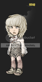
I think the ends of the hair are a bit too round now. It would look more flow-y and natural if they were more pointed. The wig reminds me a little of the Raum Elodie Wig, so I'll use a preview of that as an example: [preview=Raum Elodie Wig] See how the strands that hang out taper to a point a bit? You can see it in the wig you're wearing, too, and on most of the other wigs on this page. [EDIT] This was for the Sandy wig, by the way. I don't believe the tribute wig was up when I posted this yesterday.
I partly agree with . I'd make the ends more pointy as well. However i think you might have to make the outlines smaller along with pointy ends. It looks a little too big because of the light color. Also, i'd make the shade on top smaller and use an other color. At the moment its black with higher transparency i guess. I'd try to work with the multiply layer or use a more brownish color.
For the dark wig.. Its a lot of hair. I'd remove a few of the strands on the left side, very top of the bangs. But beside from that i can't think of anything else to change. x)
( - what do you guys think? dun hit me, i thought you might have an idea. xD)
Ugh, CW ping lol.
Hey there. So, for the first wig; I think they will complain about the shading at the back of the head. Keep in mind that the light is coming from the top(!) left. Yours looks like it's coming from the bottom left due the deep shading there. I know what you tried to do there; but I'd rather avoid the soft-shading/gradiant) issue there. since my wig got denied for the very same reason. I'd recommend using an hard brush and stroke in that area following the strands of hair instead of shading the whole area dark. I think you should also try to continue some black lineart in the wig and shade the areas near the lineart a bit darker, to avoid the sticker effect your wig currently seem to have. I really like the wig itself and how you shaded it, but I think the lineart and shading around it needs to be tweaked a bit to avoid the blunt denial "sticker effect"!
The second wig isn't something I can work with, sorry. I like the fluffy look it has, though!
I made some changes: [IMG]http://i3.photobucket.com/albums/y65/Tjulan/SandKopie-3.png[/IMG]
Hey sweetie! I love how this is coming together but idk if you saw this..
 And it seems like theres a taaaad bit of bleeding along the lower part of the hair on the right
Used to be known as RyuZefer
I like everything except for the hair sticking out on the top left (our left) of the avatar. It just looks strange to me .