Venetian style background. Critique/interest?
Replies
I had this idea for a venetian style background from a picture I took a few years ago. Any feedback/interest/critiques would be great. :)
This is still a work in progress, under major construction, like completely redoing the water/dock, working on shading/colors, and improving lineart.
If this did go on the market, there would only be two releases, at the most. Probably one. I want this to be somewhat rare.
[IMG]http://i40.tinypic.com/28vanwn.png[/IMG] Bottled Gondola If anyone has an idea for a description feel free to tell me!
Female version:
[IMG]http://i42.tinypic.com/wa3hmv.png[/IMG] new one: [IMG]http://i40.tinypic.com/mj5s39.png[/IMG]
Male version:
[IMG]http://i43.tinypic.com/aes2zp.png[/IMG] new one: [IMG]http://i39.tinypic.com/351vbx1.png[/IMG]
Interest List

i think it's a little too hard to see the buildings and stuff. at first glance i thought it was a train
I think there is a lot of potential there and I for one would love to see it finished and released!
I... guh. GUH.
more incoherent babble
I love it. I've been looking for a Venetian background for a while, I'd love to get this.

I really like this concept. This has the potential of being a really amazing background! My two cents is that I think you should take a different look at the coloring / shading. Right now it looks like you've used the burn and dodge tools way too much, or the multiply / screen / overlay settings. The texture on the dock / wood looks really messy and doesn't have a flow. I feel the water has this same issue. Water and wood, though chaotic at a glance, actually has a specific movement to it. And lastly, a lot of your line art varies in thickness. For this, I would suggest it getting thinner as you go back, but right now there are some thick lines here and there that don't exactly make a lot of sense.
I'd love a Venetian bg :)
The idea is lovely, though like mentioned, the shading is a bit too messy (making the water choppy), and the colours are a bit too saturated.
Also, What if instead of having the HA stand on the wooden dock, have it standing on a gondola instead?
I'm a member of Daily Item | [flower=maplerose]
Style-file | My CW shop
Wow! I didn't expect this much feedback!
I'm working with colors and redoing the bottom half, so hopefully it will look less train-like next edit. :)
Thanks! It still has a long way to go, but would you like me to ping you when it's close to being released? :)
haha, I'm glad you like it! It still has a lot of work to go, but would you like me to ping you when it's close to being released? :)
Thank you for the critique! :) I've actually made a new .psd file and was in the process of completely erasing the water/dock and starting over. :P I've been working on the lineart as well, so hopefully the next edit will show a lot of improvement. :) Would you mind if I pinged you again when I have it up? I'd like to hear your opinion on it.
I'm currently going over the colors to make them blend better, it's saturated right now because I was fiddling with colors. :) I was thinking of putting the HA on a gondola, but I think it would interfere if someone were to have a full skirted dress on or something of the sort. Unless it was a fat gondola...hmmm. :P I'll experiment with it, though.
Absolutely go ahead and ping me again. C: This could be a useful background to a lot of HAs, especially some I would make. I'd love to see how it comes out.
oh yeah, I didn't think about big dresses XD What about just adding a gondola to the background then? ('cause I think if you have "gondola" in the item image and the name, they want to see it in the overlay too, I've seen CWs being denied for silly reasons like these >_< )
I'm a member of Daily Item | [flower=maplerose]
Style-file | My CW shop
Really? Well, I guess I'll add in a gondola somewhere in the water. Maybe a little gondolier, too. :P
yes, I would love a ping please. I would say I would just be watching for it but I am afraid I will forget!
Definitely. I'd certainly have a myriad of uses for a background like this.
I'd imagine there's some tweaking to the shading yet to come and if you want to try and add in gondolas, am I right?
Yes, there's going to be some tweaking to the color and shading of the buildings and clouds, as well as refining the line art. I'm also in the process of completely redoing the water and dock. And yes, there will be at least one gondola in the final product. :)
I look forward to it~
Sorry I haven't updated in a while, I had to put my dog down a couple days ago, so I haven't been in the best of moods.
I added a new edit, still not finished with the stone dock, trying to work out shading for that one. I'm also planning on experimenting with the water a bit more.
I thought I'd ping you to see if you had any more comments, since your critique was really helpful last time. :)
This is just a personal preference, but I honestly preferred the wood dock, instead of the stone ground xD It looks like you're coloring over the top of the lines layer? And some spots this makes the lines look way too thin or glooped over. And the shading still looks like you're using the dodge / burn / multiply. It kind of looks unrealistic in those colors.
I agree with what Mels said about the shading. It looks a little too contrasty or something... it's hard to place exactly what it is... or perhaps just a little too bright in general. The best thing to do is to lay out a palette instead of using dogde/burn (if that's what you're using). If you're using a palette, try using colors that are a little more natural and use photos as a guide for what that is exactly. Here are a couple pictures of Venice that may help: Ref 1 and ref 2. Obviously depending on the mood you're going for, your palette will change so it's hard to help you there... Anyway.
The water looks like it might be soft shaded or smudged. You might get denied for that, so perhaps make a palette for the water as well and use that to shade/highlight the water. As for a preference for the dock or stone, eh... either one works really. I kind of like how you shaded the stone since it looks closer to the Subeta work. I do like what you have going on with the sky though. The colors are really pretty.
Hopefully some of this stuff helps you. Good luck hun <3
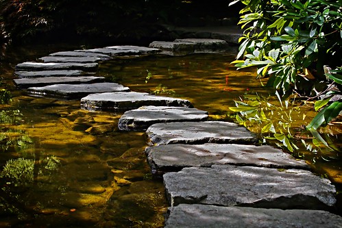
I am not an artist! Let me get that up front. So I don't know much about perspective and how to make it work. However, on the cobblestone path you have it kind of looks to me like it is a wall and not a path, perspective wise. The only thing I can show to you try and explain what I mean is the difference between how yours looks and how the path on looks. I am going to ping back here cause she usually understands what I am trying to say!
I think has a point. Now that I look at the stones they do appear a little flat. I think it's mostly due to the lack of deeper shading on the side of the stones closest to us. If you look at this picture and this picture you can see that the stones have a darker side, and even a lifted edge from the ground that give them a more three-dimensional look to them.