lock C:
Replies
I tried a new way of shading today, and I was hoping that you guys could critique it for me? I would like to improve ^_^

Ignore the ugly shape and blinding colours :P I wanted to do something quick (and me being lazy) so I lined it in one stroke.
The shading looks to be in grey or black, which is a reason for rejection on CWs, you might want to try using a darker shade of the colour you're using. Also you might want to include some more internal lines as it looks a little flat. Sorry I can't help more, I'm terrible at wigs myself lol Your username is awesome by the way :)

Thank you! I did use a darker shade of the colour, but I think I went too far with it xD I'll try to get the shading softened down.
And you have an awesome username too! o3o
Try to imagine it as a 3d object when you shade. I haven't done any CW yet but I'd much rather add the thick black outline at the end. It feels like it messes up with the 3d-ness. Hm what else... define light source (I saw in other thread that it's supposed to be in top left corner, but I don't know anything about that) and add more layers of strands; right now you only seem to have one (from the muddle to the edge) which makes it look flat. Good luck!
EDIT:
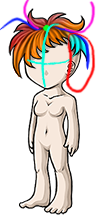 Okay, I know you asked about the shading, but I have come comments about the general shape/structure).
It seems to be constructed out of 2 main parts; front (what's under the blue) and top (what's above pink). There is no back and side part which is one of the reasons why it looks flat.
The red area, unless intentional, is supposed to have hair and not be bald.
The center (green dot) is too far towards the forehead. It should be more towards the end of the light blue line if it's meant to be somewhere on to top.
Okay, I know you asked about the shading, but I have come comments about the general shape/structure).
It seems to be constructed out of 2 main parts; front (what's under the blue) and top (what's above pink). There is no back and side part which is one of the reasons why it looks flat.
The red area, unless intentional, is supposed to have hair and not be bald.
The center (green dot) is too far towards the forehead. It should be more towards the end of the light blue line if it's meant to be somewhere on to top.