item accepted - lock please!
Replies
Please lock or
Thanks!
I've pinged you guys twice on this already, I apologize, but we could really use the help!
do you use photoshop? I know that pink in general is very tricky, got a few pink items denied for grayness. If you use PS, try adding an adjustment of vibrance, that usually helps a lot! It's not exactly the same as saturation, but it creates more... vribrance (!) to the colours, which usually eliminates the grayness.
The other solution would be to have the shadows shift a liiitle bit towards either the red or the purple tints, instead of making it darker pink, otherwise it'll really just need to be more saturated in general. I think the blue in general might contribute a bit to the grayness because it's not totally blue, it looks more muted!
Cathii's CW shop ❤️
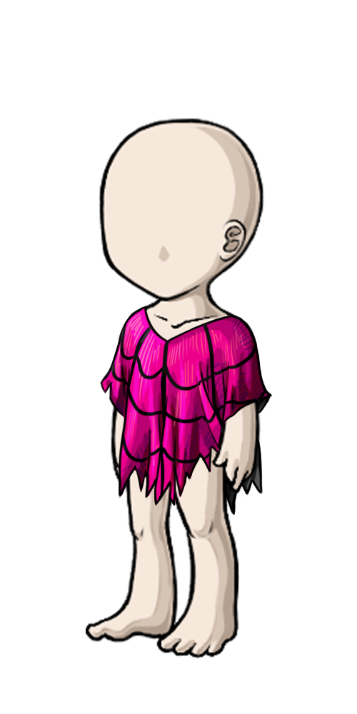
Thank you so much for your input! I do use photoshop, so I upped the vibrance on all the shading layers and tweaked the colors a bit to shift them more toward the red spectrum. Originally the poncho was getting denied for too few layers of visible shading, so I kept going darker and darker pink trying to make the layers more apparent -- but I guess that was the wrong way to go! Hot pink is a difficult color to work with, surprisingly!
Anyway, here's a new WIP if you would be so kind to look at it, and my larger working size image, if you would like to take a look at that: [IMG]http://i1202.photobucket.com/albums/bb374/berryberrytart/Custom%20Wearables/ponchocomp.jpg[/IMG]
Working Size - Click!
Hmm im not sure, perhaps try to move the vibrance adjustment layer, but on the shadows only, not the highlights? I think the breast part might have lost a little bit of definition because the colours are saturated and more similar.
I can definitely see more vibrance in the shadows though. I'm still unsure of if it would be considered grayness however. Perhaps try making the layer a little more purple, see how it looks like? x3
Cathii's CW shop ❤️
Pinging you since you're the one doing it the item =)
Ok so hum, I think something that could work is make the outline of the item stronger, bolder, and the inner lines of the spider web lighter, like a deep purple. This may take of the focus of the the enter, which I think is messing with the shading. And instead of making the light layer textured, what if you make a solid block? I see it looks like small pieces so you can't say how many levels of color there is. Does that make sense? :P
the one thing I'm seeing is on the chest lines themselves there's a strange looking gray highlight that I think might be a problem.

If you don't mind me suggesting something different... Did you already try a redish multiply layer above the shades?
(oh and.. btw, watching this for a while now and the new ci looks MUCH better. very nice)
Alright, so first off I'm going to echo a bit of what Kel said and suggest that you use larger blocks of color instead of the thin lines you're currently using. They do add texture, but once it's shrunk down to the proper size it all gets lost unfortunately. Second, I definitely suggest playing with the colors you're using for shadows and highlights. What I like to do is get down shadows/highlights in a random color that just shows up well so I can be sure I've shaded everything that needs shading, and then go to Adjustments-->Hue/Saturation and adjust it from there until the color actually works. Sometimes it can be really surprising what colors work and this way I don't get caught up in any preconceived ideas that I have to use x color to shade y. :)
I messed around with your working size just a bit - blocked in that hot pink in just a few sections and then reshaded using my random color method to give you an idea (although what I did do is kinda crappy and looks like it needs one more layer of shading but whatever, lol). click So on the sections I messed with, I used the hot pink as the base, then used the purple set to multiply with 60% opacity to shade the largest areas, then wound up using that crazy green at the same settings for darker shadows within the purple ones, then used that bright orange set to screen at 100% opacity for the highlights. These are SO not the colors I would have picked out if I was choosing the color first but what I wound up with using the method above and I do think they work pretty well with the hot pink and definitely avoid any hint of grayness, lol. (That green totally surprised me xD)
Anyhow, hope that can be helpful. :)
(Oh, and it totally does depend on your preference, but for me at least I've found that while it can be nice to work at the 500x1000 size for an item here and there, clothing usually works better at 250x500 since at the 500 it's so easy to add detail that it's easy to over complicate the shading and such and then you wind up doing a lot of extra work that doesn't even show up at the finished size or worse just melts into a blur. :/ But it could be that that's just me. :P)
I just wanted to say a personal huge thank you to all of you for your suggestions. Between what you folks have said and the ticket reply we got from , Tartelette is pretty sure she can get it sorted out and I appreciate so much that all of you were so willing to help us get this out there! She's been working her bottom off trying to get this approved for me and I cannot thank her and everyone who's helped along the way enough :)
Thank you all for your kind attention and feedback. I really appreciate you all taking the time to help out! I ended up darkening the outer outlines slightly and changing the interior web to purple, as well as blocking in the highlights more decisively. Hopefully the colors work better now, as well! Thank you again for all your tips and workovers. Even after these last few months of getting CWs onto the site there's definitely a lot to learn, still. :)
New Overlay and CI: [IMG]http://i1202.photobucket.com/albums/bb374/berryberrytart/ponwork2.png[/IMG] [IMG]http://i1202.photobucket.com/albums/bb374/berryberrytart/obsidiana_ponchoCI6.gif[/IMG]
I think it looks a lot better than the last time! Hopefully it'll get in :)
The color itself looks better and less greyish. However.. don't hit me.. somehow i doubt it will be accepted like that. The difference between base color and shade is pretty huge.. The shade is a little too dark and heavy compared to the base color, so it might need a bit more adjustment?
I'm not an artist - so I can never see what you guys see, but I'm liking it :)
Haha, I think there's always more to learn no matter how far you go! But that's a good thing - helps to keep life interesting. :D It's definitely not looking grey anymore so that's a great start, however I think Squishy is right that it needs just a bit more tweaking on the colors to get them to mesh a little better, but I think you're making really good progress and are nearly there now. :)
@ Squishy @ Dannica Thank you both, I'm going to tweak it again -- I'm just afraid of the shading layers getting lost in the color. I've had a lot of trouble with colors blending too much, or being accused of using gradients and so forth, so I'm paranoid about having very distinct layers of shading. You're right, though, of course! The CI I can see especially, the shading is far too dark and dramatic. Thank you both for your input, I'm sooo grateful to have extra eyes to look at this!
Hey hon, one more set of wips for everyone to look at! Since this post is edited I don't know if I can ping Squishy and Dannica again. What are your thoughts? Do you think it's ready to resubmit? [IMG]http://i1202.photobucket.com/albums/bb374/berryberrytart/Custom%20Wearables/ponwork3.png[/IMG][IMG]http://i1202.photobucket.com/albums/bb374/berryberrytart/Custom%20Wearables/obsidiana_ponchoCI7.gif[/IMG]
I think it looks great and ready - I'll ping and and hope they don't mind me bothering them for one last opinion :)
And I want to thank you again for everything you've done to get this on-site for me ^_^ I know this one has not been easy and I feel terrible that it turned out to be so much more complicated than it originally seemed.